Banksy + 5: October 3rd

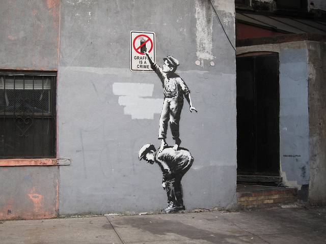
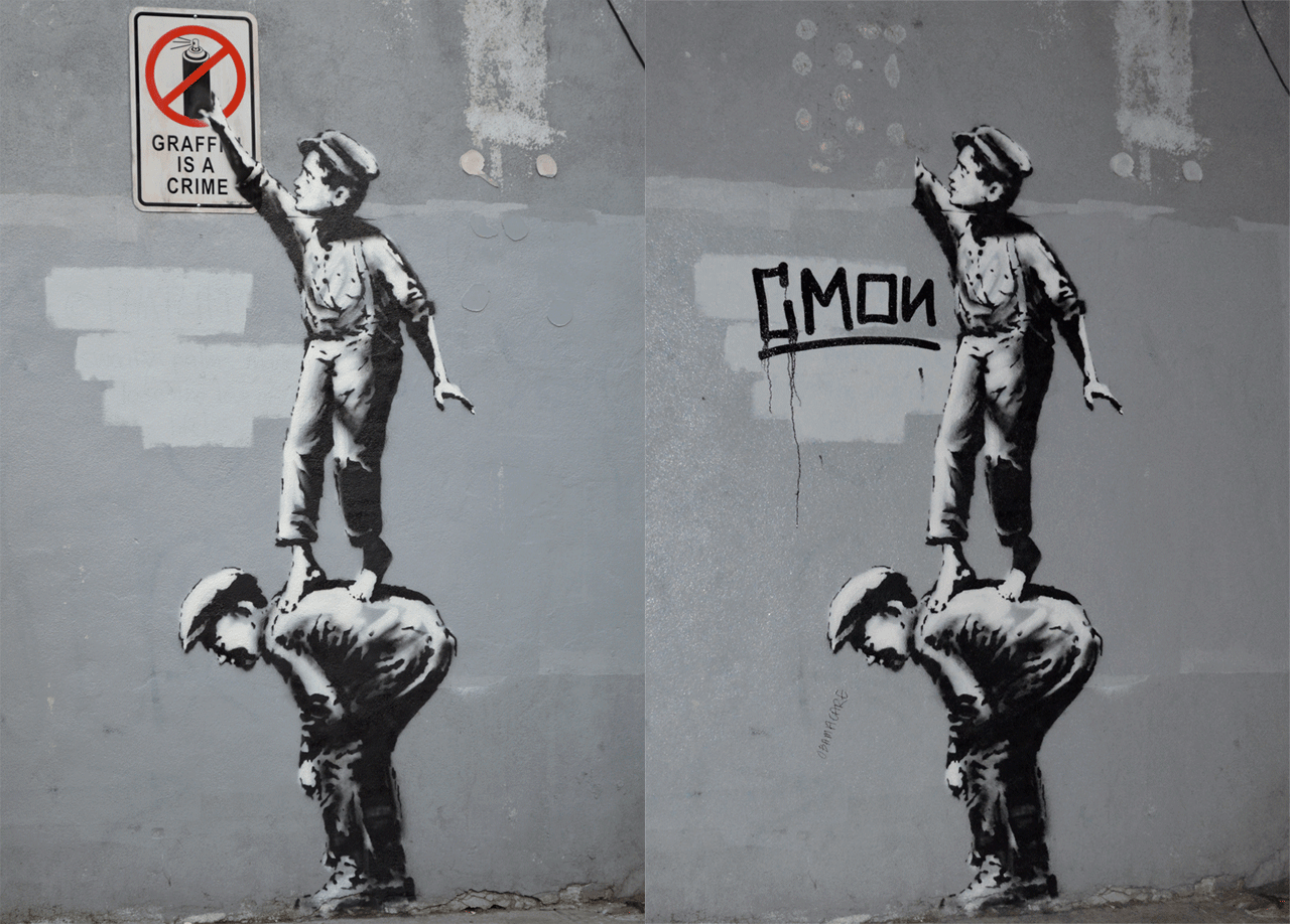
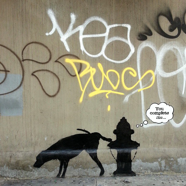
Banksy at 24th Street and 6th Avenue. Photo by Luna Park.

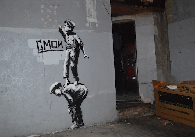
Once again, I’m much more a fan of the audio description of this latest Banksy piece than the work itself, which may be the point or maybe I’m just taking Banksy too seriously (as the audio description for this piece suggests). Luna Park came across this piece on Wednesday before it was announced on the Better Out Than In site this morning. It was confirmed last night when a description of it became available on the Better Out Than In audio guide 800-number (1-800-656-4271-2#). Hat tip to Ryan Oakes for alerting me to the audio description. Now, you can listen to it over the phone or on Banksy’s website.

And now for our +5, five other photos of street art by artists other than Banksy that were uploaded to Flickr yesterday. Today there’s work by Poster Boy, DabsMyla, Troy Lovegates, Tomo and one unknown artist:

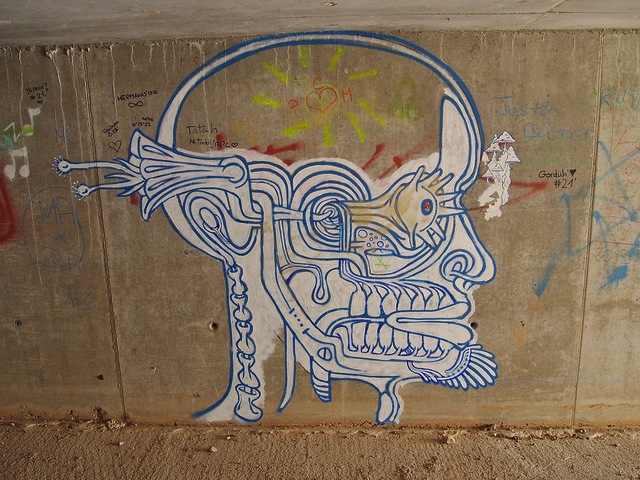
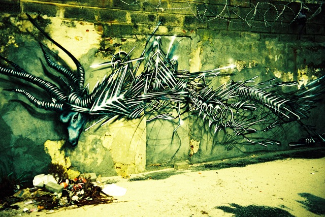
Unknown artist in Benicàssim, Spain. Photo by mejuan.
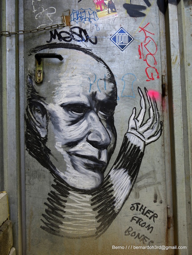
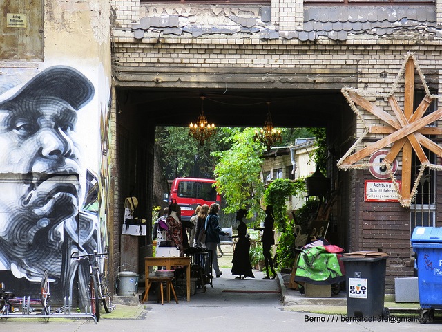
Troy Lovegates
Troy Lovegates in Berlin. Photo by Bernard Oh.
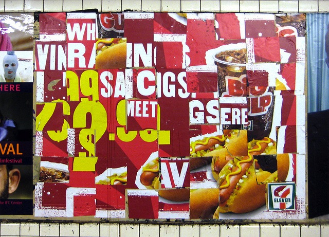
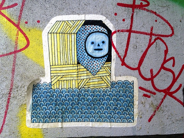
Poster Boy. Photo by Poster Boy.
Poster Boy in NYC. Photo by Poster Boy.
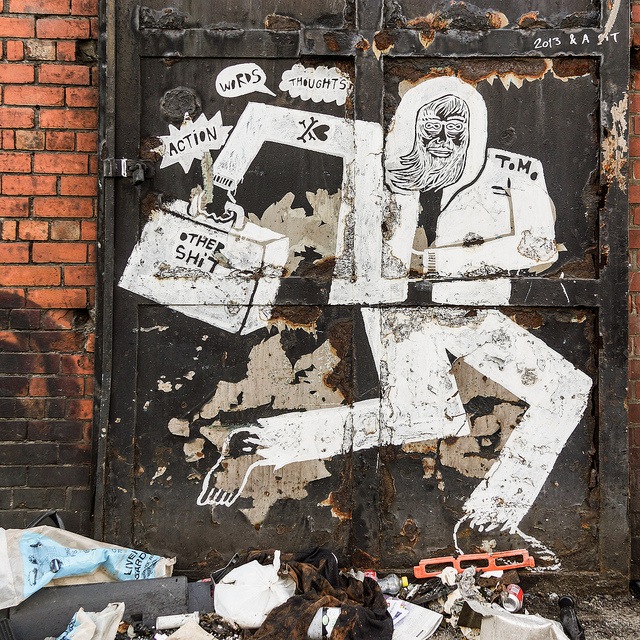
Tomo in Liverpool. Photo by Beverley Goodwin.
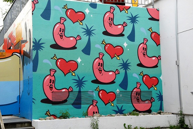
DabsMyla in Norway. Photo by Marie Guillaumet.

Photos by Luna Park, mejuan, Bernard Oh, Poster Boy, Beverley Goodwin and Marie Guillaumet

Banksy + 5: October 2nd

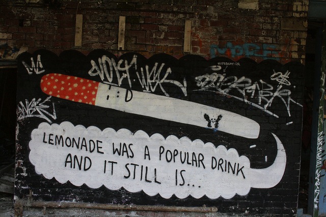
Banksy on 25th Street between 10th and 11th Avenue. Photo by Luna Park. Click to view large.

So I know that late last night I said that I didn’t expect we would be covering all of Banksy’s new NYC work on this blog (also, did you somehow miss that he’s doing a bunch of work in NYC in October for his Better Out Than In project?). I said that we’d probably just be sending out links on Facebook or that I’d be tweeting about it. But then Jonathan Lynn from Anewspace in Dublin tweeted an idea at me: “you should do a column called ‘this is the new banksy & here is 5 more artists who painted today'”.

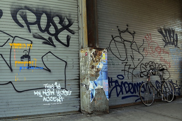
Banksy + 5 is a slight twist on Jonathan’s idea. Every time a new Banksy work for Better Out Than In is discovered, I’m going to post a photo of that work, as well as 5 photos of street art by other artists. The photos will be photos are sent to me or were uploaded to Flickr the day before the latest Banksy piece. So, for example, today’s Banksy + 5 includes the latest Banksy (the “New York Accent” stencil shown above) and 5 photos that were uploaded to Flickr on October 1st.

For today’s +5 we have NiceOne, Kid Acne, El Mac, Loretto and a collaborative piece by Shuby, Rowdy and Sweet Toof next to a piece by Eine:

NiceOne. Photo by Christmas Junkie.
Kid Acne. Photo by Kyla Borg.
El Mac. Photo by bernardoh.
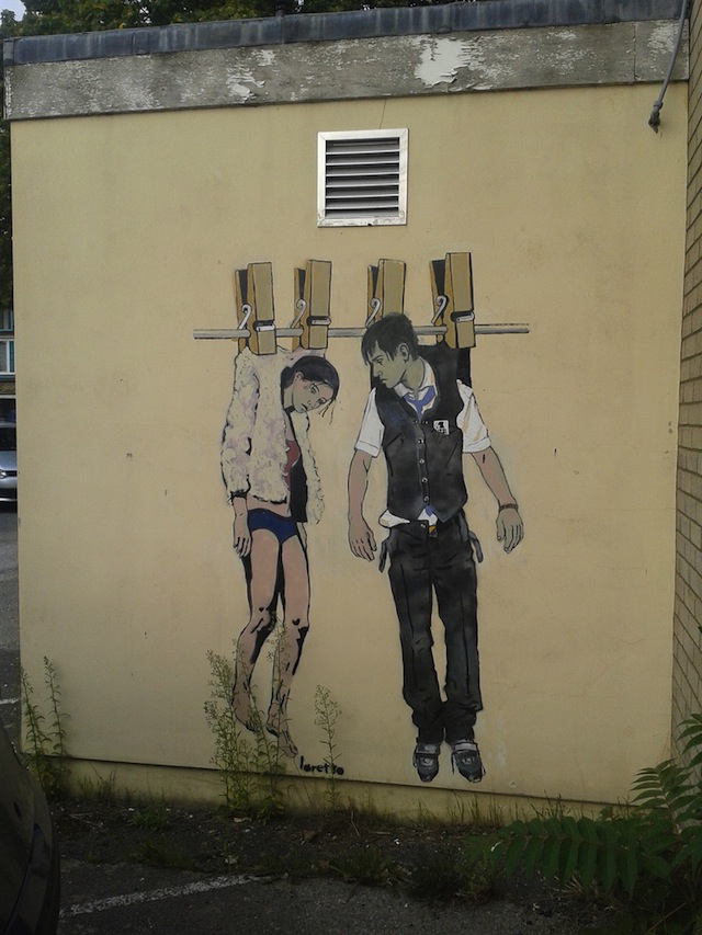
Loretto. Photo by Sarflondondunc.
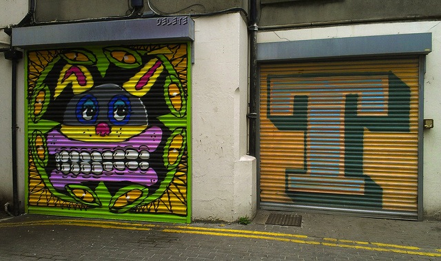
Shuby, Rowdy and Sweet Toof next to Eine. Photo by Delete.

Want to digitally side-bust Banksy and get some attention by being featured in a Banksy + 5 post? Get up, take some photos, and send them my way (rj a-t vandalog dot com).

Photos by Luna Park, Christmas Junkie, Kyla Borg, bernardoh, Sarflondondunc and Delete

Banksy comes to New York City, first piece damaged within hours

Banksy in NYC. Photo by carnagenyc.

Update (October 2nd, 11am): AnimalNY is reporting that Smart Crew temporarily replaced the sign with one of their own making, but that sign is now gone too and the entire piece has been buffed.

We now have some idea of what Banksy‘s Better Out Than In project is, the project that was hinted at on his website last month. It seems Banksy is putting up work around New York City (not LA as rumors initially suggested) throughout October. The work above is the first piece of Better Out Than In and is located on Allen Street around Chinatown/the Lower East Side. Pretty much everything that’s known about the project is on a new site, Banksyny.com. There’s also an Instagram handle (@banksyny). Looks like we will be getting regular updates from those two sources as to when new pieces go up. The site currently says, “For the next month Banksy will be attempting to host an entire show on the streets of New York.” To make this like (scare quotes) “a real show,” there’s an audio guide of sorts. Note the little stenciled numbers to the right of the piece in the above image. That’s a phone number (1-800-656-4271) that you can call to hear the audio guide (the item number of this piece is, naturally #1). You can also listen to the audio description (at least of this first piece) on banksyny.com.

As Bucky Turco at AnimalNY says, “So to recap: Banksy, a street artist who puts up work in the street–as other street and graffiti artists are wont to do–will be putting up work in the street. Got it.” But that seems to be missing the point, at least the point of where I suspect Banksy may be going with this. Just like The Street Museum of Art is absurd, there is a level of absurdity in Better Out Than In, but I think it’s probably useful absurdity making a point.

It may be the case that Banksy is trying to comment on street artists’ desires to get into museums or paint legal murals rather than work on the street in a guerrilla fashion. Are Banksy’s stencils good? Yes. Are they usually mind-blowingly brilliant? Nah. As Melrose&Fairfax points out, the concept of first stencil of this “show” is similar to work that went up earlier this year in LA last year by Plastic Jesus. If Better Out Than In continues in this vein of the kinds of stencils and public interventions that we have come to expect from Banksy, then I think Better Out Than In may be using those “typical” works to make a larger commentary about Banksy’s work and street art in general. So it’s not really the individual works that will matter but the show as a cohesive whole. Could Better Out Than In be the street art equivalent of institutional critique, really only using the works of street art as props? If so, Banksy may once again outdo himself, a commendable feat when the question among his fans always seems to be “What can Banksy do next? How can he top that last thing?”. Like I say, it’s too early to say with any confidence if this is what Better Out Than In is really about. So far we’ve only seen one piece and gotten a hint at the larger project, so I’m just speculating out loud and tomorrow it could become apparent that I’m completely wrong and have just my head too far up my own ass to see that yet. Maybe Banksy just wanted to make some jokes that didn’t work as stencils or he’s upset that MoMA hasn’t given him a show yet. I guess we’ll find out soon, although with Banksy it seems that hardly anything is ever completely clear.

One of the questions that people seem to be asking about these works is how long they are going to last, given the recent spike in the number of Banksy street pieces that people have sold or are trying to sell. Well, if this first piece is any indication, the works won’t last very long. This first piece has already been damaged. The sign has been removed and some tags have been added. My partners in The L.I.S.A. Project stopped by the wall late Tuesday night and took this photo:

Photo courtesy of The L.I.S.A. Project

Or, for the gif-lovers out there, I’ve made this:

Photo courtesy of The L.I.S.A. Project
Photos courtesy of The L.I.S.A. Project

The point is, if you really want to see one of these pieces, it’s probably best to keep a close eye on the project website, the project’s Instagram and other social media channels where the location might be revealed (since it appears Banksy’s sites will only be giving an approximate location) so that you can get to the new work before thieves or people bent on destroying it do.

Speaking of other social media channels. I tweeted a bit this evening that perhaps Banksy had joined Twitter for this project as @banksyny, but pretty soon after that I realized that the account is almost definitely a hoax. Obviously there’s no way to no for sure, but the general rule-of-thumb for confirming anything Banksy-related is to see if it appears on his website. While the @banksyny Instagram account is linked to from banksyny.com (which his official site, banksy.co.uk, currently redirects to), the Twitter account is not. So, I think it’s safe to say that the Twitter account can be assumed to be a hoax. Ironically, right after tweeting about the @banksyny Twitter account and believing that it could be real, I tweeted this about how people shouldn’t report Banksy rumors as fact. So, I screwed up on that one…

My guess it that we won’t be posting updates about every new piece in Better Out Than In or news about the project to this blog. Instead, you’re probably better following Vandalog on Twitter or Facebook for those updates (or of course following Banksy’s own site).

Photos courtesy of The L.I.S.A. Project and by carnagenyc

Melbourne Monthly Madness – August 2013

Sorry this post is so late. I’ve had an injured hand, so typing has been a pain, literally… Here’s my round up for August. I’m calling this month the Video Edition, cos I don’t think I can recall a month where so many awesome videos came out… Here we go…

To start off check out this great video from Jack Douglas. Jack is a talented Melbourne street artist and tattooist; this video shows some of his street and tattoo work. His characters are always awesome.

Another rad video featuring local writer BOLTS smashing some walls across Melbourne with his always super tight style.

Do you know what a “bogan” is? It’s an Australian colloquialism, this video from Melbourne writer AEON (created alongside VNA magazine) gives you a perfect explanation of the Aussie Bogan, lost in London.

LINZ from Queensland visited Melbourne and painted this great piece. LINZ also talks about his time as a writer and how things have changed so much over the years.

This video from Spacerunner is definitely my favourite video for the month. SIMR and Rides showing us how it’s done painting one of Melbourne’s trains in the dark of the night.

Check out this video featuring interviews with Rone, Sandra Powell and Andrew King discussing their views on street art in galleries and the streets and the general attitude towards the art recently in Melbourne.

Rone was in Portland Oregon recently for Forrest for the Trees festival.

A new video from LUSH.

And finally Reka painted this epic 8 story wall in Copenhagen.

Continue reading “Melbourne Monthly Madness – August 2013”

Tim Hans shoots… Carlos Mare

Mare139_TimHans_03

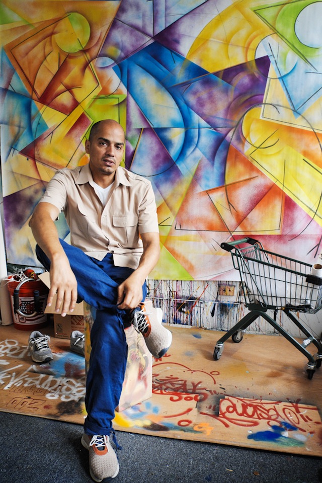
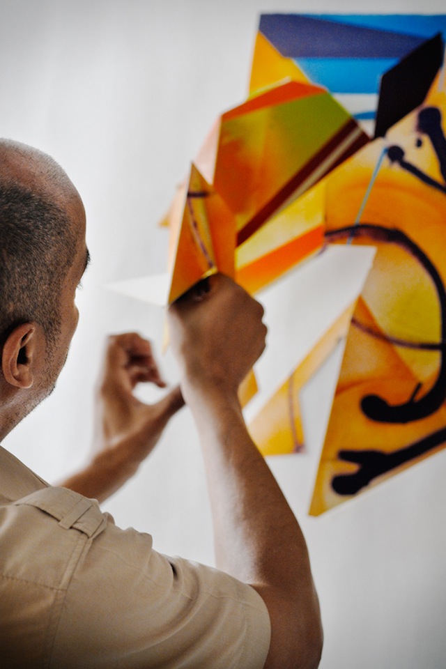
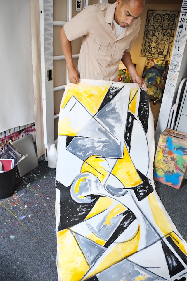
Carlos Mare aka Mare139 is one of hip hop’s living legends, and one of the pioneers when it comes to adapting what he learned in graffiti to settings other than walls and subway cars. Indoors, he is probably best-known for his sculptures, but of Mare’s recent work involves painting Bboys in action. This past spring, Tim Hans met Mare at his studio for the latest in our continuing series of photo-portraits of artists by Tim. I asked Mare a few questions over email.

RJ: Do you see yourself as bridging a divide between hip hop and other art movements with your artwork, or do you see art movements all as one thing?

Carlos Mare: I believe, though unintentional my works and words act as a bridge between histories and culture. Art movements are isolated events that are time and location specific, ultimately the ideas and aesthetics of that culture disseminate. Hip Hop was a great catalyst for global impact, it used to be very provincial in NYC during its hey day but once it breached local geography it was adopted and readapted by the world. This forced the hand of us pioneers to rethink it, I just happened to think of it in Modernist terms after I saw the 1980 Picasso retrospective at MoMa.

RJ: What have you done in your role as a cultural ambassador for the USA?

Carlos Mare: My role is not unlike any other traveling artist of the culture, we have been doing ambassadorships since day one. My role in part is supported by the State Dept., which does so for many American artists. I just happen to be an ‘Urban’ voice of the generation. Being able to have these opportunities allows me to speak in rooms with high level officials, artists and art advocates about the benefits and challenges of today’s urban artists. One of the most important things about traveling and speaking is that you get to educate others about the past and present contributions of the culture. This discourse is crucial and often overlooked in the relationship between governments and artists which is at best a side eyed acknowledgement.

Promoting American urban culture is much easier abroad then it is at home just so you know, in the US we have a tendency to marginalize the people of color who innovate culture until it is adapted by the mainstream. On the other hand the world youth took us on as their own and flipped the script by recognizing us as an artistic movement they too could embrace. Once it went pandemic it became hard to deny so it had to be in the best interests of Governments, Institutions and artists to bridge the gap in order to create more opportunities for personal and community change.
Mare139_TimHans_05

RJ: What do arrows mean to you?

Carlos Mare: Not much anymore actually. When I was more into Style Writing it had different meanings such as the direction in which the the construct of the letter would flow or to camouflage my name, perhaps use it as a weapon as my good friend Rammellzee used to imply. I learned that the greatest of Style Writers could do without it and can create sophisticated graffiti without it. At the end of the day it’s just another graphic element in the graphic design of graffiti.

RJ: Your Bboy pieces seem to capture so much energy and movement even while they are based on stick figures. Even moreso than many photographs. How do you go about capturing that movement in a static 2-dimensional image?

Carlos Mare: The Bboy works are not based on stick figures at all but rather geometry and movement. The line work implies the skeletal framework of the body and to a degree yes the stick figure is an easy analogy but it’s been so refined and so thought out that these shapes even in their simplest forms capture a reduced impression of the body, a familiarity that both Bboys and writers can identify with. It’s coded language, it’s rhythm, wild style and modernism all in one. One of the best interpretations came from my show in Berlin at Skalitzers Gallery when Robert Smith observed:

“Carlos Mare’s Bboy drawings and paintings, so refined and visually direct, become coded representations of the dancer’s repertoire of movements and poses. In much the same way that staffed symbols are used to represent the written form of musical notation, so too the simple, gestural icons come to express a visual codification, a defined scale of available movements.”

I had never considered an analogy like this even though it was already baked into the work, this observation was spot on and opened up a whole other dimension into my thought process. These works are in large part about physical intentions, what is implied by gesture and movement, so much of the genius of the dance is nuanced and can be found in the in between spaces of the action, a dancer begins at A and goes through his whole vocabulary to get to Z. What I am interested in is what happens in between and how to capture that. It’s a Futurist concept with a dope backbeat.
Mare139_TimHans_06

RJ: What’s next for you?

Carlos Mare: I am always stretching the boundaries in my works, I’m challenged by my own works and see my work changing radically in the coming year. I will continue painting the Bboy works which are more and more amazing and will turn these ideas into sculpture as well. That series will likely come to an end but not before I do a series with Ken Swift, this will be the pinnacle of this exploration I think, I could be wrong but I’ve been at it for many many years and feel I can bookend it with the legendary master as my subject.

As for sculpture, I haven’t begun to scratch the surface. I have lots of new works coming and older works that need closure before I move into the next phase of sculpting. It’s unfortunate that sculpture is not in the urban contemporary art conversation right now, painting is getting way too much light since it is easier to do and live with. I hope to change this with new public works that are larger, smarter and more ambitious.

Currently I am consulting with the Lemelson Center/Smithsonian Institute with an upcoming exhibition on Hip Hop culture which will highlight the Turntable as an American Innovation. Beyond that I can’t speak about what I have planned as it is probably the most ambitious and important work of my career.

“Don’t be an outsider looking in, be the Outsider they look into.” – Carlos Mare

Photos by Tim Hans
Best of Woodstock, as photographed by Jared Aufrichtig

DALeast
DALeast

A note from the editor: Today we have a guest post from Jared Aufrichtig, an artist who has been taking some really interesting photos of street art Woodstock, a suburb of Cape Town, South Africa. His book about South African youth culture launches this week at Kalashnikovv Gallery in Johannesburg, South Africa. I love Jared’s willingness to make these photographs his own, rather than just documenting the art straight-up. There’s a place for that traditional documentation, but these photos are great examples of how people can use the gifts that street artists give to the public and make their own art out of them. Jared’s photos here feature work by DALeast, Cern, Faith47, Gaia, Jace, Jaz, Know Hope, Louis Masai Michel, Freddy Sam, Paul Senyol, Mak1one, Pastel Heart, Jared Aufrichtig, Kasi, ?All and Makatron. – RJ Rushmore

These images were taken over the past 6 months while I got to know the Woodstock Community and explored the explosion of new work by local and international artists. During my many visits I was welcomed by the kind majority-Muslim community, they commissioned me to do work for them and I shared many fond experiences (except for when my original custom made RETNA Art iPhone grew legs while painting a mural). I was able to freely document their lives and unique area; I even shot portraits of a small child that ended up being used for a piece I had done by my friend from Durban Pastel.

Over the past few years the level of work and roster of international artist has risen dramatically. Woodstock will soon become Cape Towns ONLY area filled with creative public expression. I believe in and support the beautification of urban areas like this and others around the world.

Know Hope
Know Hope
Cern
Cern
Faith47
Faith47
Gaia
Gaia

Continue reading “Best of Woodstock, as photographed by Jared Aufrichtig”

Praxis bombs Bogota with surveillance reminders

3

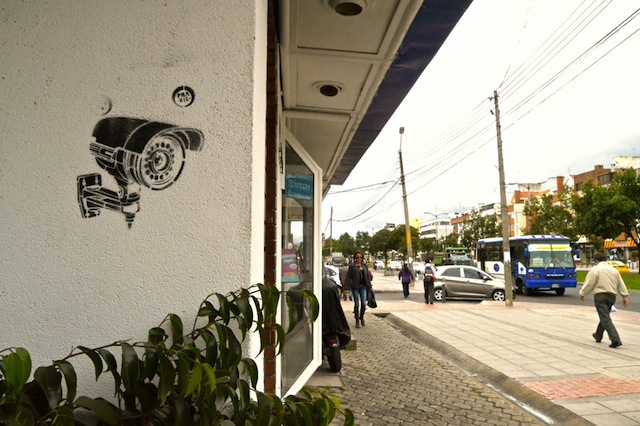
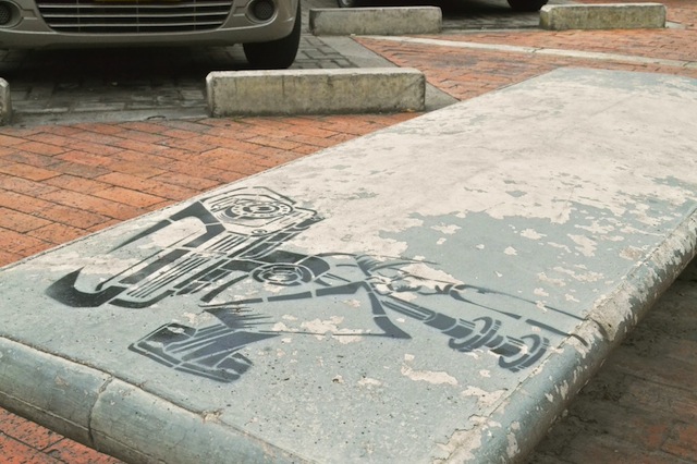
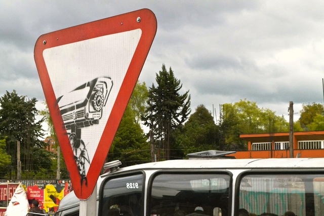
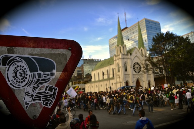
Lack of surveillance, personhood and privacy are new, modern world era problems that are hitting every  corner in major cities. In Bogota, stencil artist Praxis took on a project to create reminders all over the city of just how much we have lost our privacy.

2

People have all become accustomed to seeing cameras on their walk home from work, or at parks, areas that used to be public, but have become grounds of surveillance. The technological advances that allow for a surveillance culture to become normative have also engaged a new form of understanding the individual and the public space.

4

Praxis played with the idea of how people in Bogota would react to seeing the stencil or sticker of a surveillance camera as opposed to their reaction to a real camera. I saw a few of these in Bogota while I lived there this past year, I must say, it did kick my consciousness and attention to realize that I’ve become accustomed to the prevalence on constant visual control in my everyday life.

1

Praxis has provided a stencil for those who want to spread his reminder in other parts of the world. Download it here.

Photo courtesy of Praxis

Tim Hans shoots… Trek Matthews

TrekMatthews_TimHans_02

Trek Matthews is a young Atlanta-based artist whom I have had the pleasure of getting to know through his work with Living Walls. Through complete coincidence, Tim Hans ran into Trek on a Brooklyn rooftop earlier this year. Tim photographed Trek for the latest in our continuing series of photo-portraits of artists by Tim, and Laura Calle met up with Trek back in Atlanta for an interview. – RJ

Laura: Let’s talk about your experience as an artist who  also works on the streets. How did you start painting outside?

Trek: I’m gonna tell a short story to answer this. Basically one summer, when I recently had moved into this city, I think it was the second year of Living Walls but it was the first year that I heard of it. There was a call for volunteers and I got involved and it was rad. I assisted for Gaia and Nanook and Sam Parker and it was super super rad. I had seen their work before cause I had always been passively interested in seeing what they were doing at that time. I decided to keep going with it, and kept hanging out and trying out new things. At that time I was part of the graphic design program at a university, and then shifted the focus to drawing and started to bring that to a certain direction, with no intention of painting, until Living Walls approached me with a project. Until that point I had not done anything large at all, I hadn’t painted on a wall, or at all. I started practicing and experimenting anywhere I could, then I did my first wall a couple of weeks later. So it pushed me really quickly. Then I tried to adapt my aesthetics to different situations and aspects.

L: How do you think you participate in this contemporary movement, which going outside to the streets art, do you see yourself as an illustrator, a street artist, none or all of the above?

T: Yeah, I kinda just try to do a mix of anything instead of being a purist on any intent and that tends to include doing things on paper that I can push myself personally on a small scale and then how that translates to the public realm, whether its sanctioned or illegal, it’s always sort of interesting, to see how things aesthetically adapt to the public environment, or conceptually adapt to the public environment. So, with personal pieces I tend to go more with memory based objects or things that are purely based on what I have experienced or things that I remember, whether they be memories or fractions of memories, and when my work goes into the public I tend to look at how that area has progressed in a very subtle level. So it’s about my personal memory and what I experienced in that area even for the short time that I have worked there. So with things like public transit, public infrastructures, I try to see how they change the specific spaces I come across. So I like putting things both on paper or any sort of material, but I think the ability to react with the public is really good and to have a conversation with people that aren’t ‘art people’ and how they see things, how they react to things, especially now that I am pushing more towards a minimalized and abstract aesthetic.

TrekMatthews_TimHans_01

L: How has your style evolved in the past few years?

T: I was trying to focus on illustration and basically straight up drawing things, drawing anything from an animalistic approach, I liked that a lot at a certain point. I had basically not painted at all so I have always enjoyed deconstructing things and re-drawing them how I’d like to see them, but still pretty simple. I didn’t have too much concept so I tried to look into cultures in my area, the descending cultures of where I was from, and tried to branch out into other cultures without re-appropriating it too much. Just to keep it personal but try and still exhibit a culture that was here previously, so I kinda wanted to keep doing that for a while and got interested in color, cause I was just doing black and white and I wanted to do more color based stuff, therefore I had to start to focus into paintings or pushed ink. So that changed the subject into people and transportation and the process of moving in general. So I tried to make it more dynamic and minimal, I guess I started doing that earlier this year. I’ve been bouncing between doing things large scale and small scale, so I would go to location, like when I was in Spain I’d sketch something and then go and see how that it fits into the space, then bouncing that into paper and adapt that by adding more depth and trying to increase my speed.

L: Does the setting of where you’re working influence you?

T: To an extent, I like to have the composition fit what it’s on to a certain extent and then trying to base it on the loose history of that area, without getting to apparent or in your face, I like to keep it fairly loose and conceptual so that people can give it their own personal narratives or a narrative of that area. So if it’s not sanctioned, they are kind of just compositions that adapt to the area that I’m working on, but I just wanna quickly put it up. But if its sanctioned I want it to be relevant to the area, for example the piece I did in Bushwick in March, I wanted it to relate to the area and how it’s changed. I learned that the spot that I was working at was an area with high volumes of violence towards prostitutes, so I kinda wanted to look into that and keep it very loose, but with that I wanted to make it more powerful on the feminist approach. When I was sketching it, I was keeping that in mind, so the concept that I was going for and the composition reflected that local history.

Photos by Tim Hans
Sara Conti’s Russian nesting dolls

198+(2)

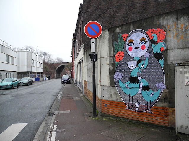
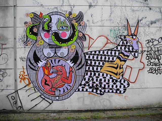
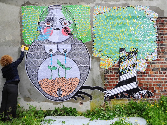
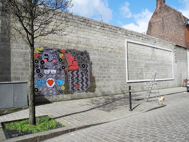
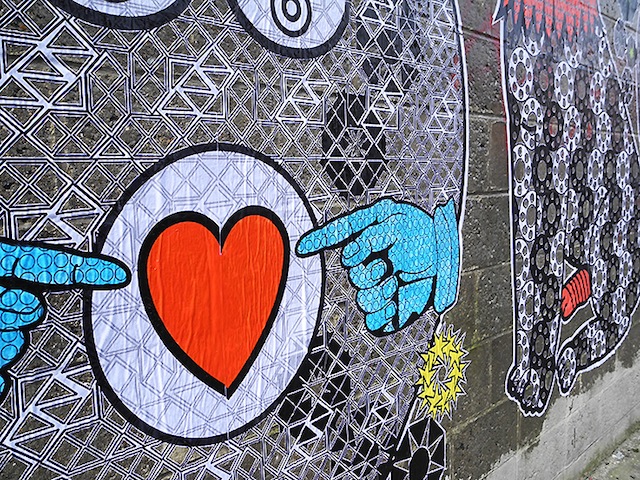
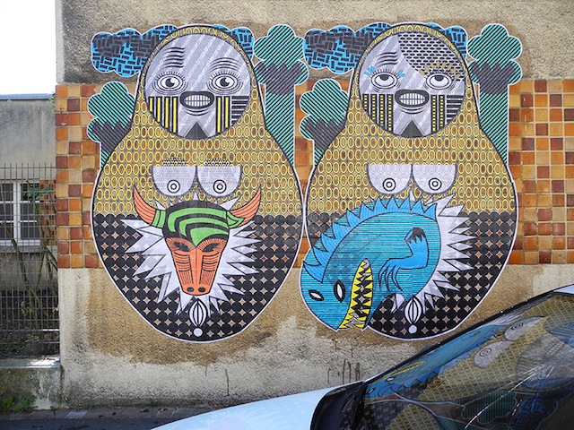
I was recently introduced to the work of Sara Conti and her Russian doll wheatpastes. I’m enjoying her combination of printed designs and cut paper. Plus, of course it’s always nice to see a bit more of a feminine vibe on the street in such a male-dominated scene (especially when the work appears to be done without permission). You can find Conti’s work on the streets of Belgium.

204+(1)

m.

15

2
Check out the details of the cut paper.

213+(1)

Photos by Sara Conti

Weekend link-o-rama

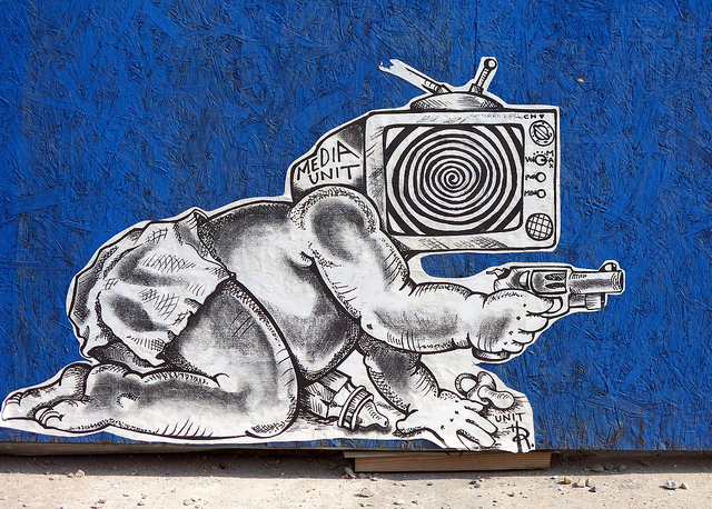
Unit 12, maybe. Photo by Dani Mozeson.
Unit 12 or Unit 112, maybe?

This link-o-rama is super helpful for me, because all week I’ve been working on my upcoming ebook instead of blogging. Hopefully the ebook will be out in November… Anyways, links:

  • I love that this show at LeQuiVive Gallery reframes a certain kind of work that often gets lumped in with street art or urban art as Neu Folk Revival, which describes the work much better than calling it street art or urban art or low-brow art. Some real talent in this show: Doodles, Troy Lovegates, Cannon Dill, ghostpatrol, Zio Ziegler, Daryll Peirce, Justin Lovato… It opens next month.
  • This piece by Part2ism needs to be seen. And look closely. That’s not just paint on the wall. Very interesting. I am glad to see Part2ism on the streets again, and I can’t wait to see what he does next. Once again, he has shown that he is ahead of the rest of us. This piece doesn’t look like graffiti. It doesn’t look like street art. It looks like art on the street, and that’s much too rare.Swampy has relaunched his website and posted a video diary sort of thing. I’m very curious what people think about it. Have a look and let me know.Check out this concept from Jadikan-LP: Art that only exists within Google Maps. Click the link. Explore the room. I normally hate lightpainting or “light graffiti,” but I absolutely love this piece. As far as I’m concerned, the internet is a public space and Jadikan-LP has invaded it with artwork, so this project is street art.
  • CDH wrote a really fascinating article in Art Monthly Australia about the commodification of street art. While I don’t agree with him entirely, I think it’s a must-read because at least it sparks some thoughts. It’s one of the best-written critiques I’ve read of the capitalistic nature of contemporary street art. Over on Invurt, they have posted CDH’s article as well as a response by E.L.K. (who CDH calls out in his critique). In his article, CDH called out E.L.K. for using stencils with so many layers that the work isn’t really street anymore, since stencils were initially used for being quick and a piece with 20 layers isn’t going to be quick. It’s just going to look technically interesting. Well, E.L.K. shot back in his response and made himself look like an idiot and seemingly declaring that all conceptual street art and graffiti is crap. There were arguments he could have made to defend complex stenciling or critique other points of CDH’s article, but instead E.L.K. mostly just attacked CDH as an artist. Anyway, definitely read both the original article and the response over at Invurt. The comments on the response are interesting as well.

Photo by Dani Mozeson