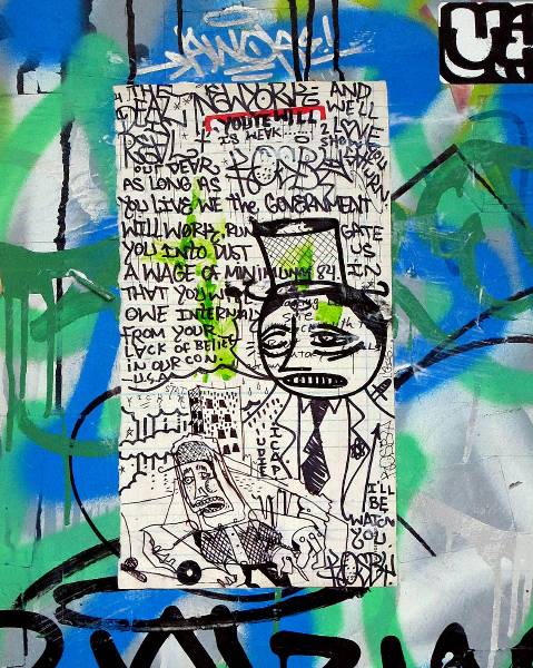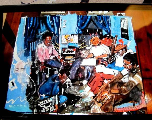
The difficulty with photographing sticker art or graffiti stickers is that it’s really difficult to provide context for the sticker without losing all the details that might make it interesting to begin with. This context versus context struggle exists when photographing just about any sort of street art or graffiti, but it’s especially true with stickers. They are usually so small that you have to get inches away for a good photo, but then it’s hardly clear if the sticker is on a busy street or in a leafy suburb, surrounded by other interesting things or the lone bit of culture for an entire block. This is especially important with illegal work like stickers where an artist is taking a risk to put something in a particular location of their choice (okay admittedly stickers are not all that risky). Understanding the context of the piece can really add to my appreciation for it. I don’t know if I’ve the first person or the thousandth to figure this out and I don’t consider myself a serious photographer, but I think I’ve stumbling across an interesting way to take photos of stickers that balances context and content: Panorama mode.

My iPhone has a panorama mode that I don’t think I’d ever used until earlier this summer, when I accidentally realized it could be useful for photographing stickers. I was just fooling around with my iPhone, seeing if the panorama mode could work if you had something up very close and also something far away that both needed to be in focus. So I tested it by photographing a sticker and trying to move from the sticker to some background elements across the street. I saw the resulting image and suddenly I hardly cared about my little experiment. I saw a photograph that captured the details of a sticker while still giving context to its placement, and I fell instantly in love with the technique.
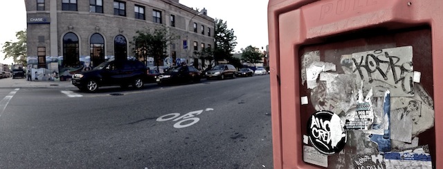
Obviously taking photos with a wide angle lens or in panorama mode is nothing new, but I can’t remember ever having seen it used for this purpose before. If anyone wants to prove me wrong, please leave a comment. I’d love to see what other people have been doing with this technique.

What do you think of this technique? Does it is balance content and context well enough? These are just some early shots by me, and I’m no photographer, so if you think you can take this further and do it better, please do and let me know how it goes. I would love to see others improve upon this. For me, it’s made documenting stickers so much more fun and fulfilling. Anyone can photograph another printed André the Giant sticker, but this technique highlights how context can make even printed stickers unique so long as the placement is interesting.

Continue reading “Photographing stickers without losing context”
