Portraits: Gaia and Sten & Lex at Brooklynite

Portraits

October 16 – November 6 Opening: October 16, 7-10pm
REQUEST A PREVIEW: info(at)BrooklyniteGallery.com
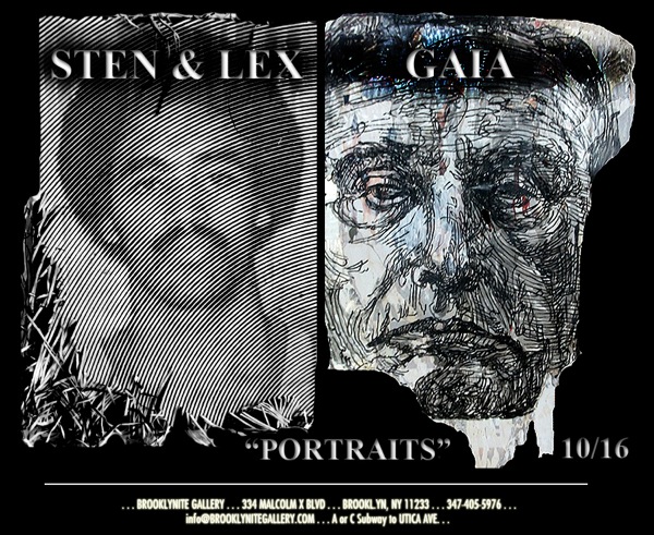
The world’s oldest known “Portrait” is believe to be created over 27,000 year ago. So why after all this time is it still the most often used subject of creation? A portrait often speaks much less about the physical features we are viewing, then it does about what’s behind the gaze in ones eyes or the telling angles of their mouth. This fascination continues to intrigue us through the work of three street artists who use traditional and non-traditional techniques to create their own brand of “PORTRAITS”.

Just because street art tandem, STEN & LEX are widely considered to be the pioneers of “stencil graffiti” in their Italian homeland, doesn’t necessarily mean they are content with resting on the title. Best known for introducing their “halftone stencil” technique, these two self-proclamined “Hole School” artists spend ample time hand-cutting pixel dots and lines to compose their imagery which is best viewed from a distance. Choosing to forgo the common pop culture imagery often associated with street art, STEN & LEX’s subject matter pulls no punches. Saints, Popes and the Italian Christian Church were primarily referenced early on –minus the often added social commentary. However, most recently and for their upcoming exhibition here, the subjects of choice comes from the historic Italian archives they’ve rescued. The 1960’s, 70’s and 80’s portraits from all walks of life are the focus this time around, as they are put through the rigorous transformation of stencil cutting style that is trademark STEN & LEX. The final appearance of these portraits appear to have been fed halfway through a paper shredder then pulled back at the last minute leaving the shreds left to dangle. The images are for the most part of common folk—young and old. People who have lived lives and have stories to tell. Just read their faces.

Seems as if the young, hard charging NYC street artist GAIA has been showcasing his bold imagery to the masses since before he could walk. Well maybe it hasn’t been quite that long but over the past few years he’s managed to garner a lot of attention by using more traditional techniques to create his wildlife animals and distinguishing human portraits. Taking a more intelligent, reflective approach to his work, this “old soul” uses wood block carvings and hand-drawn methods to achieve the fur textures of bears, tigers and rabbits as well as the worn lines in the faces of his latest portrait series entitled, “Legacy.” At it’s core, “Legacy” raises the question of infrastructure design and how we are forced to live with the decisions, good or bad, created by figures such as Robert Moses, James Wilson Rouse & Mies van der Rehoboth, all of whom have shaped parts of the American landscape. GAIA also plans on featuring a series of faded self portraits called “Sunsets”. Sunsets are a portrait of the nature of the street artist as an identity. It’s a pseudonym, to the person behind the work and the conflict between the secret, the collective and the fame of the individual. Some of the work is directly painted onto reclaimed street posters and found materials.
Weekend link-o-rama

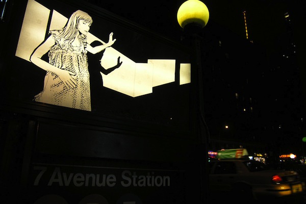
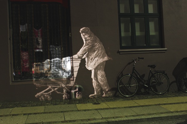
A mobile projection by Armsrock

Here’s what I missed this week, or where people just wrote things that I couldn’t do or wrote them better than I could:

Photo by Armsrock

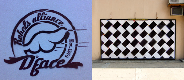
Compare and contrast: D*face and Jordan Seiler

Stencil by D*face (photo by hebedesign) and Weave It by Jordan Seiler (photo by Jordan)

I want to look at two very different artists and how they tackle advertising and the media in their art: D*face and Jordan Seiler.

D*face is known for billboard takeovers, messing with pop culture icons, messing with corporate logos and his “d-dog” icon. He’s kind of like Kaws in that D*face inserts himself into pop culture, but D*face’s work is typically subversive or critical of advertising, marketing and things like that. On the other hand, KAWS is inserting himself into pop culture in order to embrace it and become a part of it. Actually, D*face probably explains his art better himself in a new video for Don’t Panic:

I think it’s fair to say that D*face is “against” advertising, or at the very least that his critique of it doesn’t paint a pretty picture. I would also say that D*face has been, throughout his career, very good at subverting advertising, media and pop culture. Yet, there’s something about D*faces work that doesn’t subvert advertising at all. In fact, in some ways, D*face’s art embraces advertising. Like Shepard Fairey (one of D*face’s major influences), D*face has an “icon” or a “logo” of his own. The d*dog or elements of the d*dog appear throughout his work, as does D*face’s own name. So is D*face advertising himself by subverting advertising? Certainly. Is that his intent? I’m not sure. And if it is, it’s worth mentioning the standard argument defending that: (except for Shepard Fairey who has teams of wheatpasters) an individual artist doesn’t have the resources to advertise themselves on anywhere near the scale that a brand like Coke can advertise and the artist is putting up art while advertisers are solely trying to sell a product. Additionally, D*face’s use of a logo has probably helped him to become the success he is today, which in turn allows him to do crazy projects like this and increase awareness for his agenda of getting people to question advertising and mass media.

For those familiar with Adbusters, this paradox might be familiar. The Adbusters organization sells shoes which are essentially made in opposition to Converse and branded shoes made in sweatshops, but by creating an anti-brand, they have created their own shoe brand.

Jordan Seiler, like D*face, is known for billboard takeovers but also for his efforts to change/eliminate advertising in the public space. In addition to his own art, Jordan organized NYSAT and TOSAT. Throughout his outdoor art career, Jordan’s style has changed more drastically than the average street artist. While there are a few reoccurring motifs (like a use of simple geometric patterns and shapes), each project is very distinct and it would be hard for me to define a specific style for Jordan (unless doing ad takeovers is itself a style). Additionally, I don’t think I’ve ever seen Jordan sign his outdoor work. Recently, Jordan has been preparing to retire one of the designs that he has used for a while now and is starting to become identified by, his Weave It design.

From the Paper Champion project, photo by Jordan

On his blog, Jordan recently explained that he was finishing up the Weave It project (as he had ended projects previously before they became “iconic”) “in order to remained un-branded as an artist and therefor escape criticism that I use the streets and advertising venues as advertising for myself.” Two days later, Jordan restated his feelings in another post. Once again, Jordan said that he is moving on from the design in an effort to “prevent branding of PublicAdCampaign imagery.”

To most street artists, changing their style regularly and actively trying to avoid any identifiable trademarks might seem like a novel and counter-intuitive idea, but Jordan seems to be sacrificing potential short-term artist notoriety for his long-term political aims. The flip-side of this strategy is that a lot of Jordan’s art isn’t immediately obvious as an advertising takeover. Most of the takeovers don’t scream out “I am here instead of an advertisement,” so the art can easily be ignored or even possibly confused as some sort of guerrilla marketing campaign. While D*face’s artwork makes itself obvious and forces people to re-examine the world we live in, perhaps Jordan’s more subtle techniques cause the art and the action he has taken to be overlooked (although, and I’m not sure about this, he might argue that that’s sort of the point in some cases).

I emailed briefly with Jordan and he clarified his position on using logos in art. Surprisingly, he said “My thoughts on logo reproduction in street art and ad takeovers are not as idealistic as that which I practice” and he actually doesn’t believe that street artists shouldn’t use logos, just that “I choose to go as far as I can from logo production and stylistic similarities (which I can often fail at) mostly because I choose only to hit ads and therefore am under even higher scrutiny when being asked if my work is self promotional.”

So whose work to you think is more effective? Let me know in the comments.

Photos by hebedesign and Jordan Seiler

New from Labrona and Other

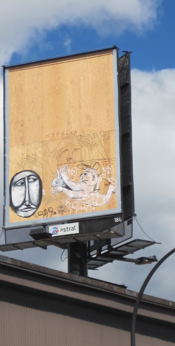
Labrona sent over some photos of what he’s been up to recently. Labrona have some work at Moniker next month in the Campbarbossa booth, so if we’re lucky, maybe he’ll be over in London for that as well. Oh and the billboard below was painted along with Other, who is one of the three artists to contribute a design to a line of Vandalog t-shirts that I’ll be launching soon (more info in the coming weeks).

Photos by Labrona

POW’s launch of Tristan Manco’s new book

Drawing from Street Sketchbook: Journeys by Neuzz

Tomorrow, October 1st, is the opening of the Street Sketchbook: Journeys show that Tristan Manco as put together at Pictures on Walls in London for the launch of his new book. Street Sketchbook: Journeys is the second book in Tristan’s Street Sketchbook series. Honestly, I don’t think I read the first book, but I respect Tristan as one of the more knowledgeable people out there making street art books, and I’ve begun to be sold on the concept of this series. But more on that in a review that I hope to do soon.

The show at POW is definitely going to be worth checking out. Tristan will be showing art from all 30 artists in the new book. That includes Roa, Vhils, Neuzz, Sam3, Titifreak, Dran, Stinkfish and obviously many more. And if you’re thinking “okay so besides Vhils, those aren’t exactly the biggest names in street art…” don’t be too quick to judge. Tristan Manco curated Cans Festival, and when Vhils showed up at Cans Festival, it seemed like nobody knew who he was, but then he amazed everyone. Tristan knows his stuff and I’m sure he’s found some brilliant artists for this show and his book.

Presumably, it will also be one of the first places to buy the book Street Sketchbook: Journeys, as it just came out this week.

The Street Sketchbook: Journeys show runs from October 1st (from 6pm) through October 15th.

Photo courtesy of Thames & Hudson and art by Neuzz

MOMO coming to Anno Domini this week

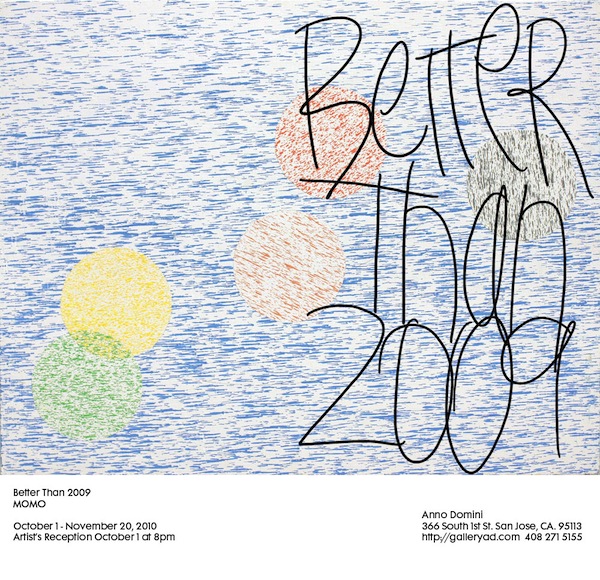
Almost everybody’s favorite abstract street artist (okay Elisa Carmichael probably prefers Aakash and he’s cool too), MOMO, has a solo show opening this week at Anno Domini in San Jose. I’m sure that Better Than 2009 is going to be a “can’t miss” event, as MOMO rarely disappoints. I actually remember MOMO’s wheatpastes as being some of the first pieces of street art that I noticed in Shoreditch, so even back when I only knew names like Banksy and Shepard Fairey, I was searching out more from MOMO.

And while we’re on the topic of MOMO, Depoe tipped me off that the New York Times recently published a photo-essay about MOMO’s largest artwork. A few years ago, MOMO dripped paint around New York City to make what might just be the world’s largest tag. I was never all that impressed with the tag itself, but these photos made me re-examine the artwork. I was much more interested in the piece as a sort of conceptual graffiti, because people (like the New York Times photographer) can follow the tag and walk its length. That process takes the viewer on a journey through Manhattan. Maybe it’s just an afternoon walk, but it’s MOMO’s afternoon walk that the viewer is taking.

Better Than 2009 opens at Anno Domini on October 1st (8pm until late) and runs through November 20th. Expect to see photos on Vandalog next week after the show is open.

Wild Fantasies features a Decade of Don’t Panic Posters

Yes, I know this post is a week late, but give me a break. I have photos! Well, borrowed photos (thanks Sandra!).

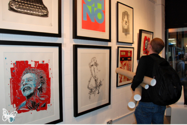
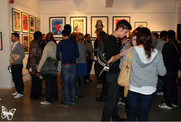
So last week premiered the Stolenspace opening of some amazing work by artists featured in the Don’t Panic packs that you find around London. On the walls hung pieces by Shepard Fairey, C215 and Word to Mother; pretty much a whose who of contemporary street art. I especially like the latest piece by D*Face. You cannot go wrong with a Spiderman motif.

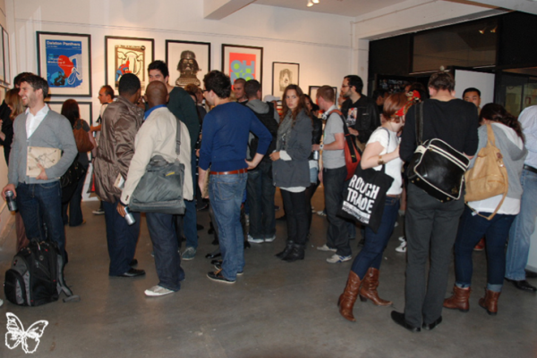
I had to laugh though. I guess I have never seen how dedicated street art collectors are, because there was a crazy line to buy the posters. Not knowing what original you were going to receive, guys were walking out with four or five tubes under their arms after waiting in line for over an hour while trying to balance a drink. Eager beavers.

Photos courtesy of s.butterfly

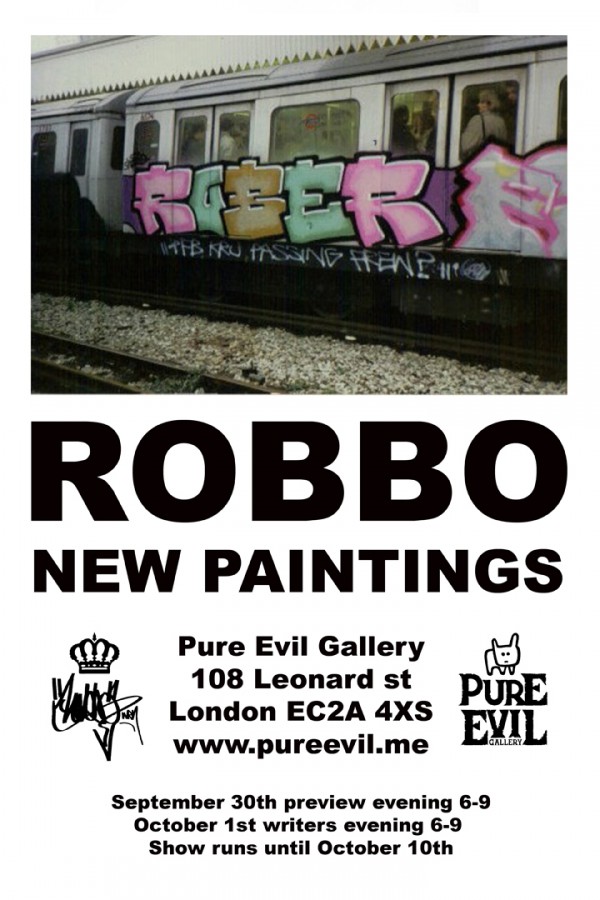
Robbo Showing at Pure Evil Gallery

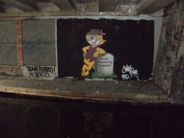
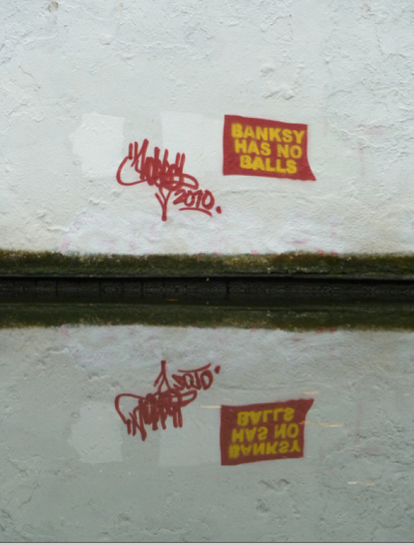
Usually, I love the shows that Pure Evil hosts. With a keen eye for fellow artistic talent, Pure Evil has put on some amazing solo shows with the likes of ROA, Dran and Specter, just to name a few. This time around though, I am a little disappointed to hear that Robbo is the latest artist to invade the gallery. You can think what you want, but in my blunt opinion, I think this atrocious to back an artist who has remade a name for himself late in his career because of a beef with another artist. I am, however, surprised it has taken this long for him to capitalize on his rejuvenated fame since the “War on Banksy” began. No doubt, there will be some pieces that make fun of the stencil artist, but I think this would be a good time for Robbo to step away from the controversy and show his own talent in a gallery, especially one that is so well respected in the street art community. If he does, I will eat my words. But his current actions in London, hyping the show, beg the differ as he and his cronies continue to bomb over Banksy pieces and make digs at him. For someone who has issues with an artist selling out and getting too big for his britches, I think the pot is calling the kettle black.

The show’s preview will take place tomorrow, September 30, at Pure Evil Gallery on Great Eastern Street. Stop by and let me know how it goes down since I am in Liverpool for the Biennial this week.

Top Cat at the Canal in Camden
More from The Canal

Photos courtesy of Robbo, Nolionsinengland, and Pure Evil

Richard Hambleton: One of the original street artists

One thing that I’ve been getting interested in lately is street are in the 1960’s-mid-1980’s. Basically, street art before Shepard Fairey. That’s why I recently visited John Fekner and Don Leicht’s studio. Perhaps the best place to learn about street art in that timespan is the book Street Art by Allan Schwartzman (and Tristan Manco has another suggestion but it’s not as easy to purchase). You’ll probably recognize some of the artists on the cover of Street Art (Futura, Kenny Scharf and Keith Haring), but the largest image on that book’s cover is of an artwork by a largely overlooked street artist: Richard Hambleton.

Hambleton started making street art in the late 1970’s when he made chalk outlines of people’s bodies in public places, as if a murder had occurred there. The physical artwork was really just the start of these pieces though. Often, these would get picked up by the local media, as residents in suburban and generally wealthy communities mildly panicked about the “crime scene.” Besides being fun, these early pieces of street art help to draw a very clear connection between the situationist movement and street art, something that I like to look for.

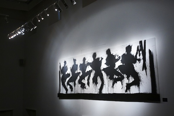
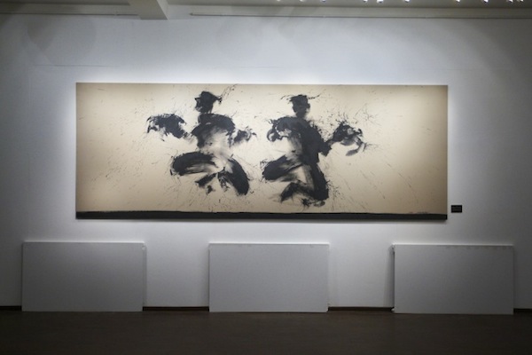
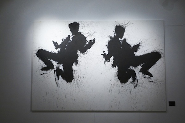
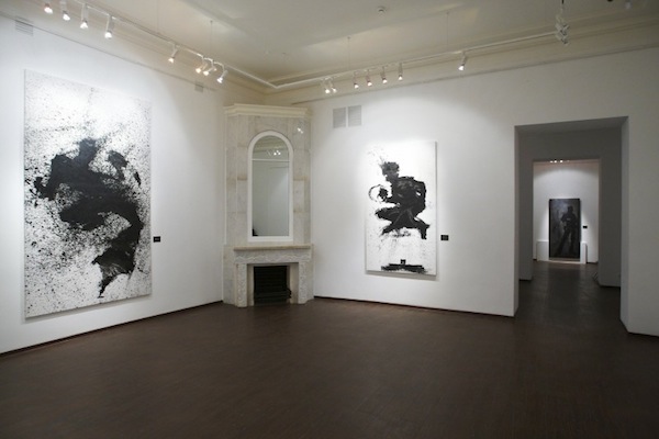
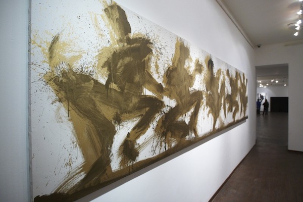
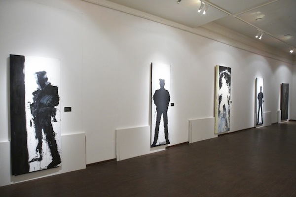
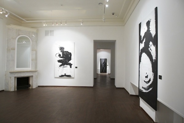
But it’s another series that Hambleton is probably best known for: The Shadowmen. These are what is on the cover of Street Art. Hambleton splashed black paint onto the streets in figurative shapes that looked like the shadows of people. It’s these paintings that you’ll primarily find at his current retrospective in Moscow. I briefly mentioned Arrested Motion’s preview of the show a few weeks ago, but now some photos of the work hanging in the museum have come out. Oh, did I mention that the retrospective is at a museum? Looks like USA hasn’t quite caught up with the Russians on this one, as Hambleton’s retrospective is taking place at The State Museum of Modern Art of the Russian Academy of Arts in Moscow.

There are some pretty nice pieces in this show, and for a fan of the years of street art like me, it’s fantastic to see Hambleton finally getting due recognition in a museum (as well as a recent Juxtapoz Magazine interview).

Unfortunately, Richard Hambleton – New York closes on September 29th, but hopefully show will help to relaunch Hambleton and we’ll be able to see these works in the UK or USA soon. Hambleton is among street art’s original innovators and it’s a shame that his contributions haven’t been more properly acknowledged until recently.

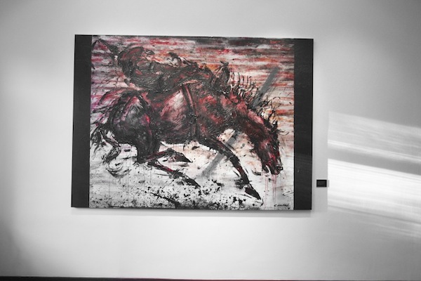
One of the interesting things about Hambleton is that even though he was one of the first street artists, his gallery work wouldn’t immediately be pegged as “street art” (unlike, for example, Blek le Rat, Crash and Futura). The above painting his part of his Marlboro Man series, and it just looks like a strong painting; Hambleton’s street art background doesn’t entirely define him.

Hambleton’s retrospective was put together by Valmorbida and Feedback.

Photos courtesy of Valmorbida

More from Dran, Sowat and Bom.K in Spain

Click to view full size

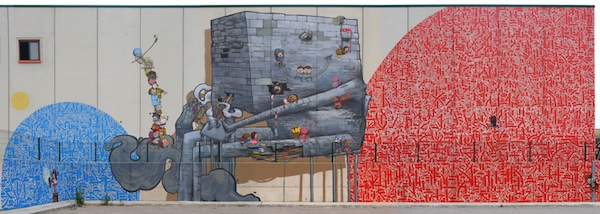
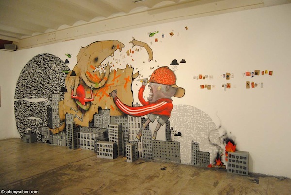
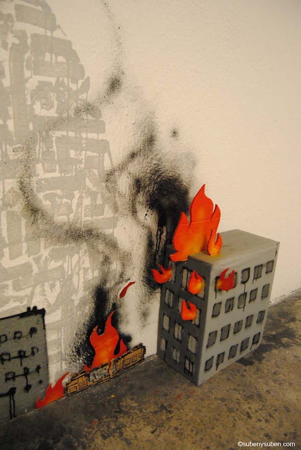
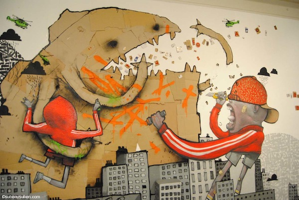
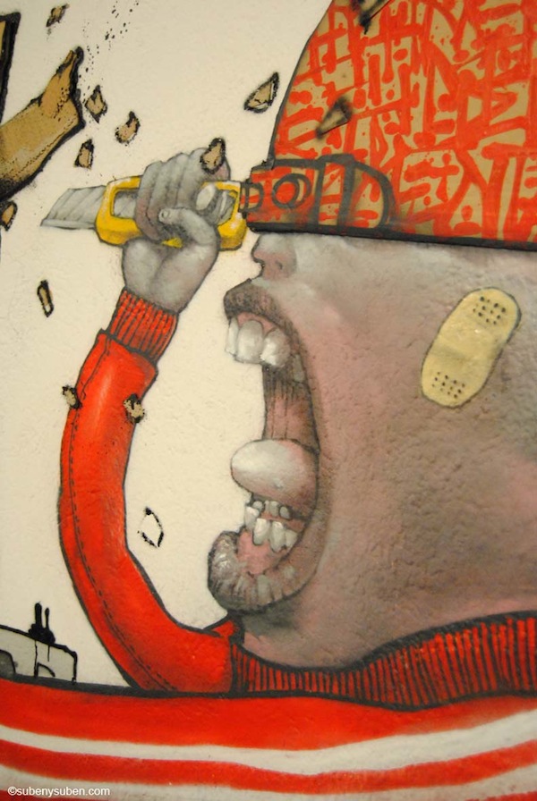
In my weekend link post, I mentioned that Dran, Sowat and Bom.K from Da Mental Vaporz were getting up to a lot in Spain. I want to expand on that a bit. They painted the above mural at the Montana Colors factory and you can check out plenty of more detailed photos of that wall on Montana’s blog, but there’s also the gallery show that DMV were in town for. As I mentioned a couple of weeks ago, Dran, Bom.K and Sowat were doing a 3-man show sponsored by Suben at Ras Gallery. If you’re interested in the work from that show, the price list is available online. Here are a couple of photos from an installation at the show:

Photos by Subenysuben.com