As promised in Tuesday’s post, here’s more from the set up process at Moniker Art Fair. Unfortunately I had to stay home on Wednesday, but I was out taking photos on Tuesday and of course plenty of other people like Hooked Blog were out taking photos.
Eine's installationPolly Morgan's installationHerakut's installationA piece by Swoon. Photo by HookedBefore the galleries moved in...Faith47 painting
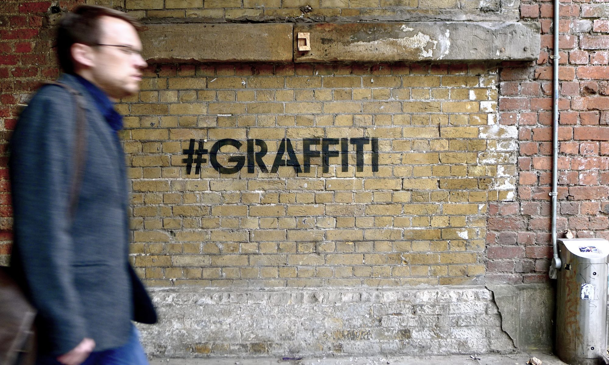
Steve Powers and Faith47 have finished their spots, 3 to go. Photo by nolionsinengland
And there are some Moniker videos to mention as well. The folks from Babelgum have been working non-stop doing editing at the fair. Here’s their time-lapse of Eine’s mural:
Calculate isn’t really for me and I’ve heard more than one person suggest that Eine should have repainted his Vandalism image which was on this same wall, but Eine fans seem to be liking this new piece as well.
S.Butterfly made this video interview with Steve Powers:
All in all, Moniker is shaping up to be everything that I and it seems everybody else have been hoping for. The fair opens on Thursday night from 7-9 and I’ll be running tours of the fair on Friday at 11:30 and 1:30, so I hope to see as many people there as possible.
While Brad Downey, one of my favorite street artists, was at BLK River recently, he tried an experiment in graffiti removal for an artwork called Searching for Something Concrete. While at first look it’s not my favorite piece from Brad, he always keeps things interesting and his art always seems to grow on me over a period of weeks. Here’s a video of the artwork:
Last week I posted some photos of what David Choe and DVS had painted in London for the Hell’s Half Acre show. Here’s some more from that recent London visit, one wall on Leake Street and another in the Old Vic Tunnels off of Leake Street:
David is interviewed in this next video, so of course it’s NSFW:
Ever since I lived in London two years ago during study abroad, I fell in love with countless street pieces that are sadly R.I.P. Yet, one of my favorite pieces still stands above the Village Underground in Shoreditch untouched and unscathed by vandals and the elements. Ronzo’s Crunchy the Credit Monster stands as a symbol of the recession overlooking the now gentrified Great Eastern Street, although to me, he still looks like a baby Reptar from the Rugrats (which is actually what I thought it was before I researched the piece). Recently, Ronzo and company released a video finally explaining the making of the adorable sculpture.
While I don’t think there’s anything new here, Babelgum has just posted a video overview of this year at FAME Festival (and actually some pieces from last year too). Check it out:
Stencil by D*face (photo by hebedesign) and Weave It by Jordan Seiler (photo by Jordan)
I want to look at two very different artists and how they tackle advertising and the media in their art: D*face and Jordan Seiler.
D*face is known for billboard takeovers, messing with pop culture icons, messing with corporate logos and his “d-dog” icon. He’s kind of like Kaws in that D*face inserts himself into pop culture, but D*face’s work is typically subversive or critical of advertising, marketing and things like that. On the other hand, KAWS is inserting himself into pop culture in order to embrace it and become a part of it. Actually, D*face probably explains his art better himself in a new video for Don’t Panic:
I think it’s fair to say that D*face is “against” advertising, or at the very least that his critique of it doesn’t paint a pretty picture. I would also say that D*face has been, throughout his career, very good at subverting advertising, media and pop culture. Yet, there’s something about D*faces work that doesn’t subvert advertising at all. In fact, in some ways, D*face’s art embraces advertising. Like Shepard Fairey (one of D*face’s major influences), D*face has an “icon” or a “logo” of his own. The d*dog or elements of the d*dog appear throughout his work, as does D*face’s own name. So is D*face advertising himself by subverting advertising? Certainly. Is that his intent? I’m not sure. And if it is, it’s worth mentioning the standard argument defending that: (except for Shepard Fairey who has teams of wheatpasters) an individual artist doesn’t have the resources to advertise themselves on anywhere near the scale that a brand like Coke can advertise and the artist is putting up art while advertisers are solely trying to sell a product. Additionally, D*face’s use of a logo has probably helped him to become the success he is today, which in turn allows him to do crazy projects like this and increase awareness for his agenda of getting people to question advertising and mass media.
For those familiar with Adbusters, this paradox might be familiar. The Adbusters organization sells shoes which are essentially made in opposition to Converse and branded shoes made in sweatshops, but by creating an anti-brand, they have created their own shoe brand.
Jordan Seiler, like D*face, is known for billboard takeovers but also for his efforts to change/eliminate advertising in the public space. In addition to his own art, Jordan organized NYSAT and TOSAT. Throughout his outdoor art career, Jordan’s style has changed more drastically than the average street artist. While there are a few reoccurring motifs (like a use of simple geometric patterns and shapes), each project is very distinct and it would be hard for me to define a specific style for Jordan (unless doing ad takeovers is itself a style). Additionally, I don’t think I’ve ever seen Jordan sign his outdoor work. Recently, Jordan has been preparing to retire one of the designs that he has used for a while now and is starting to become identified by, his Weave It design.
From the Paper Champion project, photo by Jordan
On his blog, Jordan recently explained that he was finishing up the Weave It project (as he had ended projects previously before they became “iconic”) “in order to remained un-branded as an artist and therefor escape criticism that I use the streets and advertising venues as advertising for myself.” Two days later, Jordan restated his feelings in another post. Once again, Jordan said that he is moving on from the design in an effort to “prevent branding of PublicAdCampaign imagery.”
To most street artists, changing their style regularly and actively trying to avoid any identifiable trademarks might seem like a novel and counter-intuitive idea, but Jordan seems to be sacrificing potential short-term artist notoriety for his long-term political aims. The flip-side of this strategy is that a lot of Jordan’s art isn’t immediately obvious as an advertising takeover. Most of the takeovers don’t scream out “I am here instead of an advertisement,” so the art can easily be ignored or even possibly confused as some sort of guerrilla marketing campaign. While D*face’s artwork makes itself obvious and forces people to re-examine the world we live in, perhaps Jordan’s more subtle techniques cause the art and the action he has taken to be overlooked (although, and I’m not sure about this, he might argue that that’s sort of the point in some cases).
I emailed briefly with Jordan and he clarified his position on using logos in art. Surprisingly, he said “My thoughts on logo reproduction in street art and ad takeovers are not as idealistic as that which I practice” and he actually doesn’t believe that street artists shouldn’t use logos, just that “I choose to go as far as I can from logo production and stylistic similarities (which I can often fail at) mostly because I choose only to hit ads and therefore am under even higher scrutiny when being asked if my work is self promotional.”
–
So whose work to you think is more effective? Let me know in the comments.
They’ve just released this new animated video for the fair:
While our friends at VNA are officially sponsoring the fair, we here at Vandalog have a bit of involvement as well. Elisa Carmichael is obviously going to be there for Carmichael Gallery, Steph Keller is currently interning with Moniker and I’m organizing something small with them as well which will be announced soon, so you can be sure that we’ll be posting a lot about the fair in the coming weeks.
Many Banksy fans will recognize that classic Because I’m Worthless rat. And Vandalog readers will probably be aware that Banksy’s artwork doesn’talwaysstay on the wall it’s painted on anymore.
ABOVE‘s latest stencil is an interesting take on those events. Check it out in this video:
Note from the editor: It should be mentioned that in the past I’ve been paid by the people making DOTS to help out on various parts of the project (though I was paid in artwork). Also, I still do communicate with them and help them out in small ways, but I don’t get paid for that. Also, for more info on this project and how you can help the film get made, check out Arrested Motion. – RJ
Some of you may remember us covering the newest up and coming street art documentary DOTS a few months back. Well now the mysterious filmmaker known only as as The Baron has released this teaser trailer (above) for the documentary which follows the members of London’s notorious Burning Candy Crew around various parts of the world.
Juxtapoz has also recently conducted a interview with The Baron where he talks about his relationship with BC, how he came up with the idea for DOTS and what he hopes to accomplish once its ready for public viewing. You can read that interviewhere
There’s not much to say about this yet, but Os Gêmeos posted a video on their blog earlier this week called It’s Snowing:
Okay, so it’s kind of a cool video. Not on the level of Blu or Erica Il Cane’s work, but at least something a bit different. Nonetheless, I probably wouldn’t be posting about it except for this news from Arrested Motion: It’s Snowing is really just a teaser for a larger animated feature from Os Gêmeos. If that’s true (and I would guess that it is), then that is going to be something truly special.