Tim Hans Shoots… Jordan Seiler

JordanSeiler_TimHans_01

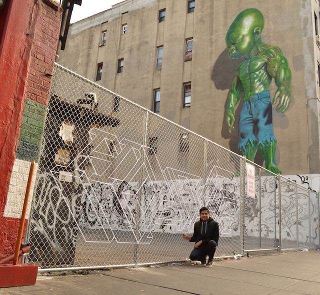
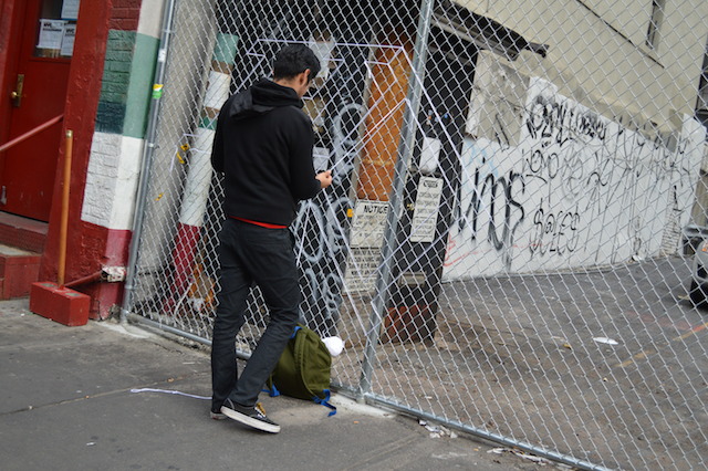
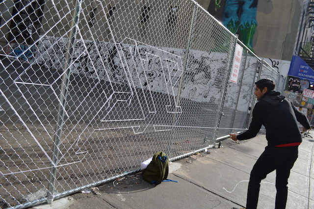
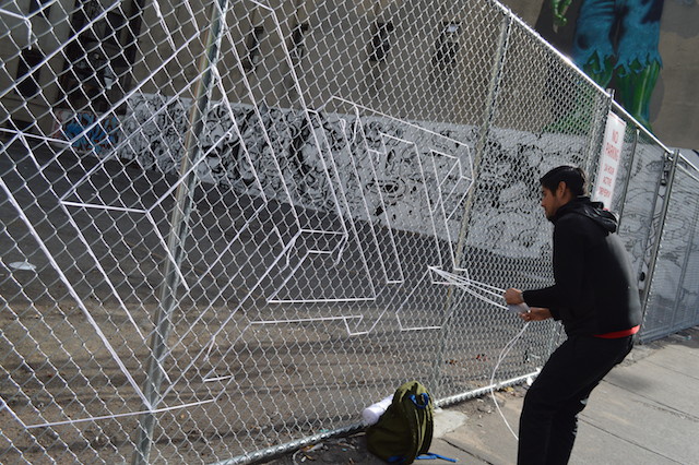
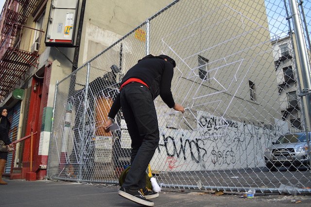
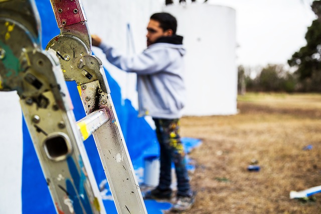
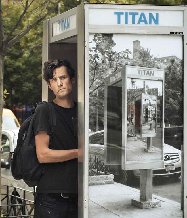
Note from RJ: It’s been a little while since we posted any of Tim Hans‘ photos, but his series of artist portraits is still ongoing. Today we have our latest photo from Tim, one he took of Jordan Seiler at the site of one of Jordan’s ad takeovers. Rhiannon Platt asked Jordan a few questions. – RJ

Under the moniker of PublicAdCampaign, artist and activist Jordan Seiler aims to help the public regain control of their visual atmosphere. His latest project, Public Access, aims to give artists the power to change their visual landscape. The artist has reproduced keys for bus shelters and phone booths for several countries, beginning first in New York and recently expanding to Brussels for an exhibition with Harlan B. Levy Projects. Today is also the launch of the app Re+Public, an augmented reality app for iPhone and Android created by Jordan and The Heavy Projects.

Rhiannon Platt: When did you first start combating commercialism with takeovers?

Jordan Seiler: I began ad takeovers in December of 2000 with an entire station takeover at the 18th street 1/9 stop. It took about 32 posters to cover both platforms. At that point, and somewhat still to this day, it isn’t about combating commercialism but rather deciding for ourselves what our collective visual landscape looks like.

Rhiannon: What made you want to start Public Ad Campaign? Was there a specific instance that you can point to?

Jordan: My first takeover was motivated purely by aesthetics. I thought the station would feel quite different with a new set of images. It was only once that feeling manifested, and I began to worry about being caught by the cops, that I began to see the differences between commercial and public media production.

Rhiannon: How does your passion for ad-busting manifest itself in your other work?

Jordan: I know this sounds trite but I prefer the word ad-takeover to ad-bust. An ad-bust suggests a play on meaning, a decrypting of the encoded media message to reveal its weaknesses or faults. My feeling is that we are already very good at reading between the lines and seeing most commercial messages for what they are. Despite this critical insight we sill cannot seem to resist their allure. Ad-takeovers on the other hand obliterate the initial media message and in doing so demand the space be used for other conversations. I think this is a very important distinction because if we are going to wrestle with the impact of media messages on our society, we need a critical distance from which to start. Ad takeovers demand an ad free public space and by extension ask the question of what we might fill that space with. I think with most of my other projects that aren’t directly ad-takeovers, I try to ask the question of how we might collectively take up the responsibility of public media production by encouraging other people’s participation, and exploring new tools for public media production.

Rhiannon: Are you currently working on any projects?

Jordan: I am currently working on a project called Public Access where I make tools that can be used to open advertising locations around the world so that people can engage their public media space directly. This is an ongoing project and I hope to continue to add more tools and more accessible cities in the coming years. I am also about to launch the Re+Public AR mobile app with my partner from The Heavy Projects. Our newest collaboration with MOMO was a wonderful experience and we are excited to finally make the app widely available through iOS and Android platforms.

Photo by Tim Hans
HOTTEA makes a brief stop in Little Italy

HotTea_LISA_866 copy

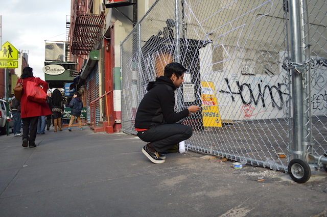
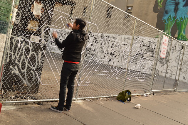
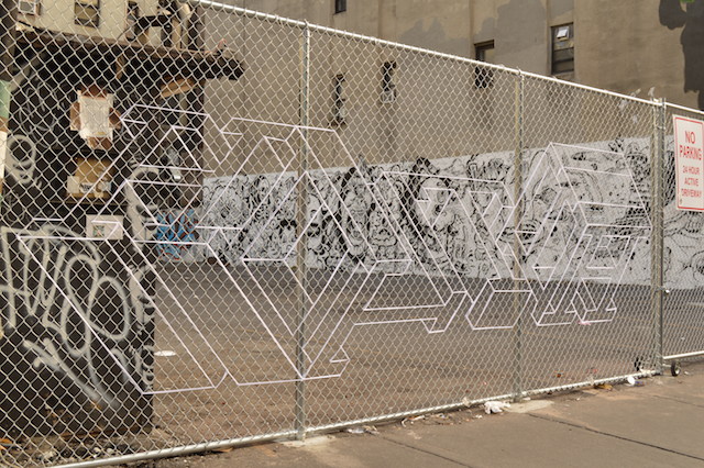
HOTTEA stopped by Little Italy last week for a last-minute piece with The L.I.S.A. Project NYC. His piece is right at the heart of our little street art murals, on Mulberry between Canal and Hester streets, near work by Ron English, Tristan Eaton, Bishop203 & Pebbles and a large collaborative mural done through Secret Walls. Since he works with yarn, HOTTEA was able to hit up a fence where I guess we otherwise couldn’t really install any art. Here are some shots of the piece coming together:

HotTea_LISA_776

HotTea_LISA_815

HotTea_LISA_817

HotTea_LISA_830

HotTea_LISA_835

HotTea_LISA_857

HotTea_LISA_872

Photos by Rey Rosa for The L.I.S.A. Project NYC

ABCDEF: the gorgonzola cheese of street art

abcdef5

ABCDEF‘s work seems no more difficult to produce than your standard shitty throw up, and yet it seems gallery-worthy. It’s stroke-your-chin-and-ponder worthy. It’s simple and exciting. There’s this great video where a disembodied John Baldessari tells Jason Schwartzman that fine art is like Gorgonzola cheese; if you give it to a child they will spit it right out. So you start giving them Velveeta cheese, and eventually they acquire a taste for Gorgonzola as they mature. ABCDEF is the Gorgonzola of street art.

abcdef3

abcdef
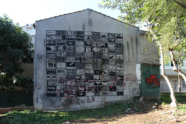
From a series done in Istanbul
From his P.B.R. series
abcdef8
From his “art is no control” series


abcdef6

Photos by ABCDEF

Guerrilla Spam’s Shit Art Fair

IMG_1628

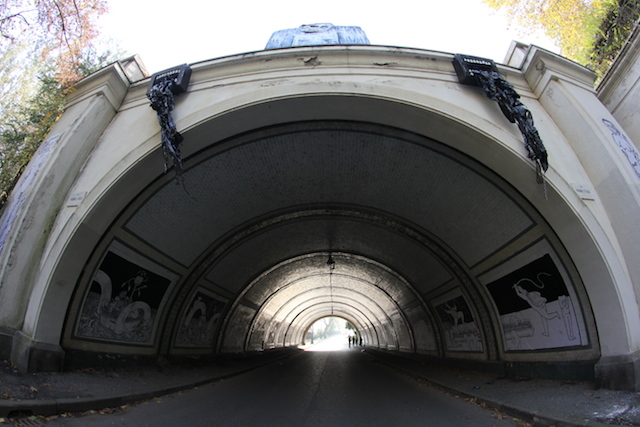
Guerrilla Spam recently took over a tunnel in Turin’s Parco del Valentino for their “Shit Art Fair,” competing with the malls that call themselves “art fairs” and putting art up on the street rather than in a hyper-commercial space. With nothing for sale, it’s a shitty art fair indeed, but a great street art installation. In addition Guerrilla Spam’s own work, they included pieces by JBRock, Galo and others.

More from the fair after the jump…

Continue reading “Guerrilla Spam’s Shit Art Fair”

Beau Stanton in Little Italy

Click to view large
Click to view large

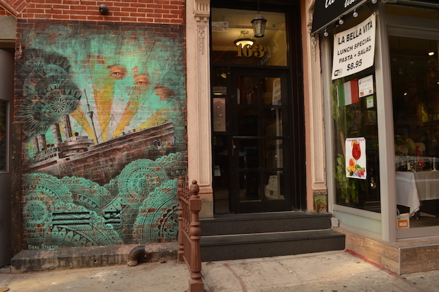
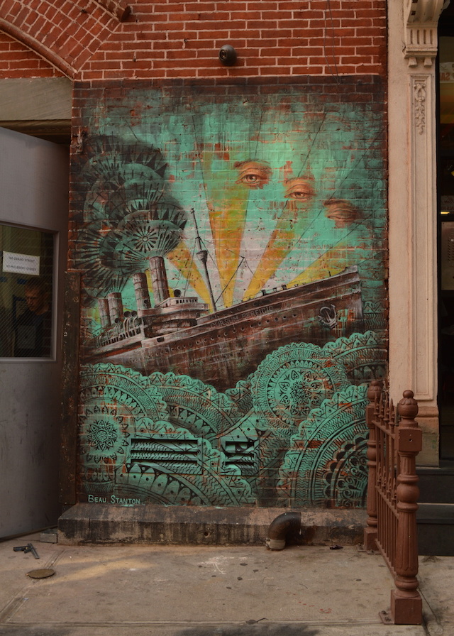
Ever since he helped out Ron English on Ron’s Little Italy mural, I’ve been hoping to see Beau Stanton‘s own work on Mulberry Street. This month, everything finally came together and Beau painted the above piece at Mulberry and Grand as part of The L.I.S.A. Project NYC. When we’re arranging murals for The L.I.S.A. Project, I particularly like when we can bring in something fresh that doesn’t totally leave the context of the area behind. With the neighborhood’s rich history of immigration, I think Beau’s mural is a perfect fit. I have to be honest though, this wall was entirely organized by Wayne Rada and Rey Rosa, with me watching jealously from the sidelines here in Philadelphia.

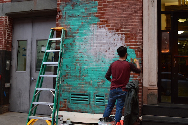
Beau Stanton starts the mural with a base layer of blue and white
Beau starts the mural with a base layer of teal and white
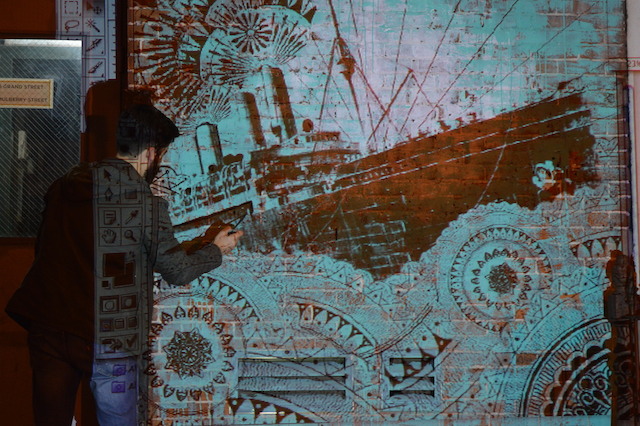
After dark, Beau projects his design onto the wall and makes a sketch
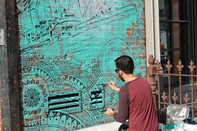
With the sketch in place, Beau can come back during the day to paint with proper lighting.

beau_comp_lisa_878-1

Photos by Rey Rosa for The L.I.S.A. Project NYC

Street Art in Montréal, Canada, Fall

hair_01
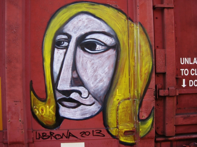
Labrona. Photo by Labrona.

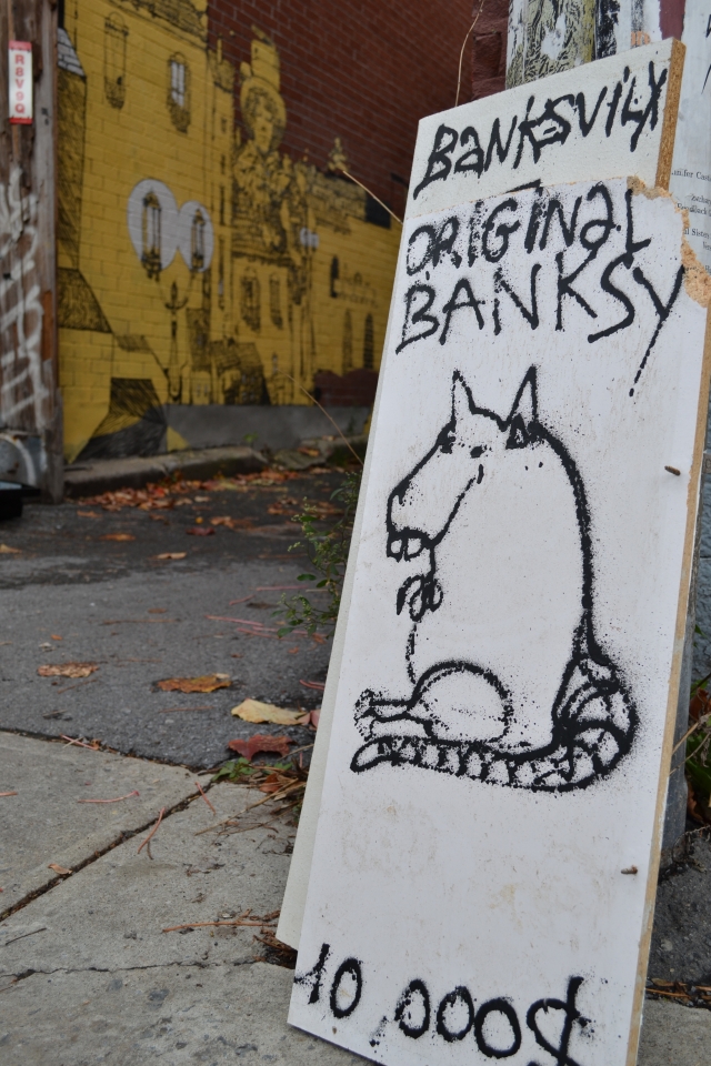
It’s already fall! Time is running out and artists too… The weather was sweet and warm at the beginning of the season, enough to have a comfortable atmosphere conducive to creation. A real indian summer that brought some good stuff in the streets. With the collaboration of my partner in crime, Space27, my eyes in Mtl when I’m far away, and with the support of some beautiful artists, the girls of Off-Murales, Labrona, Banksy…….. oh… WAIT ! WAIT ! Banksy was in town ??? No way ! No…no… it is BadVilx!!! phew… I can show you some street art works by Labrona, Vilx, Open Mind, The chief, Oh well!, MissMe, Qbnyc, Zola, Harpy, Lilyluciole, Scaner, Stikki Peaches, Mathieu Connery.

DSC_0170_01
BadVilx. Photo by Vilx.

Continue reading “Street Art in Montréal, Canada, Fall”

Elian, a geometric captivator

1

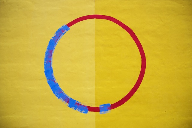
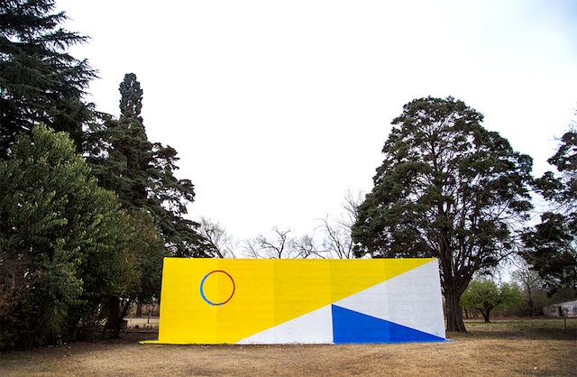
Last week, Elian finished a piece titled Environmental Influences, situated in the outskirts of Cordoba.

2

Elian’s work captivates shapes, colors that contribute to building structures in a way that can definitely bring life back to the space and, as he put it, the environment. I appreciate the thoughtful  intent in all his works found in different places, even in abandoned country sides  (like this one).

3

The explanation to his interventions is cohesive and shows strong efforts to communicate with the already built structures that are then enhanced by transformative colors and shapes that play in just right.

4

Photos courtesy of Elian

Banksy + 5: October 31st

Banksy in Queens. Photo from banksyny.com.

Banksy finished Better Out Than In today with the above piece in Queens. The balloons didn’t last long when people tried to steal them and then the NYPD came to take the balloons and arrest the would-be thieves (more on that on Hyperallergic). And Jerry Saltz be damned, this is one of my favorite pieces of the show. Jerry Saltz may say he has no problem with graffiti, but I’m not sure he quite understands it either.

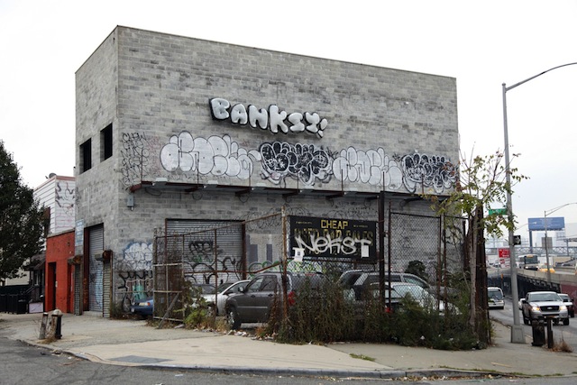
The location of this piece is perfect, with a NEKST tag (and remember what Banksy did on his website when NEKST died), an ADEK tag, two ADEK throwups and two LEWY throwups all visible in the above photo, which is the lead image for the piece on the Better Out Than In website. And of course, Banksy went higher up on the wall than all of those writers, but in a cheeky manner. I’m not saying that Banksy is still a hardcore train bomber, although he did pull of quite a few stunts this month, but he certainly has respect for traditional graffiti. Banksy could have installed those balloons anywhere, but he chose that particular spot and was able to highlight serious graffiti by some of the best writers in the city.

The audio description for this piece includes a serious note:

Banksy asserts that outside is where art should live, amongst us. And rather than street art being a fad, maybe it’s the last thousand years of art history is a blip, when art came inside in service of the church and institutions. But art’s rightful place is on the cave walls of our communities where it can act as a public service, provoke debate, voice concerns, forge identities. The world we live in today is run – visually at least – by traffic signs, billboards and planning committees. Is that it? Don’t we want to live in a world made of art, not just decorated by it?

I can’t think of a better way to close out the show.

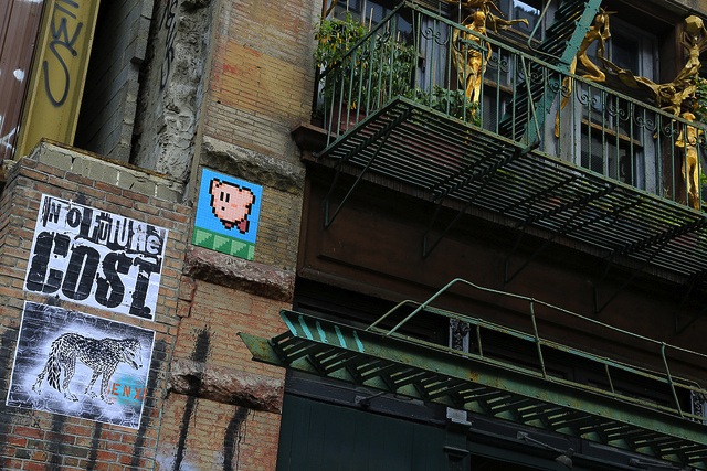
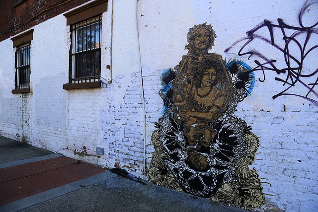
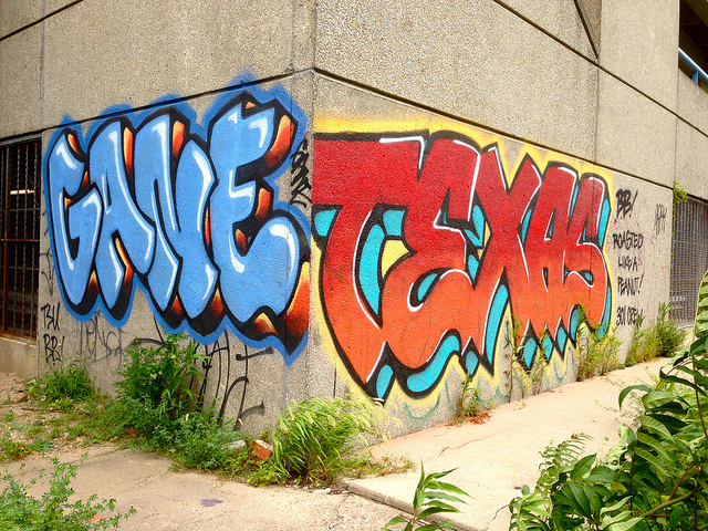
But I’m not done. We still have our final + 5 featuring Poster Boy, COST, ENX, Invader (who has reportedly been arrested in NYC!), Ludvig, Swoon, GANE and TEXAS…

Poster Boy in NYC. Photo by Poster Boy.
COST, ENX and Invader. Photo by Luna Park.
COST, ENX and Invader in NYC. Photo by Luna Park.
Ludvig in London. Photo by Ludvig.
Swoon in NYC. Photo by Luna Park.
GANE and TEXAS in Philadelphia. Photo by RJ Rushmore.

Photos from banksyny.com and by Poster Boy, Luna Park, Ludvig and RJ Rushmore

Banksy + 5: October 30th

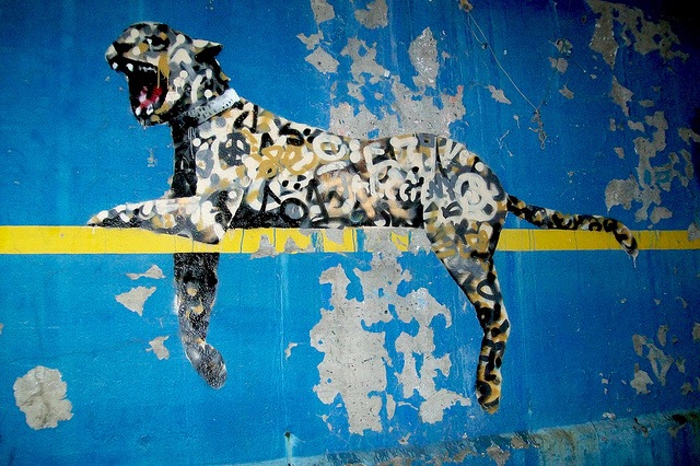
Banksy across from Yankee Stadium. Photo by Allan Molho.

Banksy brought back an old favorite today across the street from Yankee Stadium in The Bronx, a tagged leopard. He did a similar piece years ago in London at Cans Festival.
Tomorrow is the last day of Better Out Than In, so I think it’s fair to say that everyone’s expecting something big. Keep an eye on Banksy’s site for updates.
Today for the + 5, we have Vort Man, dRIP, Invader, Aris and one unknown artist parodying Banksy:

Vort Man in Salt Lake City. Photo by Vort Man.
dRIP in Lambertville, PA. Photo by dRIP.
dRIP in Lambertville, NJ. Photo by dRIP.
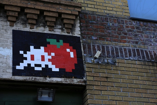
Invader in NYC. Photo by Luna Park.
Aris. Photo by Aris.
Not a Banksy, but still in NYC. Photo by Elisha Cook Jr.

Photos by Allan Molho, Vort Man, dRIP, Aris,