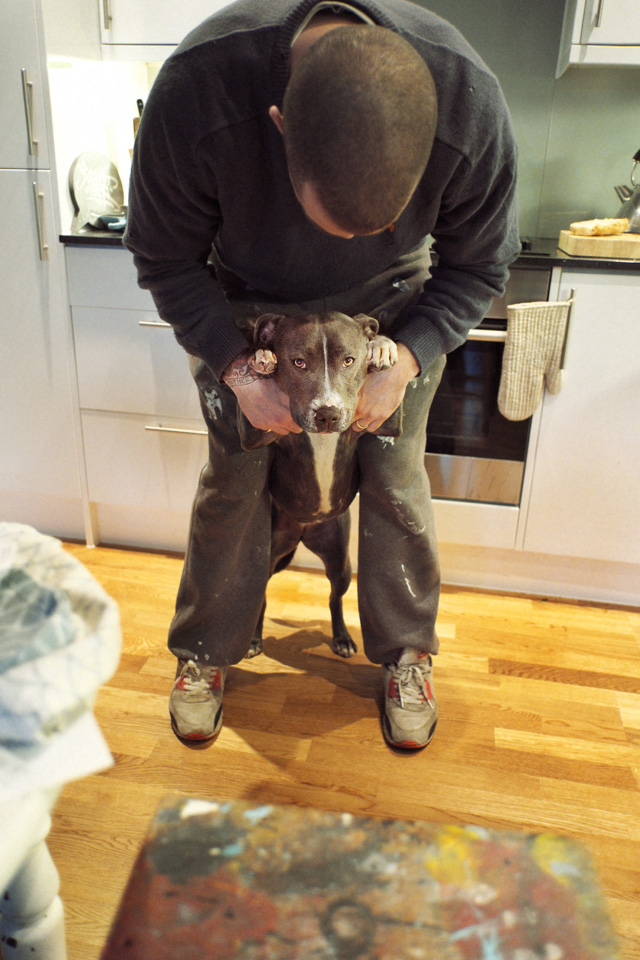
Caroline Caldwell: What influenced you to do street art? Do you remember your first time?
Sweet Toof: No one forgets the first time, its like sex, started in 1986, and still at it. I blame Beat Street and Style Wars.
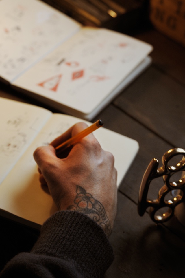
C: Do you try to do different things with your work or do let it evolve naturally?
ST: It is always good to experiment, working on the street fuels the studio work. One feeds another, what ever it takes a fat roller to a fine brush. The work evolves from mission to mission.
C: Burning Candy represents like a graffiti crew however the work is almost entirely character based. When Burning Candy was coming together, was there discussion over whether you all identified as a “graffiti” or “street art” crew?
ST: I left BC 3 years ago…. Burning Candy is what you see is what you get. We are like minded people working with characters, letterforms, tags, pieces, throw ups. Canvas sculpture print etc.
C: What’s one of the most interesting experiences you’ve had painting alone?
ST: Sinking in Quicksand was a strange experience.
C: And what about when you were painting with someone else?
ST: New York with friends was killer.
C: Have you been working on anything or collaborating with anyone lately?
ST: Working on a new body of work at present, watch this space for the rest.
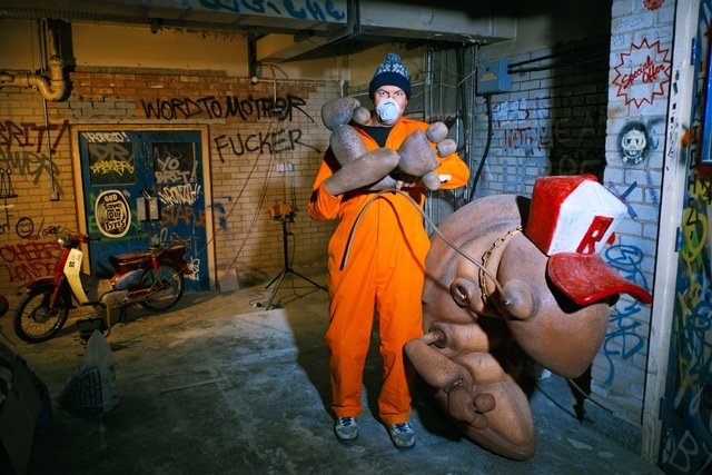
While on a recent visit to London, Tim Hans photographed with seven artists for our continuing series of photo-portraits by Tim. This week, we have Tim’s photographs of Word To Mother, along with an interview by Shower.
Also, Word To Mother has been as he puts it ‘analogue’ since we met him. In a small attempt to contribute to the digital world, he has got himself an instagram. Go follow him for regular updates on his work – @wordtomother.
Shower: I expect you have been asked this on numerous occasions but where did the name Word to Mother originate?
Word To Mother: It was never supposed to be a name. I started writing Word To Mother next to my pieces in about 2003…I like the expression, it’s affirmation of the Mother’s and classic Hip Hop phraseology, perfect! Illmatic is also one of my favourite albums so I guess that had a part to play in it all.
I started using Word To Mother as a name when I wanted to make a distinction between the fine art I was producing and everything else. I like the anonymity a pseudonym allows, it means the art is at the forefront and I am somewhere in the background.
S: Your style is very distinctive, your characters tend to be warm and welcoming with a strange complexity, and are usually found juxtaposed against stylised typography. What influences you and this style?
WTM: I have never knowingly tried to construct a style, it’s an ongoing process that is continually changing…I just try and do me, not look at what others are doing for inspiration, but to outside sources; architecture, sign writing, vintage cartoons, nature…
My strongest works are produced when I’m not thinking about what I’m doing, the images almost draw themselves. You can see by the weight of line in my sketches when a drawing is going to work. If the line is heavy then I’m not chilled and the drawing is forced. The best stuff is super fine and is like a subconscious wandering of thoughts.
S: On the subject of characters, Disney and other cartoon varieties feature regularly, which is your favourite and why?
WTM: I don’t have one favourite and the list is endless so let me just give you my starting five:
Early Mickey Mouse
Sponge Bob
Marvin The Martian
Big Bad Wolf (early Disney)
Ren and Stimpy
S: Do the influences differ between your gallery work and outdoors?
WTM: I have no interest in producing what I do indoors, outdoors. They are two separate things to me.
S: Which came first, indoors or out? Which do you prefer and what keeps you painting outside?
WTM: I’ve always drawn, so working inside came first. Working outside started with graffiti in the late 90’s. If I’m painting outside it has to be fun, and trying to replicate what I do in the gallery, outside, just stresses me out. If I’m painting outside it’s going to be letters but I don’t refer to myself as a writer or street artist, just an artist.
S: If I was describing your art I would say that much of it is illustrative. Would you agree? And have you ever had any professional training to achieve this style or are you self taught?
WTM: I love to draw so I would agree that my work is rooted in illustration. I studied illustration and animation 3 years full time, before then I was like every other small town youth that thinks they can draw…I wasn’t as good as I thought I was. Those 3 years were imperative in deconstructing and rebuilding my drawing. I wouldn’t say that anyone taught me how to draw but that course guided me in the right direction.
S: The first thing that strikes me when I look at one of your pieces is the exceptional level of detail. How do you go about starting a painting to achieve this depth?
WTM: I’m always intimidated by a blank surface, so I begin with loose mark making and tags to create a base to work on. Then it is just a case of building layers and layers of tones, pattern, characters, text etc until the piece comes to life.
S: Your art tends to be found adorning weathered surfaces using a range of mediums – wood, brick, plaster, spray cans or paint brushes. Do you find each piece is dictated by the surface you paint onto or do you look for surfaces with the content in mind?
WTM: I love weathered objects, stuff that is decaying and has existed with another purpose for years, then adding your story to it. When I am painting on these types of surfaces, I try to retain as much of the existing qualities as possible. I’m always on the lookout for those little gems to hoard in my studio. Some stuff I get way too precious about, I have objects and panels that I have had for 6 years that are still yet to be worked on as they are so beautiful already…this is now becoming a problem as I am relocating to a much smaller studio and am going to have to let go of a lot of things. Also, the cost of shipping heavy objects overseas is crippling financially. As a result, my new works are going to be on canvas…you have to adapt with the times…this recession is bullshit.
S: In some of your pieces I have seen nods of appreciation to fellow artists; Sickboy, Ronzo and Roids come to mind, and you have also worked in collaboration with Sickboy on a few projects. Do you enjoy collaborative work and do you feel it brings anything additional to your solo pieces?
WTM: I know the painting you are talking about, it had a section of tags in it which shouted out a few of the homies…it was based on the gallery front on Redchurch street where they buff over all the tags in the same colour…
In terms of collaborating, I have to work with friends. I’m a perfectionist so it has to be a certain way….Sickboy and I moved to London at the same time and were introduced by our friend Stella Dore. We are complete opposites but somehow it works. I am a massive fan of what he does and we both love the same things visually. Whenever we work together it is a succession of sleepless nights and too many jazz woodbines but we always laugh ’til it hurts and end up with something we’re proud of.
S: I rather enjoyed your recent edition of ‘fuck you, pay me’ baseball bats? Is there a hidden story of personal experience?
WTM: A decade of self employment in the creative industry.
S: You seem to be a big fan of tattoos. Are any of yours self designed or influenced by other artists?
WTM: I love tattoos and am lucky enough to own work by Thomas Hooper, Saira Hunjan, Josh Sutterby and Frank Carter to name a few.
T: Do you tattoo others yourself? If not, then would you ever consider a change of career?
WTM: I have been known to tattoo friends but I am certainly not a tattooer. If I wasn’t painting I would consider it, I think it’s a great career for someone that loves to draw. If I were to do it I would stop making art and concentrate on it fully, it is an ancient craft that demands a huge amount of respect.
S: Finally, have you got any specific plans for the future?
As I mentioned I am in the process of moving from my enormous studio to a much smaller space. It’s a shame as I am having to part with a lot of things that I have accumulated over the years…Once that is done I am going to be concentrating all of my energies on making my largest paintings to date for my upcoming show in the incredible new White Walls Gallery space in San Francisco. I’m hoping to work with the incredible Angelino Milano again this year on a bespoke run of screen prints. I haven’t shown in London for a couple of years so 2014 will see another solo show with the StolenSpace family… Other than that I’ll be drawing as usual.
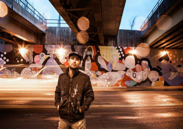
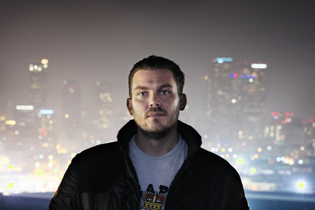
Tim Hans visited London recently, where he met up with seven artists for our continuing “Tim Hans shoots…” series, where Tim photographs some of the world’s most interesting street artists and graffiti writers. First up from Tim’s London trip is Ronzo, for which Laura Calle conducted this accompanying interview:
Laura Calle: Can you tell us a brief story of what inspired you to create materials for public urban spaces?
Ronzo: Sometimes you just get new ideas from walking through the streets and talking to people. Most inspiration comes through that and through other artists, what’s happening in world right now, music, film, popular culture and many other things. You see spots in the city and you see opportunities. You think: This would be a great spot to do something… It’s a great gift to have but also a bit of a curse. Ones you start – you can’t stop!
LC: What’s it like to set up a large scale sculpture in such a densely populated city like London?
Ronzo: It’s good fun. You need a truck with a big crane. Also pray that the roof doesn’t collapse and a massive monster crushes everyone walking by. But once it’s up, the sun rises and people on their way to work stop, thinking “WTF – Where did this come from?” It’s beautiful.
LC: What are the main differences you experience when making sculptures for the streets versus murals in public? Do you think the public interacts with those mediums differently? How so?
Ronzo: Sculptures are just a bit more of a niche. They take 1000 times more work to do. That’s why nobody does them I guess. But that’s great – It that makes them more special when you spot one. Also cool – You can walk around them. You can’t really do that with a painting. (But paintings are cool too)
LC: Does your audience influence your art or the approach you take to your pieces?
Ronzo: Tricky one. The feedback you get from an audience always filters back into new work of course. Although I want to do keep doing what I think is dope. And not the other way round. Of course your audience finds it interesting too in the end.
LC: What’s next for Ronzo?
Ronzo: Big tingz. New paintings, new sculptures, new installations. Details are classified top secret at the moment but will be revealed through the year. Please stay tuned…
Hense has been committed to growing as an artist for nearly two decades now. The Atlanta native sticks to his guns by constantly showing support and advocating for the art scene in Atlanta. He’s done murals for the Atlanta Contemporary Art Center, the Museum of Design Atlanta, and recently transformed a historic church in Washington DC into a colorful, multi-surfaced piece of public art. Hense has exhibited his work nationally and internationally in solo and group shows, and has a long list of public art projects, commissions and collections. His abstract paintings and murals can blend precise line work with bright colors, shapes, and gestures.
Nico Glaude: Let’s kick things off with the church you painted in Washington. First of all, congrats on the massive amounts of attention that the project got on blogs and art sites, well deserved. If you can just talk about how that project came to being and your overall experience painting such a historic piece of architecture?
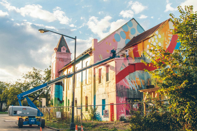
Hense: The project in Washington DC was probably the most interesting structure I’ve ever painted. I worked with a small crew to complete it. The project was a private commission which was located in SW Washington DC across the street from the Rubell’s proposed Contemporary Art Museum. The area in DC is a part of town that has huge potential to be the next art district and this project is the first step in bringing some life and color into the area. Taking an existing object like the church and painting the entire thing recontextualizes it and makes it a sculptural object. We really wanted to turn the church into a three-dimensional piece of artwork. With projects like this one, we really try to use the existing architecture as inspiration for the direction of the painting. I did several concept drawings for the church to present to the owner as rough ideas of aesthetic direction. I knew that visually, I wanted it to be drastically different from what it looked like before painting it. I also wanted to use very bright and bold colors to catch a viewers attention from far away. Most of my works are done in layers. The first step was to just get paint and color on every side and surface of the building. We then started developing large shapes and marks that would takes days to paint. The entire process took several weeks of layering and working. I’m very happy with the outcome of this project. I really enjoyed working on such interesting architecture. I also love working large and with multiple surface changes. When I’m working in my studio I usually am starting with a blank piece of paper, canvas or wood, and with projects like these I’m starting with an already beautiful piece of architecture to add color to.
Historic church in Washington DC
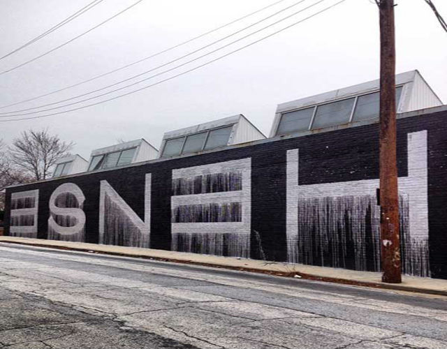
NG: Moving on to another mural you made for the Atlanta Contemporary Art Center. This mural is a complete departure from your most recent work; it’s a call back to letterform, minimalistic, comprised of only two colors and we get to see your name painted across a building. What was the inspiration behind the piece and why such a drastic change in style compared to previous murals?
Hense: I actually had another piece on the Center prior to this one and felt like it was time for an update. We were working on another exterior project right down the street for the Westside Cultural Arts Center which was very colourful and decided to do something totally opposite of that. I enjoyed taking it back to the pure essence of getting up. Silver and black, drippy block letters.
Atlanta Contemporary Arts Center
NG: Your murals always tend to be vast in terms of scale, and covered with a wide range of colors and shapes. What’s approach to doing a mural?
Hense: It really depends on the project. Right now I’m very influenced by interesting architecture. That could mean historic or contemporary. I enjoy working on flat surfaces of course, but a structure that has multiple planes and angles is much more dynamic visually before any paint is applied. It’s like having a blank canvas that is already layered and ready to go. Depending on the scale, I may have assistants work with me on projects.
Almost everything I work on is completely spontaneous and I rarely use a preconceived sketch or concept. I’ve been recently experimenting in treating my exterior works similarly to my paintings. Color is another important aspect of my work. I like to use bold, bright colors that make a statement and really pop.
The work is purely based on abstraction and the physical process of painting. I want to constantly push myself and the viewer as to what can be defined as a painting. I enjoy the experimental process of painting in my studio or outdoors and I never want to know ahead of time what the final outcome of the piece will be. For me, the exciting part of the creative process is the unknown and the experimenting that takes place to get from one stage to the other.
I worked large early on with my letter-based graffiti, so painting entire buildings was a natural progression. I used to write my name in big block letters 100 feet long and 50 feet high using silver and black oil-based paint. I think that has helped me understand how to execute large exterior works which can also have multiple surface changes. Working large for me is the best. As much as I enjoy painting in my studio, I can easily say that working on large exterior projects has been the most exciting. One of the major challenges of working on that scale is the material application to the surface. We need lots of tools and lots of paint. The marks and shapes need to be larger than most studio tools can make which means we have to invent new tools or methods for the particular project.
NG: The great debate of graffiti writers moving into gallery settings will always be contested, but it’s something that’s becoming the norm of late. How was your transition from the streets to the gallery and any advice for artists trying to make that same switch?
Hense: I would say to do what feels right, go your own route and be original.
NG: You’ve traveled a lot in the past because of your work. What is it that draws you to, and keeps you in Atlanta?
Hense: I enjoy Atlanta for many reasons. I think I’ve kept Atlanta as my home base because it allows me to grow as an artist and lets me hold down an affordable, nice studio.
I’m able to travel for projects whenever I need to and the City still has a great sense of originality and culture.
NG: So there’s the story of you getting booked bare foot while on the run from the cops, any other interesting stories that have happened to you whilst getting up?
Hense: That story your referring to is probably the most ridiculous of them. I’ve had my share of chases, bookings and incidents.
NG: What’s your favourite kind of spray paint to use?
Hense: I like them all.
NG: Do you have an all time favourite mural you’ve made?
Hense:
700 Delaware
2012
Washington DC
House paint and aerosol
NG: Toss up between a blank canvas and a blank wall, which would you pick?
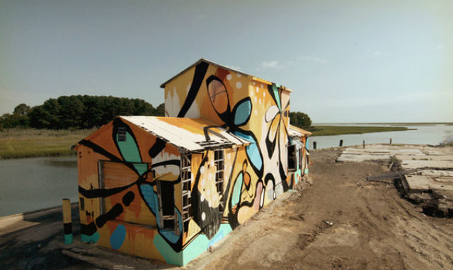
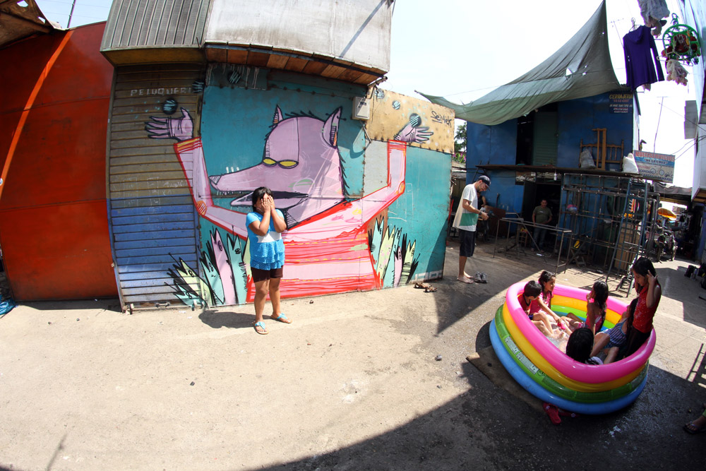
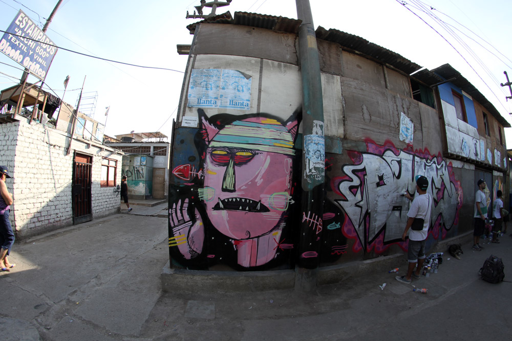
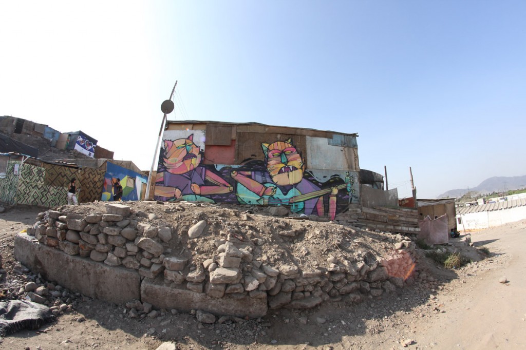
I spoke briefly with Peruvian artist Seimiek about a trend in street art I’ve seen a lot of in the past 2 years, one that that extends street art outside of the city and interacts with a new audience; perhaps forming new intent and meaning behind the works done by artists who’ve started to put colors in forgotten towns.
Siemiek in Canta Gallo, Peru
Laura Calle: I’ve noticed a lot of street artists have started to put up works outside the city, how do you think this changes the dynamics in your art?
Seimiek: I went outside of the city in search of new places to paint, in which case I did find new spots and the experience changed into something that gave me new ideas. New places, new ideas.
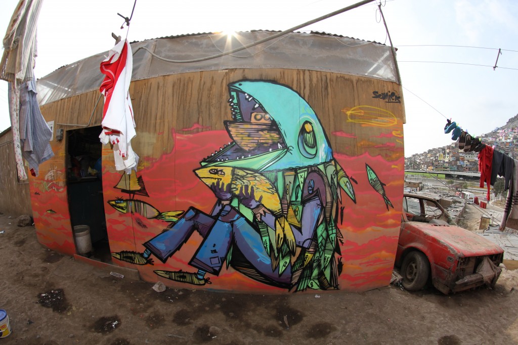
Siemiek in Canta Gallo, Peru
Laura Calle: What was your initial reason or purpose that has influenced you to paint in places like Canta Gallo?
Seimiek: I wanted to find new spots. When I went to Canta Gallo for the first time, there was a reaction by people that made me want to continue working there. I think, that that is what has made the whole experience so awesome. People will tell you, “come here, paint this spot, here here!” and then you go and finish painting that spot and they tell you how much they like it or how why they aren’t into it. That’s what made me come back. The difference in painting in the city is that you will finish something, sometimes you finish it only half way, and you leave the spot to sometimes find it gone in a few days.
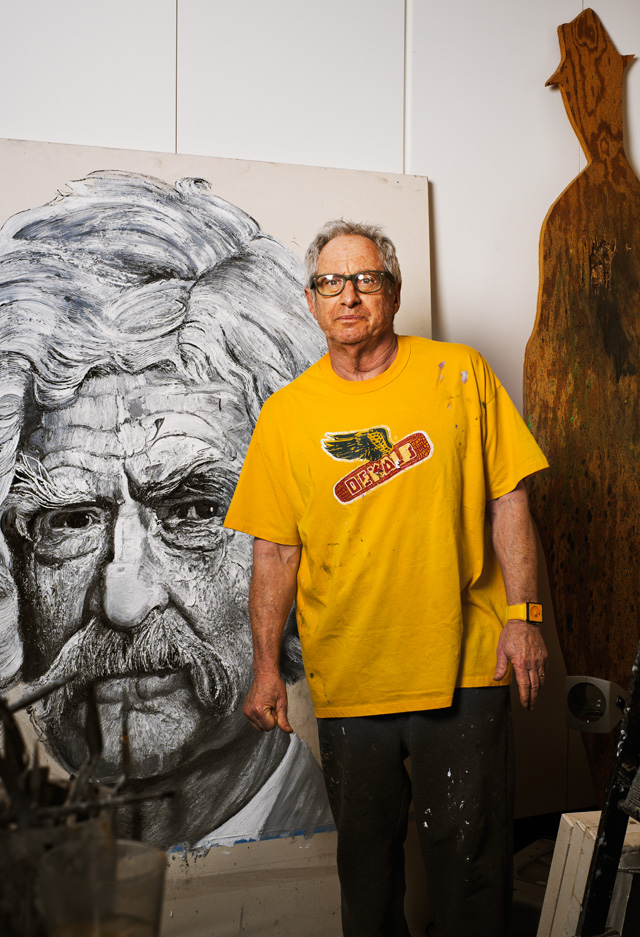
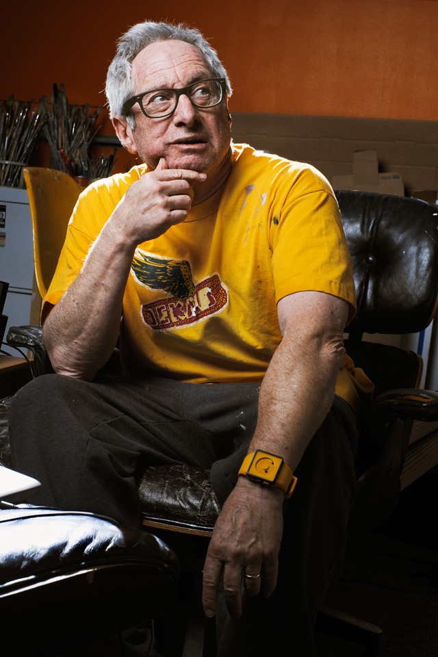
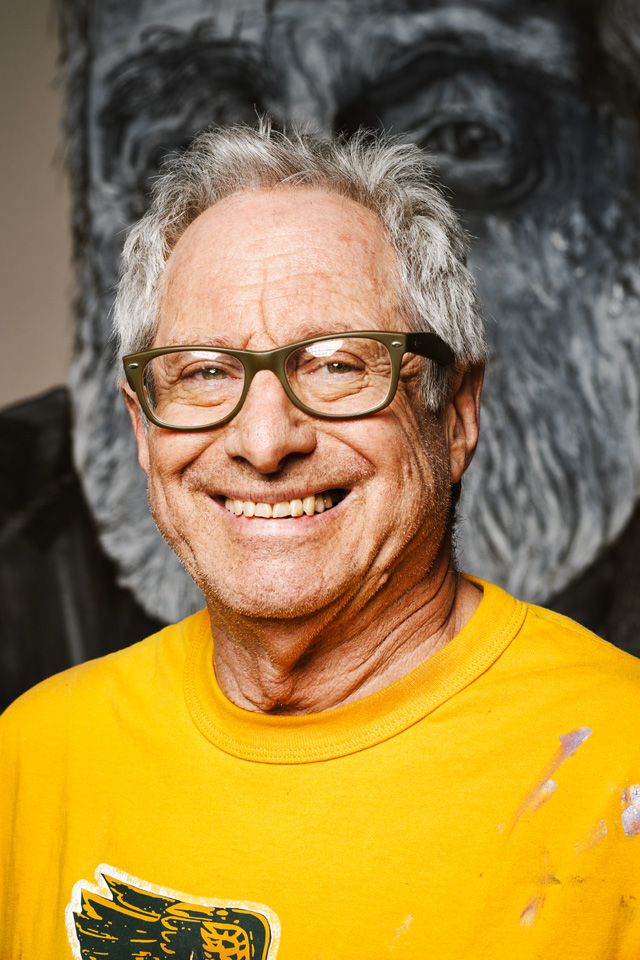
Robbie Conal is the latest artist in our Tim Hans shoots… series, where photographer Tim Hans takes photo-portraits of street artists and we pair Tim’s photos with an interview.
RJ Rushmore: What was it like to have your artwork, voice, and likeness featured on The Simpsons?
Robbie Conal: It was like being Knighted by the Queen of England. (In case you were wondering, that’s where Great Britain used to be.)
RJ: Most street artists put up the majority of their work themselves, some are even quite protective about not allowing others to put up their work, like stickers, for them. Why do you reach out to volunteers to put up your posters?
I’m always looking for a communal experience: the posters are my little way of participating in the public dialogue about issues that are important (not just to me). You know, like that rumor called, “democracy.”
Likewise, getting a bunch of like-minded loonies together at, say, Canter’s Deli, in LA in the middle of the night, talking the talk, walking the perp walk—getting up a smack of counterinfotainment on the streets together—is a bonding experience. Those are the only moments in my life when anarchy actually works and I don’t feel so alone (you know, just me and my weird beliefs and my little pieces of paper)—ha! And, of course, we get more up for more peeps to see a minor surprise on their way to work or (these days) looking for it, in the morning.
RJ: Have many of your volunteers gone from putting up work with you to doing postering campaigns of their own?
Conal: There have been a few—plus some great graff writers have joined us, rather gleefully, I might add. MEARONE, MAN1, VYAL. KOFIE, AXIS, and Shepard Fairey to name a few.
Actually, MEARONE, Shep, and I did a guerrilla street poster national tour together in 2004. It was Mear’s, Shep’s and Elizabeth Ai’s idea, not mine.
Shepard Fairey, Robbie Conal and MearOne
You might vaguely remember that George Bush’s mafia stole the 2000 Presidential election. That pissed Mear, Shep, and Elizabeth (and a shitload of other people) off! Kind of politicized them— in the sense that it made them pay attention to “party politics.”
They decided that they’d each do an anti-Bush, anti-Iraq War street poster —in their own styles—and take’em on tour around the U.S. before the 2004 election. Then one fine day they came and got me, as in, “Hey, kids! Let’s go get the old guy out of his rest home on the west side and make it a triptych!” And I’m very grateful they did. Called the tour, “Be The Revolution.”
We had a tour launch party at the Avalon in Hollywood, 1,200 peeps showed up, Ozomatli, Culture Clash, the great slam poet Jerry Quickley all performed. My offset-litho printer, Typecraft, Inc. in Pasadena printed up @ 15,000 full color street posters, 5,000 of each of ours—pro bono. We rocked around the country as best we could. It was verrrry interesting.
RJ: What do you think about the street art movement’s popularity over the last few years?
Conal: To be honest, I always thought it was inevitable. My idea of genuine indigenous American art forms is based on a “bubble up” theory of cultural creativity. The “American Dream,” of single family home ownership, keeping your kids “safe,” you know, away from the mean streets of, say, any “inner city” neighborhoods in any big city, pushes families into places like Pacoima, Simi Valley, Orange County, for Chrissakes! There’s nothing for young teens to do out there. “Safe”? A 14 year old red blooded American kid taken out to nowhere with nothing to do? Give me a break!
However well meaning, that’s some idiot’s idea of safe. But give a kid access to some markers and a U.S. Post Office with free mailing address label stickers and all that nowhere time . . . SHAZAM! You’ve got a budding graff/street artist! Likewise: Give a kid a skateboard (and nothing else)—what were they back in the day: a slab of wood and 4 fucked up, salvaged old clip-on roller skate wheels, right?—the kid will live on it 12 hours/day/7 days/week and be able to skate air on that thing. Stacy Peralta makes Tony Alva makes Shawn White makes that kid in Pacoima (or frickin Frozen Tundra, New Jersey, for that matter!) into a world-class creative athlete. Same goes for a kid and a bike—Simi Valley suddenly ain’t so bad. Cause there’s plenty of room for you get on your pony and work out new tricks—the contemporary equivalent of a cowboy/girl and his/her pony out on the range. Instead of becoming a rodeo champion, the kid invents The X Games!
Then there’s the fashion industry: how do you monetize a great graff piecer’s work? Put it on something a fan can walk away with. Like a T-shirt. Make bank at the same time you’re making the fine art world think it’s missing something, and you’re in it. Fine with me, pal.
RJ: The way you start with oil paintings and then turn those into poster is pretty atypical. It seems like the more typical process for activist street art would be to make something in a format that is quick to develop and quick to print (like Shepard Fairey or Emory Douglas). How did you develop your method of starting with oil paintings and turning those into posters?
Conal: I’m a painter. I went to art school all my life. When I was 8 years old—in NYC—my parents sent me to The Art Students’ League to (on 57th Street) by myself—to draw dead flowers and, you know, plants and vegetables. Some fruit—an apple, an orange—what they called “still life.” I wanted to draw naked ladies, but the administrators there told my parents I was too young. Theodoros Stamos, an excellent abstract expressionist painter who was teaching there at the time, would sneak me into the “life drawing” classes. He’d say, “OK kid, there’s your naked lady—just sit down, shut up, and draw.”
Actually, that was probably the only thing that could get me to shut up. Then and now.
When I was 13, I went to the High School of Music & Art—a public “specialty” school—pretty much just like LA High School for the Arts is now. They smell exactly the same.
From ’63-’69, I majored in art and psychedelic drugs at San Francisco State. I was an O.H., an “Original Hippie.”
M.F.A. at Stanford (’78) and blah-blah-blah…you get the idea.
So street art, postering, came after all that. But painting is still how I get my torque on the subjects I address. Like Lucien Freud said, for me, “paint is flesh.”
RJ: Although you’re an important figure in the street art movement, you don’t seem to be so pigeonholed as solely or mostly a street artist, unlike many of your contemporaries. Do you think that being an oil painter has helped you to avoid being pigeonholed in that way, or is it something else?
Conal: I’m not sure about that—it might have a little to do with it. Mainly because one of the many, many artificial hierarchical rankings in the history of the Western Art aesthetic is that oil painting is the highest form of art making. Ha! (And I start with paint, so I don’t have to prove to the art world that my choice of medium is “worthy.”)
But, to be honest, I think it’s my perspective on the world—outside of whatever specific venue my art might be inhabiting at any particular moment—street, art gallery, museum, private home, man cave, dungeon. My thought process is always political—and I’ve had both an academic and a full-on mean streets education.
Also, my parents were union organizers in NYC in the 1930’s and 40’s. My Dad was “blacklisted,” by the House Un-American Activities Committee in the 1950’s. That was basically for having different ideas from its august members about systemic political and economic issues, like what government’s job is; what system of government and what economic system could best (and how much it should) provide for the health, education and welfare of its citizenry.
ART has always been my most receivable way of expressing myself about issues I care about. (Meaning, you really don’t want to hear me whining about what I think is wrong with the world, now do you? You’re way better off, if you just look at the nasty portrait of the ugly old white man in a suit and tie. Read the 2 or 3 punny words. Work it out for yourself.) Democracy, with a small “d” being my pet peeve. In the sense that I miss it, want it back (the small amount of it we ever had). I sincerely think the world desperately needs it for us to survive. And I’m a wise guy. So, as for ordnance—the instruments of mass destruction at my disposal—all I got is wise ass humor, sweat equity, and an evil eye.
Photos by Tim Hans; Shepard Fairey, Robbie Conal and MearOne posters courtesy of Robbie Conal
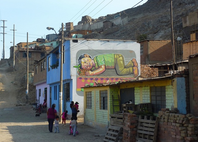
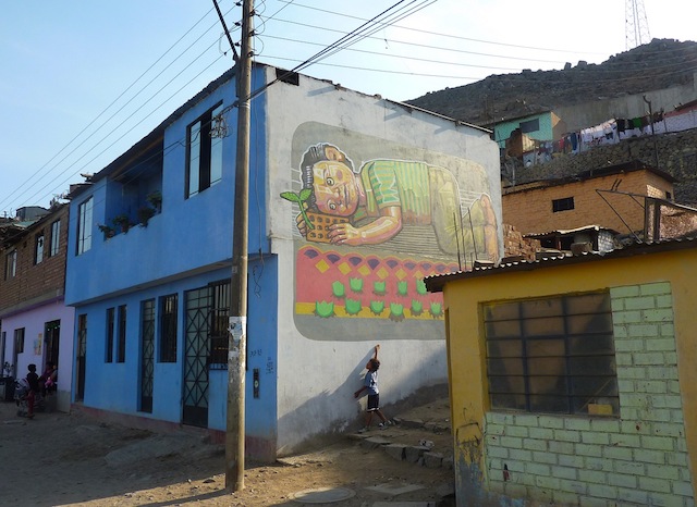
Last week, el Decertor began working on a small township called Huachipa near Lima, Peru. I spoke to him about the context of his pieces and asked for a bit of background about the environment he works in.
decertor:
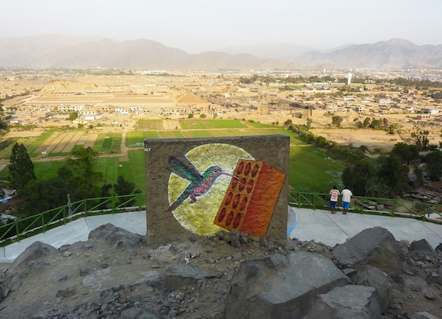
I chose this mural because it has a direct view from the hills, it is titled “Porvenir” (“To Come”) because of the elements I used: the brick symbolizes the future of a town that is emergent, the boy is the heir to this dream and apparent progress. There is also a plant growing from the brick, which is a repetitive element in my work that I generally associate with resistance, strength, and faith.
decertor:
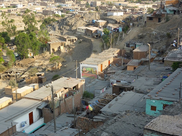
This area is home to some brick enterprises and factories, the land has a clay-like texture, which is the key material for the manufacturing of bricks. It is a very positive activity for the families in the areas, whom mostly make a living from that industry. This area is rapidly growing in its population, therefore families living there have to organize and mobilize their rights effectively, so that they have property over their homes. Frequently, they are kicked out by “land owners” or “companies” who don’t care about the community that is being built, nor the amount of time and effort families dedicate to this area.
decertor:
In addition to the brick companies, there’s also a large area where grass is grown to sell for profit by square meters. I did this intervention at a high point in a hill where you can see in the landscape the brick and grass companies. In the Andean world, hummingbirds are a good luck charm and if a person runs into one it signifies something good is to come.
Zio Ziegler is one of those artists who I’ve admired for a while, but not given nearly enough attention to on Vandalog. Actually, I’ve hardly mentioned him at all. And maybe it’s good that I didn’t because even though he’s based in SF, I thought he was based in LA. So, to make up for all that, I thought I’d do a quick interview with him to try to get the facts straight. So here’s Zio…
RJ: How did you get into painting murals?
Zio: I grew up fascinated by graffiti, wild style stuff especially, down to looking at the color layering and the black books and hand styles- and I began to think about art as a distinct intuitive mark rather than a representational struggle. A mark that searched for individualism and aimed to keep the viewer’s eyes plastered to it, that reflected the surrounding culture through osmosis, rather than photo realism. Work that had vast scale but also audacity, pieces on bridges and billboards, and with this as my fascination I began translating my drawings from the page on to on hats, shoes and shirts- with paint pens and sharpies- for me the billboard and the accessibility found its form in clothing. Then I began to paint canvas and on wood, and mixing up the gallery formula by sometimes leaving these pieces in public areas so they could find a home. At this point, I was really searching for the same things in my own work that had initially inspired my making. I was a Junior in college and I was frequenting the same popular breakfast place in Providence RI multiple days a week, The Brickway Cafe. It had what looked like giant primary color sponge paintings all over the walls. So I figured why not ask if I could paint them? My canvases where getting larger and larger, so I figured a trade for free pancakes couldn’t hurt. It took about a month, working from after my classes ended in the evening until way into the morning. The mistake I made was to use my small brushes and thinking of the wall the same way I thought of a canvas. But it was an awesome experience, and I’ll be forever grateful for the free pancakes and wall space. After that, I was addicted to gigantism. The next mural I started, was 20′ by 8′ and it was incredibly intricate as well. About three weeks into painting this, day in and day out- I grabbed a can of spray paint out of frustration, and decided to paint in an illustrative black and white style on the opposing wall. The style was more akin to what I had been doing in small drawings, in the margins of my notes, but somehow it came out as the missing link in what I had been searching for in murals. They where the same lines that had initially found their ways onto clothing, and into my black books, but it took the process of re-learning that it was the intuitive that is beautiful. It was fluid and fast- allowed me to make “mistakes” that I had to quickly adapt and learn from, errors that rather than having to start over, showed me a new way of viewing the form. And since then, I’ve been making these intuitive mistakes on a larger and larger scale.
RJ: Many young artists who do street art or even just legal murals use pseudonyms, but you’ve always gone by your full name. Why?
Zio: Because I do not view painting, as long as it’s respectful, as illegal. Without art an urban atmosphere looses it’s soul, so I might as well stand behind my pieces with my identity.
Many of the walls I paint are legal, and I’ve found that if you just ask if you can paint many people say yes. So while I was out there in the middle of the day painting legals, I began to study the public’s reaction. With the movement graffiti and street art becoming somewhat mainstream and accepted by the fine art world, no one quite knows what is legal or illegal anymore within reason. You could hypothetically paint a wall directly across from the police station in the Mission in SF, in broad daylight and people would come pat you on the back as long as you looked like you where supposed to be there. It’s the veneer of legality that matters, It’s being respectful, painting on temporary walls or ones marred by careless tags or buff paint, and looking like it’s a commission. The public views it as a legal mural because its figurative rather than letter oriented, and legal because its often 10am on a Sunday. I tend to keep these kind of murals to temporary wooden walls, and just paint directly over the posters and advertisements that previously covered it- and in this way the piece itself is ephemeral and doesn’t “damage” anything should the owner of the property not like it. But I think in many ways it is a public service, people see that you love your surroundings and inspire them to do the same. It’s a rest from the bombarding of ads, and provides something that is thought provoking for the passer by. I actually received a gracious thank you tweet for one of these murals, which was as much of a surprise to me, as my mural must have been to them.
RJ: Does your work generally tell a story or have some sort of hidden meaning, or is it more about getting out random images that are in your head?
Zio: Yes, my work is allegorical. However it’s an allegory that makes more and more sense as the piece finds it’s form. It’s not preconceived- in many ways it’s entirely subconscious. I tend to use the same symbolism time and time again, but by changing the context and scale it assumes a different meaning. The titles often hint at the story behind the piece, or as a thread that the viewer can unwind until the metaphor is clear. I’m fascinated by primitive painting and sculpture- work that simplifies the human condition into narrative on a wall, and so I think in many ways I try to do the same thing. The figures first and foremost react to the size of the wall, the neighborhood that It’s in, and then as the scene begins to build, I sometimes will step back and understand what I’ve made. I try to take my mind out of the painting as much as possible by making it fast and gestural. To this point I’ve always finished murals in one sitting, that way for me they preserve the honesty of expression that tells a clear story.
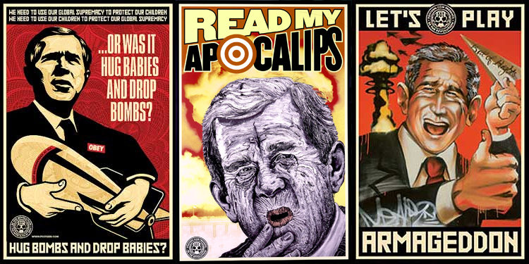
Shepard Fairey released some prints using diamond dust, which is quite interesting. As the press release says, “Perhaps most famously used by Andy Warhol, who understood perfectly how to convey a message, Diamond Dust was used to add glamour, transforming ordinary images into coveted objects. The material aligns with Shepard’s work and interest in the seduction of advertising and consumerism. Diamond Dust, literally and metaphorically is superficial, applied to the surface of the print, the luminous effect is both beautiful and alluring.” But it’s one of those things that just gets me thinking about how the art world, much like capitalism, seems so good at absorbing critique and spitting at back out as product. People love the meaningless OBEY icon, so Shepard sells it. Shepard needs to make more product to continue selling to this market he has created, so he takes an old design (or a slight variant, I’m not positive), and adds meaningless diamond dust to it and sells it as something new. The best critiques participate in the system which they critique, but that’s a risky game to play. Of course, I say all this with a print by Shepard hanging on my wall.
OldWalls is a project where the photographer took photos of graffiti in the early 1990’s and recently returned to those spots to take the exact same shots, and then each matching photo is displayed next to its counterpart.
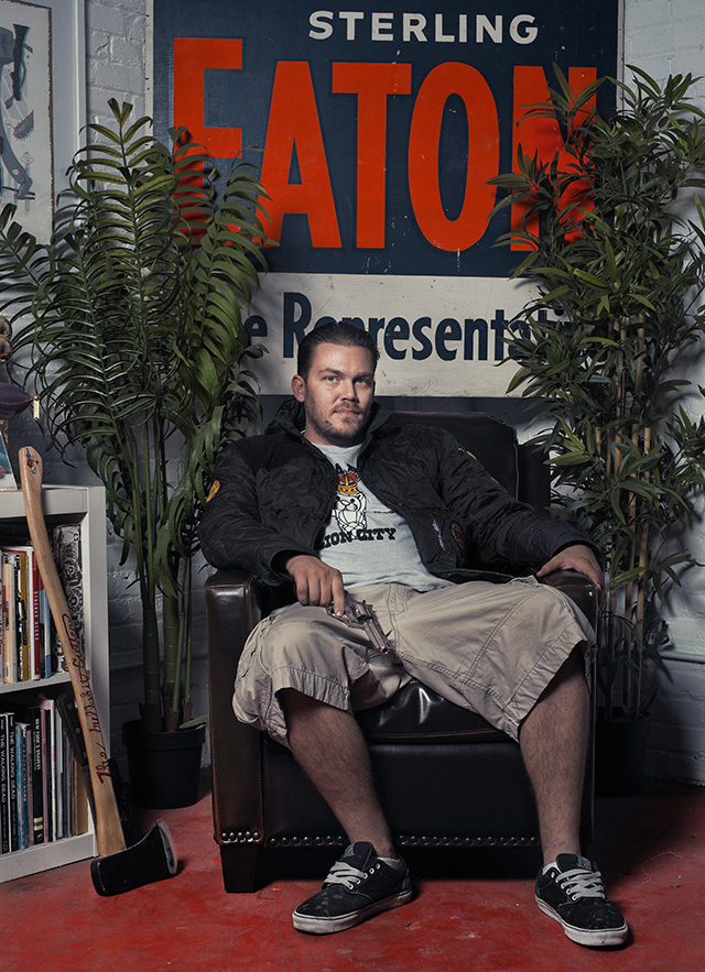
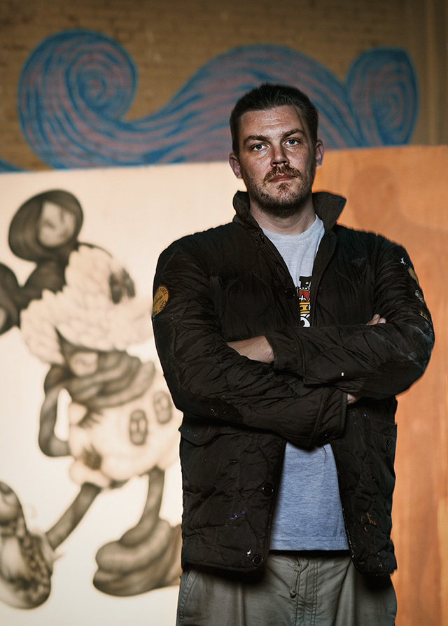
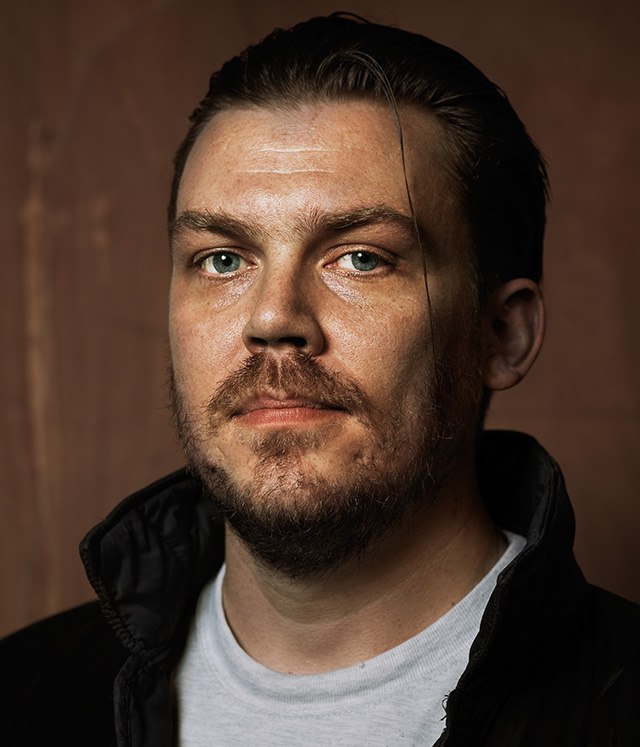
For the second artist in our Tim Hans shoots… series, where photographer Tim Hans takes photo-portraits of street artists and we pair them with interviews with those artists, Tim met up with artist and designer Tristan Eaton.
Caroline: At what point were you like ‘screw art school’?
Tristan: I dropped out of SVA after my Junior year because I couldn’t afford to enroll again. At that point I had no choice but to say fuck you, I’m gonna do it on my own. I started doing illustration work and showing in galleries when I was 17, before I started college anyway, so I had an inflated sense of confidence. The next 4 years of broke life humbled me, but I never stopped learning and making art no matter how poor I was.
C: When you told relatives or family friends that you were a “toy designer” how did you explain what that meant?
T: That never happened. I never set out to do toy design, nor have I ever fully identified as one. By freak chance, I designed some toys for Fisher Price when i was 18, then later helped start Kidrobot and designed a lot of toys. But it was never my profession or my main focus. Any commercial work, toy design work etc., I’ve ever done has been a distraction or separate from my work as an artist. I’m an artist first, everything else is second.
C: There are some incredible painted/modified Dunny’s and Munny’s out there, but I’m curious if you’ve ever seen ones that were so bizarre or bad that you were like “don’t put my name with that”.
T: Of course! But that doesn’t matter. The fact that we’ve given people inspiration to be creative is the whole point. I’ve met accountants, mail men and even cops who paint Dunnies and Munnies. All of them didn’t see themselves as artists until they started customizing toys. That’s amazing to me. On the collector side, a lot of toy collectors graduate into collecting prints and paintings by many of the Dunny / Munny artists. It’s become an amazing platform for discovering artists and even launching careers in some cases.
C: If you were stranded on a deserted island and you could only have one of the following things, which would you choose between a sketchbook with a marker, 3 buckets of house paint, or a large amount of play-dough?
T: Sketchbook & marker!
C: How was it celebrating KidRobot’s 10th anniversary?
T: Awesome. My time at Kidrobot feels like a lifetime ago, but it’s amazing to see how far it’s come. I’m very proud of it’s legacy.
C: What are you working on now?
T: Right now I’m just working on paintings and mural work. I do a few commercial projects here and there to pay bills, but I’m really trying to get better as a painter! It’s hard, but it’s the most rewarding thing in my life.