Brian Adam Douglas aka Elbowtoe is one of New York’s best-loved street artists, but he also has also developed a healthy and equally well-regarded studio practice. This week, Douglas’ largest and most significant solo show yet opens at Andrew Edlin Gallery in New York City. “How to Disappear Completely” will feature drawings as well as Douglas’ famous cut paper paintings/collages. I’ve been eagerly awaiting this show for at least a year, and now it’s almost upon us. The show opens on Thursday evening (6-8pm) and runs through October 26th.
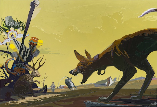
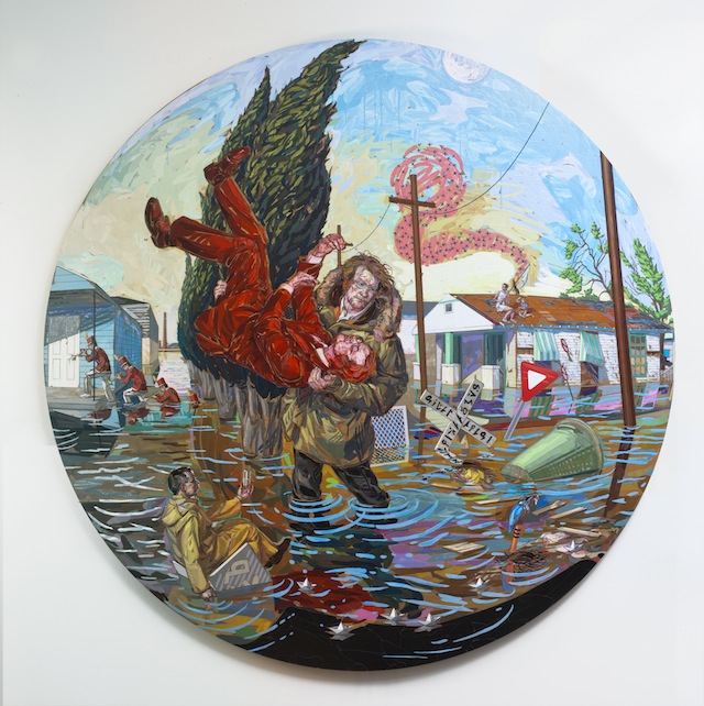
“The Last Jackalope And Other Fables Of The Reconstruction” by Brian Adam Douglas. Photo courtesy of Brian Adam Douglas.
RJ: What can you tell us about your upcoming solo show?
Douglas: This show, at least for me, has been grappling with the end of things.
My close circle of family has been through quite a series of challenges over the past 2 1/2 years, and these struggles have had a profound effect on my psyche. My show is a series of events of great calamity, more often than not after the fact. The protagonist most often rises to the occasion and grapples with the changed environment, though there are occasions that they stand in awe of the devastation before them. The images are on first glance an illustration of destruction, but in actuality are metaphors of redemption.
Though the initial seeds for the images came quite quickly, I have been working out the compositions slowly over time, letting elements slide in and out of focus.
A majority of the work is made of paper, though there is a series of drawings that compliment the cut paper works. I took it as a challenge to make drawings that in their starkness could hold their own against the complexity of the cut paper.
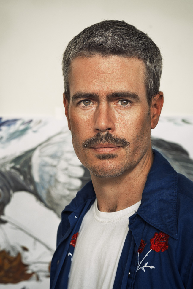
Photo by Tim Hans
RJ: What goes into making one of your paper paintings? Can you go through the process from beginning to end? How long did the pieces in this show take you to make?
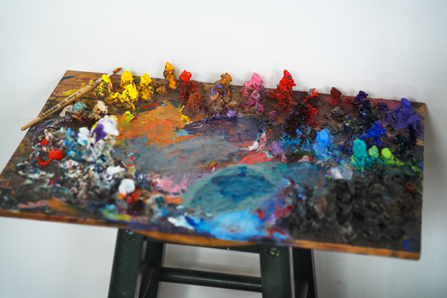
Douglas: For most of the works in my current show, I developed the ideas while taking long walks. My goal is to be a vessel for my imagination, so I am very open to whatever my mind throws at me. Once I get a set of ideas, I begin to research what the significance of the signs, gestures and relationships might offer. This often leads to troves of new information that in turn yields more imagery. My goal when coming up with the images, is to step as far back from the process as I can and literally take notes at what my imagination throws at me. When I have the inklings of an image, I run through a number of studies, and once I find the composition that works best for the image, I get to work on the final drawing.
These drawings can take days, and sometimes weeks to execute depending on the level of complexity. Many of the structures I have in the show are built using old fashioned perspective techniques. The more complex the structures, the longer the study takes. I have one piece with several shipwrecked frigates that I built each with their own vanishing points. They become like scale models. After the drawing is complete, I make a very detailed color study, to establish the proper relationships in terms of light effects and atmospheric effects as well as color and value.
A huge influence on my process is an unfinished painting by Dürer at the Met. In it one is able to really see him working things out. I took his process of the very detailed under drawing from that work in progress. Once I transfer my drawing onto the panel, I comb through my vast collection of paper in search of paper that will build off the color study and other reference that I have gathered. If there are colors that I am unable to find I will make the colors. This is particularly the case in areas of large solid color.
I then attack the image like I would a painting. There is not a set method to the application of the paper. It is a very organic response to the studies as well as all the reference I have gathered. I will say that my “brush marks” are as closely aligned with drawing as they are with paint. I think that the two are inseparable.
When I varnish the pieces, I tend to rub the varnish in, like I am polishing a table. I find this part of the process to be the most stressful. I use a rag to apply the varnish, and I build it up in several thin layers. The difficulty arises from the texture of the built up paper. The surface creates ledges and crevices that the varnish can build up on/in.
The smaller pieces in the show take somewhere in the ballpark of 2 months to execute. The largest pieces took almost half a year in execution, but almost a year for all the elements to accumulate and ferment into the appropriate image.
“The Center Cannot Hold” by Brian Adam Douglas. Photo courtesy of Brian Adam Douglas.
RJ: You seem like you are always one of the busiest people I know and you spend a lot of time in your studio. What drives you to work so hard?
Douglas: There was a period of time in my life that art was the only stable place I could be. During that time I forged a deep love of the solace of the studio. Since then I have never really been able to shake it. My wife has always been very driven by her arts as well. I think her passion encourages me to work even harder myself. But probably the greatest driving force of my time in studio is that I am always trying to raise the bar on myself with everything I take on, and that just means more work.
RJ: How do you see street art fitting into your practice these days?
Douglas: Sadly I don’t have much wiggle room for street art these days. It has certainly not been for a lack of desire. I have a stack of prints in my studio that we printed this summer, that I have just been waiting to get out. Honestly with any spare time I have I want to spend as much as I can with my twin boys.
RJ: Has having kids changed your art?
Douglas: I don’t know if it has, at least in terms of subject matter. I know it has meant less time in the studio than I used to take. I used them in a street piece. And I made the decision that any time I do any work with them I will make it as off-kilter as possible, find the troubling or unsettled moments. I hate sentimental art, and any time one uses children in art, the artist runs the risk of sentimentality. Having children has certainly made me take a hard look at my practice. I don’t want to waste any time making art that is not worthy of the time I take away from spending with them.
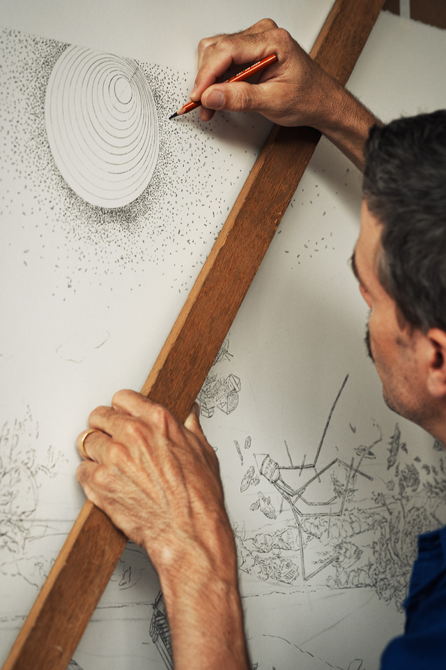
Photo by Tim Hans
Photos courtesy of Brian Adam Douglas and by Tim Hans
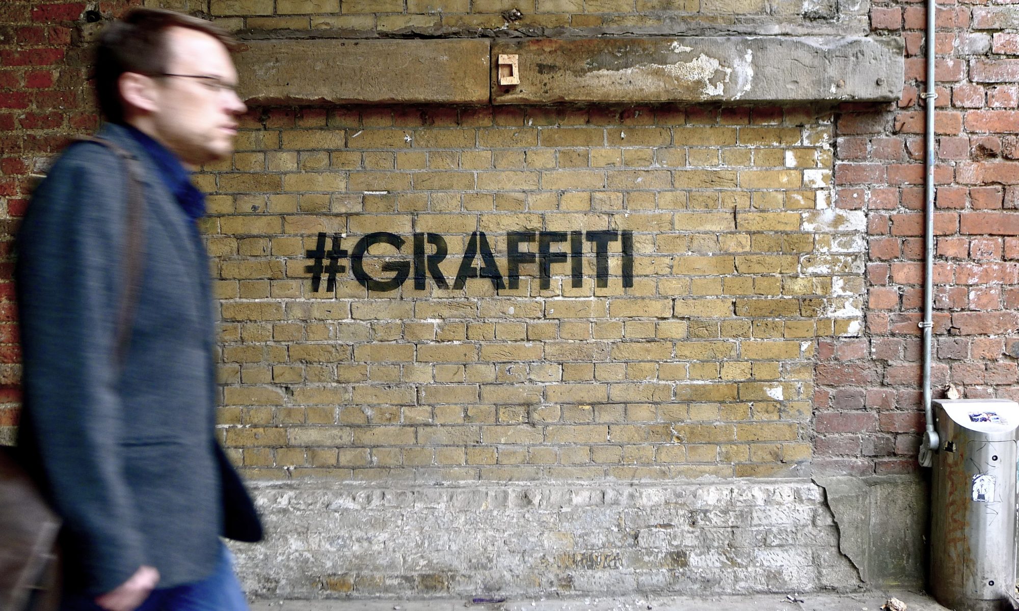
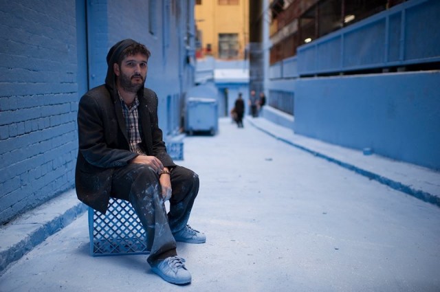
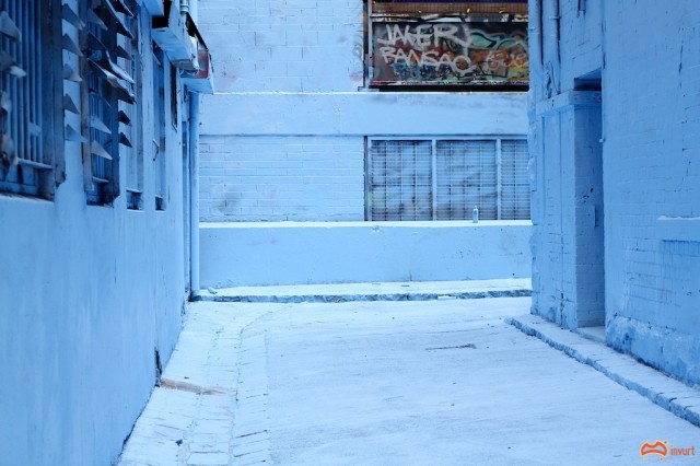
Adrian Doyle in the new Blue Rutledge Lane. Photo by Adrian Lagniton.
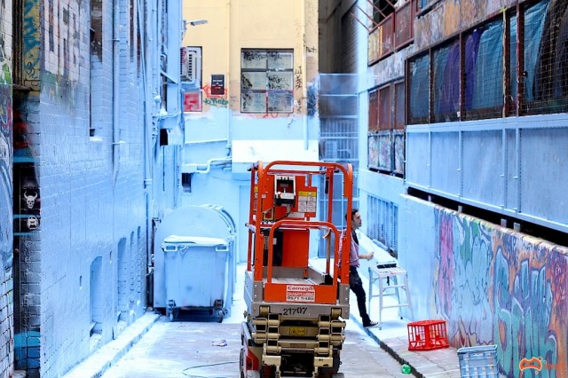
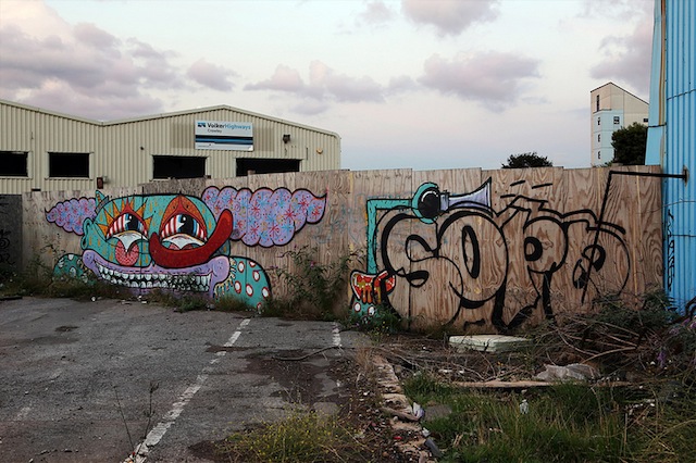
A couple of weekends ago on Sunday the 25th of August, I started walking down Hosier Lane, which I do at least 5 times a week, but this time I noticed something very strange. Rutledge Lane (located parallel to Hosier Lane – one of Melbourne’s most well known street art and graffiti locations) was completely fenced off and there were trucks and equipment. When I made it down to the other end, an even more surprising site met me.
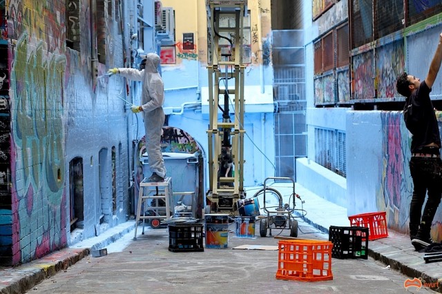
It was Adrian Doyle (who I’ll tell you a bit more about later) in a full white body suit, spray gun in hand, starting to paint Rutledge Lane completely BLUE. An eery light blue glow came all the way to the edge of the lane with a distinct sharp blue line all the way to the edge of Hosier. What followed has been the talk of the Melbourne street art and graffiti community, and whilst it has calmed down now, or has even been forgotten, it definitely created quite a stir.
The ‘installation/artwork/buff?’ was not only the talk of the local street art and graffiti community, it also attracted much media attention on radio, TV and in newspapers due to the infamous nature of the lane way.
The Lane being painted. Photo by David Russell.The Lane being painted. Photo by David Russell.
Adrian continued down the entire laneway and proceeded to buff everything in sight, and I mean everything, every bin, every spec of rubbish laying around, everything. Top to bottom, even the road. Scissor lifts and spray guns were his tools of choice to get as much paint up as high as he could.
Rutledge Lane. GIF by Khoon Sorasiri.
Later that day Invurt posted an article on the project, which contained Doyle’s explanation behind the project, taken from his Facebook page:
Today piece was not a buff….. it was a burner.. Hell yeaH…
Houses are a major influence on my aesthetics and imagery. Most of the important events in my early life were focused around our quarter acre block in the heart of suburbia. We had an outback toilet, complete with its own dunny man that came every week to change the bucket. We went through numerous above ground pools and sadly, many pets. My house was not really different than any other suburban house. Yet it was my world for many years, a curated world, in which I learnt social skills and perceived normality from my parents.
I watched from a very young age as my parents struggled with house payments and debt collectors. They worked so hard to pay the bills and bring up 5 kids. They worked in jobs they hated with little respect from their bosses. They married in their teens, and did all the expected norms and learnt behaviour passed down from their parents. The house was a symbol of their hard work.
This experience made me reflect on my childhood home, and the hold it had over me, my family and my art. When my parents eventually lost the house to the bank, my parents moved four hours away to a small cottage in East Gippsland. But the grief and pain followed them. I began to play with the idea of creating a colour that represents my childhood and my suburban experiences. Was it possible to create a colour that could capture that kind of experience?
So I decided to come up with my own colour. I named it: Empty-Nursery Blue
The way I decided to create Empty-Nursery Blue was by sitting in the studio and creating hundreds of different blues until I found the one that expressed my experiences the most. It was a baby blue that had hints of mauve in it. It’s a beautiful colour, a bright pastel. This colour expresses the feeling that something has been disturbed. All is not quite right. I took my disturbing yet beautiful colour to a paint lab and worked out its recipe.
But what good was Empty-Nursery Blue, if it was without a context. I needed to find something to paint to physicalise the concept of the colour.
As mentioned above, after losing their house, my parents moved to an island in the Gippsland Lakes. It’s a significant removal from the realities of suburban Frankston. Their house is alone in the landscape, only bushes and trees to keep it company. Not even a bridge links the island to the nearest shop. This physical removal from the past does not automatically come with emotional removal.
This is why I decided to paint my parents’ new house Empty-Nursery Blue.
Empty-Nursery Blue once placed in context became a symbol of a collective past. Surrounding the new house with the memory and emotions of an experience that ruptured my family’s suburban dream.
In recent years I have spent much of my time lost deep in the Melbourne Street Art world. Street art has become a major part of my life and the lane-ways have become my world. I have lived and breathed art all my life. My art, however, is conceived of and formed from my past experiences. I cannot exist today without recognizing my roots in the past.
Thus, I would like to incorporate my past and my present in a Street Art piece using the colour Empty-Nursery Blue, and only this colour. By using Empty-Nursery Blue to cover Hosier Lane, I am symbolically ‘coating’ my present with my past, it is reminder to me and anyone who is living, that you are a product of your former experiences, and you should be reminded of them as you work your way through your present and into your future. By doing this, I am claiming that a colour in its pure form can be street art or graffiti. This is a great conceptual link from fine art to street art, a link that is often lacking in the Melbourne Street Art scene. By bridging this gap, I hope to expose more people not only to Street Art, but also to the importance of art in general.
Doyle explains that his piece reflects the experiences of his childhood and his relationship with the suburban house, in particular the negative impact of his parents losing the house to the bank when he was young. “We’re all victims of suburbia” he said on a radio interview on 774. This all inspired him to create the “Empty Nursery Blue” colour.
Doyle claims the piece wasn’t a buff, but by nature it can’t really be called anything else. That doesn’t mean it wasn’t an interesting piece of art, although some argue it is not art, at all.
Doyle is no stranger to street art in Melbourne. He runs Blender Studios; Open since the birth of the circa 2000 street art explosion in Melbourne and home to so many of Melbourne’s best past and present street, contemporary and fine artists. Doyle also helps run the Signal Arts mentoring program which provides young kids paint and the opportunity to learn from some of Melbourne’s best street art and graffiti artists. He is a well known character in the closely connected Melbourne scene.
Does his intimate relationship with street art give him the right to paint an entire lane way blue though?
The Lane just before it was painted. Photo by David Russell.
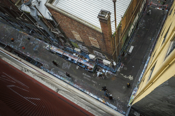
For readers not familiar with them, let me tell you a little about Hosier and Rutledge Lanes. Hosier Lane is Melbourne’s most renowned street art location by far – I say renowned, not best; because there are MUCH better places for street art and graffiti in Melbourne. Just open any Lonely Planet or travel book about Melbourne and you’ll see that it is considered as a must see tourist attraction. On any given day of the week, hundreds and hundreds of people (from all walks of life, ages and parts of the world) visit Hosier and Rutledge Lanes to see what amazing artwork has been left for them to admire. The lanes are also one of the most popular places in the city for wedding photographs, which I personally think is extremely tacky, each to their own through.
Rutledge Lane before the Doyle’s project. Photo by Dean Sunshine.
Hosier and Rutledge Lanes are close to the middle of Melbourne (off to the side a little) and are apparently a legal painting precinct, which means anyone can paint there, any time.
For many years the laneways were cared for and curated by a guy called Andy Mac, who used to run Until Never Gallery on the corner of Hosier and Rutledge Lanes. This kept the level of quality artwork fresh and relevant and to some extent meant that the lanes had a caretaker of sorts.
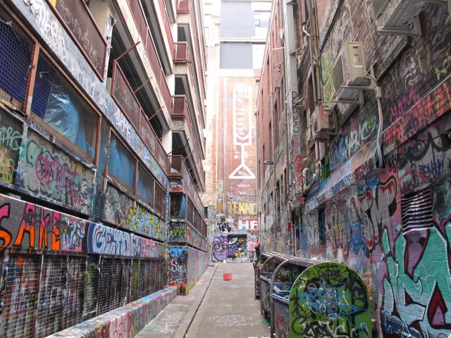
Since Andy left, Rutledge Lane in particular has gone downhill in terms of quality and in terms of respect shown to the work, unlike most other places people paint in Melbourne. I mentioned my disappointment in my July article at a piece by German artist MSYK getting capped almost immediately after being painted (at the time it was by far the best piece in the lane). This is what Rutledge Lane is like now.
More recently in particular Rutledge Lane has gained a reputation as a “practice spot”. This reputation definitely doesn’t do any favours for the longevity of pieces painted there or to encourage respect, an unspoken rule in most other places you find graffiti and to some extent street art. “Don’t cap what you can’t burn” is not a saying that generally holds true in Rutledge Lane.
All of that said, while the lane was a little out of control, the layer upon layer of paint and tags and sculptures, was a spectacle in itself. There really wasn’t many (so publicly accessible) places quite like it in Melbourne. It even caught the eye of Futura when he was last in Melbourne. From my interview with him: “Well that’s the fucking craziest street in the world, I mean, that one back alley, it’s like DONE. Jesus it’s impressive. Fuck, I mean, you gotta see it to believe it. I don’t care where you go, you know, Germany, Italy, France no no no, it doesn’t exist. Plus your architecture.. the lanes, just the set up.” Not everyone will agree with this opinion, but it was a pretty special place in hindsight.
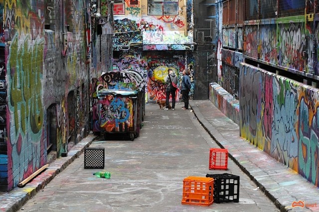
Walking through the lane after Doyle had finished, was a pretty surreal experience, love or hate the project. The fact that every single surface was well and truly covered in bright blue buff and it was quite unique. The lane stayed fenced off for 45 minutes before it was opened back up to the public, and once the fences removed it didn’t’ take long for the cans to come out and some awesomeburners to grace the new blue walls. (“Thanks for the Blue” – someone wrote). Sadly these pieces were capped with shit soon after. (Check out #RutledgeLane on Instagram or Flickr to see lots more shots, it changes daily).
What was I expecting though? One criticism of the project relating to this point, would be the lack of community consultation and engagement. Could this have had a different outcome if let’s say all the artists and writers were a) across the project, b) endorsed it, and c) aware of it happening? What if it had been discussed and debated? What if the majority of artists did support it, and organised to meet in the lane once it had been reopened, and repainted the new blank canvas? Would that have changed things? Could it have been one almighty refresh of Rutledge Lane?
Watching the event in time lapse is also fascinating. Personally I would still be filming the experiment, to see how long it takes for all the blue to disappear. I think this was also a bit of a missed opportunity; how fascinating would it be to watch it over 6 months or a year?
Rutledge Lane. Photo by David Russell.
Another disappointment from my perspective was the lack of intelligent discussion this project generated. Not because it didn’t have potential to do so, but because most people are idiots. I found the reactions to this fascinating.
The majority of the reactions on Facebook and Blogs was just mindless insults and abuse. Some interesting (and ill informed) rumours too: “It’s for a new commercial,” “It’s the cops, they’ve baited the lane and they’re filming to catch people,” “It’s illegal to paint there now.” There were a few sensible and intelligent comments though. Along the lines of “It’s a fresh canvas”, “Nothing is permanent” or “Go down and paint your best stuff and stop complaining”.
Others complained that he destroyed a iconic place with some classic pieces. As Doyle says “the lane was trashed” there were no really significant pieces there except for maybe 2 or 3; as Acclaim Magazine rightly noted “in my opinion, it is a shame to see those Mic and Tekno rollers disappear” (those pieces were only still left intact because they were up so high). The rest of the lane way was a mess. And, it will be back before people realise, I bet.
I think one of the things that pissed many people off was the fact the project was endorsed and facilitated by RMIT University (a large institution) and (as it turned out) the City of Melbourne. Two of the least relevant authorities on street art. It was also interesting timing given the Lord Mayor had said he was “worried about the quality of the street art” in the Herald Sun only a week earlier.
Was it a kick up the arse the lane and the scene sorely needed? Was it a challenge to the community? Why has this lane become a “practice lane”? Is this what the painters of Melbourne want people to see when they visit “the most iconic street art and graffiti location in Melbourne”? (According to the public/tourists anyway). Or was the lane perfect, just the way it was?
I still don’t know exactly what I think about this very unique project. I can see so many good things about it, but I also understand many people’s negative opinions. For me the negatives were only in the execution, maybe missing out on some potential opportunities to make this project even more effective.
Anyway, it’s over now. I am looking forward to watching the evolution of the new Rutledge lane. I wonder how long, if ever, it will take for every drop of blue to be covered.
I’d be interested to hear what you think in the comments section below.
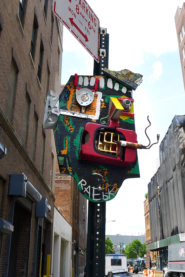
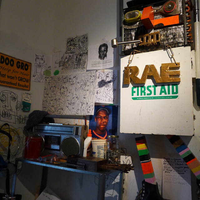
Rae is probably one of the ballsier street artists active in New York at the moment. He regularly installs sculptures on signposts around the city, stickers prolifically and once even installed a bas relief-like piece onto the wall of a subway station. I recently caught up with Rae over email.
RJ: Why do you think there are only a handful of sculptors doing street art?
Rae: Well they definitely take more time to make and usually require more planning to install. But I like to mix things up, so sculptural pieces are just one aspect of my work along with painting walls, paste-ups and stickers.
RJ: What do you see as the difference between your street pieces and your gallery pieces?
Rae: With my street pieces I try to focus on things being a bit more graphic. So if you see them from a distance you can make them out easier. They also need to able to hold up to the elements and A-holes messing with them. My indoor pieces tend to have more details to them, hundreds more nails banged into them and more metal parts. Too much metal on outdoor work makes them attractive for scrap metal guys.
RJ: Why do you install your work outdoors?
Rae: Growing up in Brooklyn and doing graffiti was all about getting your name up as many times as possible. I was not prolific in that way but the times I did write outside it was as much about the art of getting away with it as it was to getting up. I’ve been making art my whole life but didn’t always share it with others. When street art first emerged I became a “lookout” and “facilitator” for other artists but didn’t have the bug to get into it myself for some reason. I just focused on making art indoors and experimenting with microwaving, melting and boiling things. Until one day I woke up took a look at all the stuff collecting dust in my studio and said “shit’s got to go”. I tried giving some art to family as gifts but some of the pieces wound up stored in the garage next to mechanical reindeers. So next best thing was to try bolting things outdoors and paint murals. After that I was hooked. Now it’s about seeing the work become apart of and play off of the street’s landscape that interests me.
RJ: How important is an artist’s mythology to their artwork?
Rae: Considering we live in a society where people tend to want to label others and put them in a box, I think as an artist it is important to have some mythology behind your work. For example, I have been making art my whole life in one form or another but because I didn’t put work outside or tell everybody I met I was an “artist” some might think you’re new to the game. I also think your work should speak for itself. If you’re going to stand in front of your paintings with a Kool-Aid smile explaining the meaning behind your work– something’s wrong. The other issue is that fact that 90% of my outdoor work is ‘unsanctioned’.
RJ: Whose art do you have hanging in your home, and whose would you like to have hanging if you have unlimited resources?
Rae: I’m into collecting things that some may not consider “art”. Misspelled signage from local shops, crudely made tools, poorly crafted furniture, for example a stool I picked up in Costa Rica with one leg shorter than the other two. Things like that. I see art in everyday objects and things people make for function. But, if I had unlimited resources I’d probably hang the Mona Lisa in my house. I think it’s interesting that out of all the masterpieces ever created in the world the one that intrigues people the most is a portrait of a half-smirking, thick woman.
RJ: What have you got coming up?
Rae: Besides my dental appointment next week, more street work in a variety of mediums and a show/project somewhere TBA in the fall.
RJ: What’s up between you and Bast?
Rae: Rather than give you a lengthy explanation, I prepared a video statement that I hope you will consider including a link to in this interview: http://www.youtube.com/watch?v=syaGBHRguYY
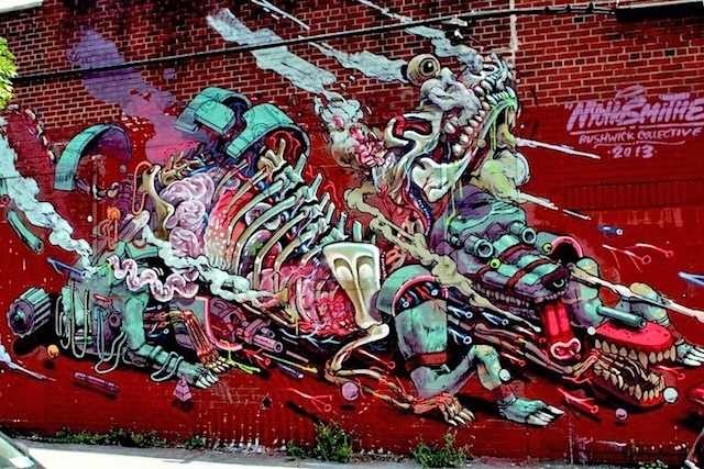
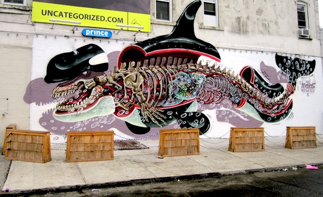
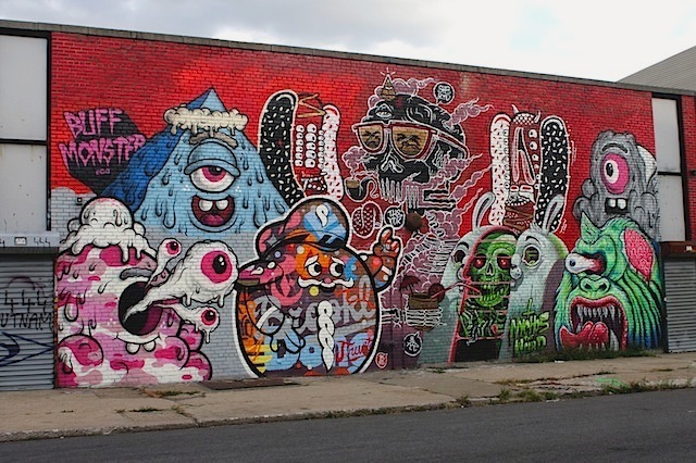
Nychos with Mexican artist Smithe at the Bushwick Collective. Photo by Dani Mozeson.
Working alone and collaboratively with other first-rate artists, Austrian artist Nychos brought his wonderfully weird visions to NYC last month.
On Bogart Street in Bushwick. Photo by Tara Murray.Nychos with Buff Monster, Tristan Eaton, Sheryo & the Yok at the Bushwick Collective. Photo by Dani Mozeson.
And although his hugely successful exhibit at Mighty Tanaka closed this past Friday, his works can be viewed online and a few of his pieces are still available for purchase.
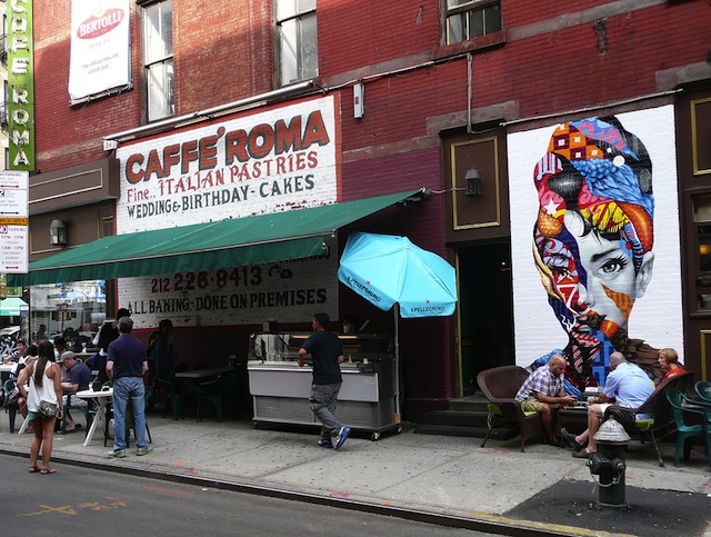
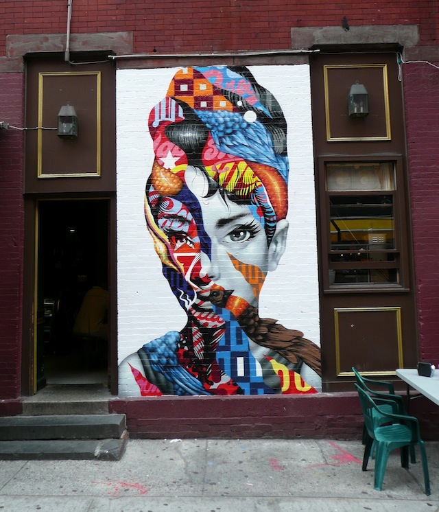
One of the things that I just have to bring up despite it happening in August while we were only posting illegal work is Tristan Eaton‘s portrait of Audrey Hepburn. It was painted last month in New York’s Little Italy as part of The L.I.S.A. Project NYC, a mural program that I help to organize along with Wayne Rada. Tristan painted this piece at Caffe Roma on the corner of Mulberry and Broome.
Ripping away at Hepburn’s flawless Hollywood exterior, Tristan finds a combination of the natural world and hollow advertising. Beneath the makeup and the hairdo, Hepburn is only human, but today we as humans are so surrounded by advertising at every turn that it becomes a part of us. We like Coke better than Pepsi, not because it tastes better but because Coca Cola is a part of our identity. And Hepburn, just like the rest of us, is made up of brands just as much as she is made up of natural elements. For me, the best artists are those who can make something that addresses both the “at a glance” audience who just want to walk by a piece and smile, maybe stop and take a photo if they have a moment, and the audience who search for a deeper meaning and enjoy spending time with an artwork, looking at it as more than just decoration. It’s very difficult to please both of those audiences simultaneously, but Tristan does it with this mural.
Plus, just have a look at the #littleitaly hashtag next time you’re on Instagram. People love photographing this piece.
For me, school is back in session. Hopefully everyone else out there is still enjoying the tail end of the summer. Here’s some art to keep your weekend interesting:
Just because Colossal Media paints murals based on designs by people like KAWS and Faile doesn’t mean there should be any love for them. They paint advertisements. That is their business. If they paint some murals on the side, that doesn’t excuse billboards invading public space. Unless you think BP sponsoring art exhibits excuses oil spills and pollution…
Also what’s up with KAWS’ work being used for a mural (I hesitate to say he did a mural, since it appears all he did was license his imagery)? He’s spent the better part of this site’s existence distancing himself from street art and graffiti and his public art has consisted of sculptures and flyposted advertisements (if you consider that public art).
Maybe I’ll be able to ask KAWS about all this myself soon, since presumably he’ll be in Philadelphia for his show at the Pennsylvania Academy of the Fine Arts. Arrested Motion has a bit of a preview, but I think the link really worth checking is PAFA’s website (and this archived version of the same page from mid-August) because of this section of the show description which has since been removed: “Placing KAWS’ sculptural works throughout PAFA’s historic galleries will further the ‘graffiti effect,'” and the edit of (emphasis added) “KAWS grew up in Jersey City, where he emerged as a graffiti artist in the early 1990s.” to “KAWS grew up in Jersey City, where he emerged as an artist in the early 1990s.” So that’s interesting.
I’ve never been a big fan of Elle’s work, but I do love this ad takeover.
FAME Festival is no more, although ad hoc projects will continue to be organized in the town of Grottaglie, Italy by festival organizer Angelo Milano. It’s definitely sad news, but Angelo is always ahead of the times. Maybe this glut of street art festivals is just too much. Maybe it’s time for something different. Let’s hope Angelo figures it out. I can’t wait to see what he tries next.
Mata Ruda’s piece on Broadway. Photo courtesy of Wall Hunters.
Editor’s note: I tried to write about this fascinating project that just finished up in Baltimore, but for some reason I was unable. So, instead, I asked Nether to write about the project for Vandalog. Nether was one of the co-organizers, so instead of my guesswork and thoughts based on a few articles I had read, now we have a first-hand account of one of the more daring street art projects in recent memory: Wall Hunters’ “Slumlord Project”. – RJ Rushmore
Wall Hunters‘ “Slumlord Project” was a project that installed 17 pieces on dilapidated vacant houses that are owned by people we consider to be negligent property owners. The project was a collaborative venture between the newly-minted street artists’ nonprofit, Wall Hunters, and Slumlord Watch, a local blog that documents the city’s shameful and shockingly large stock of uninhabitable vacant homes. QR codes and text descriptions were pasted alongside the art. A cell phone app scan of these instantly unveiled ownership information on the guilty landowner by linking to the Baltimore Slumlord Watch website. The artists’ ephemeral work and the community reaction to it was recorded for a documentary being produced by the project’s third partners, filmmakers Tarek Turkey and Julia Pitch. The project’s goal was to catalyze a larger conversation on Baltimore’s vacancy issue–a conversation that includes the normally muted voices of those who live in the targeted neighborhoods, as well as politicians and the developers whose phone calls get answered by city hall.
The idea for the project was born about a year ago. At that time I was putting up wheatpastes on dilapidated, vacant houses. As I was researching specific properties I was hitting, I regularly came across the Baltimore Slumlord Watch blog run by the housing activist Carol Ott. Slumlord Watch is basically Wiki-leaks for Baltimore’s underfunded housing authority. As blog posts make clear, many of the blighted houses are owned by entities with the means to fix their crumbling properties–slumlords who blithely ignore the cost of their neglect on city communities. Since much of my work uses images to deal with the vacancy problem and Carol was battling the same issue, we decided to meet and try to do something that joined street art with housing activism. I began driving her around while she catalogued vacants and researched ownership, and I wheatpasted.
Tonight is opening night for Calligraffiti: 1984-2013 at the Leila Heller Gallery. The show is interesting for two reasons:
It examines connections between graffiti and calligraphy at a fancy gallery. Seriously though, this should be really fascinating. There will be work by El Seed, L’ATLAS, Jean-Michel Basquiat, Keith Haring, LA2, ROSTARR, Niels “Shoe” Meulman, Ramellzee and many more artists (including many with no history on the street or with graffiti, but rather with feet firmly rooted in more traditional modern and contemporary art).
It marks the return of Jeffrey Deitch to New York City, basically. He didn’t curate the show, but he did curate a version of the show at the same gallery back in 1984, and the New York Times reports “Mr. Deitch served as Ms. Heller’s sounding board” for this version of the show. Deitch recently resigned as Director at the Museum of Contemporary Art Los Angeles after growing the museum’s endowment from under $10 million to almost $100 million, although it seems as though he is staying on at the museum just a little while longer, through the completion of that goal of reaching a $100 million endowment and the process of finding a new Director.
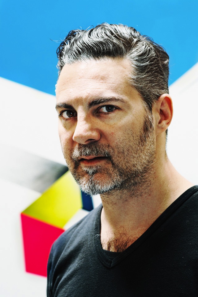
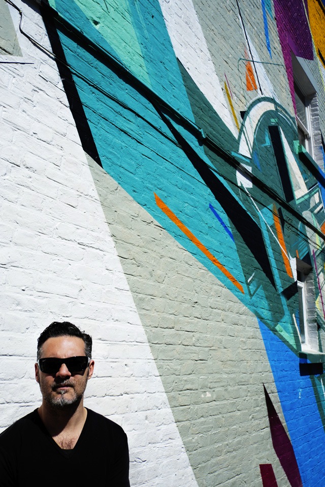
Remi has been a friend and an artist I’ve followed closely for many years, one of the artists putting some fresh energy graffiti with his abstract style, so I was glad that Tim Hans could meet up with Remi Rough at his studio in South London earlier this year and that Rhiannon Platt could interview Remi for our continuing series of portraits by Tim Hans. – RJ
Rhiannon Platt: For those who may not be familiar with your work, when did you start using spray paint?
Remi Rough: I did my first piece in 1984. Paint was different then, as were the styles, techniques and obviously the fan base, which hardly existed at all except in the younger generation.
Most of the artists, paint brands and the pieces themselves don’t even exist anymore.
It’s quite funny to think of something I was part of as a kid being considered historical now!
Rhiannon: And how has your work evolved since then?
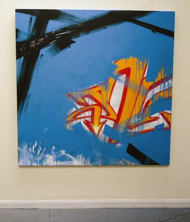
Remi: It became a lot simpler. In the late 90’s and early 00’s I stripped back a lot of the chintz in my graffiti pieces and lettering. Colour, background and periphery became unimportant to me. I guess things continued to simplify and become more minimal from there. Now the colour has regained a key importance in my work and the line and shape is just a conveyance for that. As long as I can create a similar tension in my paintings to the graffiti pieces of my youth, then I’m doing something right I think.
Rhiannon: What does abstraction mean to you?
Remi: Abstraction is all about questioning what you see. Graffiti was and still is abstract right from the very beginning. The entire concept of Wildstyle is completely abstract. the fills, the outlines and the backgrounds. Taking basic type forms and abstracting them into a more stylised version of the original product is as about as abstract as it gets.
Abstraction is keeping your feet firmly planted in reality whilst your head is in the clouds of imagination.
Rhiannon: What keeps you going creatively?
Remi: Many things to be honest. Good coffee, amazing people (of which I think I’m lucky to be surrounded by a lot of the time), great art of any kind, good food, my family and most of all I guess I manage to find new challenges for myself on a constant basis.
Rhiannon: What projects are you working on right now?
Remi: I’m off to Detroit in November to work on a very large mural project, which I’m quite excited about as I’ve never been there before. I have also been working on a collaborative show with Shok1 and I have a couple of solo shows booked in for next year already. Lastly I have a new book available next month called #roughsketches it’s a huge book of sketch work dating back from 1996 until now. It marks my evolution into the style I work with now and has a good few hundred outlines in it. There’s only going to be 100 editions tho, plus 25 special editions! It’s my Seventh self published book and I personally think it’s my best one so far…
Apologies for the delay posting this. I have had to hold off posting it due to Illegal August.
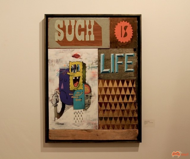
HAHA – Photo by David Russell
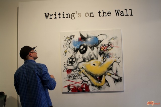
Metro Gallery started off the month with the opening of their group show “Writing on the Wall” with works from local and international artists such as Swoon, Rone, Matt Adnate, HAHA, Word to Mother, E.L.K, Dabs Myla and D*Face and more. Some shots from the opening below and more here.
Rone – Photo by David RussellWord to Mother – Photo by David Russell
The day after the opening Metro hosted more live painting, this month featuring work by Unwell Bunny, Two One and again E.L.K. More shots here.
Unwell Bunny – Photo by David RussellTwo One – Photo by David RussellE.L.K – Photo by David Russell
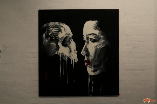
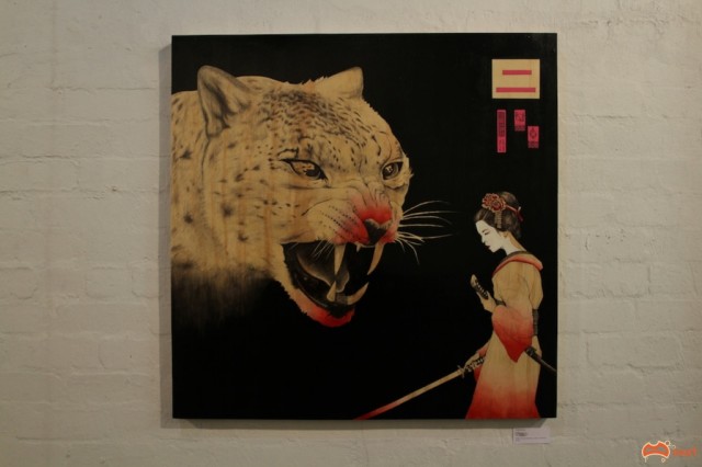
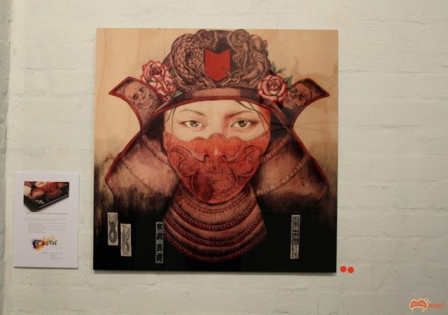
Chaotic Gallery’s 1st show BRUISER by Creature Creature was a cracker. A massive turnout for the Southside’s newest gallery. The works were amazing; a combination of the two artists styles which mesh so well together, featuring influences from the samurai era throughout. Check out some of my favourite pieces below and more here. Also check out some of their recent paste ups, which I also love, here.
Creature Creature – Photo by David RussellCreature Creature – Photo by David RussellCreature Creature – Photo by David Russell