Largely self-promotional link-o-rama

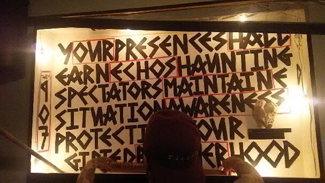
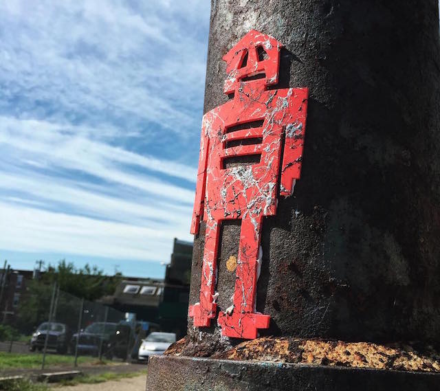
stikman in Philadelphia

Apologies that this particular link-o-rama is full of self-promotion and conflicts of interesting, but I do think these are all interesting projects and I hope you do too:

  • It takes a lot to get my excited about a mural festival, but this year’s Wall\Therapy in Rochester, NY looks great. It’s difficult to put on a mural festival. One short cut is to work with obvious artists. Your festival will look like 50 other festivals, but the walls will probably seem impressive. Wall\Therapy has not gone that route. This year in particular, they put together a surprising and diverse line up to create an arguably cohesive body of new work, and the quality of the murals is still strong pretty much across the board. Check out Brooklyn Street Art’s photos and review for the full story.
  • From the selections I’ve read, I’m still not sure how I feel about the book What Do One Million Ja Tags Signify? by Dumar Novy, but a philosophy book centered on the work of a prolific graffiti writer seems like something that should at least catch the interest of Vandalog readers.
  • Phlegm is in the middle of his latest art-making experiment, spending a month making art in the woods of rural England. I’m loving the results so far, and of course the concept of challenging himself in this way.
  • Shepard Fairey’s latest print about corporate greed and campaign finance reform is about to drop. It’s a nice print, and I’m always glad to see Shepard tackling this important but not particularly sexy topic. Plus, the profits from this print go to two great organizations fighting for campaign finance reform. I’ll just note that Shepard is working on a couple of projects right now for my employer, but campaign finance reform and political corruption really are topics that I care a lot about.
  • Speaking of my employer, I recently got to work on a really fun project with the City of Philadelphia Mural Arts Program and Ben Eine. Back in June, Eine came to Philly for a few days and painted almost 40 of his classic shutter letters. Philly now has a complete Eine alphabet, and then some. Eine’s work can be found throughout the city, but the shutters are definitely clustered in South Philly around Southeast by Southeast, a community center and art space for the neighborhood’s large Southeast Asian refugee community. Brooklyn Street Art has more on this project.
  • And one more Mural Arts project to mention: JR recently installed a huge mural right in the heart of Philadelphia as part of Open Source, our public art exhibition curated by Pedro Alonzo. The mural is a portrait of Ibrahim Shah, a local food truck chef who came to Philadelphia from Pakistan about a year ago. The Philadelphia Inquirer ran a great profile on Ibrahim. I love how this mural looms large on the side of one of the biggest buildings right in the center of Philly, but isn’t actually that visible from the ground except from a few choice locations. Sounds like that could be a problem, I know, but the mural actually pops out from behind buildings in the most surprising places, and catching a glimpse of it winds up being a thrill, a bit of hide and seek. Plus, that game plays into the meaning of the mural, which is about how immigrants are a big part of our cities, but aren’t always celebrated or allowed to be made visible.
  • Okay, actually, Mural Arts has something coming up with Steve Powers too, but hopefully it will last longer than these signs in NYC! No surprise, a great series of street signs by Powers, installed legally as part of a project with the NYC Department of Transportation, seem to be being ripped down and stolen by greedy collectors or maybe thieves hoping to make a buck. It’s no surprise, but it is still disappointing.
  • A few days ago, I appeared on Al Jazeera English as a guest on their show The Stream. Gaia and I joined their panel to talk about street art. You can watch the full episode, plus some bonus online content, here.
  • If you’re in New York City, do not miss Faile’s exhibition at the Brooklyn Museum. It’s on now, and visiting is a really exciting experience. Vandalog contributing writer Caroline Caldwell currently works as an assistant at Faile’s studio, but even hearing bits and pieces from her as things were coming together did not prepare me for the awesomeness that is Savage/Sacred Young Minds. Without a doubt, the highlight of the exhibition is the latest and (I think) largest iteration of Faile and Bast’s Deluxx Fluxx Arcade, with custom foosball, pinball, and of course video games. It’s just an unabashedly fun experience. Arrested Motion has photos of much of the exhibition.

Photo by RJ Rushmore
Saber: Bull in a china shop

"TOO MANY NAMES" by Saber at the Long Beach Museum of Art
“TOO MANY NAMES” by Saber at the Long Beach Museum of Art. Photo courtesy of Saber.

Last month, “urban contemporary art” came to Long Beach, California. Thanks to Pow! Wow! and ThinkSpace Gallery, the Long Beach Museum of Art is currently hosting Vitality and Verve: Transforming the Urban Landscape, an exhibition of talented and famous painters like Low Bros, Meggs, Andrew Schoultz, Saber, and Audrey Kawasaki. It was supposed to be a show about painting with artists “demonstrating the skilled and nuanced application of their craft,” and, for the most part, the works in Vitality and Verve are well-painted and beautiful. Except for one. Saber’s installation. Continue reading “Saber: Bull in a china shop”

Live a little on Coney Island

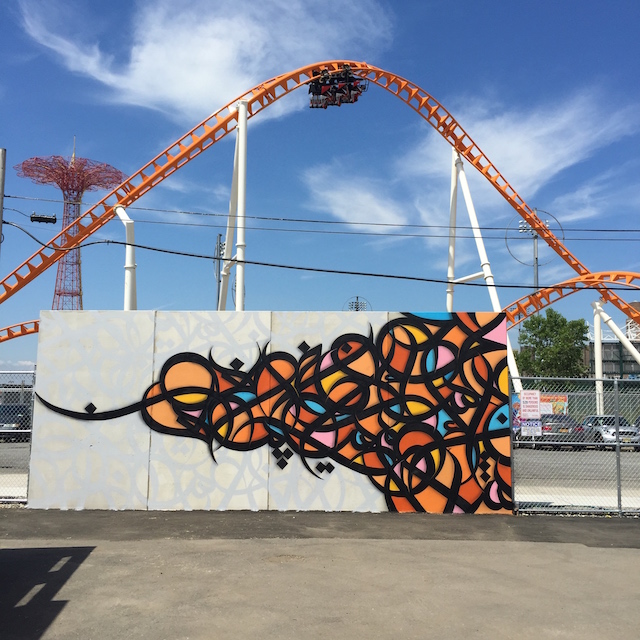
eL Seed. Photo by RJ Rushmore.

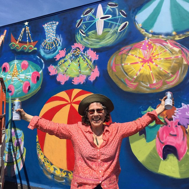
Last Sunday, I visited Coney Island for the first time. I was there to see The Coney Island Art Walls, Jeffrey Deitch‘s latest mural project. Deitch is a master of fun, and he has a habit of causing controversy. The Coney Island Art Walls are no exception. The murals are a great addition to Coney Island’s myriad of attractions, but artnet in particular has been treating Deitch like their personal punching bag, in large part because of the project’s ties to Joseph J. Sitt of Thor Equities, a real estate developer whose company owns the lot where the murals are being installed.

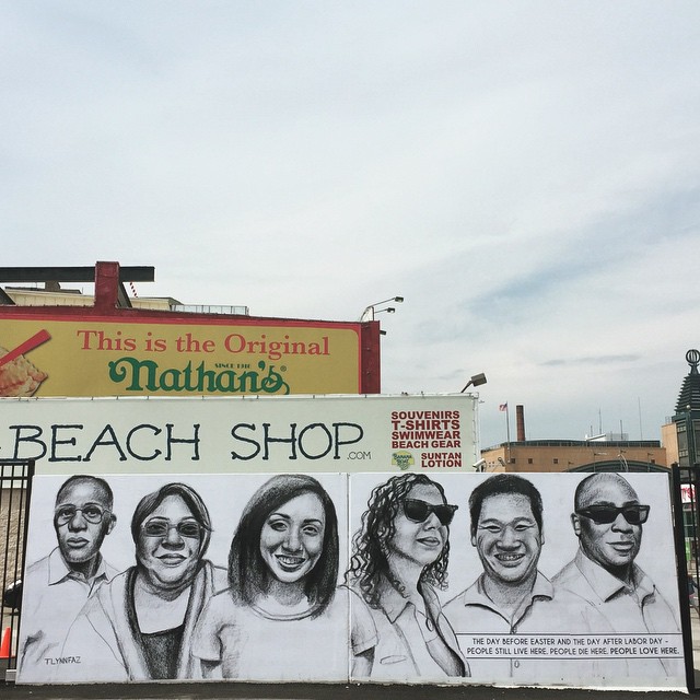
Tatyana Fazlalizadeh. Photo from Tatyana Fazlalizadeh's Instagram.
Tatyana Fazlalizadeh. Photo from Tatyana Fazlalizadeh’s Instagram.

People were mad at Sitt for attempting to destroy the history of Coney Island and leaving lots his lots vacant. Those are completely legitimate concerns. Now, they’re mad that Sitts has put something in one of his lots: A bar, some concession stands, and murals by an amazing array of artists, many of which explicitly celebrate the history of Coney Island. Or rather, it’s arts journalists who are attacking Deitch, on the basis of those complaints, for helping Sitts DO THE VERY THING THAT PEOPLE WERE CALLING ON HIM TO DO. Their anger makes no sense, unless those journalists are just desperately searching for one more reason to hate on Deitch.

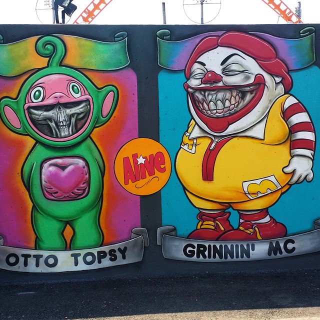
Ron English. Photo from Ron English's Instagram.
Ron English. Photo from Ron English’s Instagram.

That said, The Coney Island Art Walls are entertaining, which makes the project easy to dismiss as unimportant. But the murals are literally across the street from an amusement park, so of course they’re entertaining! Are the murals tools for gentrification and mindless amusement more than social justice and disrupting the everyday? Probably. And most days I’d prefer to see a piece of illegal street art or graffiti or a “socially engaged” public art project than a wall where the art functions primarily as decoration. Most days, I’d also rather eat a salad than a hot dog. But on that rare occasion when I visit an amusement park, I am there to be amused and I definitely don’t want a salad for lunch.

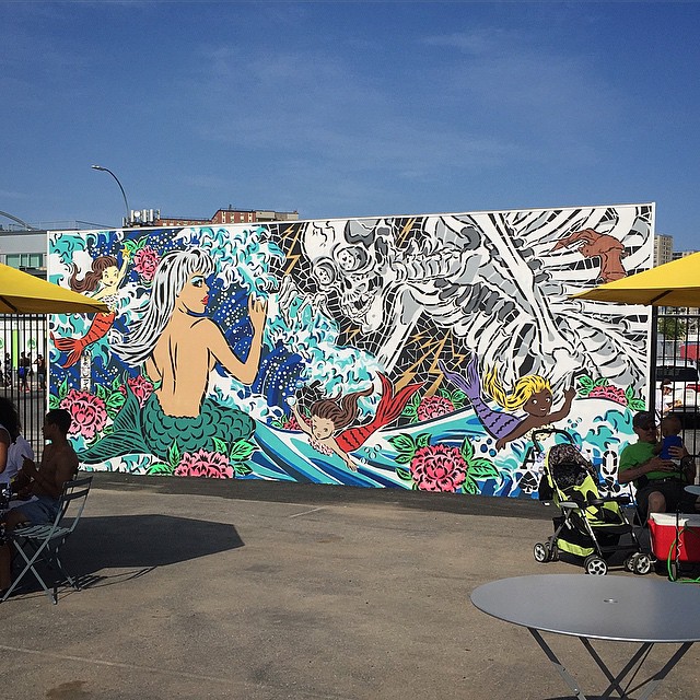
Lady Aiko. Photo by RJ Rushmore.

The key to the project’s success really is the setting. These are not murals that you’ll just stumble across randomly. It’s a project that you travel to the end of the subway line to see. It’s its own Coney Island attraction, and a good one at that.

Jane Dickson at work on her mural. Photo by RJ Rushmore.

Artnet’s Brian Boucher suggested that organizing murals for Coney Island was a new low for Deitch. That’s such a closed-minded view of what and where art can be. The bulk of the murals celebrate the history of Coney Island or at least fit in perfectly among the area’s existing cacophony of iconic rides, amusements, and signage. Aiko‘s piece looks like it belongs on the side of a carnival game, and Jane Dickson captured spirit of wonder in the air. I’m not sure I’d enjoy AVAF’s mural if I had to live across the street from it and see it every day, but it’s fantastic as a contemporary take on an crazy Coney Island signage. The Coney Island Art Walls are an opportunity to install a series of murals that wouldn’t make sense anywhere else.

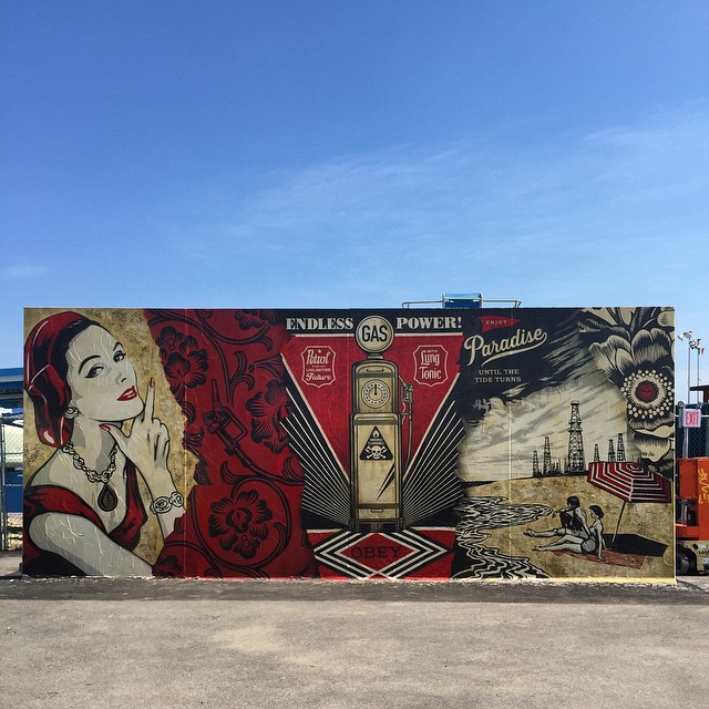
Shepard Fairey. Photo by RJ Rushmore.

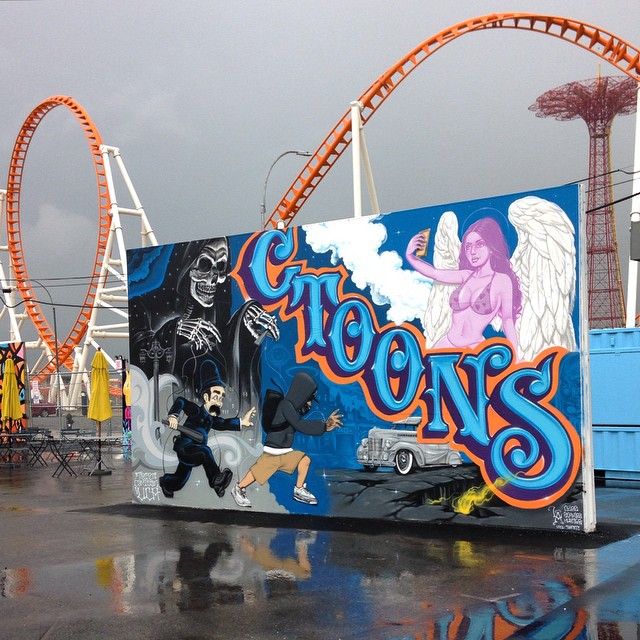
Artnet’s Christian Viveros-Fauné was also flat wrong when he dismissed the project for its “Uniformly colorful murals that individually deploy some of street art’s standard motifs—bright hues, stencils, and graphic punch—but engage in neither activism nor neighborhood politics.” Amongst the color and revelry, there is in fact some politically-charged worked: Shepard Fairey‘s fitting tribute to classic seaside advertising features a call for environmental responsibility, Mr. Cartoon‘s painted a young person of color being chased by a white police officer while the grim reaper lurks in the background, and Tatyana Fazlalizadeh’s portraits of neighborhood residents are accompanied by this statement: “The day before Easter and the day after Labor Day – People still live here. People die here. People love here.” Politics and activism are far from the focus of the project, but they’re not absent.

Mr. Cartoon. Photo by Martha Cooper.

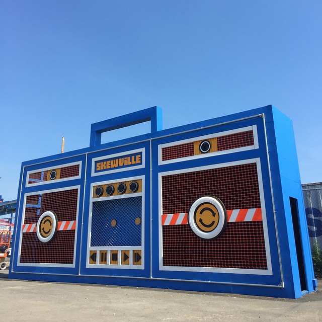
So, go to Coney Island. Check out The Coney Island Art Walls. But go with the right mindset. It’s an attraction to be enjoyed. Take a selfie with Ron English‘s sideshow characters. Snag the perfect photograph of eL Seed‘s mural with a roller coaster in the background. Climb onto Skewville’s oversized boombox and do a little dance. Go home with a smile on your face. It’s good for you.

Skewville. Photo by RJ Rushmore.

Photos by RJ Rushmore and Martha Cooper, and from the Instagrams of Tatyana Fazlalizadeh and Ron English

Sharing Inspiration: Noxer for Frontal Labotomy at Tender Trap

Lance de los Reyes
Lance de los Reyes. Photo by Darryl Nau.

Since reopening in Greenpoint, Tender Trap has hosted an ongoing series of shows curated by Andrew H. Shirley. The Frontal Labotomy series takes place biweekly in a 3′ by 4′ display case in the middle of the bar.

Russell Murphy
Russell Murphy. Photo by Paul Reubens.

Shirley explains:

The idea came to me from staring at my bedroom wall. I was thinking how psychologically explicit the assortment of objects and art I have displayed are- how they tell a story of me and my emotional being. I wanted to be able to create a setting where artists could display themselves the same way. That said, it’s totally up to them how they want to inhabit the box. It’s completely hands-off in the sense that I don’t have any involvement in the content outside of asking individuals to participate in the residency. In the future, I’m looking to curate people from backgrounds outside the world of art- plumbers, vagrants, clowns, convicted felons, and crossing guards in attempt to let the public look into their lives in a more intimate way.

Noxer
One of Noxer’s pieces for Frontal Labotomy. Courtesy of Noxer.

Tonight, April 29, Frontal Labotomy rotates and New York writer Noxer takes over the space. The opening reception starts at 7pm. Know for bringing his “black man robbing” character to graffiti, drawing, and puppetry, viewers can expect a mixed-media approach to the 4′ x 3′ space, including the above image.

Photos by Darryl Nau, and Paul Reubens, and courtesy of Noxer

The story behind this crazy Tod Seelie photograph

OutlandEmpire-TodSeelie-20

Tod Seelie is one of my favorite photographers, and his recent book is something that I seem to take off the shelf and show to just about anyone who stops by my place. You might be familiar with his work for any of a dozen reasons, but Vandalog readers are probably most likely to know his photographs of Swoon’s rafts, or his documentation of Bike Kill. His most recent body of work is Outland Empire, shot earlier this year in Southern California during a residency with Superchief Gallery.

In Outland Empire, Seelie explores the eccentricities and underground of Southern California, from the streets of LA to the characters in Slab City to crazy to the literal underground of storm drains. Seelie’s photographs oscillate from depicting the forgotten vestiges of humanity to wild moments full of energy, always with his unique eye and penchant for exploration. Outland Empire is a reminder that the world is more than just carefully manicured people and places. There’s still a bit of dirt and magic out there, for now.

In May, we’ll be exhibiting an expanded version of Seelie’s Outland Empire series at LMNL Gallery, a space I help run in Philadelphia. The show opens this Friday from 6-9pm.

There are a bunch of photos in Outland Empire that I’d love to get the back story on, but the above photo in particular seemed relevant to Vandalog, so I asked Seelie about it. Here’s what he had to say:

I shot this image while with some friends deep in the storm drain tunnels of LA. There is a spot, over a mile deep, where the floor is slanted so the water is more concentrated to one side leaving a “beach” area for hanging out. I have been down here with friends a few times for various things, dinner parties, live music, (there was flaming tall bike jousting, but I wasn’t there for that) and painting graffiti. It’s a very chill spot and worth the wet feet.

For more stories and photos from Outland Empire, check out this post on Hopes&Fears.

Outland Empire is also being exhibited this week at Tender Trap with Superchief NYC.

todseelie_1

Photo by Tod Seelie

Sunday link-o-rama

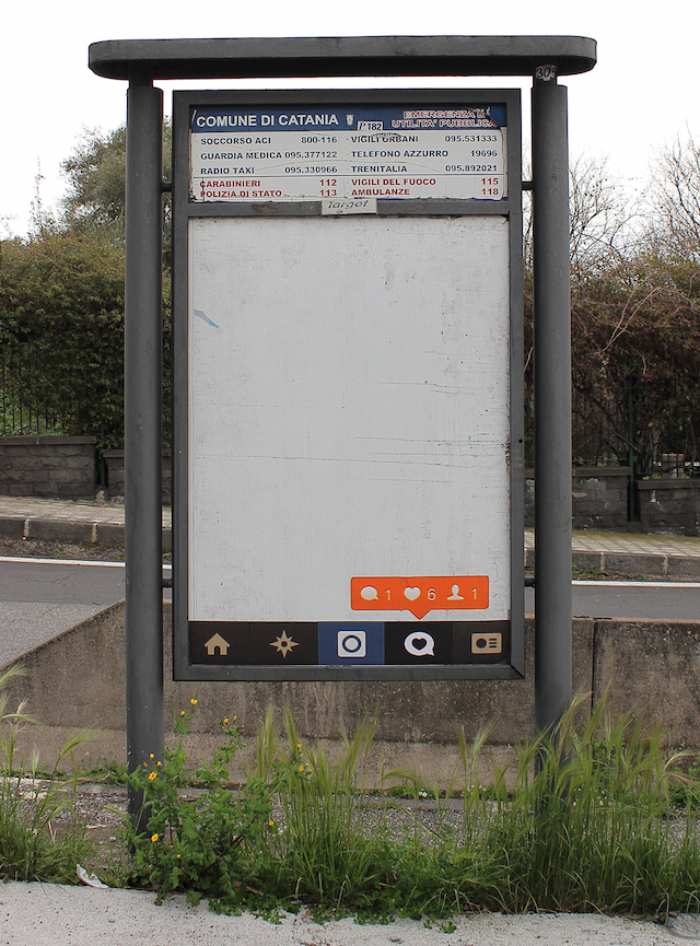
"the beauty of un-advertising" by VladyArt in Catania, Italy
“the beauty of un-advertising” by VladyArt in Catania, Italy

Got a few things that caught my eye recently, so I’m going back to the old link-o-rama format for a day:

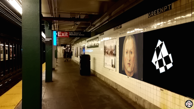
  • A group of anonymous artists installed a bust of Edward Snowden at a park in Brooklyn, but the piece was almost immediately taken down by the city. Luckily, as the artists noted to ANIMAL, “The fact that a risk was taken, the fact that an image comes out of that event that can be passed around can never be undone. So you can rip the statue out, but you can’t erase the fact that it happened and that people are sharing it.” It’s all a bit reminiscent of when the British government forced The Guardian to destroy hard drives containing files leaked by Snowden, even though there were other copies of the files outside of the UK. Of course the sculpture wasn’t going to last. Take it down or leave it up, it hardly matters. We have the photos.
  • Faile and Bast are showing at the Brooklyn Museum in July. So I’m looking forward to that, and you should be too.
  • But if you’re looking for something up now in NYC, definitely stop by Roa’s solo show at Jonathan Levine Gallery. ANIMAL very cleverly made a series of GIFs of the show. I had a pretty similar reaction to this show as I had to Roa’s show at Stolenspace last year in London. Basically, I went in with a negative attitude of thinking I’d seen the work before, and I left happy as a kid in a candy store because Roa’s pieces are so damn fun to experience and play with. It’s a really stupid fear/attitude that I have about Roa’s shows, and it’s one that the work always seems to overcome, proving my preconceived notions wrong. Good stuff, as always.
  • And if you’re in Paris, Know Hope just had a show open there.
  • Check out this spot-on anonymous critique of crappy stencils in Shoreditch by terrible street artist Bambi.
  • It’s great to see Aakash Nihalani getting some love from Juxtapoz for his interactive work.
  • Niels “Shoe” Meulman is retiring his use of the term “Calligraffiti”, because he feels his work is now better represented by the term “Abstract Vandalism,” now that his work is moving away from letters and becoming more abstract. Okay, he’s evolving as an artist, but really: who cares? That’s a pretty standard evolution these days for artists coming out of graffiti. Two reasons this is interesting. First, he’s published a short manifesto of Abstract Vandalism, which I love, and I highly recommend picking up a copy for the great little tidbits like “The difference between art and vandalism is only in the eye of the law upholder.” Second, Shoe is giving up admin control of the Calligraffiti facebook page, which has over half a million likes. In a few days, Shoe will be selecting new admins for the page, artists whose work he feels is in line with Calligraffiti now that his work is not. You can learn more about that, and suggest yourself as a new admin, here.
  • Gotta love Jorge Rodriguez-Gerada’s latest pieces.
  • I’ve never really cared for MTO‘s realistic figurative murals, even though they do play with space in an interesting way, but he’s really piqued my interest with a new piece for Memorie Urbane 2015 in Gaeta, Italy. The piece is a conceptual look into the future, a future where Google controls what information we have access to (oh wait, maybe this isn’t so futuristic…) in public space. The mural is a response to the Google Cultural Institute’s Street Art Project, which ostensibly acts as a digital archive for street art and murals. The project is highly curated and controlled, begging the question: Who decides what’s included, and what isn’t? MTO’s piece also hints at a future where augmented reality is the norm. The re:art has a great article with photos and analysis of MTO’s mural. For now, I’ll just add: I can’t wait for this mural to show up on Google Street View.

Photo by VladyArt

Cash For Your Warhol is coming to Philadelphia

CFYW

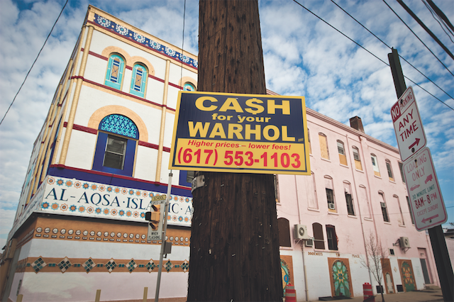
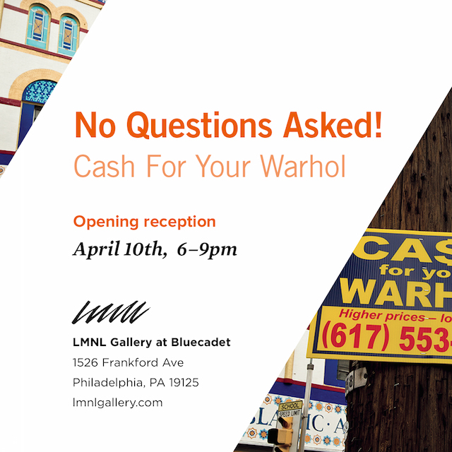
For years, I’ve followed the saga of Cash For Your Warhol, the Boston-based art experiment that’s been bugging art collectors, confusing the general public, and entertaining the street art world for years. Now, Cash For Your Warhol is coming to Philadelphia with a show at LMNL Gallery, where I’ve been curating shows since last fall. No Questions Asked! opens at LMNL on April 10th.

Cash For Your Warhol is the brainchild of artist and photographer Geoff Hargadon. The project began in 2009 in response to the financial crisis, and to an art market that treats paintings and sculptures as investible assets similar to real estate and gold. Through stickers, stencils, plastic signs, and billboards, Cash For Your Warhol has been a subtly hilarious part of the urban landscape and the art market for over half a decade. In 2012, the Andy Warhol Museum in Pittsburgh even added a few of the signs to its permanent collection.

The Cash For Your Warhol project is such a simple and effective critique of art market and financial industry absurdity. From the moment I first saw the signs, I was hooked. The project is even more fascinating now that you can find Cash For Your Warhol art in galleries. That’s something I love, but I never expected. With No Questions Asked!, it’s all come full circle in a perfectly surreal way. Plus, it’s an opportunity to exhibit some of Hargo’s photos, and he is one of the best street art photographers active today.

No Questions Asked! will be Cash For Your Warhol’s first exhibition in Philadelphia. The Cash For Your Warhol team did, however, visit earlier this year to install work around the city. The exhibition will include photographs from that visit, an interactive sculpture, and the complete collection of the 24 Cash For Your Warhol signs created since 2009.

As the opening of No Questions Asked! approaches, keep your eyes out for CFYW to make its message heard in Philadelphia in a big way. In the meantime, remember to dial (617) 553-1103 for all your Warhol-selling needs.

See you at the opening on April 10th!

cashforyourwarhol-flyer

Photo by Cash For Your Warhol

“Common Thread,” a stikman solo show opening soon in Philly

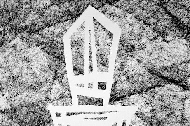
sm-common

Today I’m very pleased to announce Common Thread, a solo show from stikman. It opens March 6th at Philadelphia’s LMNL Gallery, where I’ve been curating shows for the last six months or so.

I love working with stikman because his work just brings people so much damn joy. If you’ve been in Philadelphia long enough, or Boston, or New York, or Chicago, or Los Angeles, or Toronto, or any of a hundred small towns across the United States and Canada, you might know stikman. You just might not know that you know him. One of the most elusive and prolific street artists in America, one of the last truly anonymous street artists, stikman has been putting a smile on people’s faces with his street art for over 20 years.

The late DJ John Peel’s favorite band was The Fall, and he once described them by saying, “They are always different, they are always the same,” and I cannot think of a better way to describe stikman or the works in Common Thread.

For months, stikman has been experimenting with the latest evolution to his character, and he has developed what he calls “thread paintings” for the way the paint looks like masses of thread thrown on the ground or stretched out like webbing. Already, there’s variation among the pieces, as the technique is used on different surfaces and in different ways. With Common Thread, stikman will be showing this new body of work for the first time.

The show also will also feature a digital installation: A new series of stikman’s spy-cam-like photographs. The installation will also highlight how street art, and stikman’s work in particular, is simultaneously always different and always the same. One of the highlights of …in the house…, the last show I worked on with stikman, was a photo installation. It was definitely the most commented-on piece. I suspect this digital photo installation will be similarly popular and surprising, but that’s all I’ll say about it for now. If you’re curious, you’ll just have to come to the show to see it for yourself.

Common Thread opens at LMNL Gallery (1526 Frankford Ave, Philadelphia) on March 6th with a First Friday launch from 6-9pm. The exhibition will remain on view through March 27th by appointment.

Photo courtesy of LMNL Gallery

“Bob-omb,” an all-GIF augmented reality exhibition in NO AD

A screenshot from Bob-omb, featuring stills of art by James Kerr (Scorpion Dagger) and Dave Whyte.

Wow. That headline is full of some jargon and gibberish… Sorry. Let me explain…

Today marks the launch of the latest exhibition in NO AD, a new evolution for the smartphone app that simulates a world in which New York City’s subway station advertisements are replaced with public art. NO AD, which I’ve written about before, uses augmented reality to digitally replace the ads on your phone’s screen. Here’s how it works.

NO AD has become a really interesting exhibition space, somewhere between a digital exhibition and a guerrilla street art exhibition. The very platform is an artwork, so NO AD’s art exhibitions exist within another work of art, and the platform gets you thinking as much as the art it displays.

I’m honored that the NO AD creators (between PublicAdCampaign, The Heavy Projects, and The Subway Art Blog under the umbrella of Re+Public) asked me to curate the first exhibition NO AD made up entirely of animated GIF art. That exhibition, titled Bob-omb, launched today and includes artwork from by The Barkers, Caitlin Burns, Dave Whyte, Hrag Vartanian, James Kerr – Scorpion Dagger, Jeremyville, Maori Sakai, Molly Soda, Paolo Čerić aka Patakk, Ryan Seslow, The Current Sea, YoMeryl, and Zack Dougherty.

In the past, the vast majority of content in NO AD has been static images, but Bob-omb takes full advantage of the platform by focusing exclusively on animated pieces, transforming static advertisements into dynamic artworks.

Bob-omb is an effort to weaponize GIF art as a tool for reimaging public space while simultaneously highlighting the variety and depth possible with the medium. The artists range from filmmakers to illustrators to journalists, and their work varies from hyper-short documentary videos to abstract digital illustration.

To view Bob-omb, simply download NO AD for your iPhone or Android device (or update it if you’ve already got the app on your phone), find a New York City subway station, open the app, and start pointing your phone at the ads. Or download/update the app and try the test image below.

I want to give a big thank you to all of the artists in Bob-omb and the team behind NO AD for this opportunity.

test image
Test image: Download NO AD and use this image to see how it works.

Images courtesy of NO AD

From New Yawk City Walls to virtual reality

Concrete to Data

This weekend, a particularly forward-thinking yet historically mindful street and graffiti exhibition opens at Long Island University. CONCRETE To DATA, curated by Ryan Seslow, explores the history of street art and graffiti from golden age of NYC subway graffiti through to the emerging potential for digital public art in forms such as virtual reality environments and animated GIFs.

CONCRETE To DATA includes work by many Vandalog contributors and friends including Caroline Caldwell, Gaia, ekg, and Yoav Litvin. Seslow also included my book Viral Art and our collaborative project Encrypted Fills in the exhibition. On some level, CONCRETE To DATA feels like vindication and the physical manifestation of Viral Art, albeit through the eyes of another curator. Seslow and I both have a deep love for early street art and graffiti, as well as a belief that some contemporary digital art is created and disseminated in that same spirit.

In a fitting coincidence, the exhibition takes place at the Steinberg Museum of Art at Long Island University in Brookville, NY and will run during the 10-year anniversary of Tawkin’ New Yawk City Walls, an exhibition curated by John Fekner that took place in the same space in 2005. Tawkin’ New Yawk City Walls was actually conceptually similar to CONCRETE To DATA, not just another street art exhibition in the same space. Ahead of his time as always, Fekner included digital works in Tawkin’ New Yawk City Walls and arguably even hints at the possibility of viral art in the exhibition’s curatorial essay. A decade later and the world predicted in Tawkin’ New Yawk City Walls has come to fruition, and artists are creating new works for a new world, as seen in CONCRETE To DATA. In this way, Seslow provides an important and expansive update to his friend Fekner’s exhibition.

But CONCRETE to DATA is more than an exhibition to promote digital media as a route for contemporary street art and graffiti. It’s also an exhibition that attempts to capture, again much like Tawkin’ New Yawk City Walls, the most interesting elements of the contemporary streetscape in NYC and place those in a historical context alongside the best of previous generations. There’s work from Adam VOID, Swoon, Gaia, Fekner, Cash4, and many others. So, there are visuals to enjoy too.

Adam VOID's installation at CONCRETE to DATA
Adam VOID’s installation at CONCRETE to DATA

CONCRETE to DATA opens on Friday, February 6th from 6-9pm and runs through March 21st. Learn more here. I’ll be missing the opening because I’ll be at Sam Heimer‘s Why Are You Here?, opening that same night at LMNL Gallery in Philadelphia, but I’m really looking forwarding to checking out CONCRETE to DATA in person soon.

Photos by Ryan Seslow