sz zs play with paper

sz zs 3

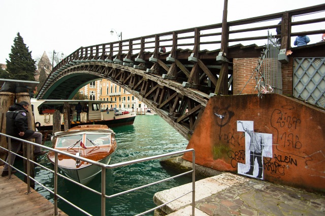
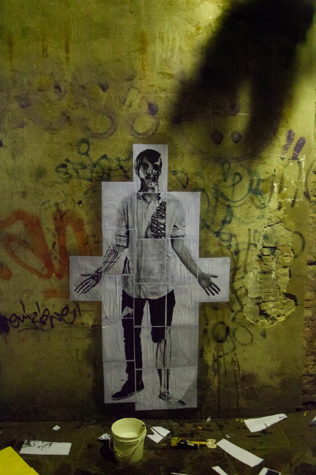
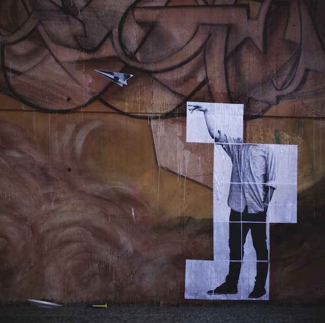
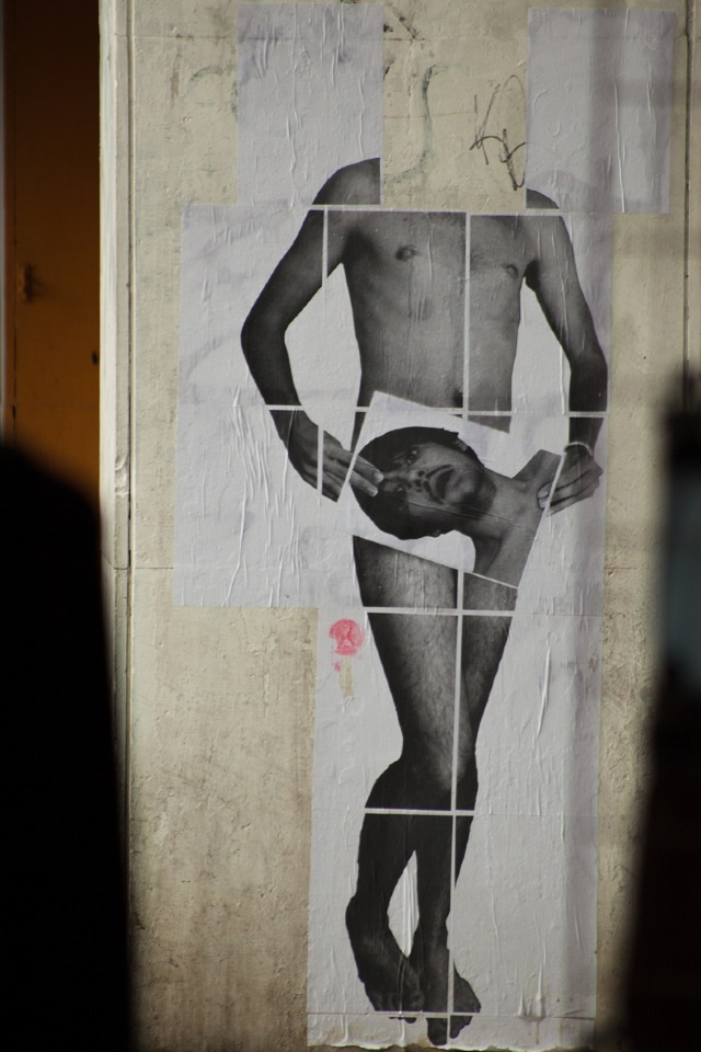
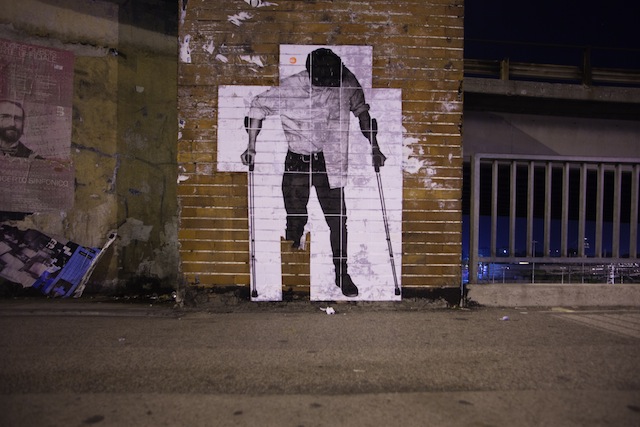
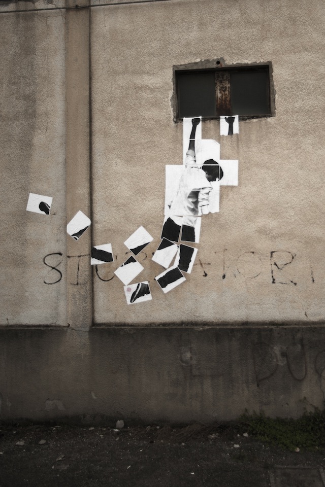
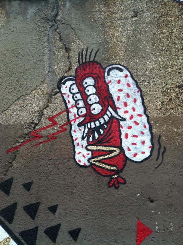
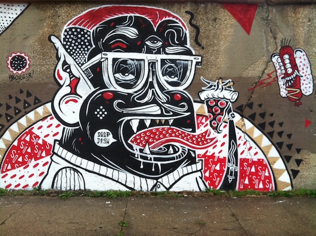
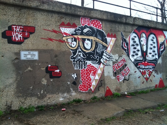
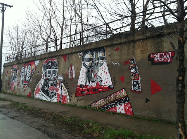
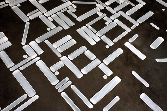
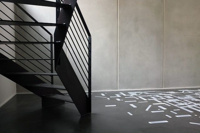
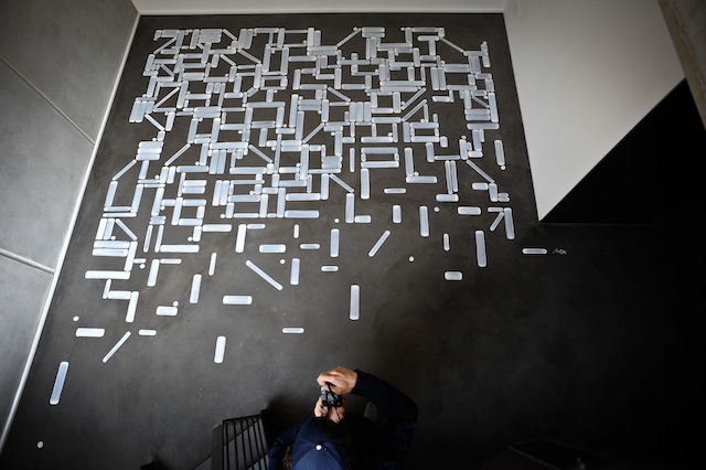
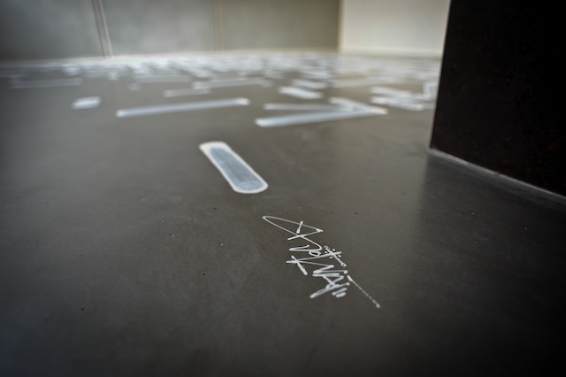
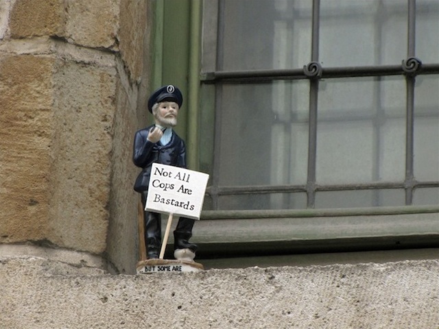
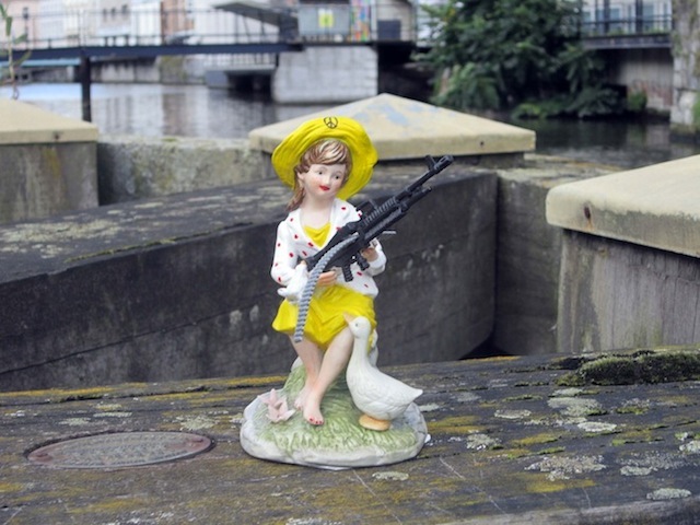
Pretty much the most amateur thing you can do if you want to wheatpaste a giant poster is to print it out on a bunch of 8.5″ x 11″ sheets and paste them up in a grid. It’s gonna be complicated and probably look terrible. Unless you are part of the Italian street art duo sz zs. They make that 8.5″ 11″ grid work work amazingly well by playing with the possibilities it provides. I’m not artist, but I must say, in my experience as an observer, playing with the constraints you are given rather than staying within them or foolishly trying to ignore them is a one very important secret to successful artwork.

sz zs have been getting up in Venice for a little under a year, and I very much look forward to seeing where they take their project next.

sz zs 2

-2

sz zs 1

-3

-1

Photos by sz zs

Mata Ruda: Exploring histories at the Bushwick Collective – Part 1

IMG_1355

Note: This article is the first in a three part series that discusses how three artists dealt with the topic of histories within their Bushwick Collective murals.

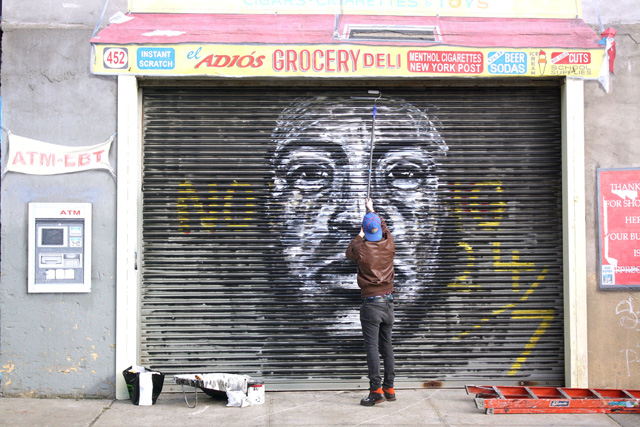
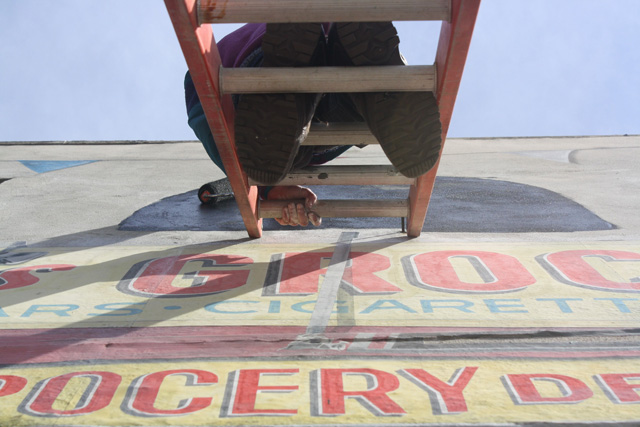
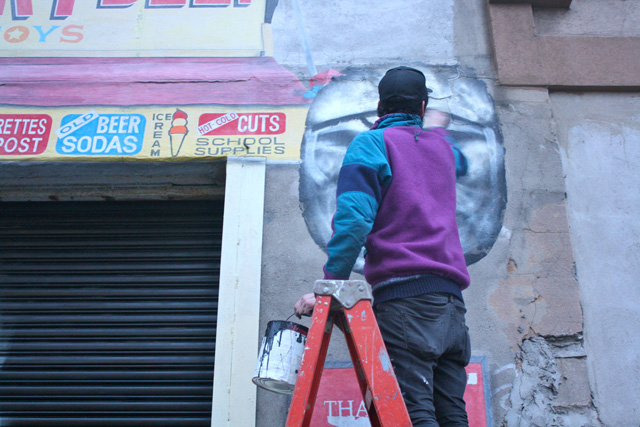
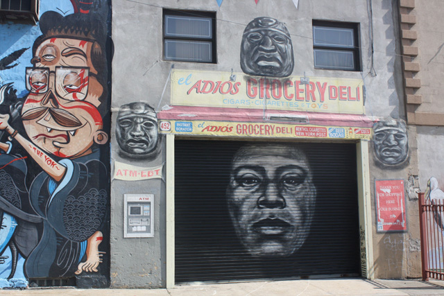
Originally from Venezuela, Mata Ruda drew upon the history of Central America for his first wall in New York City at the Bushwick Collective. Inscribing his images upon the preexisting mural by fellow Open Walls artist Gabriel Specter, the artist combines the context of Specter’s poppy “El Adiós Grocery” with his monochromatic imagery. Using a source photograph of an unknown, undocumented immigrant, this anonymous voice is given an ominous presence within this space. In a city of immigrants, the face of this everyman is accompanied by signage for a store that could exist on any corner in the city, asking us to question our interactions with people and iconography that most New Yorkers would not give a second thought.
IMG_1357

IMG_1359

Combined with the black and white central portrait are a series of masks that float ominously around him, looming over the grocery’s banner. One of the first Mexican civilizations, the Olmecs were a Mesoamerican culture that now only exists through and is represented by the objects they left behind. The defined faces and hollow eyes of these artifacts have become emblematic of the culture, often called “colossal heads.” By applying traditional imagery from the contemporary figure’s transplanted homeland, Mata Ruda links the importance of a person’s past in their present through the use of historical imagery. The Olmec expression is echoed by the undocumented immigrant, further underlining this message.
IMG_1420

IMG_1419

Photos by Rhiannon Platt

Henrik Haven’s Copenhagen – Part 3

22 IMG_0272

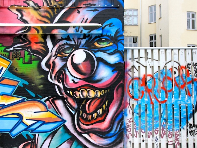
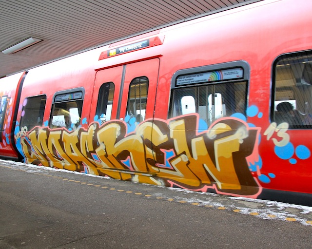
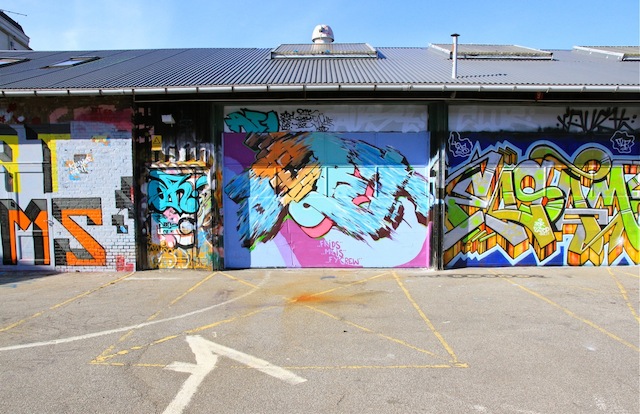
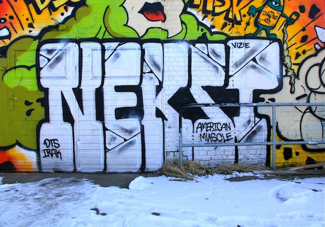
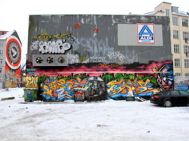
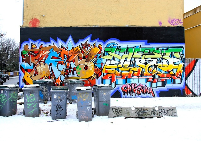
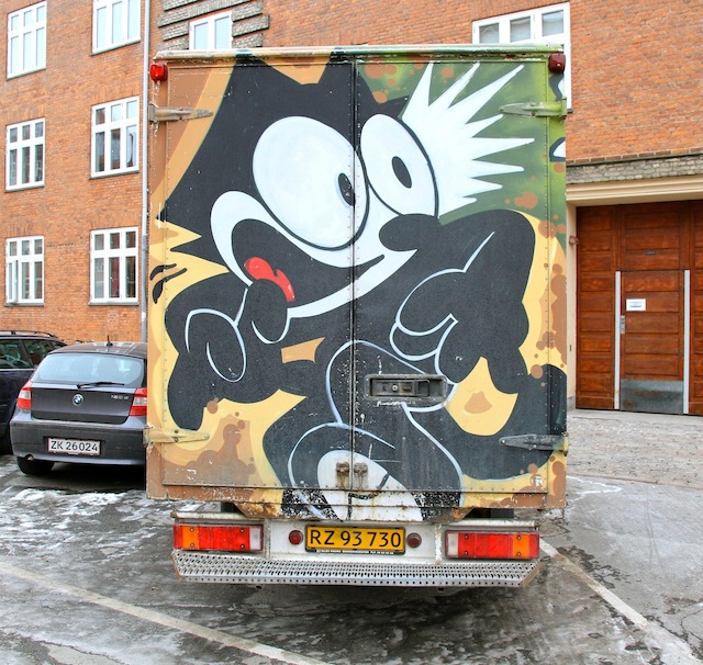
Last week I posted part 1 and part 2 of our 4-part series of Henrik Haven‘s photographs of Copenhagen graffiti. This week I’ll post the second half of the series. Here’s part 3. Once again, Haven has captured some really amazing pieces. Throughout this series, rather than mention some artists in the photos and neglect others, I’m just going to leave the photos without artist credits.

21 IMG_3476

23 IMG_1050

Continue reading “Henrik Haven’s Copenhagen – Part 3”

Basik goes meme

IMG_0862-var-750web

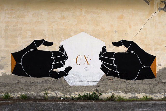
Haha, wow. At first glance, this piece by Basik in Rimini, Italy might appear to be a beautiful painting of two hands with a heptagon in between the hands. But, particularly keeping in mind the “CX” in the middle of the heptagon, see if it reminds you of anything a bit less nice to look at.

The piece, titled Goatse is a reference to the goatse.cx meme (don’t worry, that’s just a link to Wikipedia), a disgusting/super not safe for work shock image that has been floating around the web since the late 1990’s. It’s one of the more disturbing non-violent images on the internet. I’m not sure what to think about this wall, but this seemed worth sharing.

Photo courtesy of Basik

Weekend link-o-rama

"The American Cousins" by Cekis in Fleury-Les Aubrais, France
“The American Cousins” by Cekis in Fleury-Les Aubrais, France

So as finals exams and essays begin to creep up on me (70-ish pages to write in the next month), these link-o-rama posts are going to become essential until the school year is up, so you know, I encourage you to read them closely.

Photo courtesy of Ville de Fleury-les-Aubrais

Henrik Haven’s Copenhagen – Part 1

Click to view large
Click to view large

It’s damn near impossible to get a sense of a city’s street art or graffiti from a handful of shots, but Henrik Haven has gone above and beyond with this set of photos of graffiti in Copenhagen. We’ll be posting the photos in four parts over the next few days. Rather than mention some artists in the photos and neglect others, I’m just going to leave the photos without artist credits. Read the names if you’re interested in who painted what.

01 IMG_1658
Click to view large

01 IMG_3539

Continue reading “Henrik Haven’s Copenhagen – Part 1”