Here comes the masturbatory docuseries

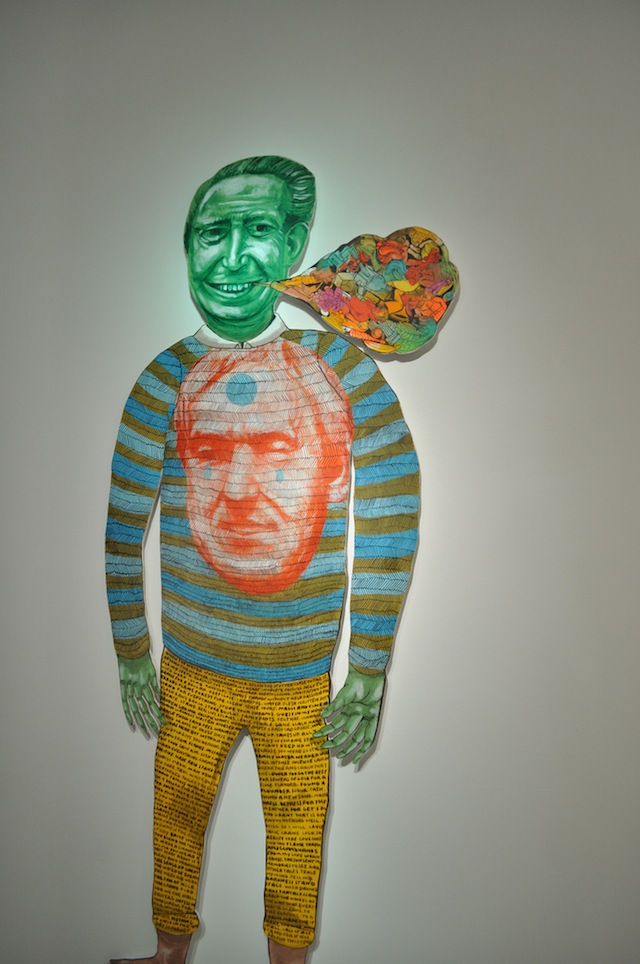
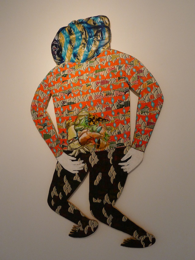
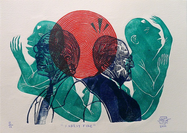
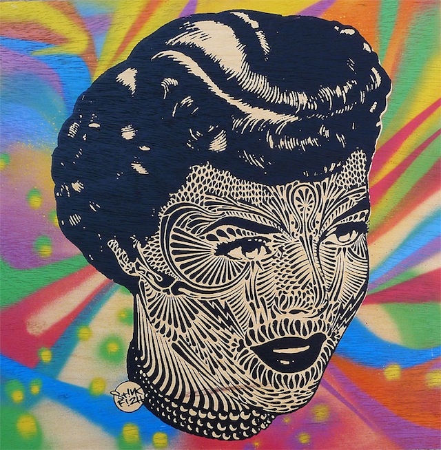
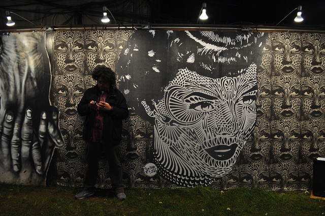
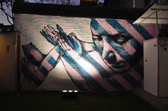
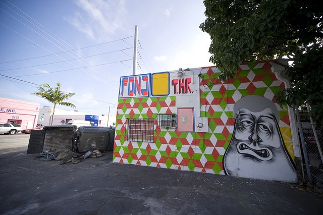
Barry McGee for Wynwood Walls

Wynwood Walls is a noteworthy mural program in the Wynwood District of Miami. It has brought a number talented of artists to Miami to paint walls, and I’m under the impression that these artists are rewarded handsomely for their work. So far, so good. The project was started by Tony Goldman, a real estate developer. For this reason, Wynwood Walls has always been a bit controversial. To put it simply, Goldman is banking on commissioned murals by street artists and graffiti artists/writers to help quickly gentrify the neighborhood of Wynwood, where his company has significant property holdings. Okay, so that’s going to be controversial, but personally I think both sides of that issue have some good points. While Wynwood Walls has made me uncomfortable in the past with their high-culture and very dollar-sign focused take on murals, at the end of the day Wynwood has more walls painted by great artists because of Wynwood Walls and the neighborhood is on the upswing. But I’m digressing with history and politics before I even get to my main point: Wynwood Walls was not the first mural project in Wynwood, nor the largest, nor the most important. Before Wynwood Walls came along, the district was known in the street art and graffiti worlds for Primary Flight, quite likely the largest mural festival ever held with over 250 participants since 2007. While Primary Flight is not going to have quite as strong of a presence this year as it has in years past (both festivals are held over the first week of December), Primary Flight has undoubtedly been the superior festival to Wynwood Walls in size and the locations of walls in the past. This year, Wynwood Walls has ramped things up and Primary Flight has slowed things down, so it remains to be seen which will be the bigger festival, but the idea of Wynwood as a mural district certainly stems from Primary Flight’s work. Wynwood Walls took a version of Primary Flight’s idea, added their personal spin to it and started up a few years later in the same neighborhood as Primary Flight.

Given that history, I at first found it surprising that a recent docuseries about Wynwood is telling such a different story: Here Comes The Neighborhood. The series is described as “a Short-Form Docuseries exploring the power of Public Art and innovation to uplift and revitalize urban communities,” and supposedly tells the story of how Wynwood has been improved by murals. Unfortunately, the series is not at all what it claims. Tony Goldman, the man behind Wynwood Walls, is the executive producer of Here Comes The Neighborhood. When you know that, it becomes a lot more clear as to why the video series is, so far, a bit of a circle-jerk of Wynwood Walls participants talking about how great the project is, save for about 20 seconds mentioning Primary Flight and Gaia’s joke that the main Wynwood Walls complex might be “where art goes to die, to a certain extent.”

The Wynwood Walls website and the Here Comes The Neighbordhood website are even worse, with absolutely no mention of Primary Flight or the graffiti and street art in Wynwood that preceded either festival. Of course people and companies can say what they want about their projects so Wynwood Walls and this video series could just tell the story of Wynwood Walls and not mention Primary Flight, but I do take issue with them claiming to tell a history of art in the area and practically writing out the organization responsible for the majority of Wynwood’s murals. Based on a quick estimate, the Here Comes The Neighborhood trailer includes at least 6 of the murals affiliated with Primary Flight rather than Wynwood Walls, as were 8 artists affiliated with Primary Flight rather than Wynwood Walls, 9 artists shown who worked with Primary Flight before Wynwood Walls and 1 who worked with both Primary Flight and Wynwood Walls during her first trip to Miami. So clearly the makers of Here Comes The Neighborhood like and know about the murals for which Primary Flight is responsible, but have for some unknown reason neglected to give Primary Flight due credit for their contribution to Wynwood.

So with their twisting of history in mind, here’s the trailer for and the first two episodes of Here Comes The Neighborhood, which at least does show some great artwork if you can get past their gross distortions:

Photo by Hargo
Arrested Motion curates… East West Connect

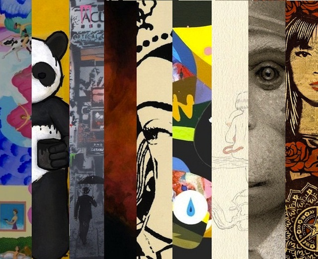
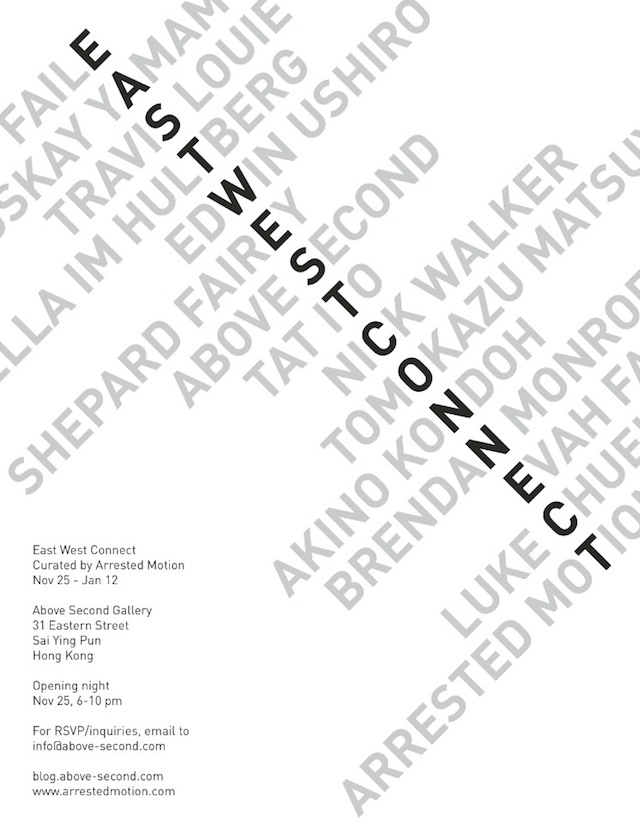
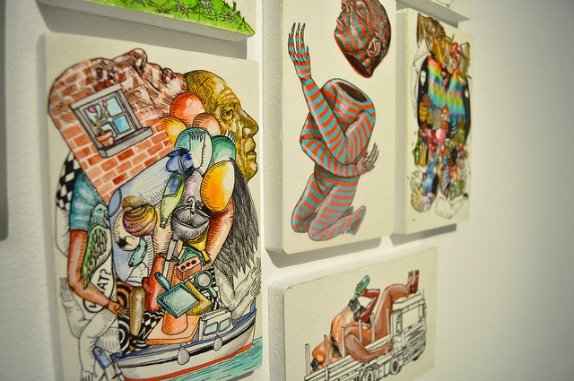
Vandalog’s friends at Arrested Motion have curated their first show, due to open this week in Hong Kong. East West Connect consists  of an impressive group of13 artists who are either of Asian heritage or whose art has been influenced by the Far East: Luke Chueh, Faile, Shepard Fairey, Evah Fan, Stella Im Hultberg, Tat Ito, Akino Kondoh, Travis Louie, Tomokazu Matsuyama, Brendon Monroe, Edwin Ushiro, Nick Walker and Yoskay Yamamoto.

East West Connect will be at Above Second from November 25th through January 12th, with an opening on November 25th.

MOMO is the man

Last month, I saw an installation by MOMO here in Philadelphia at Space 1026. Seeing the installation made me fall in love with MOMO all over again. Some of the first pieces of street art I ever noticed around London were his abstract wheatpastes, which stood out among a sea of logos and figures as something different and fresh. Since then, MOMO has been the artist whose work I think best exemplifies successful abstract street art. With street art, there is a tendency for galleries, blogs, festivals and magazines to stick to “easy” art, but MOMO doesn’t make art that you can look at for two seconds and leave alone. He changes environments. MOMO isn’t just putting up a photoshopped Batman stencil or whatever the kids are doing these days to get some hype. Nevertheless, MOMO has worked with Papermonster, FAME Festival, The Underbelly Project, Anno Domini and more. While staying just outside of this culture’s mainstream, it seems that MOMO has a lot of fans who, like me, keep him in the back of their mind at all times for his ability to push post-graffiti and street art forward and make spaces beautiful. That is to say, here’s an interview with MOMO after the jump… Continue reading “MOMO is the man”

Thinkers of This – Stinkfish and Other

Troy Lovegates

Stinkfish and Troy Lovegates aka Other are showing together now at Brooklynite Gallery now for their show Thinkers of This, but it’s almost over: Thinkers of This closes on November 26th. I wish I could have seen all this in person, but in case you’re like me and will only have a chance to see Thinkers of This online, here are some highlights:

Troy Lovegates
Troy Lovegates
Stinkfish
Troy Lovegates
Troy Lovegates
Troy Lovegates
Stinkfish
Stinkfish
Troy Lovegates

For a full set of images from the show, check out Brooklynite Gallery’s flickr.

Photos by Brooklynite Gallery

Two murals in the Canadian Arctic

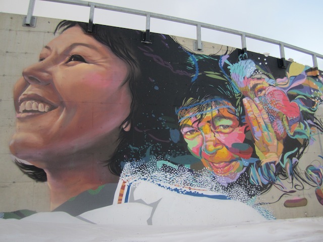
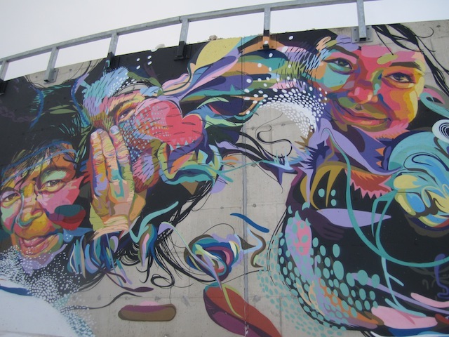
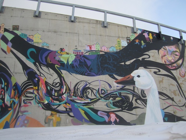
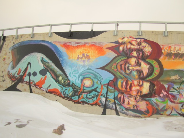
Thanks to a reader who sent in these photos, we’ve found out about two murals Iqaluit, the capital city of the territory of Nunavut in Canada. They were painted by Jonathan Cruz at the NuSchool Design Agency, Alexa Hatanaka and Patrick Thompson. It’s a pleasure to see that these artists are painting such great murals in such an unexpected location.

See more after the jump… Continue reading “Two murals in the Canadian Arctic”

Gaia in Europe Pt 1: Newcastle and Amsterdam

Click image to view large

Title: “Byker Wall” by Gaia : Edition: 33 , 2aps – 760mm x 540mm
Medium: Screen printed with 2 colours and hand painted on 300gsm somerset velvet
Paper: Somerset White Velvet 300gsm. Signed, Dated & Numbered by the Artist. £275.00 inc vat to purchase please visit OneThirty3’s online shop

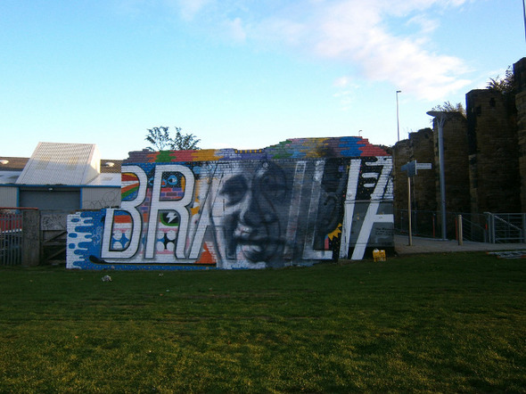
Thomas Daniel Smith (11 May 1915 – 27 July 1993) was a British politician who was Leader of Newcastle upon Tyne City Council from 1960 to 1965. A visionary of his time, Smith wanted Newcastle to become “the Brasilia of theNorth” through the implementation of massive redevelopment projects and slum clearence programs. His legacy included the Swan House in the center of the city which replaced the original Medieval streets with a large motorway and roundabout. Smith`s political career would eventually be destroyed by offering lucrative building contracts to local architects, the result of which were housing estates such as the infamous Cruddas Park project. Props to GMC crew for the wall and all of the help! Of course a big shout to Onethirty3 for flying me out and organizing the installation.

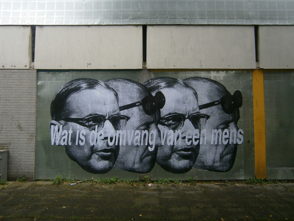
Portrait of Mayor Gijs van Hall and Corbusier interpolated by the phrase "What is the scale of a Human?" in dutch on an abandoned slab housing project in Bijlmermeer.

Bijlmer was designed by the department of City Development according to the strict tenets of CIAM. Constructed throughout the 60’s in striking resemblance to Le Corbusier’s Radiant City plan, by the time the massive towers were constructed, high modernism was already under vitriolic scrutiny by the architectural community. Intended to alleviate Amsterdam’s housing shortage, middle class never moved to the housing project in the wake of burgeoning suburbanization and a plummeting population in the center city.

Bijlmer became the dumping ground for unwanted immigrant communities and the city’s excessive drug problems. Only until recently, has the massive housing project been redeveloped into more mixed income housing with a diversity of uses and styles. Many of the block slabs have been leveled due to poor construction and maintenance but the remaining towers have been renovated into exceptional apartments. This piece was created on one of the last remaining vacant houses.

Photos by Gaia

Kickstart some films: Style Wars and the story of OBEY

There are two new Kickstarter projects that look very worthwhile for the graffiti and street art worlds. Kickstarter is the website where people can crowdsource funding for their ideas. Both of these projects are looking for about $30,000.

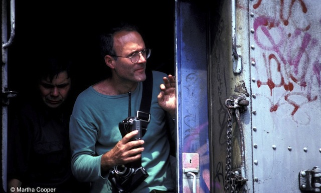
On the set of Style Wars. Photo by Martha Cooper

The first project is the restoration of the 30 hours of unseen outsides from Style Wars, the ultimate classic graffiti and hip-hop culture film for inclusion on a blu-ray rerelease of the film. Here’s what Henry Chalfant, a co-producer of the film, has to say about the project:

Shepard Fairey's first billboard takeover, done in 1990. Photo by el-pablo

The second film is a new one, but it also tells a true story from before I was born: Julian Marshall is a filmmaker currently attending RISD, the college that Shepard Fairey attended. He would like to tell the story of Shepard Fairey’s early career. Julian’s film will focus on Shepard’s first billboard takeover, pictured above, the idea for which came from a class assignment at RISD. It’s kinda like The Social Network for Shepard Fairey (so less coding and more bombing). Here’s what Julian has to say about his film:

Each of these films only have about 3 more weeks to reach their funding goals on Kickstarter. Any contributions or help spreading the word could make the difference that these ideas need to see the light of day. To support the Style Wars outtakes project, go here. To support the authorized OBEY origin story film, go here.
Photos by Martha Cooper and El-Pablo

Bien Urbain festival in Besançon, France

Sam3. Photo by E. Murcia Artengo

We’ve been posting images here and there from the Bien Urbain mural festival that took place in Besançon, France, but now photos of all the works are on flickr. These are a few of my favorite images (from Sam3, Hyuro, Moneyless, TBLR-ONE, Escif, Quillograma, Nelio, ), but definitely take the time to check out this Bien Urbain flickr set to see everything from the festival.

Hyuro. Photo by E. Murcia Artengo
Hyuro (detail). Photo by E. Murcia Artengo
Moneyless. Photo by D. Demougeot
OX. Photo by OX
TBLR-ONE. Photo by E. Murcia Artengo
Escif. Photo by E. Murcia Artengo
Quillograma and Nelio. Photo by Nelio

Photos by Nelio, E. Murcia Artengo, OX and D. Demougeot via Bien Urbain

Secrets and Sins – A look back at Sickboy’s Heaven & Earth

Despite an afternoon of heavy rain last Thursday, a large crowd was on hand to watch security struggle (literally) to open the doors of the Sickboy’s 3 day London show – Heaven & Earth.  However that delay, plus the relatively slow name checking procedure, mattered for no one as they caught a glimpse of the collection of visual delights that lay beyond.

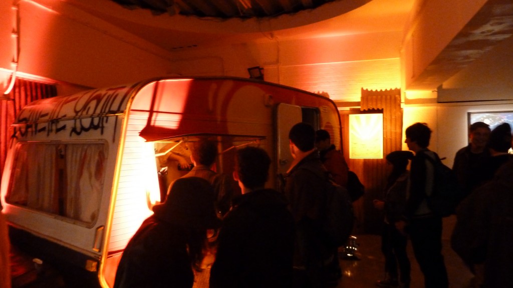
First up, upon peering into the large open room your eyes were drawn to a caravan standing proudly in the far corner.  Kitted out in the famous red and yellow Sickboy colours, it soon became apparent that this was actually the bar dishing out a variety of booze, and not surprisingly a large queue quickly formed.

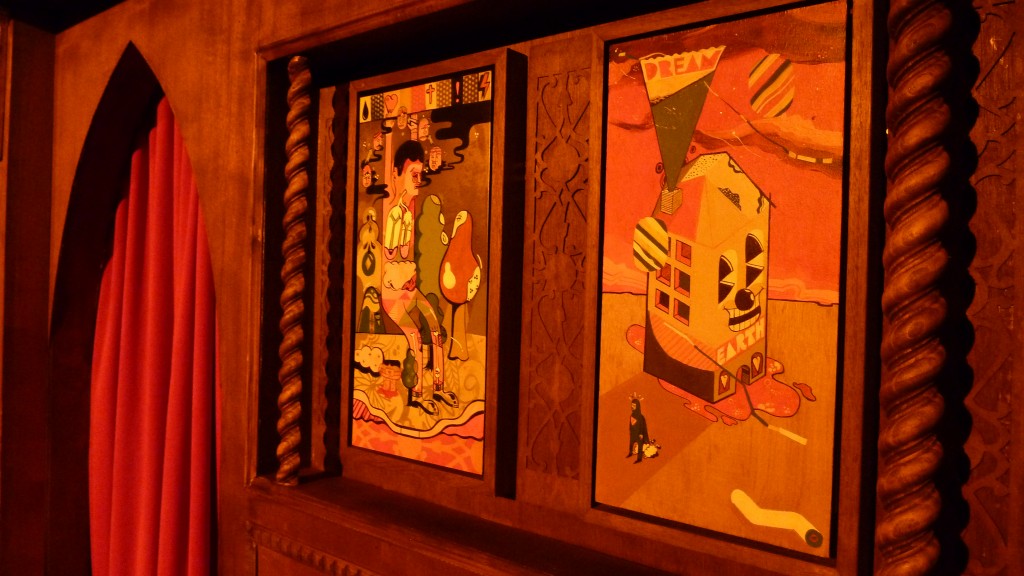
But whilst your gaze initially descended upon the brightly coloured mobile holiday home come drinks dispenser, it was impossible to ignore the plethora of meticulously-detailed paintings, riddled with their religious undertones that covered the walls.  Appropriately titled with names such as “King of Undesire”, “Critically Zen”, “Forget” and “Forgiven” these colourful masterpieces encompassed Sickboy’s own notion of heaven and earth. Fantastically detailed with sickly looking characters, rockets, angels, tags, trains, and the odd temple, this body of work was exceptional and a perfect example of how a street artist can translate their work from street to gallery. In fact many other artists should take note!

Prior to the show Sickboy allowed his website visitors to confess all, and get any sins they may have committed off their chests.  Promising to display each and every one, these unedited misdemeanours were projected onto a big screen for all to read.  I rather enjoyed the West End drug dealers who admitted to lacing their wares with a bit of laxative to ensure a messy end for their clients.  And of course there were plenty of sexual references to teachers and their daughter’s, girlfriends and their mum’s.

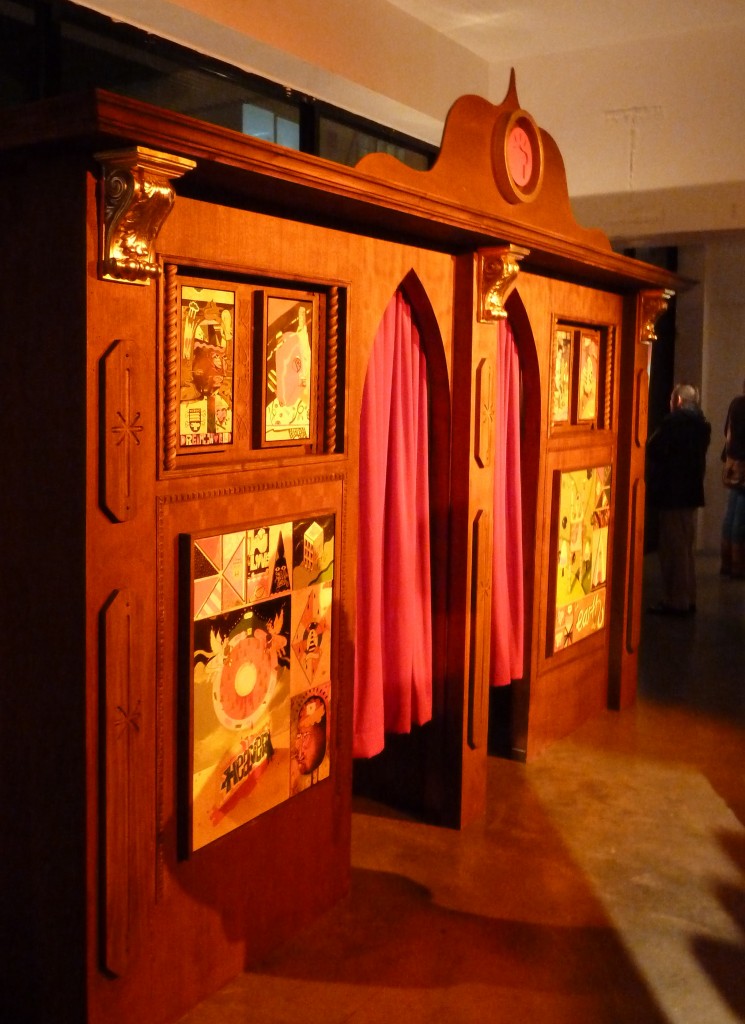
For all those last minute sins, or for those that just couldn’t think of one before the show opened, a large confessional booth equipped with a priest was on hand.  Although to be honest I am not sure how many visited the booth to confess or to just explore and view more of Sickboy’s artwork which adorned both the outside and in.  Maybe if the priest was hidden behind a screen some may have been more forthcoming, I certainly found it a little weird to just be stood in a small room with another bloke, let alone go ahead explain any times I may have misbehaved.

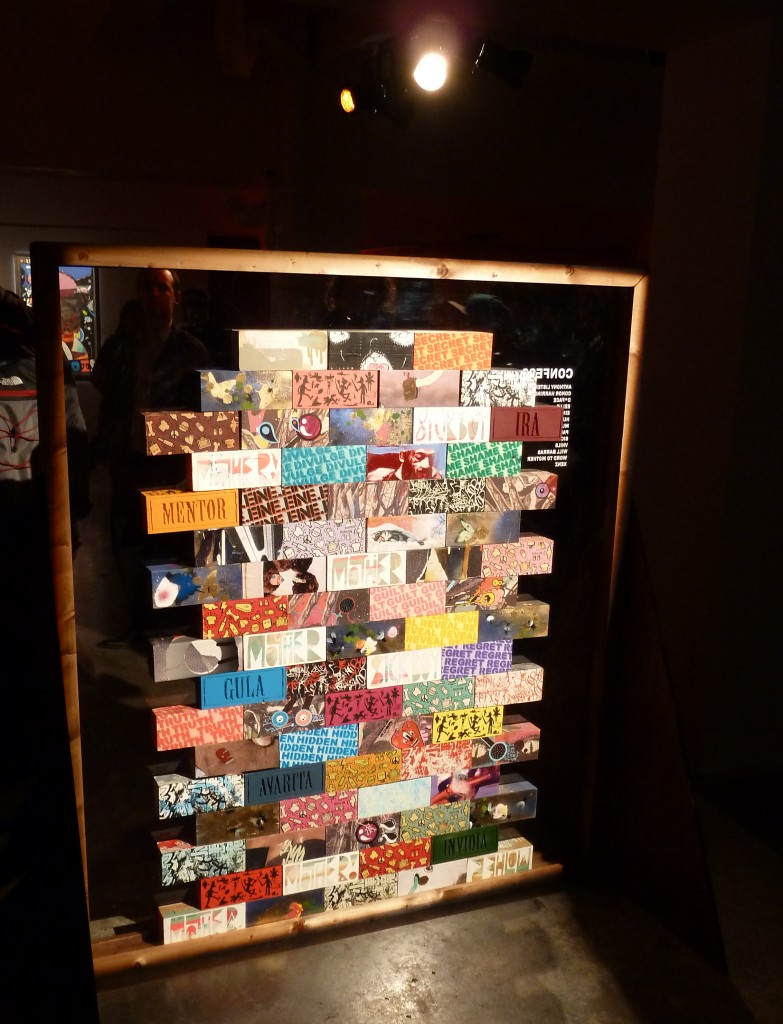
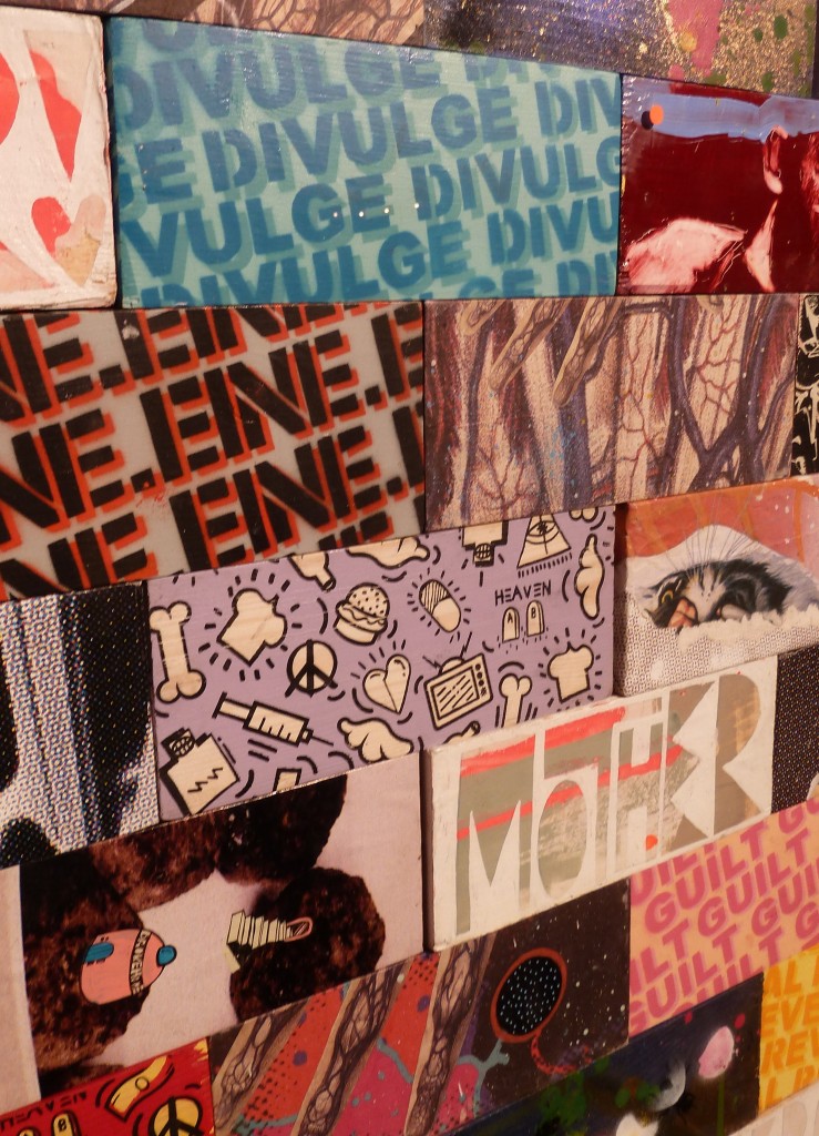
Whilst the show was billed as one based around four major installations, I personally felt they seemed to blend into each other and consequently it was hard to see each as individual entities.  However I have to admit that that was not necessarily a bad thing and the fourth and final of these installations was perhaps the one I was most looking forward to – a collaboration with 12 of Sickboy’s fellow artists and friends. It came in the form of a series of wooden bricks, a medium Sickboy has visited before, which were then stacked to form a wall. Designs and editions varied but I was most taken by the Word to Mother and Paul Insect collabs and a couple of the Conor Harrington’s. From a sales perspective the installation certainly seemed popular, but it may have just been the due to the sheer size of the space that I felt it became a little lost, maybe it was the fact that the bricks were not over the top.  Nevertheless I really liked the concept and execution of the individual bricks.

In short this was Sickboy at his best and by far my favourite show of the year so far, and I am sure that many in the packed out venue will agree.  This was street art meets gallery, street artist becomes fine artist. It’s just a shame it only lasted 3 days.

For more information about Sickboy head over to his website, and make sure you check out the gallery section as Ian Cox has done a much better job, that I have, of taking photos of each of the pieces from the show.

Photos by Shower.