Tim Hans shoots… D*face

Dface2

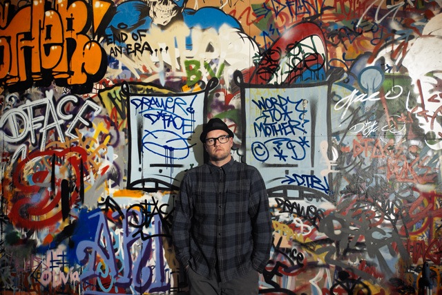
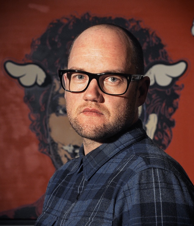
D*Face is a cornerstone of London’s street art community, both for his own art and for the work of his StolenSpace Gallery in Shoreditch. Tim Hans met up with D*Face at his studio for the latest in our continuing series of photo-portraits of artists by Tim Hans, and I asked him a few question about his work and the recent controversy with Charles Krafft, who has shown at StolenSpace Gallery.

RJ: Until recently, I was sure that one of the best shows I’d ever seen was the Charles Krafft and Mike Leavitt show at your gallery Stolenspace in 2010. Now, it’s come up that Krafft’s supposedly ironic work confronting white supremacy and Nazism is not so ironic after all, and that Krafft himself is a Holocaust denier and white nationalist. What’s your take on Krafft’s work in light of these revelations?

D*Face: I’ve thought long and hard about this topic and we’ve been asked by many to speak about his Holocaust denial statement. In truth, it is something that can only be answered by Charles himself, and I’m not even sure if the context of what he said has been altered and misreported. In my experience, I never felt any sense of him being a white nationalist in the conversations we’ve shared over for his shows, so if that is truly the case, he kept this extreme view very quiet for a long time.

What I will say is my father fought in WW2 and my grandfather WW1 and WW2 where they saw many atrocities that had been carried out under the banner of the Swastika and Hitlers Nazi rule, of which there’s no denying. I always found Charles Krafft a deeply interesting character, he has led an incredible life, often well off the grid, with people from very varied and extreme backgrounds and cultures. He has an air about him of being an antagonist, even anarchist, in the true sense of the word, which when combined with his life experience and amazing knowledge makes for a very complex character. I enjoyed talking to him in depth about the numerous, often bizarre, subjects he’d researched… you could even call ‘lived.’ It also wouldn’t surprise me at all if he’s spun all this to garner attention to his work, maybe not the best of ideas, but the saying ‘there’s no such thing as bad press’ could perhaps apply here… For me, his work is deeply challenging, uncomfortable and often disturbing, even when viewed prior to his recent statements. Do these recent statement make his work more or less powerful and provocative? Do you as the viewer have to share his alleged beliefs to appreciate his art and the challenging narrative? Maybe a more interesting debate would be ‘are we more interested in the artist than their art?’

RJ: The trend in recent years seems to be that artists who can get legal walls are going bigger and bigger, often leaving the small interventions behind, but you keep mixing things up outdoors with a combination of large, legal projects and tiny, simple interventions and everything in between. Why?

D*Face: That’s a really good question, and ironically I was pondering this recently while painting my biggest mural on a 60ft x 50ft wall in Puerto Rico. I spent 7 days up a cherry picker without a harness on unstable ground with the unsafe warning going off… I really thought LONG AND HARD about the ‘bigger is better’ legal murals that have become de rigueur. The answer to those big murals is the end result, the sheer volume of paint and impact, but there is a certain something lost. For me, it had always been about the ‘lurking’ round the corner intervention, the turning a corner and making that discovery that felt special, like you’re the only one that has found or seen it. The pieces that maybe only last a day or even less, but are able to change a passer byes day, put a smile on their face, or a frown… It’s those thoughts and ideas, the small interventions that still get me excited, as well as the big walls… I don’t think it can only be about scale, there’s always someone prepared to go bigger, more complex, paint faster, do more… but for me that’s not what it’s all about, so I’ll continue to try and mix it up.
Dface1

RJ: For me, your collaboration with Smirnoff is the quintessential example of an artist working with a brand in the right way, because you were able to make something that looked like your work rather than their vision of your work, but you got to use the massive resources of Smirfnoff to pull the project off. How did you pull that off?

D*Face: I really appreciate those words, thank you. Believe me, what wasn’t seen on the night was the years of discussions that went before it. It started off nearly 3 years ago with the ‘we’d like a bottle wrap, neck label’ email, which turned into an apprehensive meeting… at which point I said ‘thank you, but no thank you.’ But with all fairness to Smirnoff and Nude, the design agency who set the meeting up, they asked me back to present an open concept of what I would do as an ‘artist collaboration’… So I threw them some seriously full tilt ideas- the one that went ahead was probably about middle ground, so you can just imagine some of the concepts… but instead of running away scared, they fully embraced my idea and we set about making it actually happen. The problem of working with such a large corporation is that it takes a long time for the head to make the tail turn, and several times it was called off and then resurrected. Unfortunately, when you say with ‘the massive resources of Smirnoff’ it simply wasn’t the case. For what we achieved, we had a really tight, small budget and it was only by pulling in a huge favour from my friend, Ben Wilson, to help build and fabricate. By our resourcefulness, we managed to achieve that one night event to the level I aspired. I must say though, that at all times, Smirnoff kept with me on the concept and didn’t try and steer it back down the bottle wrap route, which seeing as thats the most obvious and well trodden route it would have been so easy for them to try and do.

RJ: What’s on the horizon? Anything you can hint at?

D*Face: Ok, you get the scoop. I have a new London solo show that is set to open in June this year… ‘New World Disorder.’ So, I’m in the thick of works and plans for that…It’s going to be really special– certainly a unique venue and event!

I’ve also just signed off the proofs for my long-in-the-works book that I’ve been working on in the background for well over a year. It is being published in September and I’m extremely pleased with how it looks. There’s a few other pretty exciting things in the mix, but I’m superstitious so until they’re 100% confirmed I’m keeping quiet!

Photos by Tim Hans
Sex or Suicide: Droid 907 says either way you’re fucked

SOS_van

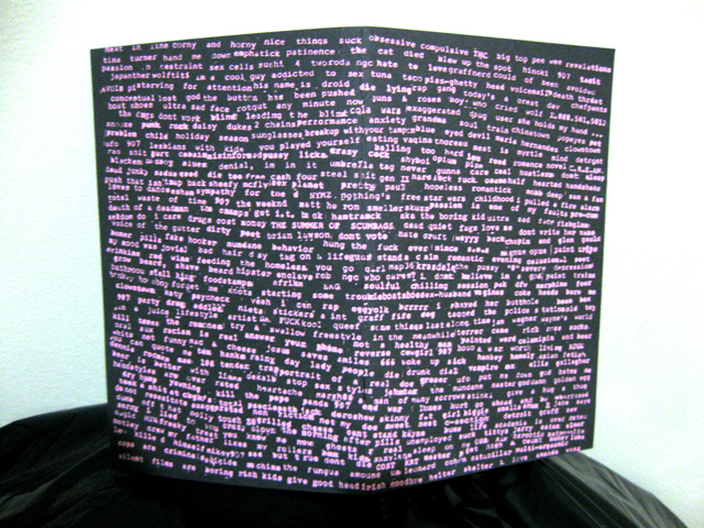
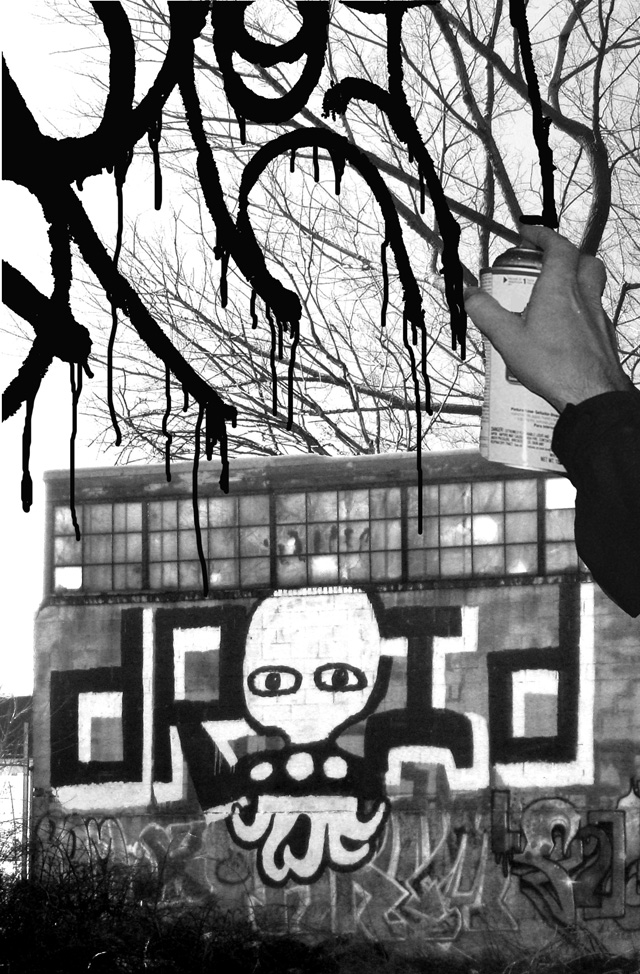
When I originally approached Droid 907 about his latest zine, Sex or Suicide (Either Way You’re Fucked), it was described as simultaneously the most honest book about graffiti and a collection of lies. This inability to distinguish which stories are strange enough to be true or perhaps so outlandish that they must be fabricated heightens the experience. From tomes written on a buffed square of an abandoned facade to gritty, type-written pages, Droid explores the limits of his medium, in both graffiti and storytelling. Through these pages, the often enigmatic but ever present force of New York graffiti slowly peels back the layers behind his “Droid” persona, or perhaps adds more if the stories are in fact fabricated. With 40 pages of travels, redacted locations, and a cover silkscreened by Bushwick Print Lab, S.o.S. is Droid’s most visceral text to date.

SOS_final_04

Following a few month span in the artist’s nomadic lifestyle, readers are placed in media res, with no prior knowledge of the author’s relationships with those he encounters. You are suddenly left on the side of the tracks with no contextualization, in an anarchistic manner that mirror’s the text’s aesthetics. To help illuminate the backstories of a few of these individuals, as well as his own artistic practice in creating Sex or Suicide, Vandalog conducted a brief interview with Droid.

Continue reading “Sex or Suicide: Droid 907 says either way you’re fucked”

Documentary – Children of The Iron Snake

Children of the Iron Snake - Cover

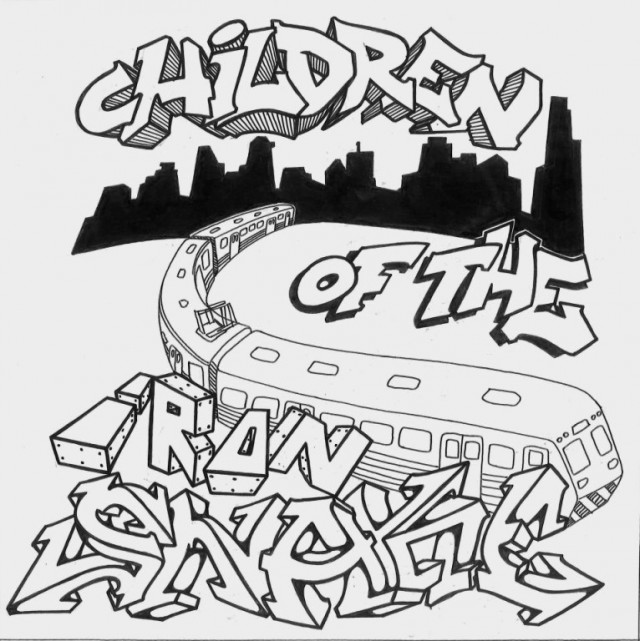
Pinched this post from Invurt, an absolute MUST see documentary on Melbourne’s graffiti and street art culture. From our awesome train graffiti to street art and gallery art; this documentary gives a great insight into the city I love and the amazing graffiti and street art that I’ve loved since I 1st got on a train as a kid. The movie features friends, favourite artists and familiar places so that makes it even more special.

From Invurt: “Created by Alex MacBeth and Miriam Hison, the documentary ‘Charts the development of the Melbourne street art scene,’ Children of the Iron Snake looks at the last thirty years and tracks the journey of graffiti from railway junctions at night to festivals, abandoned factories, rooftops, drains and galleries. Comprising interviews with over 15 artists, as well as criminologists, anti-graffiti activists, and politicians, the film offers a in-depth look at one of the biggest art movements of our time.”

Check out the preview below.

The FULL film is available online here. Make sure you check it out.

sz zs play with paper

sz zs 3

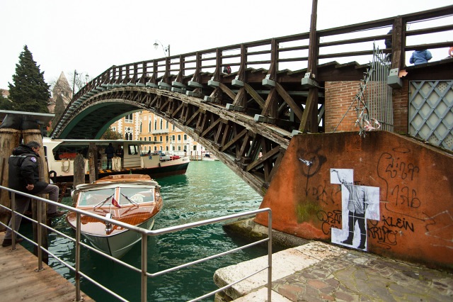
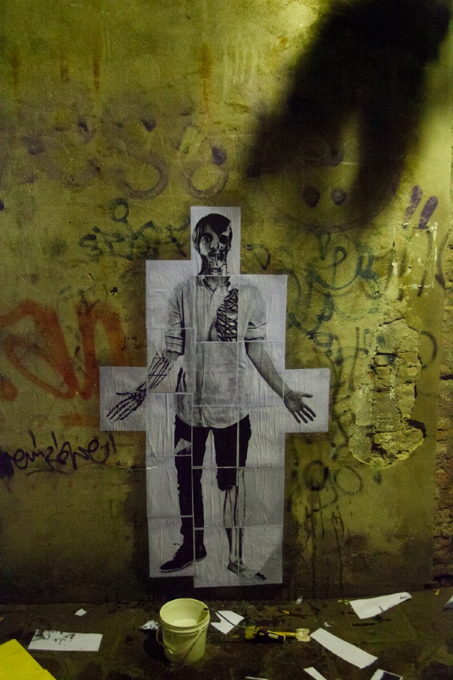
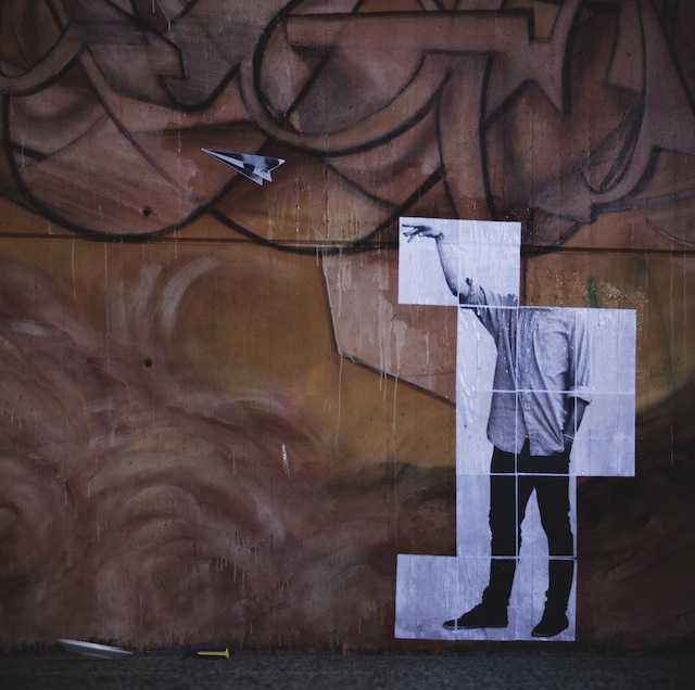
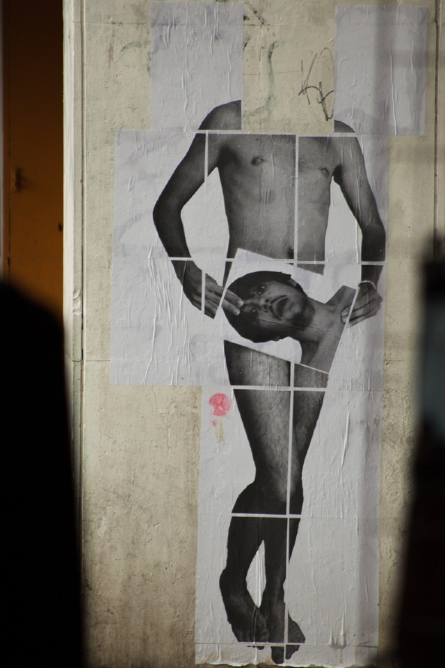
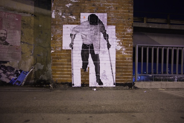
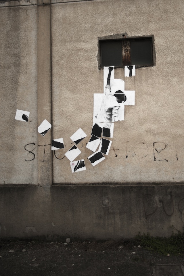
Pretty much the most amateur thing you can do if you want to wheatpaste a giant poster is to print it out on a bunch of 8.5″ x 11″ sheets and paste them up in a grid. It’s gonna be complicated and probably look terrible. Unless you are part of the Italian street art duo sz zs. They make that 8.5″ 11″ grid work work amazingly well by playing with the possibilities it provides. I’m not artist, but I must say, in my experience as an observer, playing with the constraints you are given rather than staying within them or foolishly trying to ignore them is a one very important secret to successful artwork.

sz zs have been getting up in Venice for a little under a year, and I very much look forward to seeing where they take their project next.

sz zs 2

-2

sz zs 1

-3

-1

Photos by sz zs

Watch: OBEY THE GIANT, first Shepard Fairey biopic, now online

C9noj

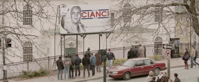
OBEY THE GIANT, the long-awaited short film by Julian Marshall, is now streaming for free online. The film tells the story of Shepard Fairey‘s first billboard takeover, which he did for an assignment while he was at the Rhode Island School of Design. This is not a documentary with grainy footage from 20 years ago. It is a biopic staring Josh Wills as the college-aged Shepard Fairey. Such a cool project. A must-watch for fans (and also probably haters) of Shepard Fairey. I’m glad to be able to share OBEY THE GIANT with you here:

OBEY THE GIANT – The Story of Shepard Fairey from Julian Marshall on Vimeo.

Photo courtesy of OBEY THE GIANT

Henrik Haven’s Copenhagen – Part 1

Click to view large
Click to view large

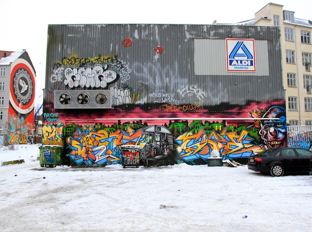
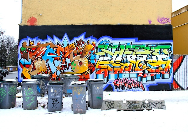
It’s damn near impossible to get a sense of a city’s street art or graffiti from a handful of shots, but Henrik Haven has gone above and beyond with this set of photos of graffiti in Copenhagen. We’ll be posting the photos in four parts over the next few days. Rather than mention some artists in the photos and neglect others, I’m just going to leave the photos without artist credits. Read the names if you’re interested in who painted what.

01 IMG_1658
Click to view large

01 IMG_3539

Continue reading “Henrik Haven’s Copenhagen – Part 1”

All the KATSU news that’s fit to print

KATSU at Eyebeam for F.A.T. Gold

KATSU, one of my favorite writers of all time, has had quite a week. I was just going to throw these things in the weekend link-o-rama because other blogs have covered the events so well, but then stories about KATSU just kept piling up. So, here they are:

Photo by Dani Mozeson

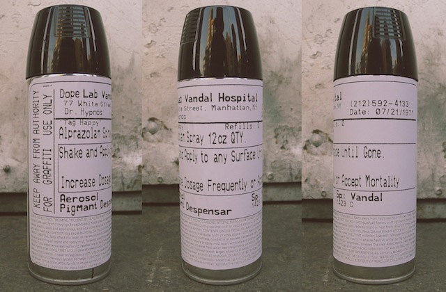
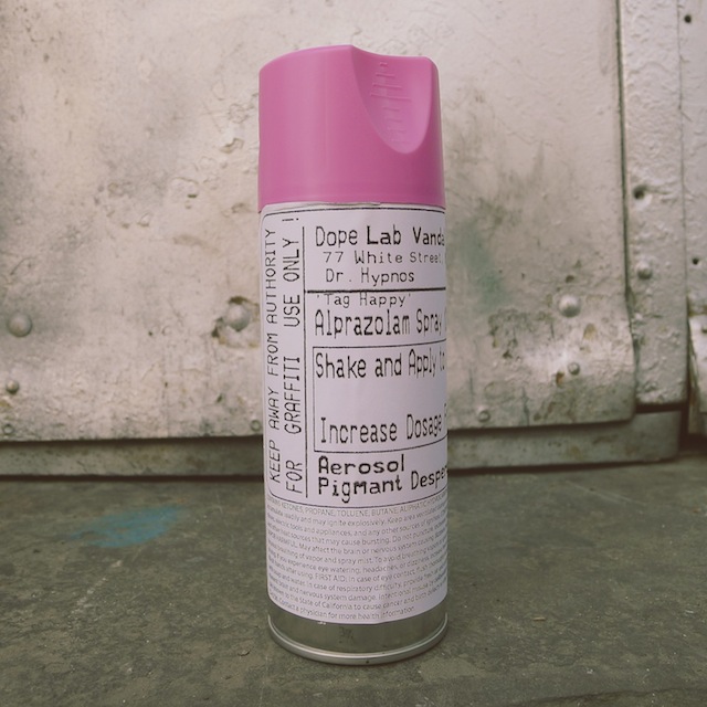
Tag Happy, Rx Uppers – spraycan sculptures by Caroline Caldwell

Cans

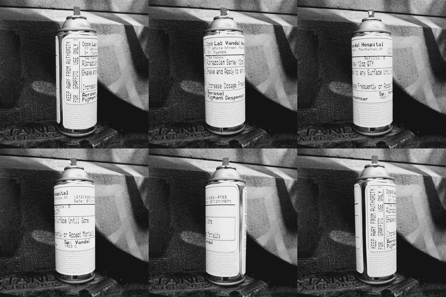
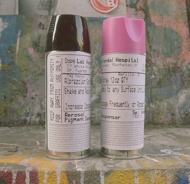
Vandalog is proud to announce the latest product in The Vandalog Shop and our second product in the shop by a Vandalog contributing writer. Tag Happy, Rx Uppers is an edition of sculptures by Caroline Caldwell. These relabeled spray cans include veiled references to key people and places in the history of graffiti. How many can you spot?

Two cans 640

Tag Happy, Rx Uppers comes in black or pink versions, each an edition of 10 which are signed and numbered on the underside of the sculpture. When shipped within the continental United States, Tag Happy, Rx Uppers will arrive as a full can of real spray paint. For all other orders, the cans will be emptied and a small hole will be put in the bottom of the piece. Tag Happy, Rx Uppers are available now at $22 for one black or pink sculpture, or $40 for a matching set of black and pink pieces. Each sculpture also comes with a set of handwritten instructions.

three cans 640

I’ve had an early version of the Tag Happy, Rx Uppers sitting on my shelf for the last year alongside sculptures by artists including Faile, Sweet Toof, and Skewville, and it more than holds its own against those classics. Caroline’s sense of style is perfectly encapsulated in these pieces, and they’re a friendly reminder for the vandal in all of us.

Starting today, you can find Tag Happy, Rx Uppers in The Vandalog Shop.

pink can 640

Photos by Caroline Caldwell

Art.com to compensate street artists whose work they sell

6207134565_68a3169699_z

Wooster Collective announced tonight that they have been and will continue to be working with Art.com to solve a very frustrating problem that many street artists face: Photographers will take pictures of street art and graffiti and then license those images to online and physical shops around the world so that they can be printed onto t-shirts, canvases, posters, bags, clocks, and other knick knacks. The street artists and graffiti writers get no money from the sale of these photographs. While I’m not a big fan of our current copyright laws and I’d rather they be much more lax, this is pretty clearly a case where the morally right thing to do would be to pay the artists whenever possible.

Art.com is a major online seller of these offending photographs. According to Marc and Sara Schiller of Wooster Collective and at the couple’s urging, Art.com “has agreed to remove every photograph of street art in which the artist who’s work is in the photograph is not being compensated, and does not want photographs of their street work to be sold in this manner.”

As for how things will work under this new arrangement, the Schillers write:

While we’re still working out the details, in the coming weeks we will be working with Art.com to help identify the artists who’s work is being featured in over 600 street art photographs currently being sold on the site. If the artist wishes to have the photograph removed, Art.com has agreed to remove it. If the artist wishes to replace the existing unauthorized photograph with a new photograph or image that they own themselves, we will be assisting the artist in putting a licensing agreement in place for their work to be sold on the site.

This is exciting news for street artists and graffiti writers everywhere. It doesn’t solve the problem entirely since Art.com is not the only company currently selling street artists’ work in this manner, but it is a step in the right direction. The exact copyright issues could be debated in court, but Art.com has done the right thing in offering artists the opportunity to control their work if they wish to do so.

This all came about because the Schillers and Evan Pricco (Editor-in-Chief of Juxtapoz) will be having a public conversation this coming Thursday evening in NYC at an event sponsored by Art.com.

Read more about Art.com’s new policy and the upcoming conversation between Marc, Sara, and Evan over at Wooster Collective.

Photo by canonsnapper