Joachim Ixcalli around Spain

swabnuralw

Joachim Ixcalli is originally from California, but now based in Barcelona, Spain. His style mixes influences from both of those regions in what he calls a Pacific-Mediterranean style. That’s all fine and dandy, but I like it for the juxtaposition of elements in the foreground and background.

tud5_36_2000

razz2013w_2000

poblenoumural12w

Joachim Ixcalli and Spogo

growtheeffvpW_2000

Photos courtesy of Joachim Ixcalli

PAL Crew at NYC’s Klughaus Gallery

-1

Klughaus Gallery is about to introduce Paris’ Peace And Love (PAL) Crew is about to the people of New York City with Palingenesis, a show with eight members of the illustrious crew. Like their fellow Frenchmen in the DMV Crew, the members of PAL fuse graffiti, illustration, and fine art. The PAL Crew of course includes the rising stars Cony aka Ken Sortais and Horfe, among others.

Palingenesis opens this coming Saturday (6-10pm) at a new pop up space for Klughaus on the Lower East Side (154 Stanton St. at Suffolk St.). The opening is sure to be a madhouse, so be sure to RSVP.

Palingenesis feat. Gorey & PAL Crew (Klughaus Pop-up Exhibition) from Klughaus Gallery on Vimeo.

Photo courtesy of Klughaus Gallery

Carlos Mare, Remi Rough and more in Marrakech

REMIROUGH_Equilibrium_IV
Remi/Rough

David Bloch Gallery in Marrakech, Morocco has a show opening up this month with a group of really interesting artists. Unfolding includes work from Carlos Mare, Derm, Jaybo Monk, LX One, Remi/Rough and Steve More. These artists form part of the Agents of Change collective, and they all come from a graffiti background. Rather than resting on those laurels, the Agents of Change are now bringing the same intensity and drive for constant improvement to their fine art and murals that they brought to graffiti.

Unfolding openings May 10th and runs through June 8th.

Photo courtesy of Remi/Rough

Kidult and Barbara Kruger respond to Supreme craziness

Suepreme by Kidult
Suepreme by Kidult

Update: gilf! sent me this screenshot from a post on Instagram by @willnyc. @13thwitness is Tim McGurr, the son of Leonard McGurr aka Futura. Futura designed the original Supreme logo. Futura’s daughter Tabatha McGurr blogged for years on the Married to the MOB website. @willnyc’s post went up before Kidult’s image. A case of “it’s a small small streetwear world” and “Suepreme” was an inevitable and obvious gag for people to pick up on, or (and this is a total conspiracy theory) a case of collaboration between Supreme and Kidult, facilitated by Tim McGurr? Thoughts? This isn’t the first time Kidult has been suspected of working for the brand he is supposedly skewering. And of course, even if Supreme didn’t hire Kidult, there’s the argument that even a “Suepreme” parody t-shirt is still a great advertisement for the real Supreme.

Supreme is suing Married to the MOB’s Leah McSweeney for the Supreme Bitch t-shirts that she’s been making for the last decade or so. In response, Barbara Kruger (the obvious inspiration for Supreme’s logo and an artist who many people do not realize got her start on the street) commented on the lawsuit with this Word document.

Other artists have taken to commenting on the ridiculousness of this suit as well, most notably Kidult. The artist known for painting his name on storefronts (including Supreme’s NYC shop) who have appropriated graffiti aesthetics for fashion or advertising purposes is going to be giving away free t-shirts on his website today with the above “Suepreme” graphic.

Kidult’s Suepreme shirts will be available for free at 3pm east coast time from his web “store”.

Weekend link-o-rama

Smells, Cash4, Don Pablo Pedro and Keely

Last class of the school year yesterday. Now for finals. Can’t wait… Here are some distractions in case you’re in a similar boat:

  • NoseGo has some new prints available today with Unit44. These are not giclee prints, but rather archival pigment prints, a significant step up in quality as I understand it.
  • The fantastic ceramic street artist Carrie Reichardt is organizing this show in London.
  • Great sculptural installation and indoor mural by Pixel Pancho in Mexico City.
  • Loving this collaboration between Kofie and El Mac.
  • S.butterfly has photos of the Bom.K show in Paris. Wish I could see this one in person.
  • And Kaws has a solo show in Tokyo at the moment. It’s Kaws, so feel free to check out the photos, but you pretty much knows what’s coming.
  • JR and José Parlá collaborated on a mural on the outside of Bryce Wolkowitz Gallery, where they have a two-man show opening next week. Glad to see Parlá working outdoors, but it always strikes me as a bit odd since he tries to distance his work from graffiti. I guess when there’s a show to promote… Although to be fair, the show is about a series of collaborative murals that JR and Parlá made together in Cuba.
  • JR’s Inside Out project booth in Times Square is a huge hit. He’s been covering the street with photos of people who stop by his little photobooth, and it looks awesome. The billboards in Times Square were even (briefly) given over to JR for the project. The whole thing is a fight against outdoor ads and for public spaces for the public, but JR manages to make his point without beating people over the head with politics. Instead, JR just shows people a better world and makes them smile. I’m not a JR fanatic, but I absolutely love this project.

Photo by Hrag Vartanian

Jaz solo show this week in Antwerp

photo_1

Artifex Gallery in Antwerp, Belgium has a solo show from Franco Fasoli aka Jaz coming up on Friday. Jaz is one of my favorite muralists, and I think I like his indoor work even more. Dude can paint. Battlefield will include new paintings as well as studies on paper. Those works on paper sure to be great as well. His sketch in my blackbook, done in just a few minutes, is one of my favorite pieces in my collection.

Battlefield opens this Friday, May 3rd, at 6pm, and runs until May 26th.

Photo courtesy of Suben

Barry McGee at the ICA/Boston

Photo by Chase Elliott Clark

Earlier this month, I visited the Institute of Contemporary Art/Boston for the opening of Barry McGee, a retrospective of McGee’s work that had come to Boston after first being shown last summer in Berkley, California at the Berkeley Art Museum and Pacific Film Archive.

falco 2
Photo by Pat Falco

Barry McGee is a mid-career retrospective and the most extensive museum exhibition of McGee’s career to date. This version of Barry McGee is somewhat smaller than the version in Berkley, and so a few large works are not included, but this version also included a few pieces that were not seen at Berkley, more specifically work by Boston artists and graffiti writers and a bit of new work by McGee. Since the exhibition is a retrospective, Barry McGee includes sculptures, paintings, drawings, zines, ephemera, etchings and video works by McGee from the early 1990’s all the way through to 2012, although even the old work is not quite the same as it once was because McGee likes to rearrange his old work into new configurations and shapes whenever possible. In addition to work by McGee, there were artworks and ephemera by about a dozen other artists whom McGee included in the show. It is not quite an official part of the show, ICA adjunct curator Pedro Alonzo also arranged for McGee to paint a mural on the back of Boston’s House of Blues theater. Despite the title, the show seems to be an effort by McGee to take advantage of his position as a “museum-ready artist” by bringing the work of his friends into the museum galleries too and to highlight the significance of the kind of graffiti that many people find ugly and undesirable.

Photo by Chase Elliot
Photo by Chase Elliot Clark

In Ben Valentine’s review on Hyperallergic of the Berkley version of Barry McGee, Valentine completely missed the mark and misunderstood McGee’s work and what was going on in the show. Valentine repeatedly refers to McGee as a “street artist” or his work as “street art”, a mistake that was made in some of the Boston press as well, perhaps because street artist is a more institutionally acceptable term than the much more accurate “graffiti artist” or “graffiti writer”. Valentine also claimed that there were sculptures all around the show of McGee tagging walls, and suggested that this might be some sort of mid-life crisis/street-cred proving move by McGee to show that he is still authentic. In fact, practically the opposite is true. Those sculptures actually depict McGee’s assistant Josh Lozcano and help to point out that McGee is older and that he is not longer as directly as involved in the culture he grew up in as he might like to be, whereas Lozcano is from a slightly younger generation and continued on as an active and accomplished writer long after McGee went into his current stage of semi-retirement.

Photo by Pat Falco
Photo by Pat Falco

Similarly, at the opening at the ICA I heard multiple people asking docents what the letters “THR,” “CBT,” or “DFW” stood for or meant (the letters appear throughout much of the work in the show). The docents were either unable to answer or radioed in to their superiors and then explained that the letters were acronyms for “The Human Race” and “Down For Whatever,” but the significance of the letters is much more important than the meaning. DFW, CBT, and THR are graffiti crews that McGee is affiliated with. McGee is repping his crews in his own way, now that he has the attention of museum-goes and does not have the freedom to go out writing graffiti as much as he once did. Of course volunteer docents cannot be expected to know everything about every exhibition, but if McGee’s show has meaning beyond “these are some cool drawings I did,” it has to do with graffiti’s relationship to the museum and the community spirit of graffiti versus the one-man genius model of the museum.

Photo by Pat Falco
Photo by Pat Falco

McGee is subversive to a point that he probably gets in his own way sometimes. He is clearly uncomfortable in galleries and museums, even though he has exhibited his work indoors for about two decades. This discomfort about and subversion of museum norms is the hidden theme of the show, which McGee successfully sneaks into the museum.

Paintings by Margaret Kilgallen inside a structure painted by McGee. Photo by Pat Falco
Paintings by Margaret Kilgallen inside a structure painted by Barry McGee. Photo by Pat Falco

The elements of Barry McGee that McGee himself made sure were included, and a few pieces that may have been added by curators but which it seems likely McGee had a good amount of say in including, point towards his attempts to subvert the museum and their model of a one-man retrospective even when it is about his own work. The show includes the work of at least a dozen other artists, and, in a video tour of the exhibition by curator Jenelle Porter, Porter points out that McGee’s video installation is made up of animations and video clips created and organized by McGee’s assistant Lozcano. Some of the other artists whose work can be found in the show include McGee’s late wife Margaret Kilgallen, his father Jon McGee, Craig “KR” Costello, more than half a dozen freight train moniker writers, and Rize (a prominent Boston-based graffiti writer in the early to mid 1990’s and the subject of a photograph which has appeared repeatedly in McGee’s work since the mid-1990’s). McGee even devoted an entire room of the exhibition to showing his work alongside the work his friends and legendary Boston graffiti writers who would otherwise not have had the opportunity to show inside the ICA. Lozcano’s chaotic tower videos and animations also include clips of other graffiti writers at work next to animations of McGee’s drawings, and at this point it becomes hard to say anymore exactly how many of McGee’s colleagues are represented in the show because there are dozens of video clips with fast cuts that all seem to melt together in the massive installation. Some would say that graffiti is about ego, and that can certainly be said of the upper-echelons of the art world, but McGee broke the stereotypes to subvert the museum and turn his supposed one-man retrospective into a celebration of many artists and mark-makers.

Photographs by. Photo by Pat Falco
Photographs by Craig “KR” Costello. Photo by Pat Falco.
Photo by Pat Falco
Photo by Pat Falco

Outdoors, the trend of subversion of norms and inclusion/celebration of graffiti culture and community continues. Rather than putting his name (TWIST) on the wall on behind Boston’s House of Blues, we get Lozcano’s name (AMAZE) in huge letters next to an almost equally massive OKER tribute piece (OKER is currently serving time in prison in the UK for graffiti, and has painted with Lozcano and McGee before). McGee put up the names of people who would better fit the wall, since the wall can be seen from the highway coming into Boston, and there is plenty of illegal graffiti to see nearby along the highway. And the names were put up so that they resembled graffiti except on a massive scale and with permission, subverting the traditional expectation that a mural should look nothing like graffiti, or even cover it up. Murals like this are nothing new for McGee, but I am still explaining it in detail because it was one more subversive move to highlight more authentic graffiti and shine a light on a couple of the deserving artists whom the ICA would otherwise ignore or not be aware of at all.

Photo by SRIMA
Photo by SRIMA

So is McGee successful in his efforts? Yes and no. He is successful in bringing those close to him into the museum along with him, but what is less clear is whether or not anyone has noticed. Given Valentine’s review of Barry McGee in Berkley and questions by visitors that went unanswered or poorly answered, it seems that McGee has only succeeded half way. Has anyone who was not already in on it has noticed his subversion? If you do not already know what DFW and THR mean, you probably are not going to discover their meaning by staring at one of McGee’s paintings. On the other hand, those who have been included seem happy, and the irony of OKER’s name being included in such a respectful way on a legal wall while he sits in prison for illegal graffiti is likely to be appreciated by the graffiti community. So maybe McGee’s subversion is a sort of secret subversion. For those who know, the show is bit of a coup. For those who do not know, things are business as usual, and that’s fine.

Photo by Pat Falco
Photo by Pat Falco

Barry McGee is the ICA/Boston’s fourth time bringing someone from the street art or graffiti world into their museum, and of the other attempts I have seen (with the work of Os Gemeos and Swoon) it is the most successful. Barry McGee is full of strong work, it provides a good introduction to McGee without being repetitive, and McGee still manages to let his true self shine through by subverting the museum’s goals somewhat and turning the show into a show about real graffiti and community, if you are in the know. At the same time, I fear that the ICA has missed the point of their own show and failed to see McGee’s true brilliance, so the success seems somewhat accidental.

For more photographs of the show, check out Brooklyn Street Art (who seem to agree that this show is really about community) and Arrested Motion.

Photo by RJ Rushmore
Margaret Kilgallen and Barry McGee. Photo by RJ Rushmore

Photos by Pat Falco, Chase Elliot Clark, SRIMA, and RJ Rushmore

Ever prints at Each / One

Description

Fans of Ever, it’s time to rejoice. I’m a sucker for affordable art, and Each / One is providing just that right now with 7 prints measuring 11 x 14 inches and available for just $20 each. The idea behind Each / One is that releases are limited not by quantity but by time. So, these prints are available now, but after May 28th, no more will be printed. So it’s still a limited release, just in a slightly different way than we’re used to with prints.

Ever’s show on Each / One, Fallas en el Sistema – Technical Flaws, is on now through May 28th. Be sure to have a look before you forever miss your chance to pick up one of these prints at a great price.

Explanation of personal contradictions

Images courtesy of Ever

Tim Hans shoots… D*face

Dface2

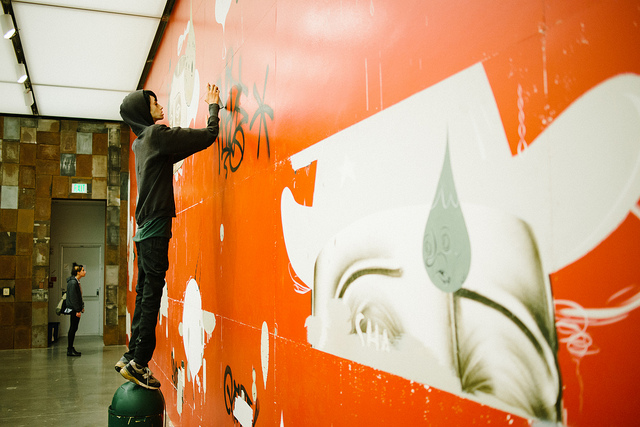
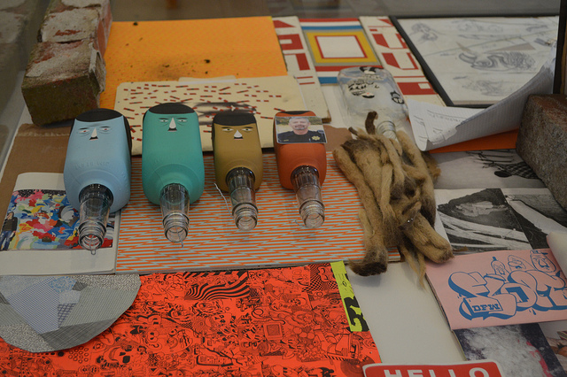
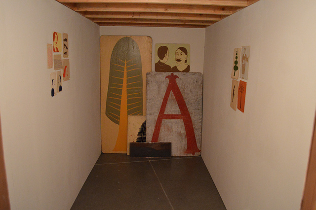
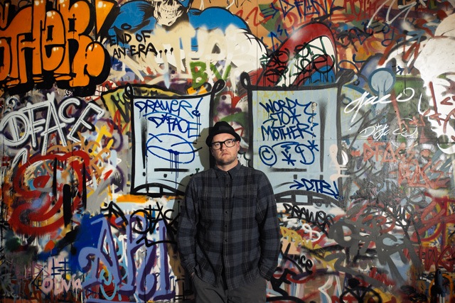
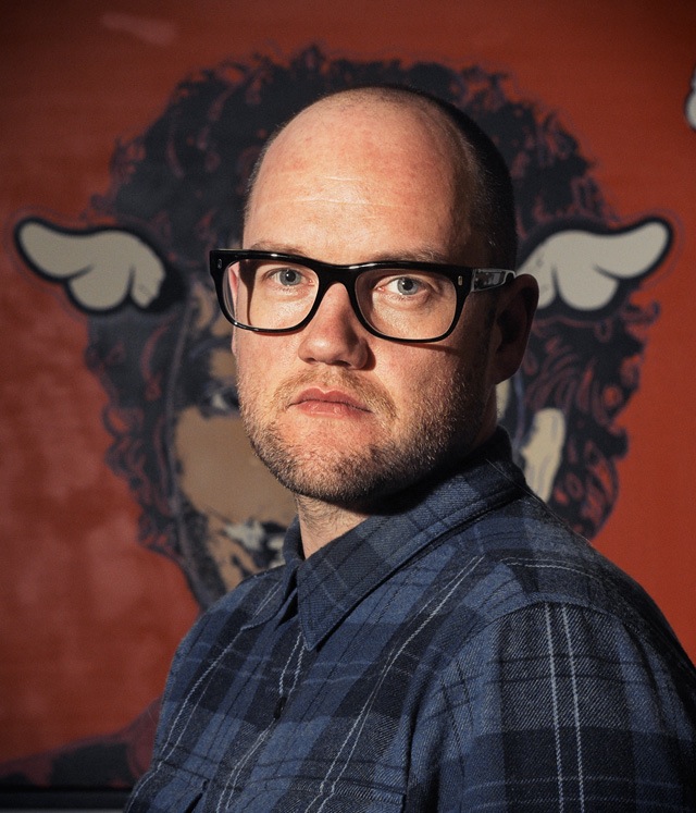
D*Face is a cornerstone of London’s street art community, both for his own art and for the work of his StolenSpace Gallery in Shoreditch. Tim Hans met up with D*Face at his studio for the latest in our continuing series of photo-portraits of artists by Tim Hans, and I asked him a few question about his work and the recent controversy with Charles Krafft, who has shown at StolenSpace Gallery.

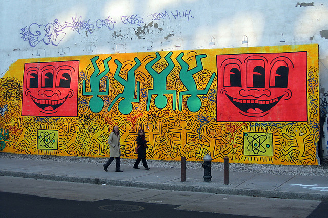
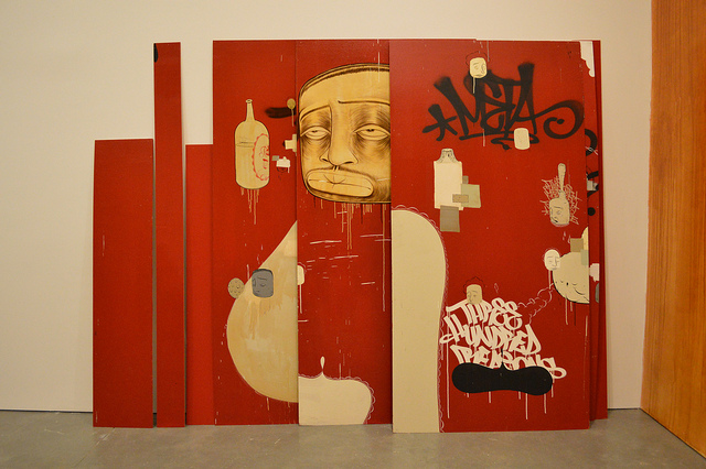
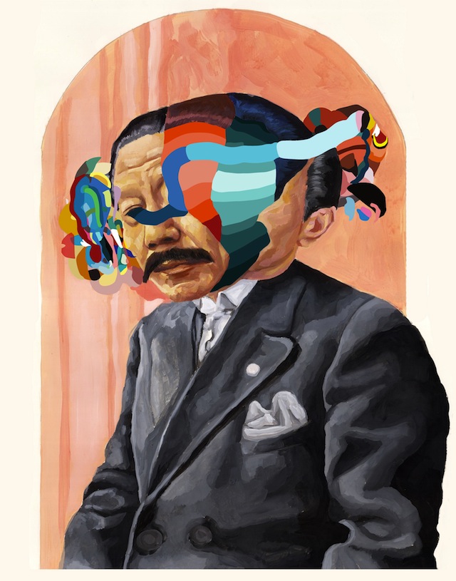
RJ: Until recently, I was sure that one of the best shows I’d ever seen was the Charles Krafft and Mike Leavitt show at your gallery Stolenspace in 2010. Now, it’s come up that Krafft’s supposedly ironic work confronting white supremacy and Nazism is not so ironic after all, and that Krafft himself is a Holocaust denier and white nationalist. What’s your take on Krafft’s work in light of these revelations?

D*Face: I’ve thought long and hard about this topic and we’ve been asked by many to speak about his Holocaust denial statement. In truth, it is something that can only be answered by Charles himself, and I’m not even sure if the context of what he said has been altered and misreported. In my experience, I never felt any sense of him being a white nationalist in the conversations we’ve shared over for his shows, so if that is truly the case, he kept this extreme view very quiet for a long time.

What I will say is my father fought in WW2 and my grandfather WW1 and WW2 where they saw many atrocities that had been carried out under the banner of the Swastika and Hitlers Nazi rule, of which there’s no denying. I always found Charles Krafft a deeply interesting character, he has led an incredible life, often well off the grid, with people from very varied and extreme backgrounds and cultures. He has an air about him of being an antagonist, even anarchist, in the true sense of the word, which when combined with his life experience and amazing knowledge makes for a very complex character. I enjoyed talking to him in depth about the numerous, often bizarre, subjects he’d researched… you could even call ‘lived.’ It also wouldn’t surprise me at all if he’s spun all this to garner attention to his work, maybe not the best of ideas, but the saying ‘there’s no such thing as bad press’ could perhaps apply here… For me, his work is deeply challenging, uncomfortable and often disturbing, even when viewed prior to his recent statements. Do these recent statement make his work more or less powerful and provocative? Do you as the viewer have to share his alleged beliefs to appreciate his art and the challenging narrative? Maybe a more interesting debate would be ‘are we more interested in the artist than their art?’

RJ: The trend in recent years seems to be that artists who can get legal walls are going bigger and bigger, often leaving the small interventions behind, but you keep mixing things up outdoors with a combination of large, legal projects and tiny, simple interventions and everything in between. Why?

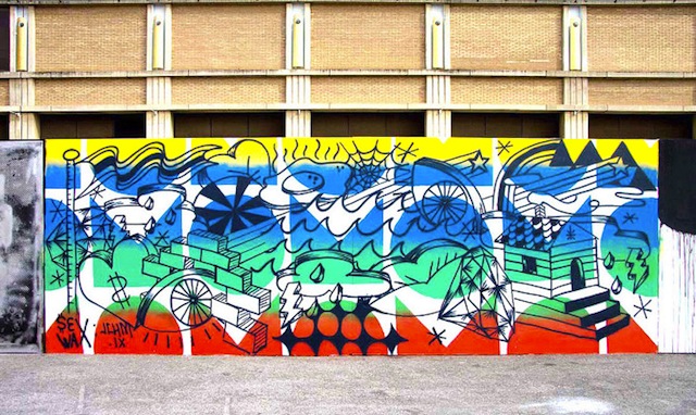
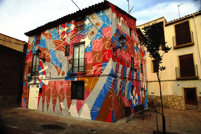
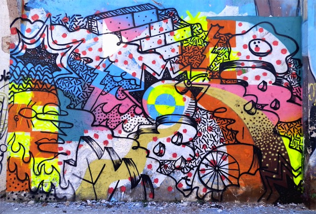
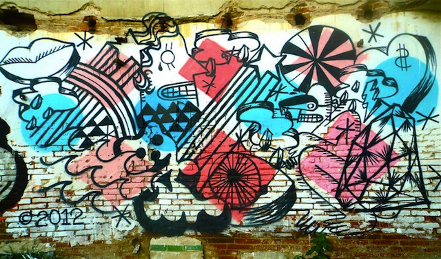
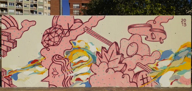
D*Face: That’s a really good question, and ironically I was pondering this recently while painting my biggest mural on a 60ft x 50ft wall in Puerto Rico. I spent 7 days up a cherry picker without a harness on unstable ground with the unsafe warning going off… I really thought LONG AND HARD about the ‘bigger is better’ legal murals that have become de rigueur. The answer to those big murals is the end result, the sheer volume of paint and impact, but there is a certain something lost. For me, it had always been about the ‘lurking’ round the corner intervention, the turning a corner and making that discovery that felt special, like you’re the only one that has found or seen it. The pieces that maybe only last a day or even less, but are able to change a passer byes day, put a smile on their face, or a frown… It’s those thoughts and ideas, the small interventions that still get me excited, as well as the big walls… I don’t think it can only be about scale, there’s always someone prepared to go bigger, more complex, paint faster, do more… but for me that’s not what it’s all about, so I’ll continue to try and mix it up.

Dface1

RJ: For me, your collaboration with Smirnoff is the quintessential example of an artist working with a brand in the right way, because you were able to make something that looked like your work rather than their vision of your work, but you got to use the massive resources of Smirfnoff to pull the project off. How did you pull that off?

D*Face: I really appreciate those words, thank you. Believe me, what wasn’t seen on the night was the years of discussions that went before it. It started off nearly 3 years ago with the ‘we’d like a bottle wrap, neck label’ email, which turned into an apprehensive meeting… at which point I said ‘thank you, but no thank you.’ But with all fairness to Smirnoff and Nude, the design agency who set the meeting up, they asked me back to present an open concept of what I would do as an ‘artist collaboration’… So I threw them some seriously full tilt ideas- the one that went ahead was probably about middle ground, so you can just imagine some of the concepts… but instead of running away scared, they fully embraced my idea and we set about making it actually happen. The problem of working with such a large corporation is that it takes a long time for the head to make the tail turn, and several times it was called off and then resurrected. Unfortunately, when you say with ‘the massive resources of Smirnoff’ it simply wasn’t the case. For what we achieved, we had a really tight, small budget and it was only by pulling in a huge favour from my friend, Ben Wilson, to help build and fabricate. By our resourcefulness, we managed to achieve that one night event to the level I aspired. I must say though, that at all times, Smirnoff kept with me on the concept and didn’t try and steer it back down the bottle wrap route, which seeing as thats the most obvious and well trodden route it would have been so easy for them to try and do.

RJ: What’s on the horizon? Anything you can hint at?

D*Face: Ok, you get the scoop. I have a new London solo show that is set to open in June this year… ‘New World Disorder.’ So, I’m in the thick of works and plans for that…It’s going to be really special– certainly a unique venue and event!

I’ve also just signed off the proofs for my long-in-the-works book that I’ve been working on in the background for well over a year. It is being published in September and I’m extremely pleased with how it looks. There’s a few other pretty exciting things in the mix, but I’m superstitious so until they’re 100% confirmed I’m keeping quiet!

Photos by Tim Hans