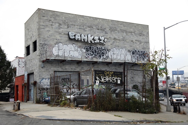
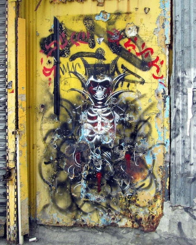
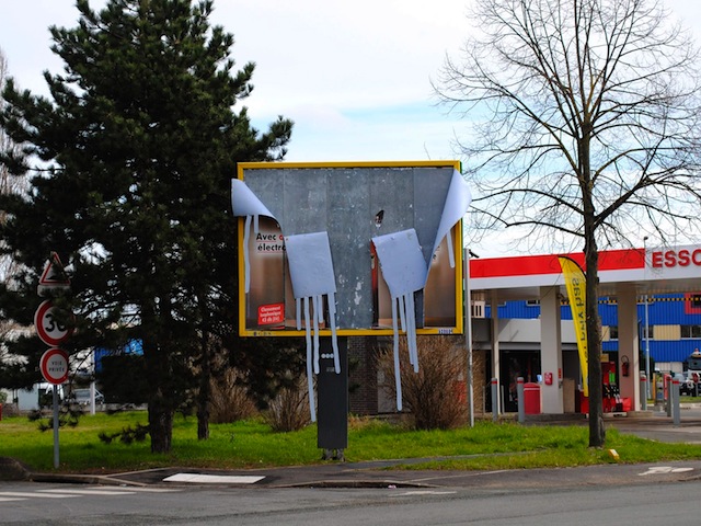
Banksy finished Better Out Than In today with the above piece in Queens. The balloons didn’t last long when people tried to steal them and then the NYPD came to take the balloons and arrest the would-be thieves (more on that on Hyperallergic). And Jerry Saltz be damned, this is one of my favorite pieces of the show. Jerry Saltz may say he has no problem with graffiti, but I’m not sure he quite understands it either.
The location of this piece is perfect, with a NEKST tag (and remember what Banksy did on his website when NEKST died), an ADEK tag, two ADEK throwups and two LEWY throwups all visible in the above photo, which is the lead image for the piece on the Better Out Than In website. And of course, Banksy went higher up on the wall than all of those writers, but in a cheeky manner. I’m not saying that Banksy is still a hardcore train bomber, although he did pull of quite a few stunts this month, but he certainly has respect for traditional graffiti. Banksy could have installed those balloons anywhere, but he chose that particular spot and was able to highlight serious graffiti by some of the best writers in the city.
The audio description for this piece includes a serious note:
Banksy asserts that outside is where art should live, amongst us. And rather than street art being a fad, maybe it’s the last thousand years of art history is a blip, when art came inside in service of the church and institutions. But art’s rightful place is on the cave walls of our communities where it can act as a public service, provoke debate, voice concerns, forge identities. The world we live in today is run – visually at least – by traffic signs, billboards and planning committees. Is that it? Don’t we want to live in a world made of art, not just decorated by it?
I can’t think of a better way to close out the show.
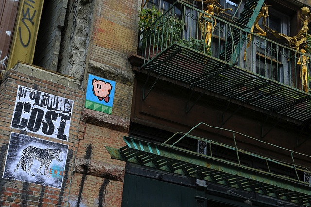
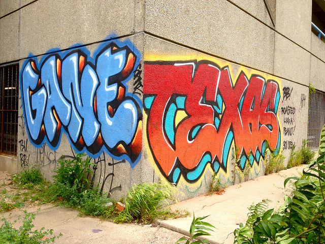
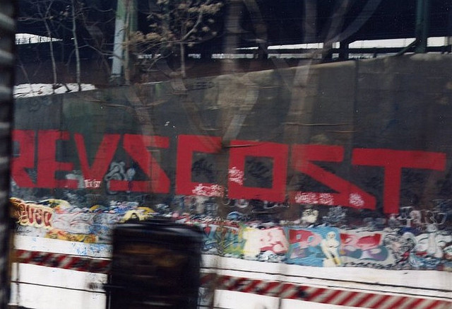
Poster Boy in NYC. Photo by Poster Boy.COST, ENX and Invader in NYC. Photo by Luna Park.Ludvig in London. Photo by Ludvig.Swoon in NYC. Photo by Luna Park.GANE and TEXAS in Philadelphia. Photo by RJ Rushmore.
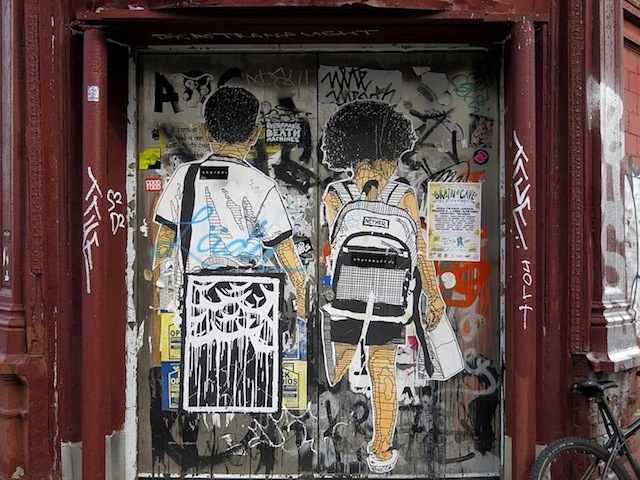
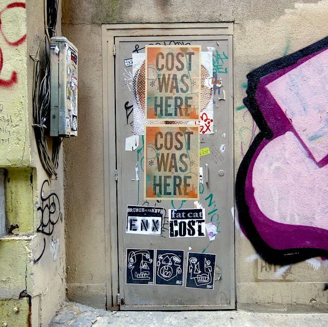
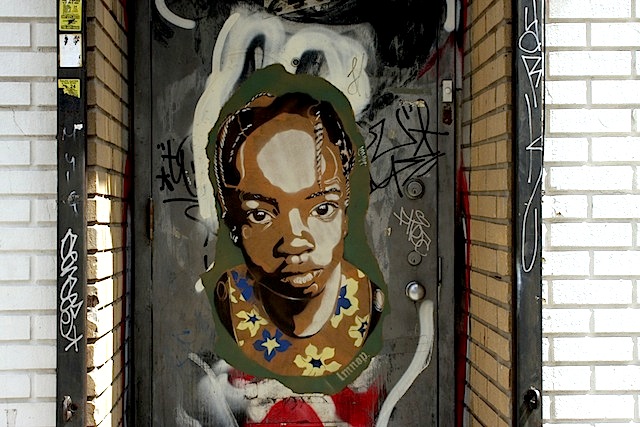
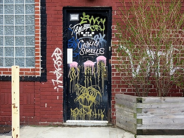
Tags, throw-ups, paste-ups, stickers and a range of characters have all made their way to NYC doors, making them some of the most intriguing canvases in town. Here’s a sampling:
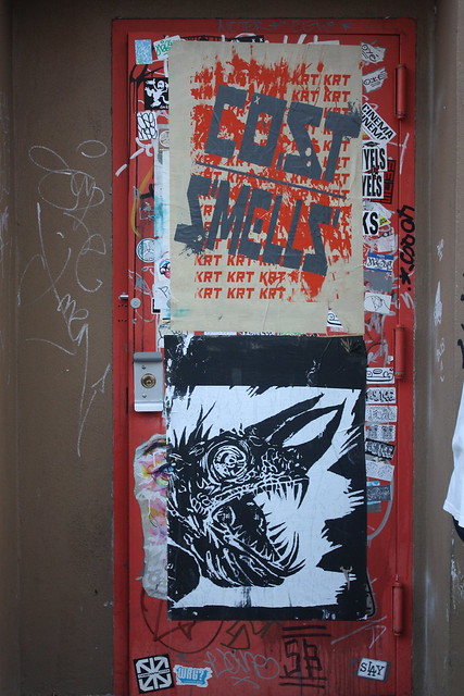
HarlequinadeCost, Enx and RAELMNOPCash4, Smells Jellyfish & more
Photos by Lenny Collado, Dani Mozeson and Lois Stavsky
Excited to announce that Paper Monster is releasing of a new COST/REVS print based on an old image. “Fuck You” -1993 is an oddly refreshing image from the legendary duo and will be available online starting sometime today. Each print is signed by COST. Merry Christmas, dad! (He doesn’t read this, it’s fine.)
Had a fantastic time in New York last weekend finishing up The Art of Comedy, but that meant missing out on a lot of news, so some of this week’s link-o-rama is a bit more dated than usual:
It is time for me to get a reasonable number of hours of sleep. Until I have to get up in the morning. Here’s what we didn’t get to write about on Vandalog this week:
These two prints from Tristan Eaton and Everlast come from 1xRun and benefit the Cystic Fibrosis Foundation, so you’ve got great artists, a great print studio and a great cause all in one package, but less than one week left to buy.
Buff Monster, David Meade and friends of Vandalog Hrag Vartanian and Adam COST will be speaking on a panel at Doyle New York next week in anticipation of their upcoming street art auction.
Endless Canvas’ Special Delivery warehouse show looks like it’s got some cool work from Swampy, GATS, Feral Child and others, but really it’s clear that photos do not do the show justice and that you had to be there.
COST could sit next to you on a train, or brush by you on the street and you’d likely think nothing of it. I walked by him three times before I finally asked, “Are you Adam?” He is a regular guy. He just happens to have been one of New York City’s most wanted. In Part Two of our interview, COST discusses a number of things including graffiti as a form of rebellion, his relationship with REVS, and, to put it simply, Madonna.
V: How do you see the face of the graffiti writer changing?
COST: Hipsters, like they’re hip! They call them hipsters around here. My friends and I aren’t hip. We’re just like dudes. The older graffiti writers don’t look like the newer graffiti guys. Like REVS looks very working class; he’s very filthy. He’s a welder so he always looks filthy, like he climbed out of a manhole. Me, I try to keep myself clean. I like to present myself that way for aesthetic reasons, like what I do with my life, where I live and how people perceive me. Some of my friends look like nerds, and some of the newer guys we hang out with are real cool, hip-looking guys and fit right in in this area. The newer guys are all like that.
V: But weren’t you guys part of the fashion of the time in the 80’s? Wasn’t graffiti was a cool scene?
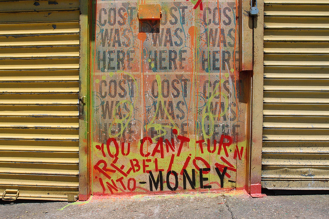
COST: I don’t know if we were so fashionable. Our attitude was more like “Fuck you and fuck the system.” We were angry, rebellious guys. There was a definite punk attitude to what we were doing. It was a “Fuck the whole system. Fuck the government. Fuck socialization.” We just revolted against the whole system. Fuck politics and all the politicians. Rudy Giuliani. Stuff like that. We were anti. The best way to describe what we did was like “We’re anti. We’re not artists, we’re anti-artists”. I consider myself an anti-artist if I’m an artist at all. That would be the best way to describe my art. It’s against the system. That’s why I want to show you the Bushwick Five Points wall I just did. At the bottom of the wall, the title, it’s says “You can’t turn rebellion into money.”
I didn’t go to the yard at 13 and say, “You know what? I’m gonna go write on these trains because I want to make money.” You know what I mean? So that’s what inspired the title of the wall. I went to the yard because I was rebelling, and my family situation was not a good one. Looking back, my family was splitting up, like my parents. The whole family was a mess and I was at that age where you get rebellious and I went into graffiti. Guys nowadays are doing graffiti and street art to make money. I don’t do art to make money.
Cost and Set KRT for Bushwick’s Five Points. Photo by Luna Park.
V: Speaking of the fucking of systems, fucking of establishments, and fucking the man….. Did you fuck Madonna?
COST: [Pause] I’m a little younger than Madonna, but I’ll tell ya, she used to hang out at a club called Danceteria. I knew her boyfriend, RP3, who’s dead now. If you look at her old videos, she used to wear a belt buckle tag around her waist that said “BOY TOY.” Boy Toy was that guy RP3. He used to write Boy Toy and RP3, and that was her boyfriend at that time. He ODed and he’s been dead for a long time, but Boy Toy was her tag that he gave her and that’s why she used to wear that in those early videos. I’m not exactly sure when he died. It’s been awhile since the posters, but I think yeah, he probably did see the posters. That poster was like the pop-poster of our campaign. It’s not like I planned it out that way though.
V: Okay, but you have avoided my question.
COST: Have I really? I tried to be as-
V: It’s a yes or no.
COST: Oh, Madonna? You don’t kiss and tell, right? Let’s just leave it at that.
V: Did Madonna ever say anything about it?
COST: I’m sure she knows it exists because she has a publicist. So everything like that is getting plopped on their table and I don’t think she has a problem with it because she was into graffiti and stuff back then.
V: Why did you do it?
COST: I don’t know if there was an exact reason. At the time it was just one of our obscure posters. We were producing a lot of just random stuff, and that one seemed hit the nail on the head for your ham-and-eggers, your average Joe’s. Everyone loved that one. We did many versions of posters and people always say that poster is probably the most recognized of the batches and batches we put out. That was the most accepted. And again, she’s an icon. Madonna is an international icon. She’s like a Michael Jackson or something. So I was using an icon as a prop, I guess.
V: That poster was extremely popular. Supreme turned it into a shirt in 2010.
COST: Yeah, certain posters like “COST Fucked Madonna” were very accepted by society. There’s a lot of knock-offs. There are stickers and posters out there like “ELVIS FUCKED MARILYN.” I didn’t see that coming. I didn’t think it was going to bring such an acceptance with the public, but the public really absorbed that poster.
V: After years of turning down other offers, why did you choose to collaborate with Supreme?
COST: They put Johnny Rotten from The Sex Pistols on the cover of the magazine and that kind of appealed to me, as opposed to Lady Gaga on the cover. It was a little more my speed. More raw, less pop. They understood the direction that I wanted to go and what I wanted my work to represent, in a sense. They were good to catering to me as an artist, in the sense that they just let me be who I wanted to be within their repertoire and it worked, I guess. It was okay.
V: Now that you’re starting to go heavy with wheatpasting again, what’s different this time around?
COST: I’m definitely using new fonts and new slogans. At this point it’s like I’m kind of in phase 1 of probably a 15 or 20 phase period, and phase 1 is really just getting my name back out on the streets and letting people know that I’m here, I’m there, I’m everywhere. It’s just phase 1 of a slow steady process of probably a 20 phase period I call “moving forward towards death.” Continue reading “Vandalog interviewed COST – Part two”
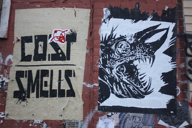
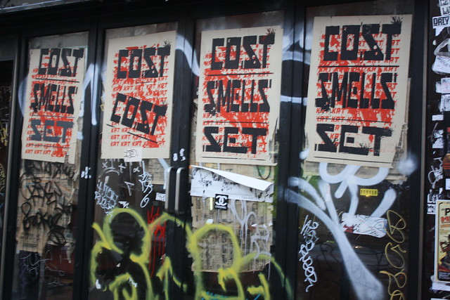
With what has been a relatively slow summer in regards to wheatpasting, Cost, Set, and Smells of KRT and Keely came as a breath of fresh air. Flipping between monochromatic color schemes to eye popping fluorescents, the designs in these posters grab the attention of viewers from a stylistically minimalist stance as well as those drawn in by painfully bright colors.
Of particular interest is the use of “emergency orange” in some of Cost and Smells collaborative pieces. While this color has been co-opted in the area by EKG for quite some time, I was glad to see someone else incorporating it into their work, especially when paired with an orange door.
For those who may not be drawn to text-based work, they are sure to notice the razor-sharp edges of Keely’s lizard. Having a presence on the streets for a while with stickers, these wheatpastes are the largest images I have seen from the artist outside of Pandemic’s walls. The imagery, scale, and voracity with which this team hit the streets recently makes for an exciting end to what has been a relatively slow summer.