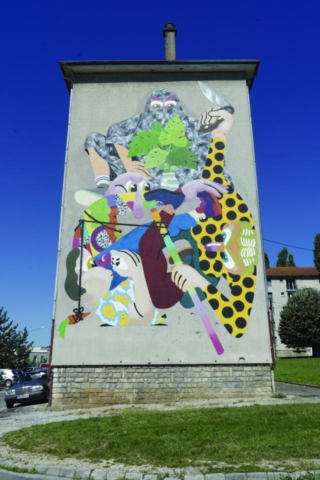
Nano 4814 mural censored in Besançon, France

Censure_peinture_Nano4814_BienUrbain5_QC_HD
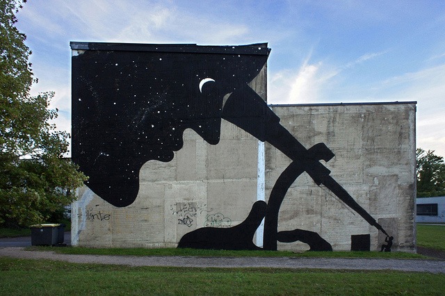
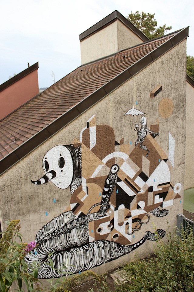
Nano 4814. Photo by Quentin Coussirat.

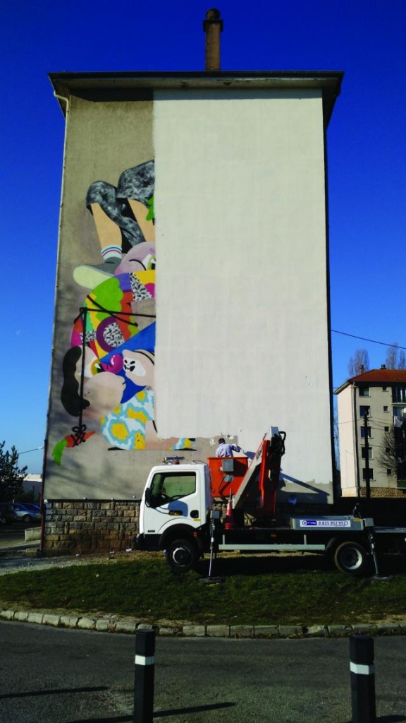
Last June, during the 5th edition of Bien Urbain (a Public Art Festival in Besançon, France) the Spanish artist NANO 4814 was invited to participate and paint the mural above. To the great surprise of the organization and the artist, the mural was erased in early December, after a decision by the owner of the building. It’s really discouraging… This festival is organized by a non-profit association that just wants to give artists space to express their art in total freedom. Murals cannot be just decorative, as noted by this press release issued by Bien Urbain (here translated into English for convenience):

On December 3rd, we were shocked to see that Néolia proceeded to erase the mural by Spanish artist NANO 4814, painted in June 2015 at 13 Bouloie Street, as part of the Bien Urbain Festival.

At the beginning of last summer, the landlord organization informed us of their desire to remove the mural, after it an unfortunate interpretation of the piece. We immediately proposed a meeting and went there to talk with residents of the neighborhood. We have obviously not met everyone, but no one we came into contact with on site mentioned any wish to cover up the mural. On the contrary, most liked to see the building embellished by art, as is the case of several buildings in the area. Some people we met had questions about the presence of a knife or a dark veil, which could represent a niqab, others saw a ghost, or a Marsupilami wanting to use a knife to cut the thread that surrounds his friends. NANO 4814 saw a scene symbolizing the difficulty of the artistic act and questions about the relationship between his work and the history of art more broadly. Art is always open to interpretation. In September, Néolia, the building’s owner, asked us to clear the wall. However, our role is to allow artists to intervene in the public space, not erase their work without prior discussion. We had heard no news from the company after that, and only found out on December 3rd that the painting was about to be covered, so neither the artist nor our association were notified beforehand.

We regret this unilateral act of artistic censorship and defend the view that exchange and dialogue are always more fruitful than “sweeping things under the rug.” If this artwork had actually caused arguments (which we have not seen), it would have been more interesting to take the opportunity to discuss, exchange, and confront points of view, rather than give in to fear. “Preventive censorship” has never been positive for “living together.”
Censure_peinture_Nano4814_BienUrbain5_CC_HD2
Nano 4814 mural’s erased. Photo by Chloé Cura.

Photos by Quentin Coussirat and Chloé Cura
Bien Urbain festival in Besançon, France

Sam3. Photo by E. Murcia Artengo

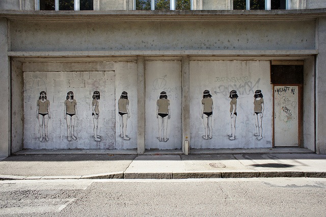
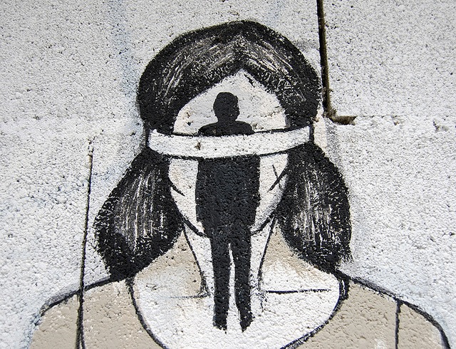
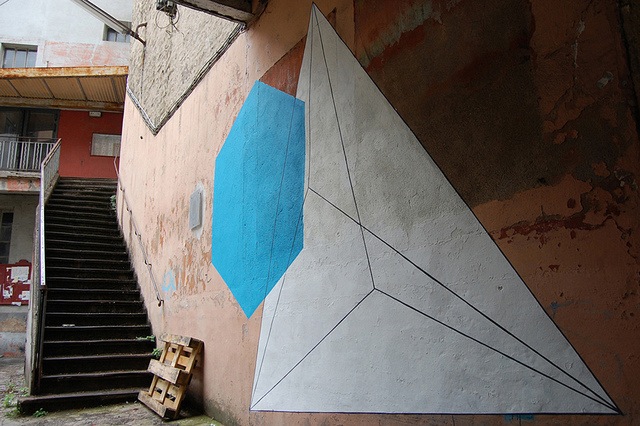
We’ve been posting images here and there from the Bien Urbain mural festival that took place in Besançon, France, but now photos of all the works are on flickr. These are a few of my favorite images (from Sam3, Hyuro, Moneyless, TBLR-ONE, Escif, Quillograma, Nelio, ), but definitely take the time to check out this Bien Urbain flickr set to see everything from the festival.

Hyuro. Photo by E. Murcia Artengo
Hyuro (detail). Photo by E. Murcia Artengo
Moneyless. Photo by D. Demougeot
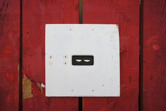
OX. Photo by OX
TBLR-ONE. Photo by E. Murcia Artengo
Escif. Photo by E. Murcia Artengo
Quillograma and Nelio. Photo by Nelio

Photos by Nelio, E. Murcia Artengo, OX and D. Demougeot via Bien Urbain

Nearly perfect: OX for Bien Urbain

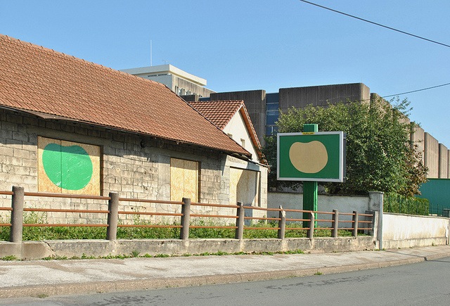
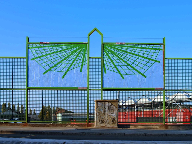
This is one of the most perfect ad disruptions I’ve ever seen. OX did this takeover at the Bien Urbain festival in Besançon, France. Here’s why I think it’s nearly perfect:

Pros –

  • It’s site-specific.
  • It’s possible to not notice it. The piece can fade into the background of the environment (not just because the billboard matches the sky in this photo, but because it doesn’t try to grab your attention).
  • For the people who are familiar with the billboards and do notice the change, the takeover is something for them to think about.
  • It’s photographed well for online distribution.

Con –

  • The billboards themselves aren’t at ground level.

Now, that last pro and the con might not make immediate sense. In the case of billboard takeovers, I think that many of the best ones make it clear to viewers that they too can do exactly what the artist has done; that it’s not only OX who can or should cover up public advertisements. So on the pro side, this takeover is beautifully photographed and people who see this photo are probably more likely to be inspired than it it were a quick snap from OX’s camera-phone. As for the billboards not being a ground level, this sort of take over would probably have required a ladder or a long pole. Those aren’t particularly difficult things to get, but ground level billboards are even easier to disrupt, so photos of those takeovers might inspire more people to take action themselves than a more difficult billboard takeover.

Some of these thoughts about what makes a good ad takeover are based on similar ideas by Jordan Seiler, so definitely check out his site as well if this is interesting.

UPDATE: Jordan as actually posted his own thoughts about this piece over at his own blog.

Photo by OX