Strange Things are Happening Every Day

Brake by Dosjotas. Photo by Dosjotas.

Who doesn’t like something a bit weird and surprising on the street? Who doesn’t want to see something strange? This week, two such interventions landed in my inbox, while a fundamentally unimaginative attempt has been going viral and clogging my social media and blog feeds. I’m not even sure that these two successful pieces have much in common with each other, except that they are both new, made me think about all the imaginative ways to mess with public space, and compare favorably to what’s been going viral.
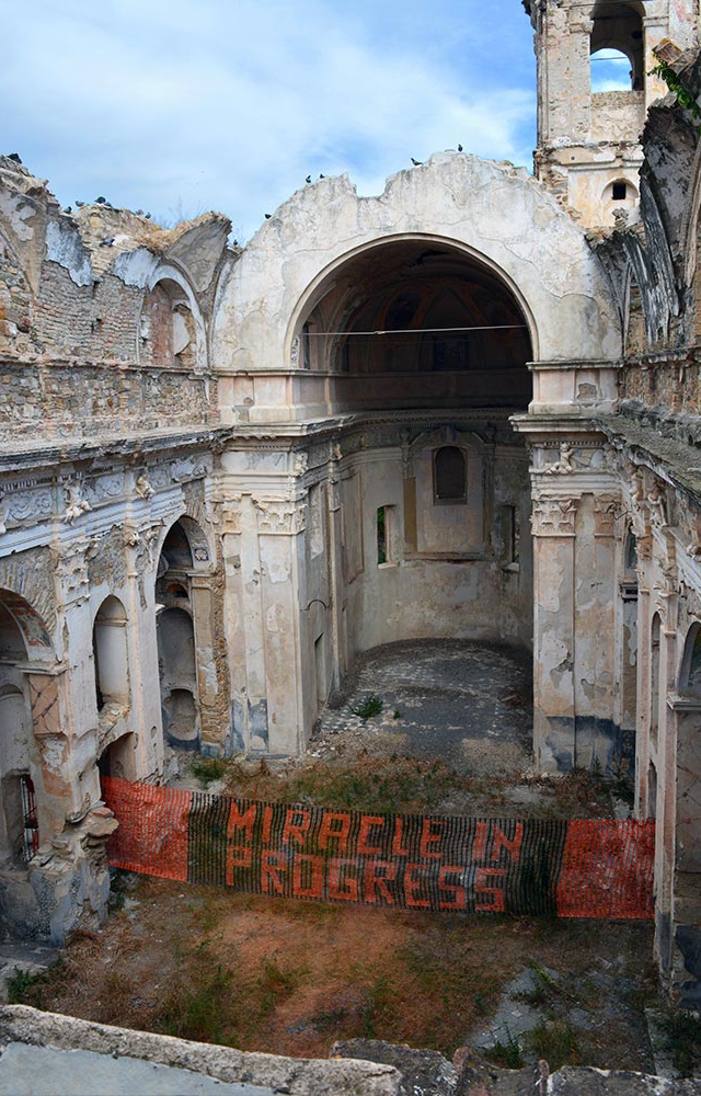
Resurrection by Elfo and Biancoshock. Photo courtesy of Biancoshock.

Resurrection, a collaboration between Biancoshock and Elfo, is a commentary on the Italian village of Bussana Vecchia. The town was devastated by a deadly earthquake, which led to to be abandoned as a ghost town. Over half a century later, it was resettled by artists, and has been an artist colony since the 1950’s. The duo write that the work reflects, “the impossibility of reconstructing [the village] except through the artistic ability and will.” So here you have a really beautiful piece, relatively simple, in a unique location, and certainly something that would be a surprise to come upon if you were exploring the ruins of Bussana Vecchia.

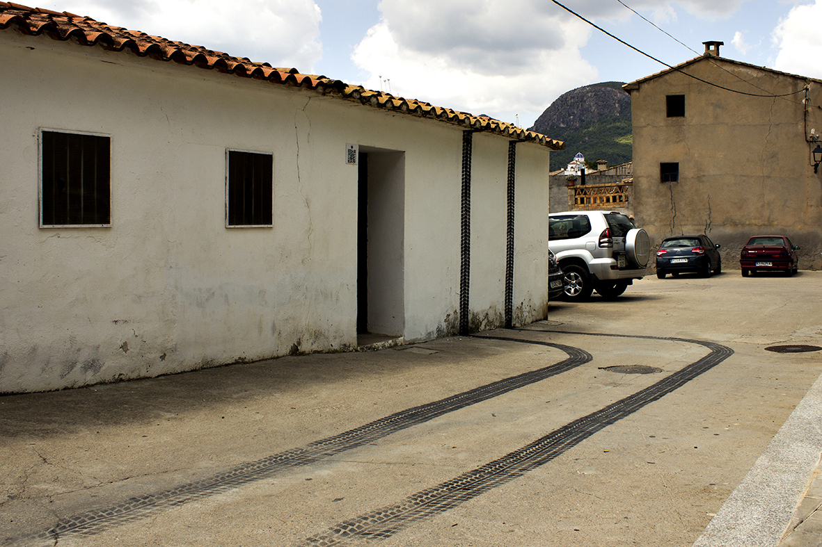
Brake, by Dosjotas, imagines a world with the physics of Mario Kart or Batman, with a car slamming on its breaks climbing up the wall of a building rather than crashing through it. Very fun, and a nice use of multiple surfaces. It was painted for Unfinished Museum of Urban Art in Fanzara, Spain.
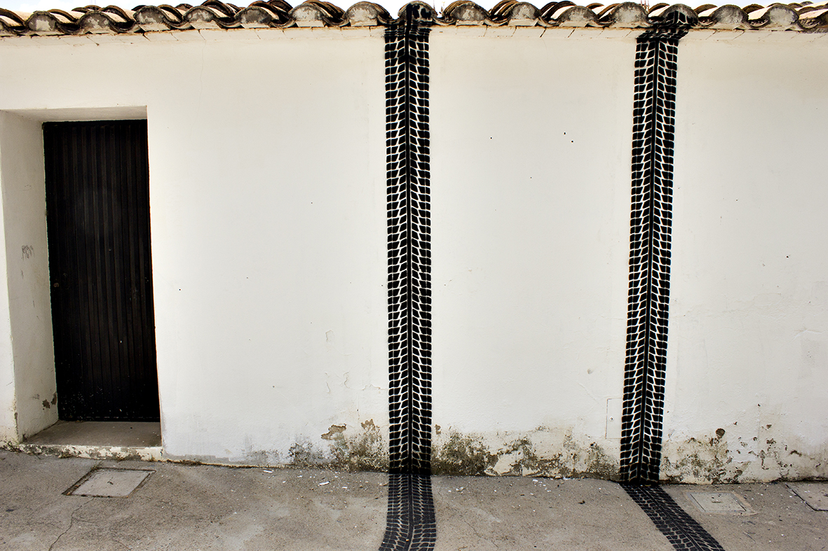
Brake by Dosjotas. Photo by Dosjotas.

As for the work that’s been frustrating me every time I see a tweet about it… no need to link or name names, but maybe you’ve seen it. The work in question shows that the artist actually has a great eye for placement. However, this piece is basically an advertisement designed to go viral. If you need to paint the entrance of a posh restaurant with someone else’s cartoon character while bringing no new concepts to that character, what you’re doing is closer to an ad campaign for the restaurant than muralism or street art. Arguably, for the artist, that’s fine. Get paid. But us bloggers should know better than to help something like that go viral when truly strange things are happening every day.

Photos by Dosjotas and Biancoshock
Wrapping up ALL BIG LETTERS

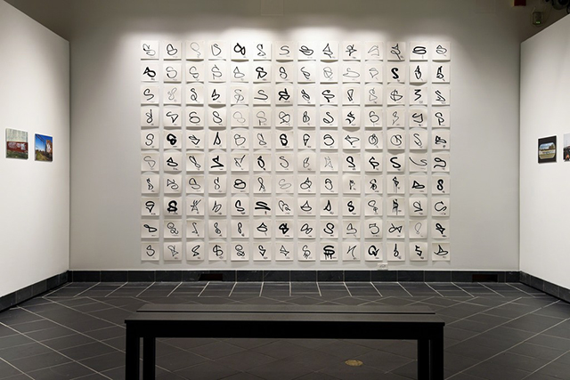
Graffiti Taxonomy by Evan Roth. Photo by Lisa Boughter.

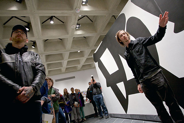
As regular readers probably know, I recently curated an exhibition about the tools and strategies of graffiti for the Cantor Fitzgerald Gallery at Haverford College. ALL BIG LETTERS closed on Friday. The exhibition featured work from Adam VOID, Aric Kurzman, BLADE, Biancoshock, CURVE, DB Burkeman, Egg Shell Stickers, EKG, Evan Roth, FAUST, Fumakaka Crew, Jordan Seiler, Katherine “Luna Park” Lorimer, Lee George Quinones, Loiq, Martha Cooper, MOMO, NTEL, Smart Crew, Steve Weinik, stikman, and more. Before ALL BIG LETTERS fades into our rear view, I wanted to highlight two more bits of press about the show.

First, I spoke with Brooklyn Street Art’s Jaime Rojo and Steven Harrington for an interview on The Huffington Post. We spoke about curating an exhibition about graffiti for a general audience (and a gallery with an educational mission), the graffiti community’s skill at hacking tools and cityscapes, graffiti as a performance, and more.

And Very Nearly Almost published a short video from ALL BIG LETTERS:

Photo by Lisa Boughter

ALL BIG LETTERS Opens in Haverford, PA

Photo by Caleb Eckert

If you’re in the Philadelphia area, head out on to the burbs for ALL BIG LETTERS at Haverford College’s Cantor Fitzgerald Gallery, probably my most ambitious curatorial project to date. The exhibition features specially-commissioned work from CURVE, FAUST, EKG, Egg Shell Stickers, and Evan Roth, plus contributions from dozens more artists and photographers.

Photo by Kendall Whitehouse

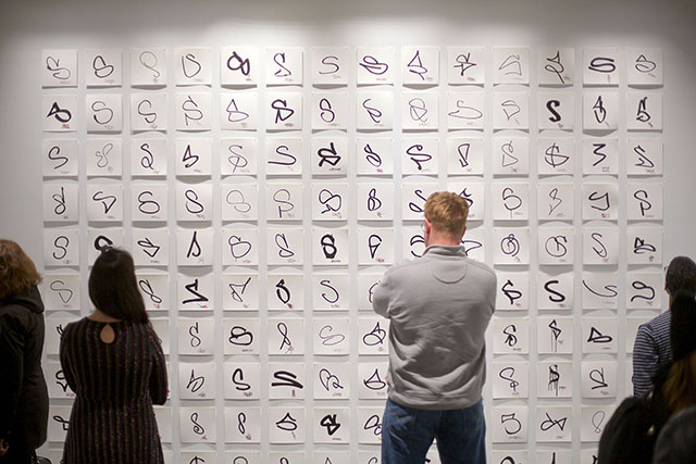
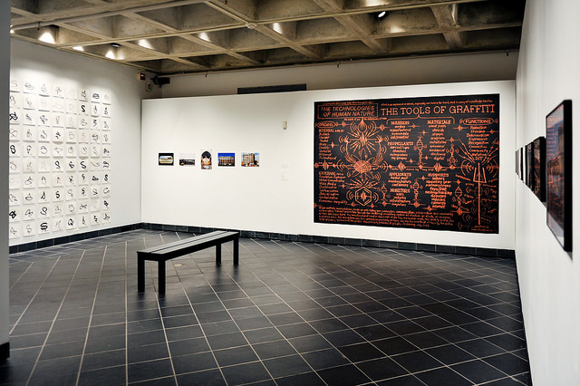
ALL BIG LETTERS investigates the tools and strategies of graffiti writers. My hope is that visitors can walk into the show with next to zero knowledge of graffiti, and leave with the ability to see a tag on the street and roughly understand how it came be there and why it looks the way it does. Was it made with spray or a marker or something else? Is the style something city-specific, like a wicked? Why did the writer choose that spot? How did they get there? How long did it take to paint? Curve’s installation in particular functions as both an artwork and a teaching tool. A similar thread runs throughout the exhibit, like in Evan Roth’s Graffiti Taxonomy series, which highlights 140 S’s from each many different tags, all written with a variety of different styles and tools.

Photo by Caleb Eckert

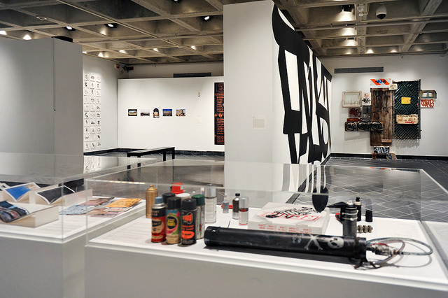
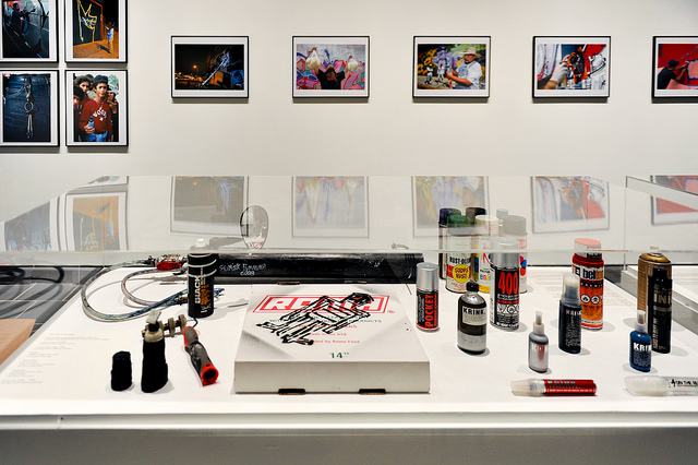
For people already immersed in the culture of writing, ALL BIG LETTERS is a different take than your typical graffiti group show. This is not tags or throw-ups on canvas. Rather, it’s a show for the graffiti nerds who understand that style is an important part of writing, but it is just one element, and it serves a particular purpose. A collection of homemade tools from MOMO, stikman, Fumakaka Crew, Biancoshock (yes, I know that a handful of the artists in the show fall more towards the street art spectrum, but I swear they fit in), plus commercial graffiti products, is paired with a series of photos by Martha Cooper of writers and street artists that highlight their tools.

Photo by Kendall Whitehouse

From a new diagram by EKG to photos by Luna Park and Steve Weinik (among others) to an investigation into the development of BLADE’s style over time to never-before-scene work by Adam VOID, ALL BIG LETTERS covers a lot of ground that is all-too-often ignored in more commercial settings, and I would like to think that it’s a pretty unique exhibition. On opening night, a handful of Philly writers all told me a similar story: I came out to support a friend in another group exhibition, but this is unlike any graffiti show I’ve ever seen.

So, if you want to see an exhibition about graffiti that’s truly different, an exhibition where the whole of graffiti is acknowledged (the repetition, the drive for fame, the performance, the risk, the competition, the hacking…), I hope you’ll stop by ALL BIG LETTERS. It’s open through March 3rd.

ALL BIG LETTERS is open at Haverford College’s Cantor Fitzgerald Gallery through March 3rd. Contributors include Adam VOID, Aric Kurzman, BLADE, Biancoshock, CURVE, DB Burkeman, Egg Shell Stickers, EKG, Evan Roth, FAUST, Fumakaka Crew, Jordan Seiler, Katherine “Luna Park” Lorimer, Lee George Quinones, Loiq, Martha Cooper, MOMO, NTEL, Smart Crew, Steve Weinik, stikman, and more. Learn more, and read essays related to the exhibition by RJ Rushmore and Carlo McCormick, here.

Photo by Kendall Whitehouse

Photos by Caleb Eckert and Kendall Whitehouse

ALL BIG LETTERS: Exhibiting graffiti tools and strategy

Philadelphia graffiti. Photo by Steve Weinik/@steveweinik.

On January 20th, I hope you’ll join me in Haverford, PA for ALL BIG LETTERS, an exhibition I’ve curated at Haverford College’s Cantor Fitzgerald Gallery, just a few minutes outside of Philadelphia.

ALL BIG LETTERS includes art, photos, tools, and ephemera from Adam VOID, Aric Kurzman, BLADE, Biancoshock, CURVE, DB Burkeman, Egg Shell Stickers, EKG, Evan Roth, FAUST, Fumakaka Crew, Jordan Seiler, Katherine “Luna Park” Lorimer, Lee George Quinones, Loiq, Martha Cooper, MOMONTEL, Smart Crew, Steve Weinik, stikman, and more.

Generally speaking, when galleries try to bring graffiti indoors, the focus is on style. Those shows portray graffiti writers as designers, illustrators, the new pop-artists and calligraphers… Headlines along the lines of “Can you believe what he does with a spray can? Now you can buy it on canvas!” still seem all too common. But style is just one component of graffiti. Or maybe the shows focus on writers who have gotten up a lot, trying to capitalize on their fame. Or, as in the case of someone like Barry McGee or Boris Tellegen, the art is (largely) removed from graffiti, a separate practice.

For ALL BIG LETTERS, I took a different approach. To write graffiti is, at its most pure, the performance of an illegal act; the performance is as important as the product. The best graffiti is also strategic. It relies on a combination of repetition, longevity, visibility, degree of difficulty, novelty, and style. ALL BIG LETTERS explores all of those strategies, and the tools writers use to realize them.

Because of the show’s angle and some deep digging over the last year, it’s full of surprises. New work from FAUST, Curve, NTEL, and EKG, never-before-seen photos of two Philadelphia graffiti legends at work (you’ll have to come to the show to find out who), homemade graffiti tools dating back as early as the 1960’s, and more.

ALL BIG LETTERS opens January 20th (4:30-7:30pm) at Haverford College’s Cantor Fitzgerald Gallery in Haverford, PA. The exhibition runs through March 3rd.

On a personal note, I worked at the Cantor Fitzgerald Gallery for just about my entire time as a student at Haverford College. It’s humbling to be invited back to exhibit at the space where I learned so much, and where we exhibited the work of so many amazing artists and curators (Hank Willis Thomas, Natasha Logan, the Dufala Brothers, Sam Durant, Pete Brook, Raymond Pettibon, Christine Sun Kim…). I can’t say thank you enough to everyone at Haverford for this opportunity.

Photo by Steve Weinik

Placement makes perfect

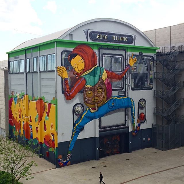
Os Gemeos in Milan. Photo by Os Gemeos.

It’s no secret that good placement can make or break a piece or street art or a mural. That can mean picking the perfect place to install an artwork, or responding to the space that’s available and making something that takes that space into consideration. Think of it this way: Site-specific should mean the work is in some way specific to a site, not simply located at a site. And when art is site-specific, it can make a big difference. Recently, some artists practicing good placement have really caught my eye. Here are a few examples:

1. Os Gemeos in Milan (above): Wow. Milan is a lucky city right now, with a spectacular new mural by Os Gemeos, facilitated by Pirelli HangarBicocca. Responding to the shape of the site, Os Gemeos took a drab building and transformed it into a massive subway car. Os Gemeos’ murals are always a treat, but they knocked it out of the park with this one.

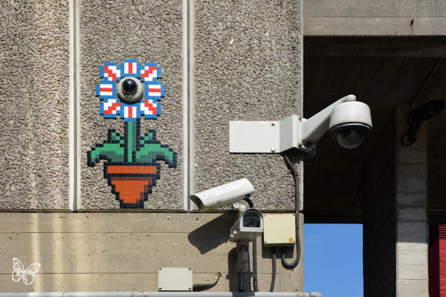
Invader in London. Photo by Butterfly.

2. Invader in London: Simple, but effective, placing his mosaics around a CCTV camera. In some ways, quintessentially London.

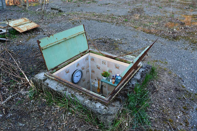
Biancoshock in Milan. Photo by Biancoshock.

3. Biancoshock in Milan: This series form Biancoshock seems to have really caught people’s attention on social media. I’ve been seeing these photos posted everywhere, so if you’re reading this, they probably aren’t new to you. But why are they so popular? Yes, I have a tiny apartment and can appreciate the joke too. But I think it’s more than that. Placement is an essential part of these pieces. If Biancoshock had made small rooms as sculpture for a gallery, or painted a tiny apartment on a wall, it wouldn’t have worked quite so well. It’s that he took a space and make work inspired by the location that simultaneously transformed the location.

Elian
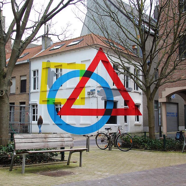
Exercise Of Anamorphosis #2 by Elian. Photo by Elian.

4. Elian in Ostend with Exercise Of Anamorphosis #2: What happens when you get to a mural festival and you’re told that you aren’t painting a flat wall, but rather two walls of a building without a lot of flat surfaces? For some artists, this could trip them up. Or they could still treat the surface like they are applying wallpaper, and it would probably work out okay. But Elian went a step further, creating an optical illusion that messes with your perspective. He took something that could have been a weakness (an odd wall), and he made it a strength.

eL Seed in Cairo. Photo by eL Seed.

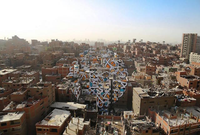
5. eL Seed in Cairo, for his Perception series: eL Seed painted this mural across dozens of buildings in Cairo, Egypt. It’s painted in a marginalized neighborhood in Cairo, where the residents are written off by the rest of the city as dirty because many of them are trash collectors. eL Seed’s text reads, “Anyone who wants to see the sunlight clearly needs to wipe his eye first.”

Photos by eL Seed, Butterfly, Biancoshock, Elian

600 climate change ad takeovers blanket Paris

Paul Insect
Paul Insect

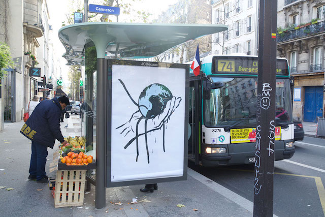
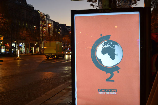
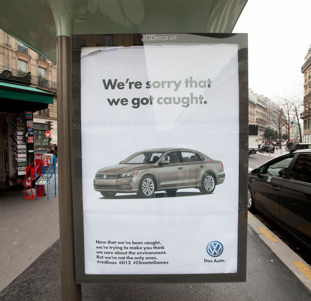
This past Friday in Paris, over 600 posters by more than 80 artists and designers were installed in bus shelters managed by JCDecaux. The posters were installed on the occasion of the COP21 conference on climate change, which starts today. Participants in the campaign include Barnbrook, Bill Posters, Fra.Biancoshock, Jon Burgerman, Listen04, Paul Insect, Revolt Design, Stanley Donwood, Unga, and many more.

Seeing as JCDecaux is an official sponsor of the COP21 conference, it makes sense that they would open up their bus shelters to messages about climate change. Of course, that’s not what happened. This was an unauthorized action, a mass ad-takeover organized by Brandalism, who say that the posters “highlight the links between advertising, consumerism, fossil fuel dependency and climate change.”

Here’s a video of the action:

And of course, more posters:

Fra.Biancoshok
Fra.Biancoshok
Barnbrook
Barnbrook

Continue reading “600 climate change ad takeovers blanket Paris”

Street art tackles the crisis for migrants

3
A still from DE-FENCE. Image courtesy of DE-FENCE.

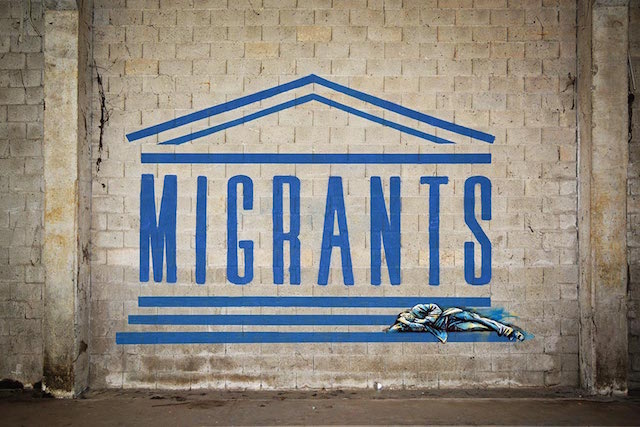
Earlier this week, two very different pieces of street art landed in my inbox within half an hour of each other. That’s not so strange. Plenty of people send me photos and videos every day. What was strange is that both pieces aim to shed light on the crisis facing the thousands upon thousands of people in the midst of international migration, and that both pieces were installed without authorization.

The first piece is by two of my favorite artists: John Fekner and Fra.Biancoshock. “Family Portrait ” (Displaced And On The Run…) is the first time these two artists have collaborated. Fekner comes from the first generation of contemporary street artists, putting up his first stencil in 1968. Biancoshock is a young Italian street artist making some of the most exciting interventions in public space today.

"Family Portrait " (Displaced And On The Run…)
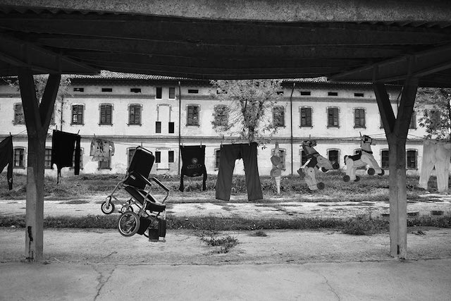
“Family Portrait ” (Displaced And On The Run…). Photo courtesy of Fra.Biancoshock.

Fekner and Biancoshock have intentionally avoided saying where Family Portrait is located, but they do have a bit to say about why they did it:
Drawing on the spirit seen in Dorothea Lange’s photographic portrait documentation of rural poor families and migratory farm workers during the Great Depression, the artists’ intent is to create an empathetic reflection of the plight of the migrant; an intimate portrait of a family “left hung out to dry” and on the run.

While Fekner and Biancoshock’s intervention is quiet and meditative, a group of artists and activists in the Czech Republic have responded to the plight of the migrant with a very different energy.

A still from DE-FENCE. Image courtesy of DE-FENCE.

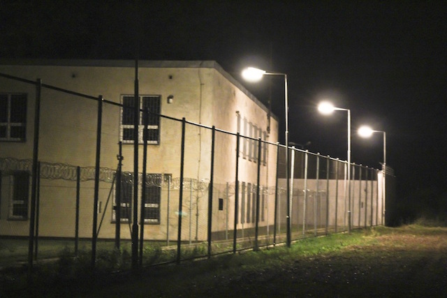
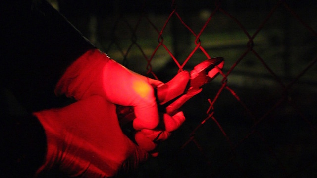
The DE-FENCE collective has made their presence felt at detention center (a former prison) in the Czech village of Drahonice. The detention center currently houses refugees that were caught by the Czech authorities. The refugees are incarcerated indefinitely and watched over by up to 100 guards, and each refugee is charged $275 a month for the privilege. On September 28th, Czech Statehood Day, DE-FENCE visited the detention center, which they compare to a concentration camp. DE-FENCE brought with them a can of paint and some bolt cutters. Here’s what happened:

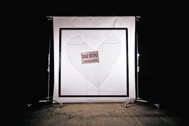
Now, the heart-shaped section of fencing that they cut out of the detention center is going to be auctioned off, with all profits going towards “grassroots refugee aid activities.” The starting price is 10,000 euros. If you’re interested in buying the object, contact de-fence@riseup.net.

The  DE-FENCE object. Image courtesy of DE-FENCE.
The DE-FENCE object. Image courtesy of DE-FENCE.

PS, in case you missed it, Banksy also recycled materials from Dismaland for use in the camps in Calais, and then someone stole the sign.

Photos courtesy of Fra.Biancoshock and DE-FENCE

#PICOFTHEDAY

instag-sito

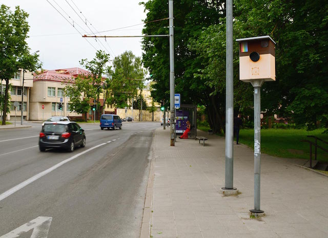
Because it’s 1am and I’ve spent the better part of my night scheduling tweets and Facebook posts, I thought I’d just very quickly share this latest piece by Fra.Biancoshock. It’s called #PICOFTHEDAY. Seems appropriate. It can be found somewhere on the streets of Lithuania. And also on the internet, which is all that really matters, right?

Photo by Fra.Biancoshock

Fra.Biancoshock invades Facebook’s walled garden

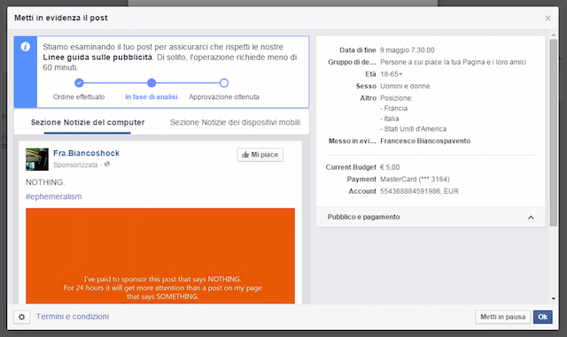
ad approval

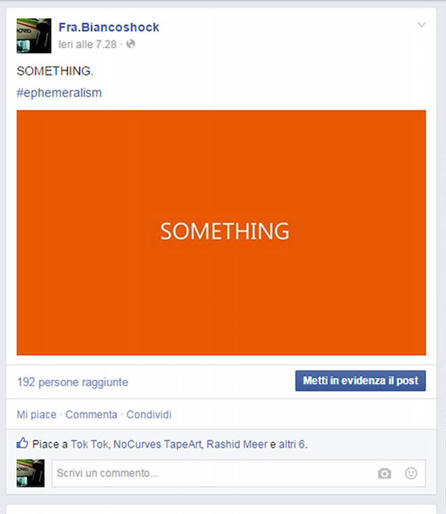
On any day, Facebook might have thousands of potential stories to show to any given user, of which that user will only ever see a handful. So does Facebook decide what to show, and how do you stand out on Facebook? How do you get your content on everyone’s News Feed? Fra.Biancoshock decided to find out.

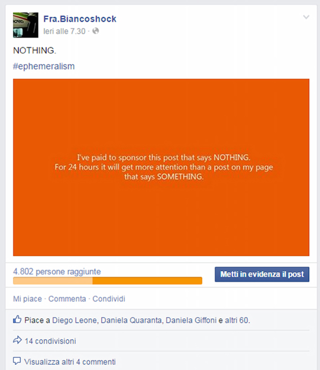
The trick to being seen is, of course, to buy ads. So Fra.Biancoshock bought one…

order nothing


Compare the results of Fra.Biancoshock’s ad to a typical post on his Facebook page…

The unpaid post on his Facebook page was seen by 192 people.
The sponsored post was seen by almost 5,000 people, for just a few dollars.

As Fra.Biancoshock’s piece shows, slots on your Facebook News Feed don’t go to the best content. They go to the highest bidder. Facebook may be in favor of net neutrality on the internet as a whole, but what are Facebook ads if not viral content’s version of an internet fast lane?

On one level, this is all good fun, and technically Facebook made a few bucks in the process so they shouldn’t be too upset, but it’s also a bit scary. Facebook’s algorithm turns the internet into a walled garden, and you have to wonder: When Facebook decides what news you see, what news are you not seeing?

Screenshots courtesy of Fra.Biancoshock