I’m back after a brief blogging hiatus. I’ve been meaning to post my review for this great event that happened back in April over in Western Australia for a while now…
Leaving a cold wet 17 degrees in Melbourne, I was pretty damn excited to fly to Perth on the 10th of April, right in time for the grand finale of PUBLIC by Form Gallery in Perth, Western Australia, which I posted a preview of a while ago.
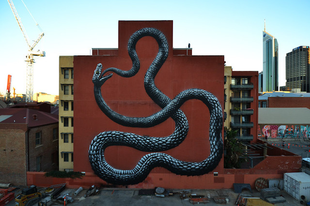
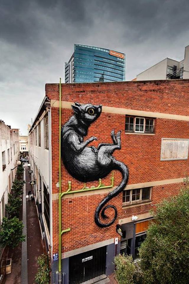
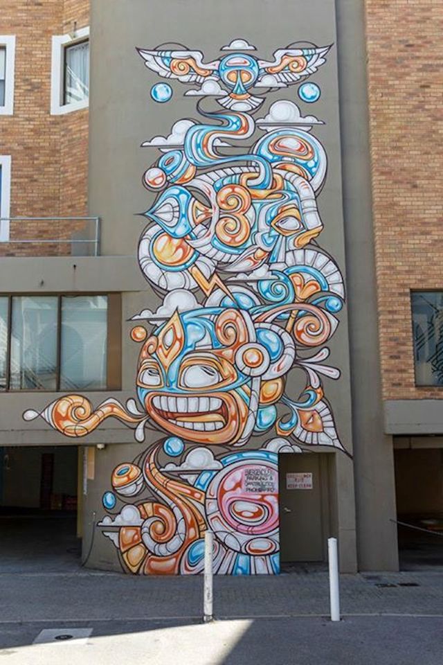
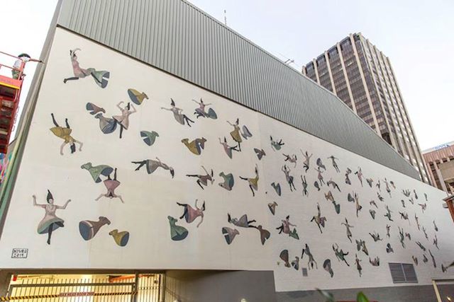
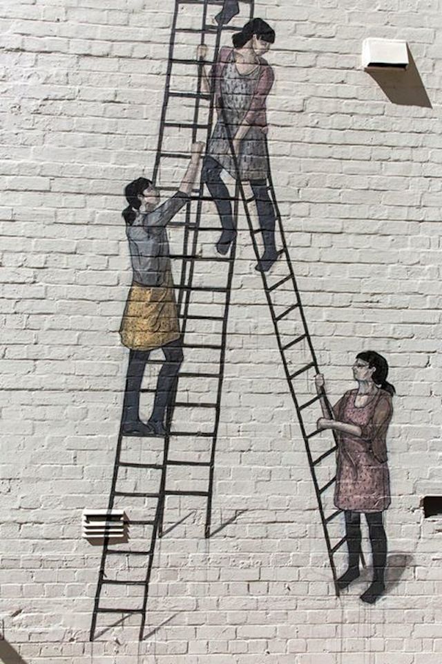
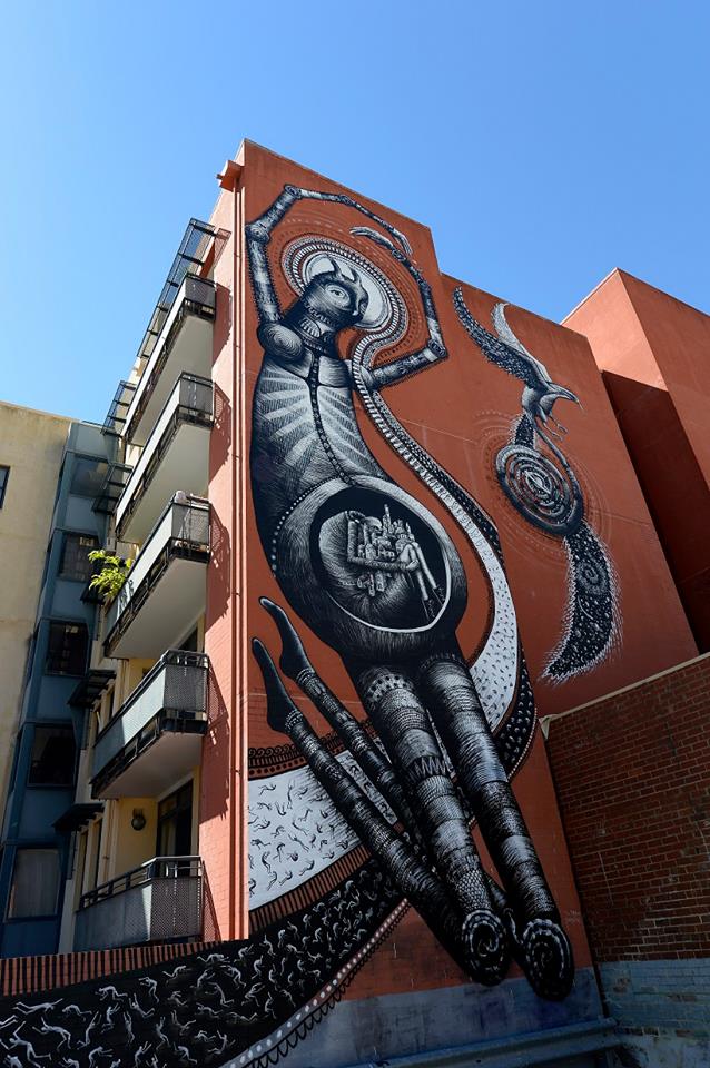
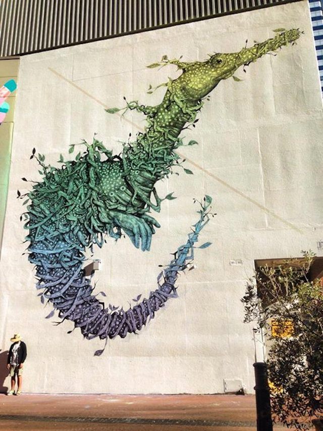
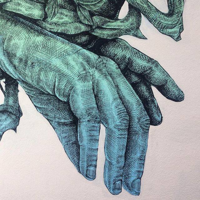
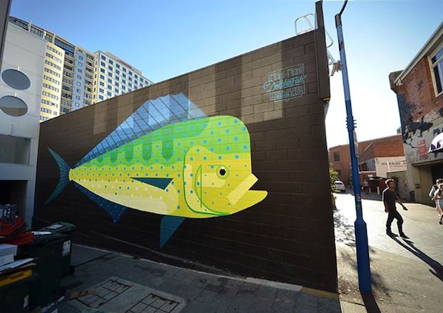
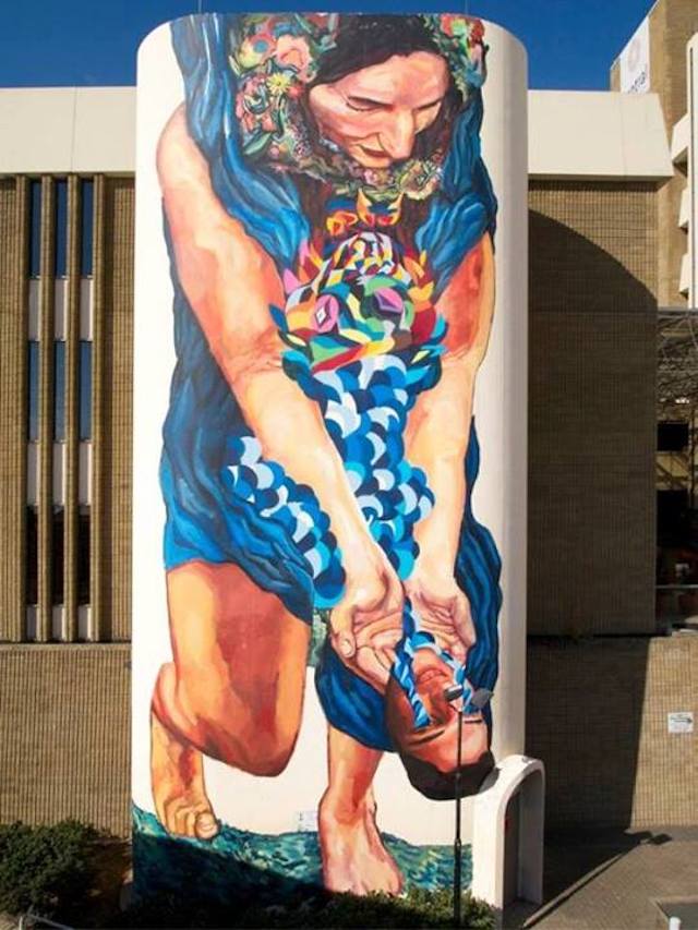
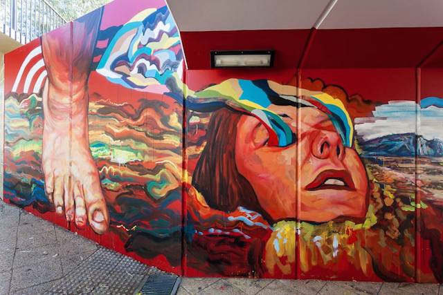
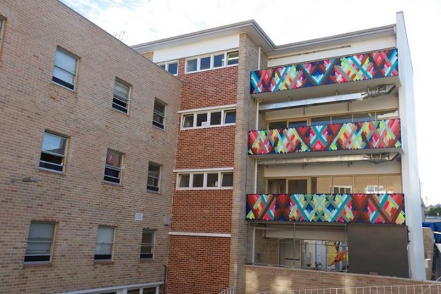
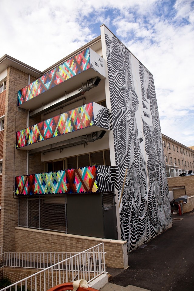
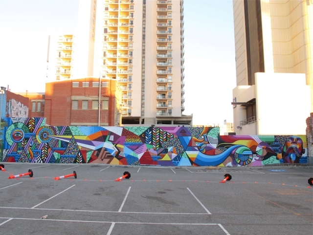
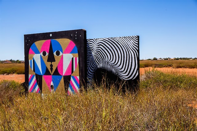
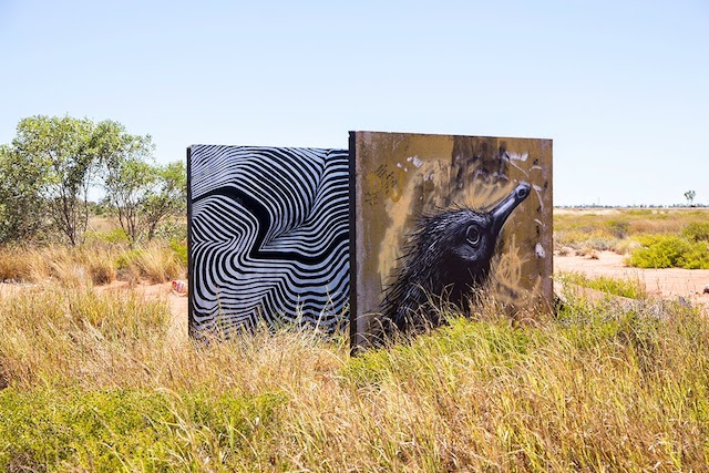
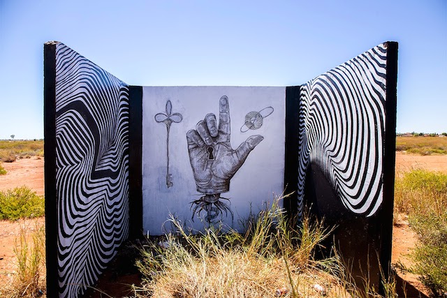
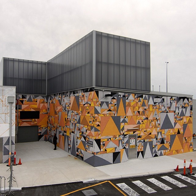
I arrived to a perfect sunny 30 degrees and soon as I hit the ground, I had a good feeling about Perth, I hadn’t been before, but something felt right. I went straight to the hotel and dropped off my bags, and went for an explore. Within a few hundred metres of my hotel, I could see the amazing Phlegm and ROA murals in progress. I made a beeline straight for them. Upon entering the car park I also saw the work of many other great artists. The works were spread throughout the CBD and inner city suburbs. Here’s a selection of some of my favourite pieces from the event.
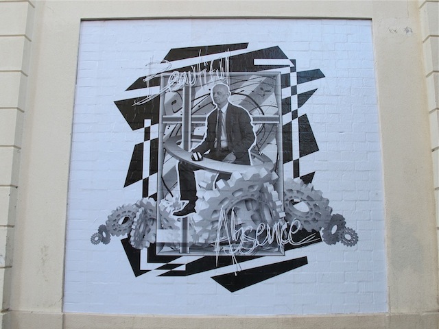
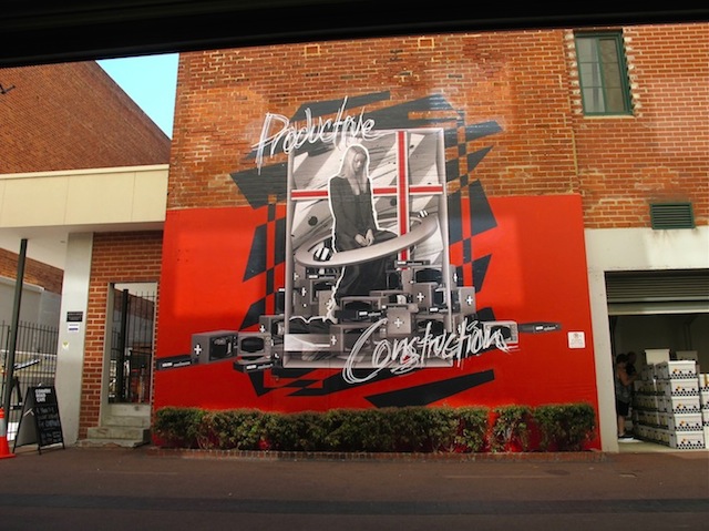
ROA. Photo by Bewley Shaylor.Pixel Pancho. Photo by Dean Sunshine.Pixel Pancho. Photo by Pixel Pancho.Pixel Pancho. Photo by Pixel Pancho.Phibs. Photo by Luke Shirlaw.Hyuro. Photo by Luke Shirlaw.Hyuro. Photo by Luke Shirlaw.Phlegm. Photo by David Dare Parker.Alexis Diaz. Photo by Alexis Diaz.Alexis Diaz (detail). Photo by Alexis Diaz.Amok Island. Photo by Amok Island.Ever. Photo by Ever.GAIA. Photo by Dean Sunshine.GAIA and Ever. Photo by Brendan Hutchens.Lucas Grogan. Photo by Dean Sunshine.Lucas Grogan. Photo by Jean-Pierre Horre.2501. Photo by Luke Shirlaw.Maya Hayuk. Photo by Jean-Pierre Horre.2501 vs Maya Hayuk. Photo by 2501.Beastman and Vans the Omega. Photo by Dean Sunshine.HEAVY Projects. Photo by Dean Sunshine.HEAVY Project. Photo by Dean Sunshine.HEAVY Projects. Photo by Dean Sunshine.HEAVY Projects. Photo by HEAVY Projects.
While the event spanned over ~30 days, the main event was the painting of Perth’s 1st ever giant murals over the last 3/4 days of the event. In total there were around 30 murals painted for the event, spanning across the City of Perth. I was very impressed by the organization of the event by the FORM Gallery crew. With a logistical nightmare trying to coordinate over 45 artists, paint and equipment, all in 35 degree heat, the FORM Crew did an amazing job, Well done guys!!! A very friendly and hospitable crew. Thanks very much for taking such great care of us while we visited.
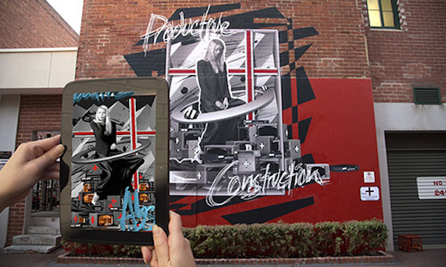
There was a great selection of artists from ac cross the globe representing all different styles and genres. Unfortunately there was no graffiti, but I suppose street art was a big stretch for conservative Perth, so graffiti may have been avoided for this reason. For a city not really known for street art, the public reaction was encouraging. People of all ages and walks of life filled the city over the weekend. I love walking around randomly and listening to some of the conversations and questions people ask each other. In particular I was really impressed by the public’s reactions to the HEAVY PROJECTS installations (interactive works of art that use Augmented Reality on smart phones and tablets). Here’s a short video the guys out together to document the event (plus some footage from a previous project).
On the Friday night there was also a great show at FORM Gallery – PUBLIC SALON showing off canvases from the contributing artists, some great work on display, check out some shots here.
And finally. This great video by Chad Peacock is a really accurate representation of the event and well put together. Damn it takes me back!!!
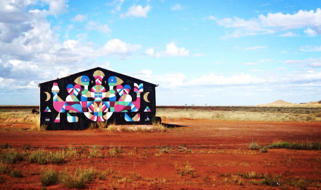
The FORM guys also took a number of artists to visit the Pilbara, a very special part of top end of Australia with breathtaking views and incredible nature (also sadly known for mining – the 2 don’t really go hand in hand). A few of the artists had a paint while there, I particularly like the piece by Remed.
Remed. Photo by Ben Fulton-Gillon.2501 and Remed. Photo by 2501.2501 and ROA. Photo by 2501.2501 and Alexis Diaz. Photo by 2501.
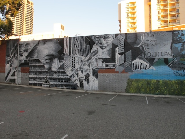
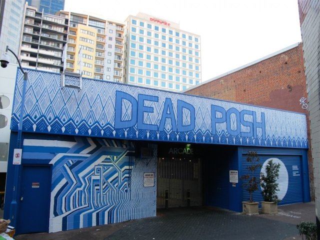
After all of the above, any street art fan in Perth would have to be pretty happy, but it didn’t stop there. FORM has continued putting up murals in Perth, with Creepy (aka Kyle Hughes-Odgers) painting at Perth Airport (a sponsor of PUBLIC) and also Vans the Omega and Beastman’s new piece that went up last week.
Kyle Hughes-Odgers. Photo by Kyle Hughes-Odgers.Kyle Hughes-Odgers. Photo by Kyle Hughes-Odgers.Vans the Omega & Beastman. Photo by Jarrad Seng.Vans the Omega & Beastman (detail). Photo by Jarrad Seng.
What I loved most about the event wasn’t just the art, and was not unique to PUBLIC; is the sense of community I felt. This is something I really love about the street art scene. I got to catch up with some great old friends, and made some new ones who I will undoubtedly randomly catch up with again somewhere around the globe.
Fingers crossed that this event is on again next year. I will be there with bells on!
If you are in Perth, check out the full list of artists and the mural map. FORM has also put together this short book called PUBLICation available for Purchase at the Gallery and viewable online for free here. FORM have also started “PUBLIC Urban Art Walks” to give fans a guided tour of the city, well worth checking out.
Ok, so that’s enough, right? Actually no, there’s more. And it’s massive. Due to some logistical 😉 issues SANER was unable to make it over for the original dates. I was gutted to hear this when I found out, but when I found out FORM are still bringing him over in August to paint in Perth and also the Pilbara, I was pretty damn excited! I’ll make sure to cover this later in the month.
Caroline and I are out in Colorado this week with my family, so art is coming second, but luckily it looks like it’s been a slow week. Here’s what I almost missed…
Caroline and I went to the opening of Pandemic Gallery’s latest show and it certainly looks better in person than over photos, but it’s not bad at all.
Outside In: The Story of Art in the Streets, the Levi’s-sponsored official documentary about last year’s Art in the Streets show at the Museum of Contemporary Art in Los Angeles, is now streaming online. If you missed the screenings that took place last spring, you can finally watch the full documentary here:
Scott Sueme & Andrew Young, Test Strip for Primary Flight
When I let RJ know I was heading up to Vancouver awhile back, he told me I had to get in touch with Scott Sueme, an artist at the forefront of aerosol abstraction who also happened to be one of the best letter-writers around. I dropped Scott a line that day, and after a few messages back and forth, we picked a day to sit down.
I first met Scott outside his studio building in Vancouver’s Downtown East Side on a night when the temperature was well below freezing. You couldn’t tell that from the look on Scott’s face though. He was wearing a Portland Trailblazers hat with the bill turned up slightly at its end, black-framed glasses, and a wide smile.
He introduced me around, quickly but warmly, as we passed through a series of first floor studios separated by half-walls and headed upstairs, only to find the end of the staircase blocked off by a construction wall. We jumped the banister and proceeded down a dark hallway before hair-pinning our way into a high-ceilinged studio.
Anchored by a foosball table, the space was productively messy–a multi-colored laboratory of experimentation. Test strips for Primary Flight littered the near wall, each a collaboration with oil painter Andrew Young.
Scott indicated that the loft was a good place to talk, so he and I climbed a thin ladder up to a small living room area, where he sat down on a stretch of faux white fur laid over a rocking chair.
Beside him were a few of his paintings from the Unintended Calculations show, specifically “Collected,” which was partially obscured by the mostly sandy-colored triangles and occasional polyhedrons of “Pressed.”
From time to time as we talked, Scott would cut his hand at these shapes for emphasis, to demonstrate how he attacks geometry in his work.
"Pressed" (Left) and "Collected" (Right) by Scott Sueme
Ryan Gattis: You’ve said that you first became interested in graffiti when you hung around people that did it, so at what point did you realize that it might be the path for you?
Scott Sueme: I think I really started to take it on when I started painting alone more. When you paint alone, you get to express your true ideas, but when you’re going with someone–whether you’re each doing your own thing or you’re doing something collaboratively together–there’s a point where you just want to see your own idea through, and I picked up on that when I started going on missions to paint freights by myself. I found I got into my pocket a lot quicker and the workflow was just more fluid by myself.
RG: Last year, you took a road trip from Vancouver to L.A. to the Art in the Streets exhibit at the MOCA. What did you think?
SS: It floored me. I wasn’t expecting anything, but then I got there and the level of work blew me away. You can go to graffiti shows at galleries, but to see a museum exhibit? To be honest, it caught me off guard. One of the most memorable things was walking through TWIST’s installation, and seeing the magnitude of the work. It just consumed me, completely heightened my sensibilities as to what was possible in an indoor space.
RG: Do you feel the exhibition did everything it needed to do, in terms of showing the history of graffiti?
SS: I think it presented an objective view. I mean, there were a lot of people talking bad about it, the idea of commercializing graffiti and how it’s gotten to this point, but that’s never really been done before–an exhibit that presented the movement to the public like that. People need to see it, and I thought the information was very thorough and factual. Every artist and viewer has the right to make that decision on how they feel about it. For me, I think it was great to see that showcase; I think it spreads awareness, and I think it’s important for people to see that.
RG: We have to talk about your work in Unintended Calculations, a show you once described as “graffiti versus abstraction.” What does that phrase mean to you?
SS: First let me say that when you’ve painted graffiti for so many years, and you’re doing that aesthetic, you’re trying to emulate something. I’m trying to do a graffiti piece that looks like it’s done in graffiti style, something that pertains to certain values in the culture. So from there, the question is: once you’ve accomplished that, what’s next? You look at the simple structures of what you’re doing, and you start to break them down and you start to deconstruct the work–so it’s less graffiti “versus” abstraction. Instead, it has become a natural progression for me, to go from trying to do something really complicated and maintain the trueness to the form of graffiti, and then say, “okay, now, I want to deconstruct those elements and break them down into something more simplified.” That’s where my painting is at right now. I’m trying to use that same color knowledge and those same materials and strategies that I practice in graffiti, but I’m trying to use them in a new way.
RG: So do you find yourself more drawn to abstraction these days, or do you try to keep a balance?
SS: I think balance is important because it allows ideas to bounce back and forth. If I see something in graffiti, it might inspire a new painting, or vice versa. I keep both going and there’s always a dialogue between the two worlds, whether I’m doing something letter-based, or I’m doing something completely abstracted.
RG: Do you foresee a time for your work when they might fuse together?
SS: I feel like they’re already fusing. There are certain ways now that I block out my backgrounds behind pieces that are reminiscent of some of my abstract work, and more complex forms are making their way into my more uniform abstract work indoors.
RG: You’ve mentioned enjoying cutout letterforms, and that definitely reminded me of the triangle forms you’ve worked with in abstract pieces. Is it fair to say that’s an example?
SS: It’s totally an example, and a good one at that. My abstract paintings were initially inspired from my graffiti pieces and working with letterforms. I started to pay more attention to the negative spaces between the letters as shapes, and I saw how they made triangles. I didn’t intentionally paint them; they were just there. It’s a direct example of the idea of abstraction, as it pertains to my work. If you take away the letterforms, you would be left with the negative spaces. So, the next question is, can you create a painting of completely negative space? That’s the evolution. I went from something letter-based and switched it over, and now I’m putting all the color information that you would typically see in a letter-based graffiti piece, but now it’s in the void of what was there before. That’s the dialogue between the two works. When you’re looking at my paintings, in a way it’s a window through the negative spaces from the perspective of my work outdoors.
RG: So much of that new process must come from experience as well, because the more practice you have doing letter forms–
SS: I guess it’s when you start getting bored, or feeling restricted by the letterforms. It’s a very specific language and only graffiti writers can translate and understand what style you’re going for or how to properly read a graffiti piece. So I felt like there was more to what I was doing than just conveying that language, I wanted to reach more people with my artwork, and also get a better understanding of what it means to paint.
RG: I get that, but I also think there’s something stripped-down and zen-like about the way you’ve started seeing the negative space as the piece, as opposed to the other way around.
SS: I look at it like I have two polar opposites within me–the illustrative and the abstract. One day I can go out and do a graffiti piece and the letterforms still really excite me. But on another day I can turn that off and not try to appease that side of myself, because I find that one thing about graffiti and dealing with the subculture is that, in order to make something stylistically fitting, or make someone appreciate your work, you have to appease a crowd, or at least an aesthetic law or established form. And as an artist sometimes you don’t feel like doing that; sometimes you just feel like experimenting.
RG: Has there been a negative response in the subculture to your abstract work?
SS: Well, some people say it’s played out, or a lot of people are doing it, or they just say it’s trendy. I think they’d just rather look at graffiti than what I’m doing anyway, but there’s some controversy around it, I guess. It’s natural because that’s obviously something they recognize immediately, but what they don’t understand about my process is that I’m not actually thinking about painting triangles, or any shape for that matter.
RG: What are you thinking about?
SS: Edges. I build a painting from a single-sided edge. Each mark I make is in search of a hard, flush edge. Then I build and react around it. I react to the next one, and the next one, and so on. The painting, and the shapes eventually builds itself. I don’t actually go into a painting with the intention of creating a specific shape. In typography they say when you look at a letter, you’re not actually reading the shape of the letter but the negative space around it. This is a lot like how I create paintings, I trace the outside edges of each shape to create the flow of a painting.
RG: So your abstract work is all about finding an intuitive flow?
SS: I think that’s fair to say. When I build these edges, I’m actually looking at the edge around it and making sure it’s straight, so the shape ends up being what’s left behind after you trace the edge around it. So when you’re doing that, that’s the practice. That’s what my eye is actually doing.
RG: You’ve posted some shots of your collaboration with Andy Dixon on an installation piece for Tangled Wires at the Ayden Gallery, so it’s makes perfect sense to hear you mention building from an edge, because you can see your process as you’re going through it and how it grows organically as you’re working.
SS: Exactly. I construct the work by building off of, and around, edges–connecting them, really. I also find in most cases using tape is too restricting, I prefer just going into paint as my sole medium, it allows for more organic geometry. Which is, in a way, what graffiti is all about too, because for anyone to paint a clean piece in graffiti you have to sculpt an edge, and with my history as a designer, I work with planes and how geometric shapes fit together and work off each other. At this point, the mark-making is natural to me.
RG: I’d add one more thing to that: angles. The way you play with angles–specifically the way you might add an arrow at the end of a letter to help create movement in the letterforms–some of those bear a strong resemblance to the triangles you are using in your abstract work.
SS: Absolutely. And there are other shapes that show up in my work, squares or even diamonds, that come out of these transformations too.
Mockups for the "Unintended Calculations" project
Part two of The Scott Sueme Interview coming next week…
I’m baking alive here in Atlanta for Living Walls, but damn things are coming along nicely. Nanook and Gaia have finished a couple of walls, including this one. But Living Walls is a busy event, so I’ve been missing out on a lot this week, including some big news from Banksy. Check all that out here…
The schedule for Living Walls is up and finalized. Festivities start tonight. If you’re in Atlanta, I hope to see you there.
Channel4 in the UK has two films of note being shown this weekend: Banksy’s tv special Antics Roadshow (it’s about people behaving badly in public) and Graffiti Wars, which is that Robbo (get well soon man) documentary that people have been talking about for a while.
So I got the latest issue of Juxtapoz in my inbox today (I have a digital subscription), and realized that I still haven’t read the last issue yet. D’oh. So while I get on that, here are a few links to keep you busy.
This is perhaps a controversial statement, but Faile’s print show in LA looks great. I barely mentioned the show here before it opened because I didn’t have high expectations and the print release seemed silly, but damn was I wrong (about the show, still big on the print release). Faile get a lot of crap for their prints, but when they are on, they are really really on.
Lois has beenposting on Vandalog about Ad Hoc Art’s Welling Court mural project, and the photo at the top of this post is from that project as well. Obviously I’m a fan. So here’s even a bit more from Welling Court, over at Brooklyn Street Art.
This show over in Milan with Futura, Os Gêmeos, Delta and more looks great. Especially the Futura pieces.
Someone, possibly associated with Banksy and possibly not, tagged this Banksy piece at MOCA. There has been work put up inside MOCA by uninvited artists, both in the bathrooms and throughout the McGee/James/Powers Street installation, but Banksy has also been changing up his section, so either option is definitely possible.
Normally I’d like to avoid doing a link-o-rama post in the middle of the week, but there have been a number of big stories to break in the last 24 hours or so, and since I’m in the middle of moving house, there’s no way I was going to be able to otherwise cover them in a timely manner. So here we go…
Banksy has reacted to Tox’s conviction for graffiti (and likely prison sentence) with this piece of street art in Camden. Banksy’s old pal Ben Eine testified on Tox’s behalf at the trial, claiming that just about anyone could be imitating Tox’s tags and pieces because they are so simple, and that the man on trial may have been the victim of imitators rather than still being a graffiti writer, as the prosecutors argued. The prosecutor also told the jury that Tox “is no Banksy. He doesn’t have the artistic skills, so he has to get his tag up as much as possible.” Banksy has actually referenced Tox in his work before. Not all that surprisingly, the Banksy piece is already being covered in plexiglass to protect it (UPDATE: actually it’s been boarded up). To my knowledge, no one has ever covered a Tox tag in plexiglass, although perhaps now they should…
Liu Bolin, aka that artist who paints himself into landscapes and photographs himself sort of disappearing, has collaborated with Kenny Scharf on his latest piece at Kenny’s mural in NYC. Wooster Collective has that story.
Although Art in the Streets was supposed to move from MOCA in LA to the Brooklyn Museum next year, the Brooklyn museum has cancelled their iteration of the street art and graffiti show. They cite financial difficulties, but the show is set to break attendance records in LA, so that’s probably some BS to cover their asses. The show has already caused controversy in NYC, and there is speculation that the cancellation is due to political pressure and fears about that controversy. Hopefully a museum with some balls will pick up the show and it will still make it to NYC.
That controversy in NYC about Art in the Streets cited this article which has been floating around for a while about why the show is so evil. Saber has just written the best response to that article that I’ve read so far.
Wow, last week went by quickly. And Steph moved in with me today, temporarily. Should be a crazy few weeks. Here’s what I’ve been meaning to write about:
Faile’s new print with Paper Monster could have been great, but I think they picked such a weak image to work with. Oh well. I’m sure there will be more and better Faile prints in the future.
I’ve never heard of Anton Steenbock, but I want to see more like this.
Glen E. Friedman has won his lawsuit against Mr. Brainwash for using Friedman’s iconic photograph of Run DMC. I still say I’d rather have seen MBW win this case. Not because I think MBW’s work based on that photo looked good, but because I’d rather see more room for artists to re-appropriate content and less restrictions on copyrighted material. What MBW did to Friedman’s photograph was transformative. The original photo is a great photo and an iconic one. What MBW did was make it look totally silly. And that should be covered by fair use, for the benefit of better artists.
If you haven’t made it out to LA to see Art in the Streets, you need to check out this video of Barry McGee, Steve Powers and Todd James’ Street installation there:
Kenny Scharf will be at MOCA this weekend as part of the Levi’s Film Workshop video series at Art in the Streets for a Q&A about Kenny Scharf: More, Newer, Better, Nower, Funner, a short film that Malia Scharf and Nathan Meier have made a short film about Kenny. The film will also be premiering at the event, before being available online. The Q&A/screening will be at 3pm on Sunday. RSVP for free online.