Off the wall with Hense

hense

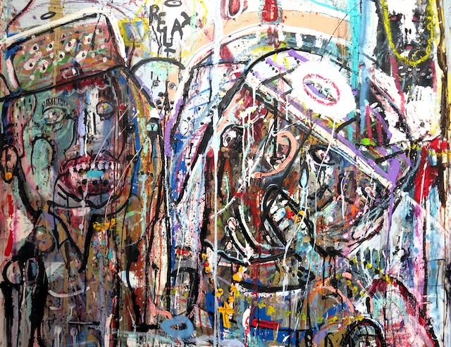
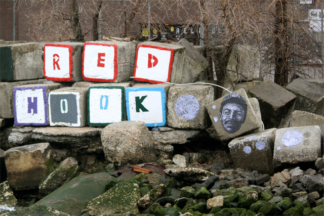
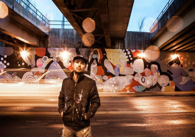
Hense has been committed to growing as an artist for nearly two decades now. The Atlanta native sticks to his guns by constantly showing support and advocating for the art scene in Atlanta. He’s done murals for the Atlanta Contemporary Art Center, the Museum of Design Atlanta, and recently transformed a historic church in Washington DC into a colorful, multi-surfaced piece of public art. Hense has exhibited his work nationally and internationally in solo and group shows, and has a long list of public art projects, commissions and collections. His abstract paintings and murals can blend precise line work with bright colors, shapes, and gestures.

Nico Glaude: Let’s kick things off with the church you painted in Washington. First of all, congrats on the massive amounts of attention that the project got on blogs and art sites, well deserved. If you can just talk about how that project came to being and your overall experience painting such a historic piece of architecture?

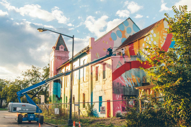
Hense: The project in Washington DC was probably the most interesting structure I’ve ever painted. I worked with a small crew to complete it. The project was a private commission which was located in SW Washington DC across the street from the Rubell’s proposed Contemporary Art Museum. The area in DC is a part of town that has huge potential to be the next art district and this project is the first step in bringing some life and color into the area. Taking an existing object like the church and painting the entire thing recontextualizes it and makes it a sculptural object. We really wanted to turn the church into a three-dimensional piece of artwork. With projects like this one, we really try to use the existing architecture as inspiration for the direction of the painting. I did several concept drawings for the church to present to the owner as rough ideas of aesthetic direction. I knew that visually, I wanted it to be drastically different from what it looked like before painting it. I also wanted to use very bright and bold colors to catch a viewers attention from far away. Most of my works are done in layers. The first step was to just get paint and color on every side and surface of the building. We then started developing large shapes and marks that would takes days to paint. The entire process took several weeks of layering and working. I’m very happy with the outcome of this project. I really enjoyed working on such interesting architecture. I also love working large and with multiple surface changes. When I’m working in my studio I usually am starting with a blank piece of paper, canvas or wood, and with projects like these I’m starting with an already beautiful piece of architecture to add color to.

Historic church in Washington DC

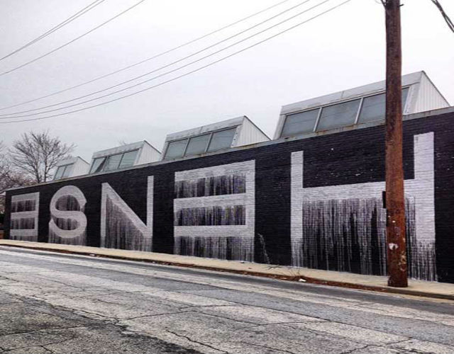
NG: Moving on to another mural you made for the Atlanta Contemporary Art Center. This mural is a complete departure from your most recent work; it’s a call back to letterform, minimalistic, comprised of only two colors and we get to see your name painted across a building. What was the inspiration behind the piece and why such a drastic change in style compared to previous murals?

Hense: I actually had another piece on the Center prior to this one and felt like it was time for an update. We were working on another exterior project right down the street for the Westside Cultural Arts Center which was very colourful and decided to do something totally opposite of that. I enjoyed taking it back to the pure essence of getting up. Silver and black, drippy block letters.

Atlanta Contemporary Arts Center

NG: Your murals always tend to be vast in terms of scale, and covered with a wide range of colors and shapes. What’s approach to doing a mural?

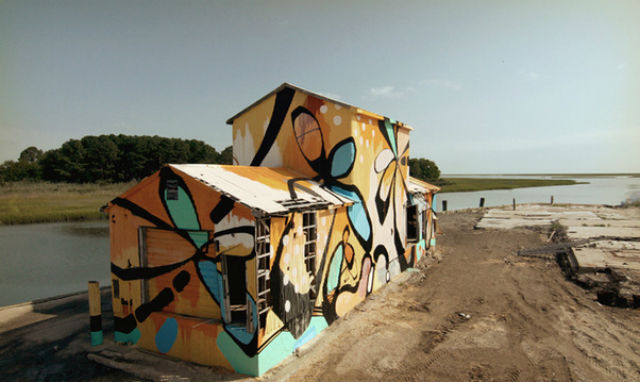
Hense: It really depends on the project. Right now I’m very influenced by interesting architecture. That could mean historic or contemporary. I enjoy working on flat surfaces of course, but a structure that has multiple planes and angles is much more dynamic visually before any paint is applied. It’s like having a blank canvas that is already layered and ready to go. Depending on the scale, I may have assistants work with me on projects.

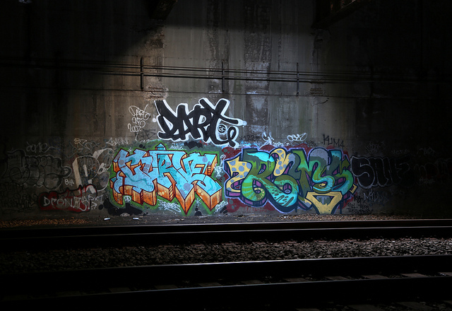
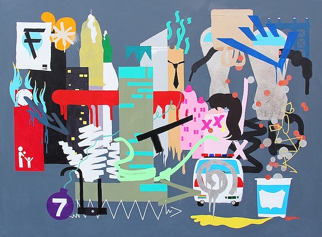
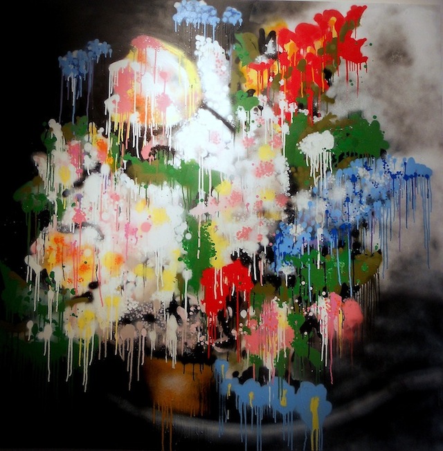
Almost everything I work on is completely spontaneous and I rarely use a preconceived sketch or concept. I’ve been recently experimenting in treating my exterior works similarly to my paintings. Color is another important aspect of my work. I like to use bold, bright colors that make a statement and really pop.

The work is purely based on abstraction and the physical process of painting. I want to constantly push myself and the viewer as to what can be defined as a painting. I enjoy the experimental process of painting in my studio or outdoors and I never want to know ahead of time what the final outcome of the piece will be. For me, the exciting part of the creative process is the unknown and the experimenting that takes place to get from one stage to the other.

I worked large early on with my letter-based graffiti, so painting entire buildings was a natural progression. I used to write my name in big block letters 100 feet long and 50 feet high using silver and black oil-based paint. I think that has helped me understand how to execute large exterior works which can also have multiple surface changes. Working large for me is the best. As much as I enjoy painting in my studio, I can easily say that working on large exterior projects has been the most exciting. One of the major challenges of working on that scale is the material application to the surface. We need lots of tools and lots of paint. The marks and shapes need to be larger than most studio tools can make which means we have to invent new tools or methods for the particular project.

NG: The great debate of graffiti writers moving into gallery settings will always be contested, but it’s something that’s becoming the norm of late. How was your transition from the streets to the gallery and any advice for artists trying to make that same switch?

Hense: I would say to do what feels right, go your own route and be original.

NG: You’ve traveled a lot in the past because of your work. What is it that draws you to, and keeps you in Atlanta?

Hense: I enjoy Atlanta for many reasons. I think I’ve kept Atlanta as my home base because it allows me to grow as an artist and lets me hold down an affordable, nice studio.

I’m able to travel for projects whenever I need to and the City still has a great sense of originality and culture.

NG: So there’s the story of you getting booked bare foot while on the run from the cops, any other interesting stories that have happened to you whilst getting up?

Hense: That story your referring to is probably the most ridiculous of them. I’ve had my share of chases, bookings and incidents.

NG: What’s your favourite kind of spray paint to use?

Hense: I like them all.

NG: Do you have an all time favourite mural you’ve made?

Hense:

700 Delaware
2012
Washington DC
House paint and aerosol

hense7

NG: Toss up between a blank canvas and a blank wall, which would you pick?

Hense: Blank wall.

Photos courtesy of Hense

Logan Hicks solo show coming up in LA

-11

Stenciling master Logan Hicks has a solo show this week at Los Angeles Contemporary Exhibitions (LACE). Thin Veils And Heavy Anchors opens on March 8th and only runs through March 10th, so mark it down on your calendars and don’t let this show pass you by. With this show, Hicks has continued to work with a combination of etching and stenciling, but he’s the work is on a massive scale that I don’t think I’ve seen from Hicks in quite a few years, and it looks like the combination of a stenciled layer beneath the etched architectural components (which I believe is new) has really helped to make the etched bits more aesthetically interesting (or perhaps just more apparent in photographs). I wish I could see this show in person, but I’ll settle for everyone I know in LA going there instead. So please go check out Thin Veils and Heavy Anchors at LACE.

The show opens on March 8th from 6:30-10pm.

Also, the LA Weekly is doing a print giveaway with Hicks. Enter here.

Logan has sent us some preview images. Check them out after the jump… Continue reading “Logan Hicks solo show coming up in LA”

Horfee solo show coming up with Topsafe London

Click to view large
Click to view large

Parisian graffiti king and PAL crew member Horfee‘s first London solo show, Horfee’s Imaginarium, opens later this month with Topsafe London at 4 Wilkes Street E1 6QF in Shoreditch. Horfee is one of the world’s most interesting and celebrated active graffiti writers, and he’s got a very promising gallery career developing. Horfee’s mad cartoons have a rare crossover appeal such that they can be appreciated by those familiar with his graffiti and the fine art world too.

Horfee’s Imaginarium opens March 14th (5-9pm) and runs through March 23rd. Email horfe @ topsafelondon .com to RSVP for the opening.

I can’t wait to see more from this show, but Topsafe London has sent over quite a healthy preview. More after the jump…

Click to view large
Click to view large

Continue reading “Horfee solo show coming up with Topsafe London”

Weekend link-o-rama

Dart, PC, Curve, Rams, and Sane

As I’ve been gearing up for midterms, I’ve missed posting some great outdoor work (and other things) this week.

Photo by Carnagenyc

“Detail” at Woodward Gallery

Cassius Fouler, Money-Making Manhattan; photo courtesy Woodward Gallery
Cassius Fouler, Money-Making Manhattan. Photo courtesy Woodward Gallery.

The small elements unique to each artwork are the subject of “Detail,” a group exhibit opening this evening, Saturday, March 2nd, 6 – 8pm at Woodward Gallery on Manhattan’s Lower East Side. Exquisitely curated, the exhibit features a range of intriguing images in a variety of media by a dozen artists. Among the artists featured are five whose works continue to grace our streets: Cassius Fouler, Thomas Buildmore, Kenji Nakayama, Kosbe and Moody. Here’s a sampling of what is on view at 133 Eldridge Street through April 28th.

Thomas Buildmore, Still Life; photo by Tara Murray
Thomas Buildmore, Still Life. Photo by Tara Murray.
Kenji Nakayma, Duck; photo courtesy of Woodward Gallery
Kenji Nakayma, Duck. Photo courtesy Woodward Gallery.
Kosbe, Borrowed Time, photo by Lois Stavsky
Kosbe, Borrowed Time close-up. Photo by Lois Stavsky.
Moody; photo courtesy Woodward Gallery
Moody. Photo courtesy Woodward Gallery.

Photos by Tara Murray and courtesy of Woodward Gallery

“Petrichor” by Swoon

IMG_5202
Click to view large

Caledonia Curry aka Swoon‘s latest solo show opened last night in her home-state of Florida. Petrichor (a word I was unfamiliar with but she says means “the first scent of rain on parched ground”) is an installation at the State College of Florida, Manatee-Sarasota Fine Art Gallery in Bradenton, FL. The show runs through April 3rd. Petrichor was made for Curry’s father, who lives near the college.

Click to view large
Click to view large
A portrait of Swoon's father
A portrait of Curry’s father. Click to view large.

More after the jump… Continue reading ““Petrichor” by Swoon”

Mata Ruda: Where nobody bothers to look

“I was leaving the South to fling myself into the unknown…I was taking a part of the South to transplant in alien soil, to see if it could grow differently, if it could drink of new and cool rains, bend in strange winds, respond to the warmth of other suns and, perhaps, to bloom.” –Richard Wright

IMG_1124

Conceptually and visually intricate, Mata Ruda‘s portraits convey a history that is unfamiliar to those who remain unaffected in their daily lives. The idea of el otro, or the other, is something that permeates not only methodologies behind Latin American art history, but the lives of those who chose to emigrate from those countries. While the translation is literal, the word otro encompasses more than that; it’s the feeling of being pushed to the side by the government and others because of one’s origins. Whether undocumented, displaced, or otherwise without a home, these individuals are often left without a voice.

IMG_1127

Director Alejandro González Iñárritu explains the feeling of otherness as, “we can’t understand what is happening to ‘something’ if we aren’t looking but nothing is going to happen to that ‘something’ if we don’t look deeply. That’s why so many things with incredible potential go unnoticed…..because nobody bothers to look.” In his most recent series, Mata Ruda draws attention to artisans who would otherwise go unnoticed, traditional Central American weavers who have since emigrated to Brooklyn. By immortalizing these individuals in a public space, the artist draws attention to several underlying issues, such as our lack of appreciation for craftwork, immigration, and labor standards.

IMG_1128

Often seen as less than art because of its functionality, this portrait draws attention to the technical layers that makes up the complex patterns associated with Central American textiles. In order to create the zig-zags and vertical stripes associated with these patterns, you must be proficient enough to operate several huddles as well as have mathematical precision in order to accurately reproduce a specific image. This same attention to detail can also be seen in the detailed lines that form the shadows and creases of the weaver’s hands. While the right hand is busy manually picking the weft to create a pattern while the left tests the warp’s strength. It is in this intricate representation of the forgotten that Mata Ruda can be compared to other Social Realist public artists such as Gaia and muralist José Clemente Orozco.

During his life, Orozco saw his neighbors used as expendable bodies in the  Mexican Revolution, which he envisioned in The Masses as a sea of faceless heads, yelling but not thinking. The harsh lines that define a field of overlapping reflect the hoards that barricaded towns into starvation during his childhood and eventually led to the loss of one of his hands. For Orozco, he called upon these experiences to give a voice that would otherwise be lost with the pulling of a trigger. A hundred years after the war’s inception, Mata Ruda follows in a similar path, but instead representing the inequalities that run through the 21st century.

IMG_1125

Equally as important for Mata Ruda is the representation of homeland and histories. Visually, the artist draws upon the mythology of lunar planning that was integral to his predecessors. Used as a planning tool for practical matters and spiritual ceremonies, Mata Ruda has created portraits that symbolize this importance; the lunar calendars orbit his figure’s head on a series of rocks or become literally placed on their conscience.

It was not enough for the artist to display this meaning in a public space, he also took on a name that would convey this symbology. When literally translated, Mata Ruda means a rough or hardy plant, one that can survive when transplanted like the emigrants he depicts. Beyond the translation, the latter part of his name can be seen as a corruption of the spiritually vital herb Rue. As with lunar charts, this herb is used for its supposed spiritual properties, such as warding off evil and to bring abundance. Through his use of subjects and histories that would otherwise be forgotten, Mata Ruda can be seen as an embodiment of his chosen name. Although paper and wheatpaste may not weather storms, the ideas behind them will last.

Photos by Rhiannon Platt

Lush back at Backwoods Gallery

-10
Mini graffiti by Lush

Lush is returning to Backwoods Gallery outside of Melbourne for a solo show (I believe his 3rd there) this week. The show, The Evolution of a Graffiti Shit ****, is open for one night only: This Friday. Lush’s shows are always a bit of a madhouse, so I would definitely recommending checking this one out, although obviously not if you’re easily offended (or, just really ever get offended about anything really). Seriously, should be great if you can handle it.

-9

lush

Photos courtesy of Lush