Juxtapoz and Complex miss Banksy’s uniqueness, celebrate his sameness

While I doubt anyone in that crowd is Banksy, they're all participating in Banksy's artwork. Photo by Ray Mock.
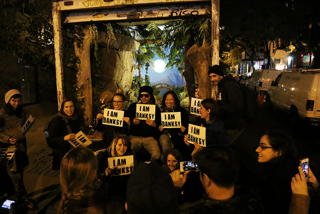
While I doubt anyone in that crowd is Banksy, they’re all participating in Banksy’s artwork. Photo by Ray Mock.

These last few weeks, I’ve been processing Banksy‘s Better Out Than In residency project and reading what other people have had to say it about it. Now, some mainstream media outlet like Forbes writes a silly article about Banksy and focuses almost entirely on money using numbers pulled from thin air, I understand. And hey, Jerry Saltz isn’t a fan or someone with a background in street art or graffiti, so of course his list ranking the pieces in Better Out From In from terrible to less terrible is a somewhat ridiculous. What really upsets me is when writers on media outlets that should know better miss the point entirely. Two articles in particular, in Juxtapoz’ print edition and on Complex’s website, struck me as particularly off-base.

The latest issue of Juxtapoz arrived in my email inbox on November 12th, so it’s very possible that Nick Lattner wrote at least the majority of his article before Banksy finished Better Out Than In, which is just the unfortunate reality of print journalism from time to time I suppose. If that was the case, I understand why Lattner went for writing about Banksy’s use of social media during Better Out Than In than the works in the show. Or maybe it was an attempt to stand out among the hundreds of blogs and magazines doing round ups of the top X pieces in the show. Whatever his reasoning, Lattner tries to argue that the real brilliance of Better Out Than In is how Banksy showed “a mastery of [his] command” of social media and the internet for getting his work out there. Lattner praises Banksy’s use of an Instagram account, a website and a hotline for audio-descriptions-by-phone.

None of that was innovative. It might have been cool, but it was not new. Cost and Revs listed a working phone number on their wheatpastes in the 1990’s. Banksy has had a website for years, as have most serious street artists, and Banksy was late to the game joining Instagram. Was it a surprise to see Banksy on “social media” networks? Sure. But only because he’s anti-social. And once on Instagram, he used it to push out content, not to engage. What Banksy did by putting his work on his website and posting it to Instagram was not innovative. It was simply not being stupid, assuming he wanted as many people as possible to see his work. Why is Lattner applauding a lack of stupidity like it’s a stroke of genius?

Similarly, Leigh Silver over at Complex.com wrote an article with the headline Banksy’s “Better Out Than In” Took Place on the Internet, Not the Streets. I’m very pleased to see Silver writing something of such substance on Complex and she connects the show to a larger narrative about street art and graffiti online that I think is important to understand, but I disagree with her somewhat. Basically, she argues the same thing as Lattner with regard to Banksy: That the noteworthy aspect of Better Out Than In was that Banksy was posting this photos online. That’s where most people saw the Better Out Than In, and it helped to “preserve” the show in a sense by allowing it to be seen in photos even after the work was tagged over or otherwise destroyed. That’s all true, but I wouldn’t say that’s what was noteworthy about Better Out Than In.

On the one hand, with a book on basically the topic of street art and the internet coming out soon, I’m excited that other people have picked up on this shift. That said…

  • Even Silver admits that this has been the modus operandi of other street artists for years. It isn’t like Banksy just suddenly invented the idea of people seeing street art online.
  • Banksy himself has done work that’s made to be seen on the internet before (for example).
  • Seeing the work online was an option, but it’s not what Better Out Than In was about. Banksy is more interesting than that.

We need more people like Silver, people who suggest that “maybe ‘getting up’ is not on the streets anymore; it’s on social media,” but it seems odd to cite Better Out Than In as a prime example of that mindset. While there were a handful of pieces in the show that were meant to be seen online or really only existed online, there were many more pieces that were intended to be seen in person. Many of the best pieces in Better Out Than In begged for, or even required, crowd interaction to be activated and seen as complete. Here are the ones I’m thinking of:

  1. This is my New York accent – Perfect placement for people to crouch down and take photos while flashing fake gang signs.
  2. You complete meDogs peed on it.
  3. Truck delivering “calm” – This truck was supposed to be delivering calm, but really it delivered endless chaos as fans chased it down the street and crowded around for a photo.
  4. Balloon heart – You mean to tell me photos like this one weren’t the point of this piece? Oddly, this is a piece that Lattner cites as one of his favorites.
  5. Banksy beaver – Maybe crowds weren’t intended as essential to this piece, but Lattner cites this video as evidence that the show had a focus on digital experiences, which is ridiculous since the video only exists due to the actions of people at the site of the piece.
  6. Sirens of the lambs – Yes, the video of this piece is great, but it’s one of those pieces where the experience is 10x better in person.
  7. Confessional – Again, this is about the crowd staging photographs. Yes, those photos are shared online, but a crowd needs to be there away from keyboard as the first step.
  8. Central Park stencil sale – Even this piece, which it seems no hardcore Banksy fans saw in person, required some crowd interaction or lack thereof. Without that, what’s the story?
  9. Twin Towers tribute – Many people have suggested this was Banksy essentially daring people to tag over the work. Who would dare tag over a 9/11 tribute piece?
  10. Big malletMore site-specific posing.
  11. SphinxJust like many ancient Egyptian ruins, Banksy’s work is often subject to looting.
  12. The banality of the banality of evil – How much will you pay for a painting of a Nazi (okay, admittedly this auction took place online…)?

Better Out Than In was not about the internet. It was not about Banksy “broadcasting” his work to an Instagram audience as Lattner suggests in Juxtapoz and it did not primarily take place on the internet as Silver suggests, at least not any more so than 99% of mainstream street art today. Yes, Banksy utilized the internet, but for the most part only to the extent that any reasonable street artist utilizes the internet. In fact, Banksy probably had more of a focus during this show than most contemporary mainstream street artists have in their work on away from keyboard crowd interaction and response. What Silver and Lattner are noticing is street art in general, not Banksy.

If you want examples of street art that exists on the internet and was actually designed to exist there, check out the other examples in Silver’s article, or these posts I’ve written, or wait for my ebook Viral Art, which will be out in a few weeks.

Photo by Ray Mock
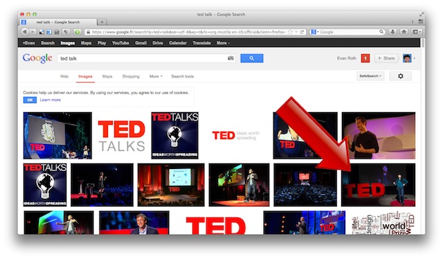
Evan Roth’s intervention in Google Images

Ted Talk

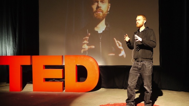
Earlier this year at FAT Lab‘s show at Eyebeam in New York, bad ass motherfucker Evan Roth had an installation called Ideas Worth Spreading. Basically, the installation is a mock stage setup for a TED conference, the popular conference with the tagline “Ideas worth spreading.” Getting to give a TED talk is considered a pretty high honor in some circles, but naturally not very many people get to give them. Roth’s Ideas Worth Spreading gave anyone who stopped by Eyebeam the opportunity to at least appear like they had given a TED talk. Naturally, lots of people pretended to give TED talks, took photos, and shared them on social networks, getting plenty of kudos from their friends in the process.

Roth recently posted an update about Ideas Worth Spreading on his blog. As it turns out, a few of the photos were reposted and shared enough that a Google Images search for “ted talk” brings up some of the Ideas Worth Spreading photos in the results. As you can see below, there’s even one Ideas Worth Spreading pic within the first 10 images of the “ted talk” search (it’s the one at the top of this post).

Ted Talk

You may be asking, “Isn’t this Vandalog? What the hell does this project and some Google Image search results have to do with street art?” Hear me out. This is what my upcoming ebook Viral Art is largely about. In Viral Art, I argue that this project falls into a category that I call active viral art, and that street art is also active viral art. Basically, active viral art is art that is imposed upon an unsuspecting audience. That’s what street art is on the street, right? Artist decides to put up work in a public space for an unsuspecting audience, bypassing any art-world gatekeepers in the process. Well, now that we spend so much time in front of screens and online, the internet is a kind of new public space. What Roth has done here is put up his work in this new public space for an unsuspecting audience. In this particular case, I guess the street art equivalent would be a subtle ad disruption.

Am I crazy or am I on to something? Let me know what you think in the comments. I can’t wait to more of my thoughts on active (and passive) viral art later this year when the Viral Art ebook is released (for free of course).

Photo and screenshot courtesy of Evan Roth

An experiment with street art, the digital image and the internet

A note from the editor: This is a guest post by Australian street artist CDH. Although I personally disagree with some of the conclusions CDH reaches in this post, I think it may be the start of a debate well-worth having, and it’s one that connects closely to my upcoming book, Viral Art. – RJ

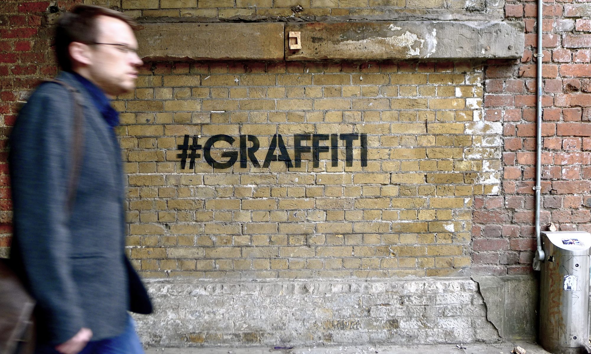
Street art is primarily consumed as digital images online, rather than as paintings on walls in the physical world. Juggernaut sites like Street Art Utopia pump out new images each day to their million plus audience. Street art fans are likely to subscribe to multiple sites and so this audience encounters far more street art online, than on the streets. The street art fades away but the digital images live on, which makes them the primary cultural product that we engage with.

In many ways it’s very positive; I can view global works from locations I may never visit, or the works may be gone by the time I do visit. It’s also just more efficient; I don’t need to travel all over my city to view the latest works, I can just check out the Melbourne Street Art page. There are many other consequences of online consumption to the street art medium that I don’t intend to investigate here. I’m primarily interested in exploring two consequences of online consumption:

  1. Audacity: Before the internet, placing works in a high traffic location was the only way to ensure a large audience (of generally passive observers). Today a work can be painted in any back alley, photographed and shared online with a huge audience of active consumers. Contextual spatial elements like the police station around the corner and the legality of the work are typically discarded online. So connecting with the audience doesn’t implicitly demand the same personal risk.
  2. Lifespan: Digital images of street art bounce around the internet long after the original work has been buffed into oblivion. In Melbourne, the limited legal spaces make it common to see writers paint a piece, photograph it and buff it immediately for their mate to use the space. The works exist in the physical world for just a few minutes, but live on indefinitely online. They’re made for online consumption.

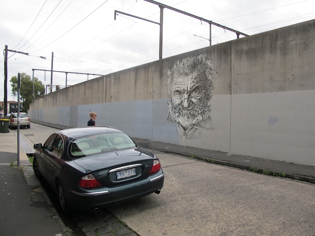
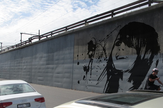
Online dissemination has generally diminished the audacity and the physical-world lifespan of street art. In the experiment here, I will take these 2 elements to their logical minimum and reduce them to zero. I have created street artworks that require no audacity and have no physical-world lifespan. I do this by photoshopping street art images into photographs of physical locations. Ultimately if we primarily engage with street art online and the digital image has effectively become the art (rather than the physical object), why not make this cultural production more efficient? This just cuts out the laborious middle step of painting a physical object, to then photograph, to then share online.

Results:

-1

-3

-2
This image utilizes a portion of a photograph by sultan-alghamdi

Interpretation:

This is an art experiment, so we should examine these images honestly. My interpretation is this: I think this is an interesting idea but ultimately I think these works are really just a bit shit. If the images were printed out, framed and hung in a gallery it would feel completely in place. But on a street art blog it feels out of place. It seems dishonest. An unspoken rule of street art has been cheated- it’s not on the actual street anymore, so can it even be street art? We had a similar debate in the early 2000s, when street art first transitioned into the gallery system; it’s a weird limbo space outside of what’s really street art. Perhaps it can be called ‘street inspired art’, like the gallery street art was originally described. The term ‘street art’ again appears amorphous and manipulable.

This experiment also draws attention to the idea that street art is really something halfway between art and mountain climbing. These photoshopped street art images are like photoshopping yourself into a picture at the top of Mt. Everest; the real point is that you climbed the mountain, not that you got a photo. Street art is less about the image and more about the task of creating the image. The street art audience is continually fascinated with large scale works. It seems absurd that artistic merit could be proportionate to the scale of a work, but when interpreted through the prism of the ‘audacity and the task’, it seems perfectly reasonable. Perhaps it’s why street art is closely tied to cultures that are intertwined with physicality, like skateboarding or parkour.

What are we actually engaging with when we view street art images online? We’re consuming a digital facsimile of a street work, not the actual street art in its original psychogeographical location. People sometimes falsely believe the photograph is an objective representation of truth. In reality the photographer’s eye subjectively selects images to present. Those images are then open to the same forms of manipulation as the photoshopped images above: Perspectives are forced; contrast and lighting can be adjusted in Photoshop; colours can be enhanced; the photograph might be taken from a crane or an angle that is inaccessible to a viewer in physical reality. So who is really the author of the online content we consume? Is it the street artist, the photographer or a convolution of the two? This photographic subjectivity and influence become even more noticeable when images of the same artwork by different photographers are compared side by side; sometimes they look like completely different artworks. With the online dissemination of the digital image, where exactly does street art end and digital art begin? Perhaps it’s tied up in abstract elements like the intent of the photographer or the place of exhibition.

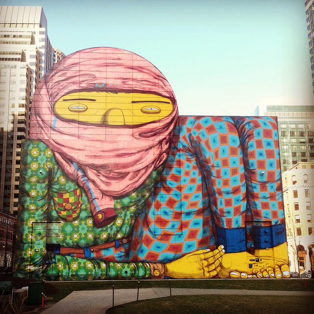
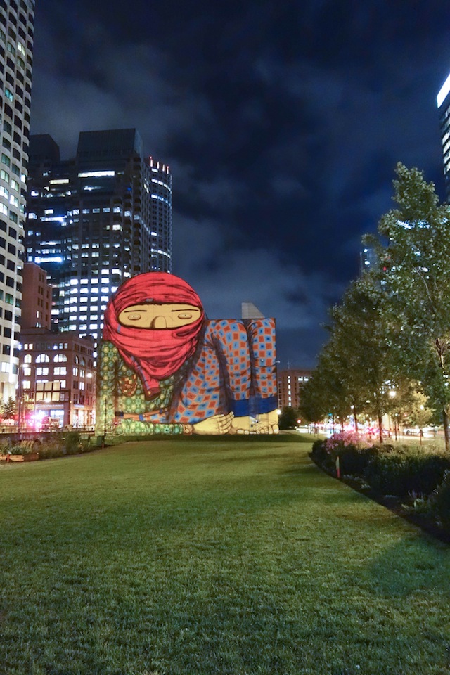
"The Giant" by Os Gêmeos. Photo by RJ Rushmore.
“The Giant” by Os Gêmeos. Photo by RJ Rushmore.
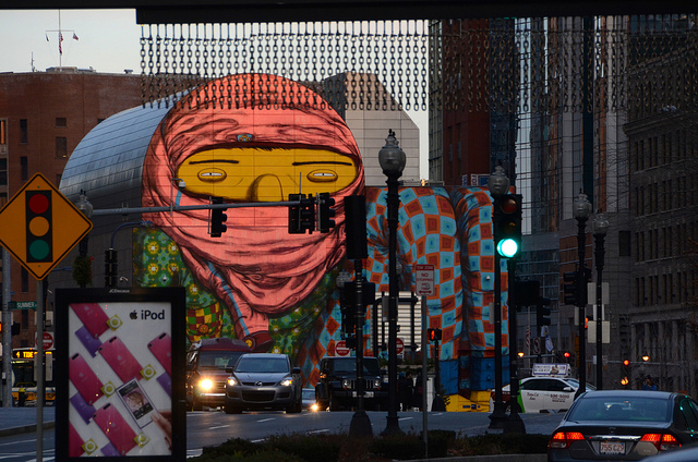
Photo by Nate Dorr
Photo by Nate Dorr
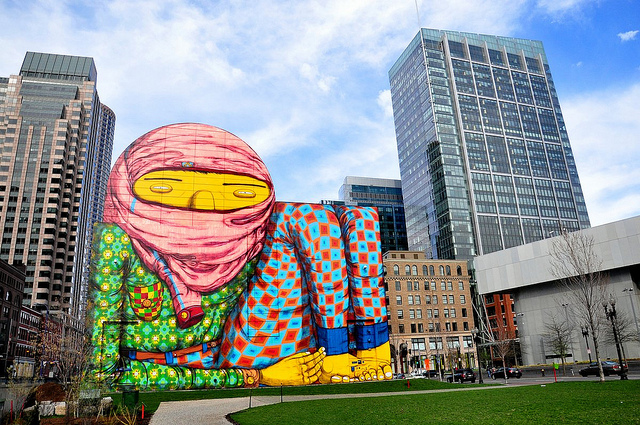
Photo by AnubisAbyss
Photo by Dylan Pech
Photo by Dylan Pech

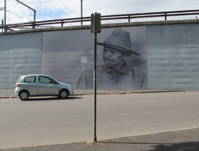
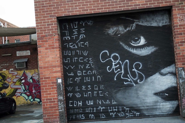
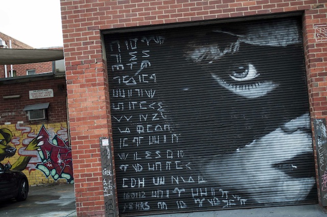
Post-Script: Coincidentally, after submitting this article, these photos, which depict one of my pieces, appeared on the Melbourne Street Art Facebook page. The tagging has been photoshopped out of the original image by the photographer. Random experiences like this never cease to amaze me in street art. On a personal level, it’s flattering that someone has taken the time to digitally restore the work but it also demonstrates that the digital image is not an objective record of reality. Similar to a restoration, the photographer constructs their interpretation of my original intention, not the work as it exists today. What if I tagged the work or intended for it to be tagged? Like a photoshopped image of a girl in a magazine, this photograph represents a mutable, aspirational reality. The photographer and I become collaborators in the construction of a new cultural artifact, that is consumed by the online audience but only exists in a digital realm.

-8
Before photoshop. Photo by Melbourne Street Art.
After photoshop
After photoshop. Photo by Melbourne Street Art.

Photos by RJ Rushmore, Melbourne Street Art, Nate Dorr, AnubisAbyss and Dylan Pech, with a portion of an image by sultan-alghamdi used in one of CDH’s edited pieces