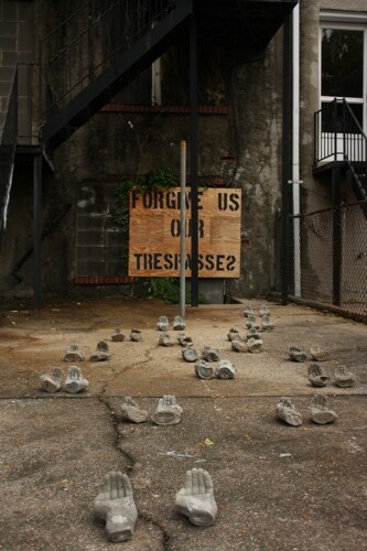
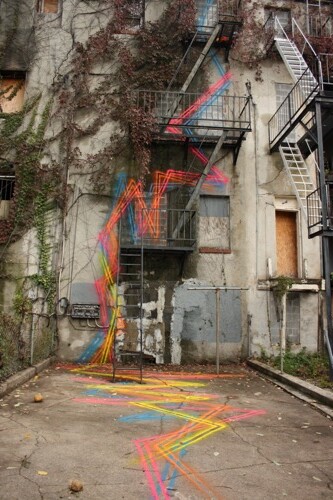
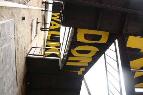
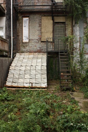
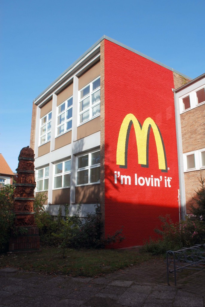
There has been a lot of cool work going up for the ARTotale event at Leuphana University, but this is one particularly interesting piece by Brad Downey.

And no, McDonald’s did not pay for that.
Here’s a bit of an explanation from Daniela Kummle, one of the university students:
With the change of university board in 2006 arrived an era of radical reformations at the Lüneburg university. This reformations did not only include the mandatory realization of the Bologna process but also a massive restructuring of the university. Especially the re-naming and the aligned marketing- and image campaign caused public stir. The new image of the university is clearly influenced by marketing considerations such as in private economies. A well-known German advertising agency invented the new name “Leuphana” and developed a “brand” logo which – in some peoples view – rather evokes associations of a car brand than of a university.
Along with these changes comes another big project – the building of a giant lecture hall (Audimax) by the world wide famous architect Daniel Libeskind. The costs are said to add up to a 62 billion euro. In order to avoid a public bid invitation for the building contract, Libeskind was made part-time professor at the Leuphana – not for the benefit of the students though – as he is rarely giving lectures at all.
Overall, the reformation of the university has aroused remarkable suspicion and critique both amongst students and lecturers. In the light of marketing campaigns and a giant construction project, many expressed intelligible suspicion about the use of tuition fees. In 2007, a website appeared which caused further confusion. ‘leuphana.de.vu’ is a mock university homepage which resembles the business-like tone of the new university president. As the page copies the official university pages visual style they look at first sight almost identical. The page also contains an “advertisement” video for the university. This video portraits the university’s campus as a high security area where access is only possible after showing one’s ID. It furthermore shows the university as being sponsored by Coca Cola.
Brad Downey’s contribution to the Art Totale, which goes in line with the welcome week for the first semester students, has lead to further discussions about Leuphana’s politics. An artwork that could in other context be read as a plain provocation acquires a deeper social and political meaning within in the recent history of this specific university. It imbibes the earlier articulated fears of critics, that forsee Leuphana becoming somewhat of a private university serving primarily economic interests. By raising disturbance and maybe even irritation, it functions well as a means of re-initiating the current discourse amongst the students. It will now take time to see, whether the Leuphana will incorporate its own institutional critique by allowing the work to be a permanent installation.
And there is a short interview with Brad about the piece over on Ekosystem.
Just has plenty of other photos from the event.
