Moniker set-up: Monday

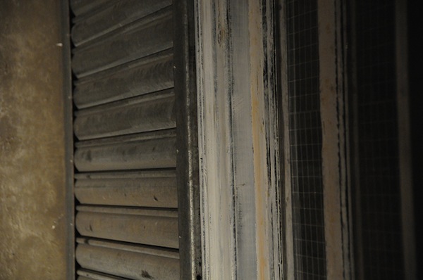
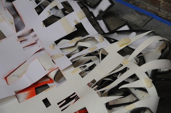
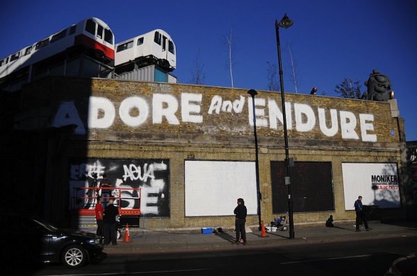
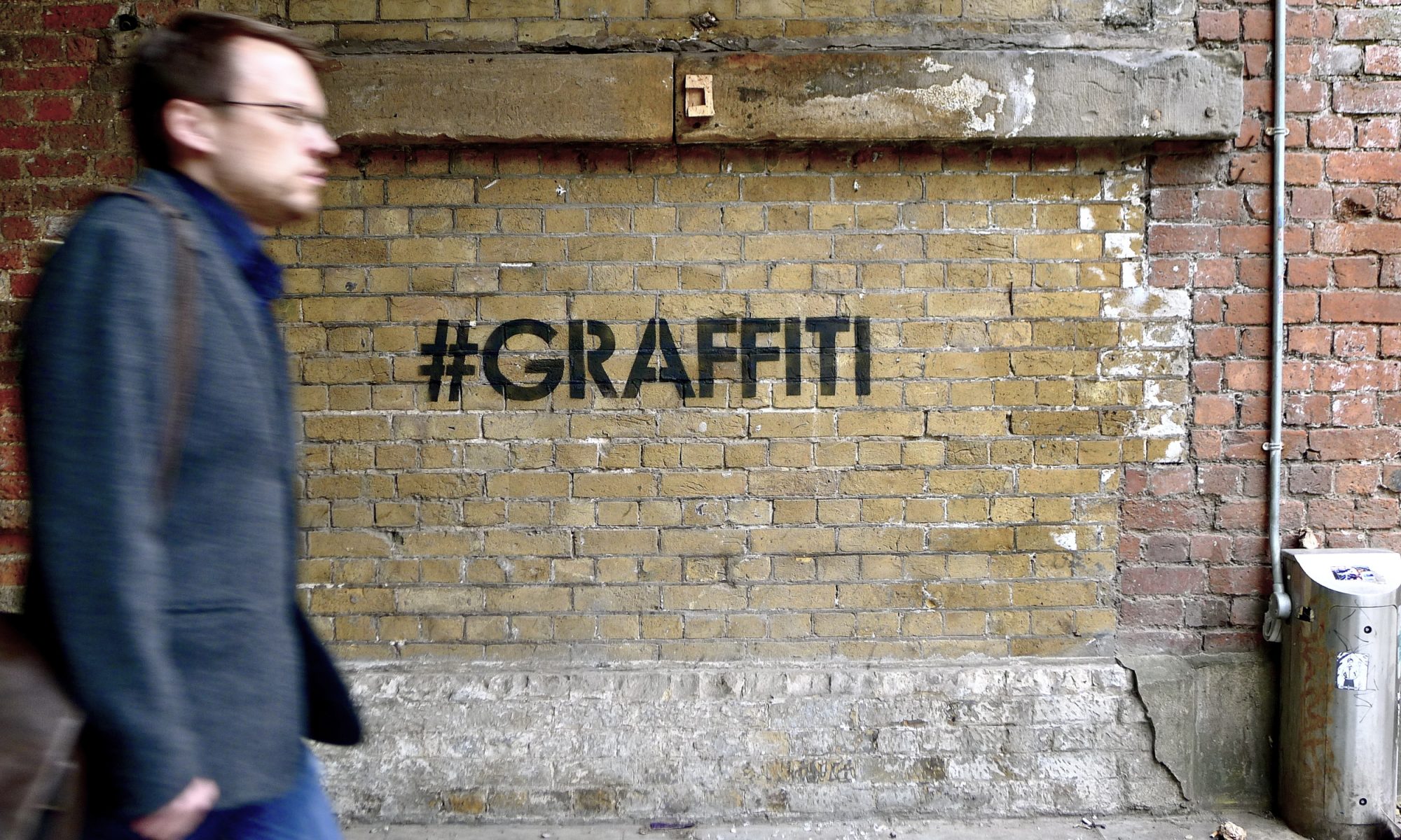
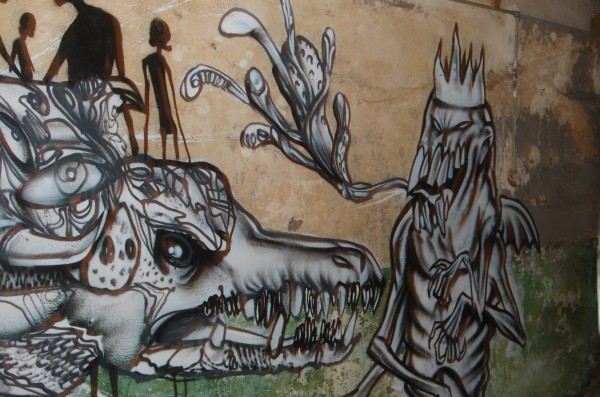
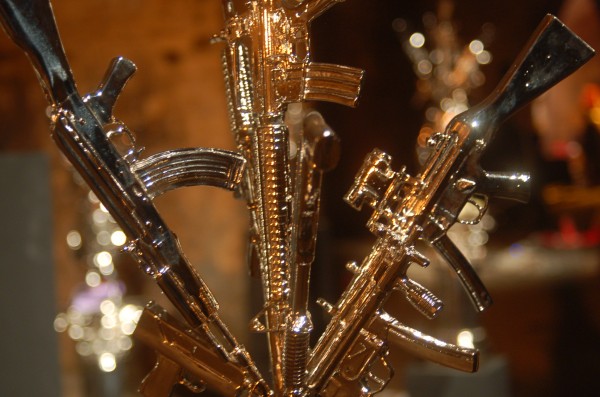
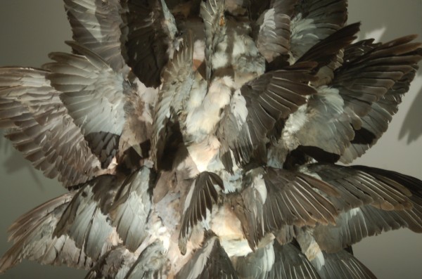
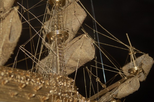
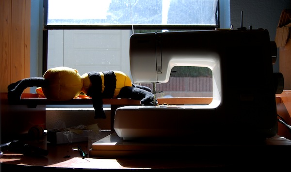
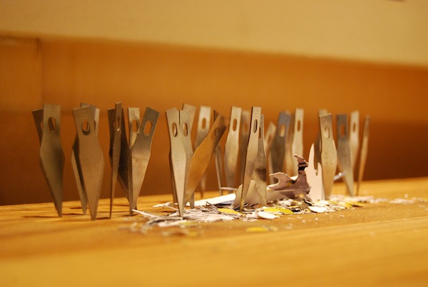
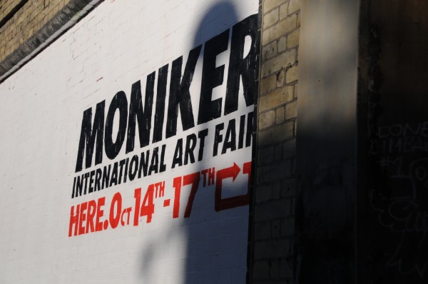
Village Underground is where it’s at this week. The Shoreditch warehouse off of Great Eastern Street is host to Moniker Art Fair. Hookedblog has a much better description of the fair than what I could throw together right now, but the fair opens Thursday night and it’s going to be a highlight of the street art calendar in London this year. Big names from around the world have are taking part in this fair and there’s lots of great art to see and fun events planned (including some tours led by me on Friday afternoon at 11:30 and 1:30). I’m on my way out the door to go see how the set up is going today, but here are some photos that I took yesterday as things were getting set up:

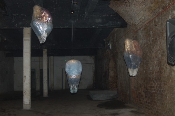
A certain British signpainter's installation...

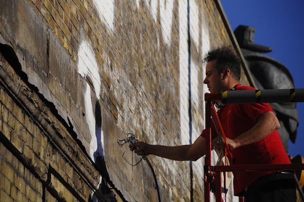
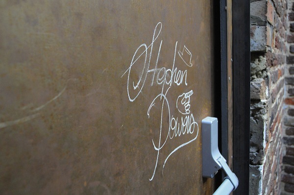
Steve Powers aka ESPO is in town to paint a Love Letter
And he's been tagging up the building a bit...

Expect more photos tonight or tomorrow and hope to see people there on Thursday…

Hell’s Half Acre Photo Exclusives

On Friday, I was graciously given an early preview of Lazarides highly anticipated new show, Hell’s Half Acre. Taking place at the Old Vic Tunnels by Leake Street, the off-site display hosts new works from heavy hitters Conor Harrington, Vhils, George Osodi, Antony Micallef, Doug Foster, Todd James, Paul Insect, Mark Jenkins, Boogie, Ian Francis, Polly Morgan and Jonathan Yeo.

The team at Laz still had a lot of work to do before the private opening tomorrow, but from what I could tell, this is sure to be one of the most talked about shows for months to come. Loosely basing the concept off Dante’s The Inferno, the works themselves reek of death, destruction, fantasy, and myth. The dark and wet tunnels create an ambiance that not only makes viewers uncomfortable, but forces them to react to the art. I don’t want to give too much away, but all of the work is brand new and most of it was made specifically for the show, especially the large scale installation spaces. At every turn in the tunnel’s maze, there is something new to be discovered, attempting to shock and intrigue viewers.

Here are just some of the pictures I have as well as the Babelgum preview video that is circling the Internet like crazy this weekend.

Photos by Stephanie Keller

Vandalog interviews – Faith47

A couple of years ago, I mentioned to one of my high school teachers that I liked street art. She got really excited. Turns out, she a. a huge tattoo by Mike Giant on her back and b. once interviewed South African street artist Faith47. At the time, I’d either not seen or not taken much notice of Faith47’s artwork, but that quickly changed. Now, Faith47 is one of the artists that I think of when I think of street art. There are a lot of talented street artists, but Faith47 really gets what street art is about: Faith47 can take an old wall and give it new life, and she helps to raise awareness of serious social issues at the same time. While they are stylistically very different, I see a similar intent behind Faith47’s art as I see with Swoon. Before this interview, I’d only been in touch with Faith47 once or twice before. Now, all my suspicions about her being as amazing and genuine a person as she is an artist seem to have been confirmed.

But it’s not coincidence that Vandalog is doing an interview with Faith47 now. Next week, Faith47 will be taking part in Moniker, the London art fair for street artists. Faith47 will have some art in Campbarbossa‘s booth at the fair. Moniker opens next Thursday evening. Most of Vandalog will be there; it’s definitely something worth seeing (hell, I’m traveling all the way from Philadelphia). So that’s my reminder about Moniker, here’s the interview with Faith47:

RJ: How did you start painting walls? Do you do graffiti, street art, a bit of both, something else or does it even matter what we call it?

Faith47: Wealz130 from the YMB crew was my catalyst in the formation of this love affair with graffiti, he taught me the do’s and don’ts and has been my adviser ever since.
I understand and appreciate graffiti culture immensely…
One of the things I liked most about graffiti was its anti social nature and its ability to exist outside of society…
And with this in mind I didn’t want to feel stuck within the mode of graffiti thinking where I am not free to experiment and do exactly what I want to do.
So you could label the different things I do into different categories, but at the end of the day it’s all just labels.
I paint the streets, and in a gallery space, I basically just do the work that I want to do and don’t worry so much about any of this, ‘what do we define this as?’ thinking… as life is bigger and more complex and intricate then that…

Where is your favorite place to paint?

My studio… at nighttime… with deep dark music on…
Or in the inner city littered streets, on a broken abandoned building which is still echoing of times past…
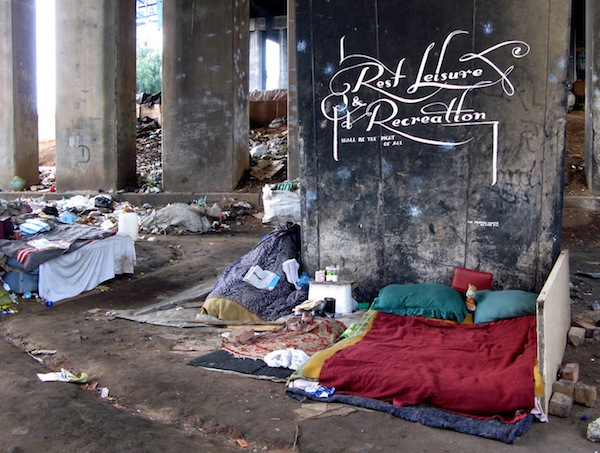
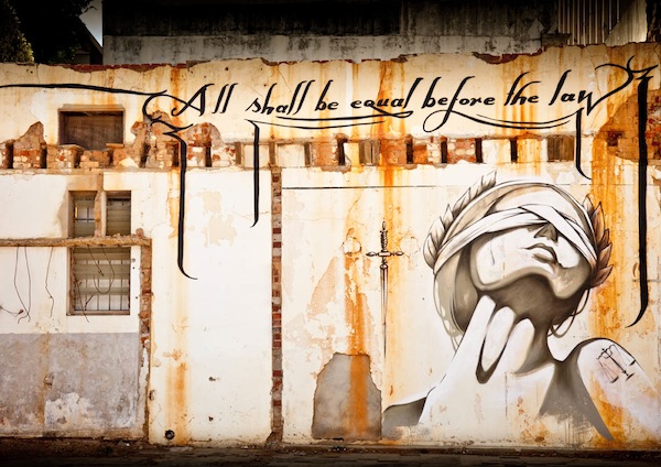
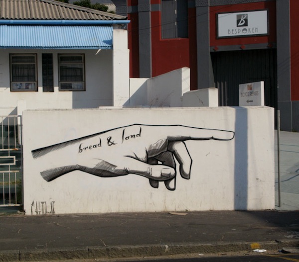
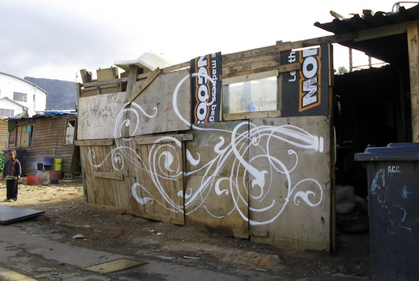
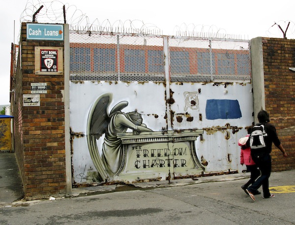
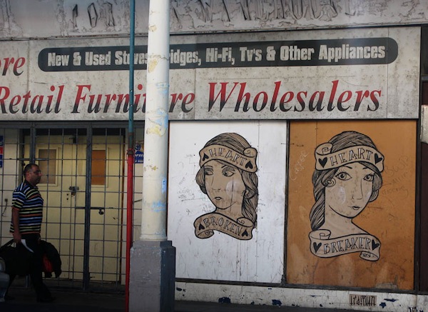
Most of your photos of your work outdoors show the wider context of where the work was painted, and many of those photos show members of the public passing by the art. Why do you paint where you do, and how do people react to it? It’s one thing for sites like Vandalog or Wooster Collective to post a photo and say “wow that’s cool,” but I’m not sure that’s your intended audience…

I’ve always loved the actual process of painting on the streets. It’s the experience itself that is half the beauty of it.
In South Africa people rarely explore life outside of their particular class category. This is partially due to the legacy of the apartheid group areas act.
So, to move around the country and in and out of the various communities through my painting has opened up this life to me in ways that I don’t think I could ever actually explain in words… This spills over to traveling in other cities and countries, the way you experience the city changes 100% when you are painting its streets… I’ve managed to experience the world and its alleyways and stolen lost roads with sheer excitement and wonder for the last few years, and for this I feel truly blessed.
I much prefer to paint in gritty, neglected areas and countries… Where one can see the life stories of the people ached into their faces…
The hand painted shop signs, the chaos of the streets, the freedom in this chaos to find your own space and work within it, to become part of the environment in this way… It’s organic and breathing and I like to feel that silent screaming breath of the city.
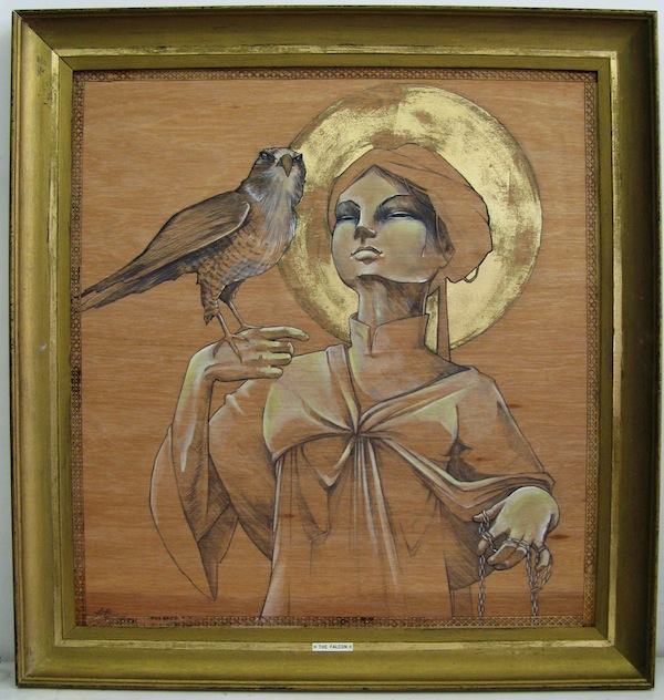
How does your art change between working on walls or “gallery art?”

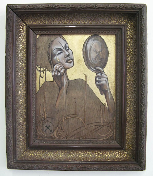
I fell in love with painting on wood and I think this will be an endless exploration into how I can play with this medium, it is so natural and such a base element. It takes me closer to nature. I’ve been exploring thoughts that are intensely personal; it’s been good for me.
I think it’s freeing me up a lot, allowing me to work in ways that are also in turn affecting my street painting.
So the relationship is symbiotic.
Also I can’t do one of them too much with out getting tired, so it’s nice to change from street to the studio from time to time, keeps things sharper…
What are you goals as an artist?

I really want to get to the point where I can comfortably support my son and myself without doing any work or commissions that I don’t want to do.
I really want to be able to use all my time to explore whatever ideas I have in my mind.
My biggest challenge in this life has been the financial pressures that interrupt my artistic process… It’s gotten a lot better, but it’s been such a long process and taken up a lot of extra time. I think this is a challenge for many artists… Especially in countries where there are no support structures or where you’ve had no formal art training etc.
This issue may have completely blown over by now, but I remember something like a year and a half ago that you tried to get the word out about an absurd anti-graffiti law that was being proposed in Cape Town. Were you successful in preventing that law from being passed?

It was passed a month ago.
I am feeling very depressed about it. It’s a blanket law that totally alienates us. I feel completely deflated about this. There is no option but to carry on as per usual and hope for the best. I want to move away from this city because of this negative energy from the city, but my son is here and he is very close with his father and we have a strong extended family structure. So I have to wait it out until he is at least 18…
Cape Town is a beautiful city, but it has a sickness that can affect you if you are not vigilant about it.
This is why I love / need to travel, to make sure I am breathing and thinking and alive and not subscribing to the bullshit that one subscribes to when you are in a small town for too long. A few days ago my unsuspecting heart sunk into the ground when I saw that they had buffed over the old “free Mandela” slogan which is on the off ramp near the Pick and Pay in Observatory… I’ve driven past that for years, we used to joke about stealing that iconic vibracrete and selling it to a museum – it’s so precious of course where it is that we would never had done such a thing, but our city council doesn’t care about these things and with grey bland death cement paint they erased a symbol of the painful struggle, perhaps because they knew that it never really ended and that the tires are still burning.
You’re probably the only well-known street artist that I can think of who is also a mom. How does being a mother influence your art?

Well it’s been super challenging, especially in the beginning.
But his dad and the family play a big part.
I’ve always thought that the best way to teach is through example, so when I had him, I was really young, and everyone expected me to get some lame ass job and do ‘what needed to be done,’ but I thought, “no, if I want him to do with his life something that he loves, then I need to do the same…”
I’ve been pretty uncompromising about this and it’s working out now after all this persistence.
He hangs out at his dad’s tattoo studio or at my studio a lot so he is always around great artists and people.
We’re really lucky, he loves drawing and in fact he burns a lot of artists hands down…
From the start we incorporated him into our lifestyles, so as he’s gotten older hes become an amazing friend and it’s actually a pretty easy dynamic.
How will you be involved in the Moniker Art Fair?

Well I’m going to be showing and painting at the Stroke.03 fair in Berlin.
So I thought I would hop over to see Moniker. I’ll paint a wall somewhere I think, and I’ll have some work up with campbarbossa.
But really I just wanted to hang out with Frankie a bit who is organizing the fair, and meet some of the galleries who are involved.
What have you got planned for the future?
I’m going to fall in love.
Again.

Photos courtesy of Faith47
Bumblebee’s First Solo Show

Things have been busy the past few weeks here at Carmichael Gallery – Seth and I have been prepping for Moniker / our trip to London, I’ve been finishing off the next issue of tasj (more about that soon) and Bumblebee has turned one of our back rooms into a full-on studio in preparation for his first solo show, which opens this Saturday at Beyond Eden!

If you live in LA, I hope you can make it to the show. There will be lots of new canvases, mixed media pieces and a big installation on display. He’s worked really hard for it, and it shows. It’s some of his best work yet.

Unurth posted one of Bumblebee’s most recent street pieces, “I’m Not Supposed To Bee Here”, last week; you can see it here.  He also did a cool piece last night called “Sleepwalking”, which you can see on tasj.

– Elisa

Photos by Bumblebee

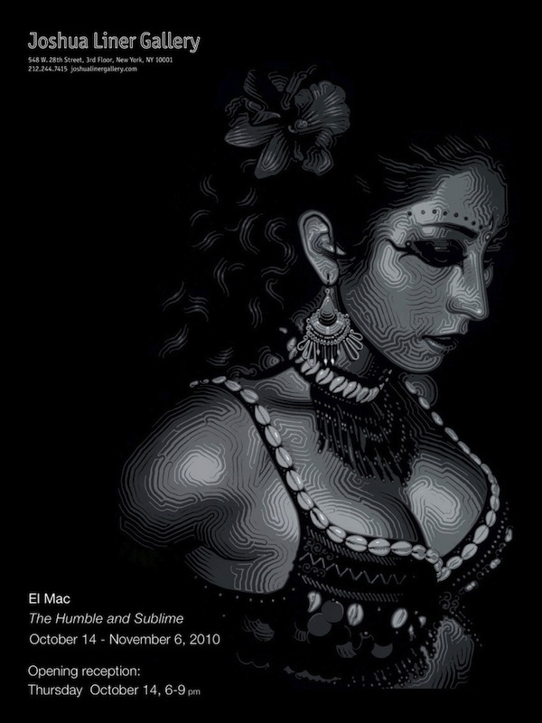
The Humble and Sublime: El Mac at Joshua Liner Gallery

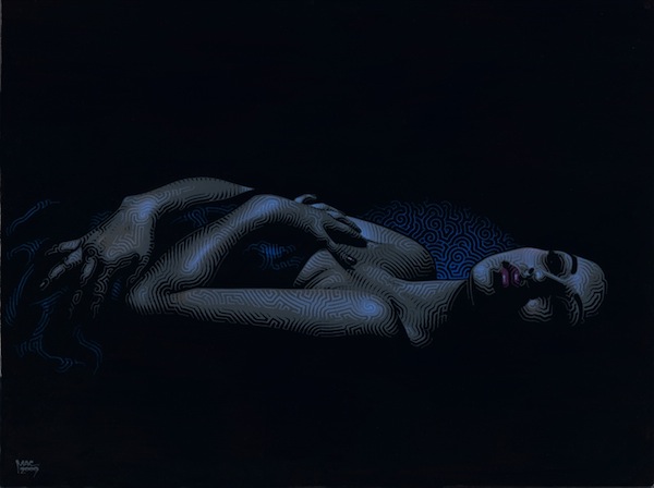
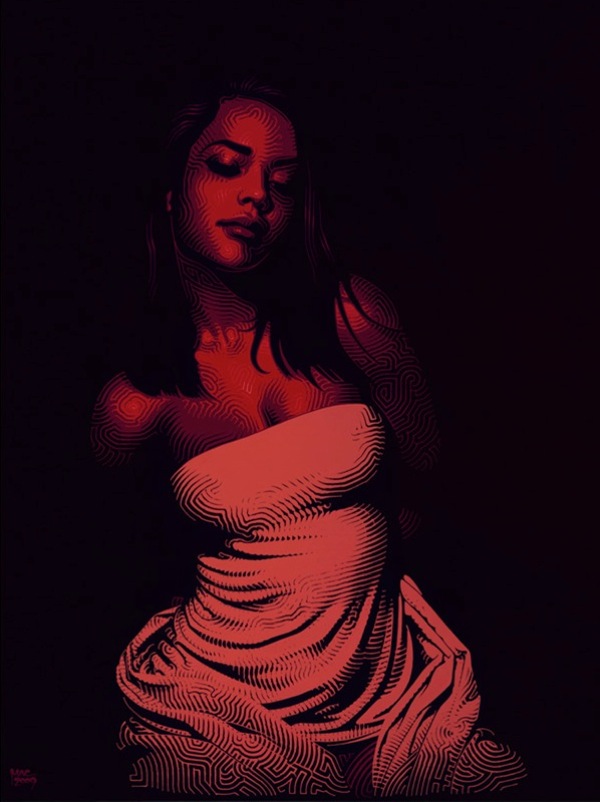
There’s less than two weeks until El Mac’s upcoming solo show at Joshua Liner Gallery in NYC. While Mac is best known for his murals, he’s also active in the studio producing work for galleries.

From what I’ve seen so far, it looks like most of the show will consist of Mac’s stunning acrylic on panel pieces. The first time I saw one of these was earlier this year Joshua Liner’s summer group show, and it was definitely one of my favorite works there.

The Humble and Sublime opens on October 14th and will be El Mac’s first New York solo show.

Photos courtesy of Joshua Liner Gallery

Compare and contrast: D*face and Jordan Seiler

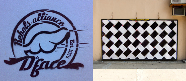
Stencil by D*face (photo by hebedesign) and Weave It by Jordan Seiler (photo by Jordan)

I want to look at two very different artists and how they tackle advertising and the media in their art: D*face and Jordan Seiler.

D*face is known for billboard takeovers, messing with pop culture icons, messing with corporate logos and his “d-dog” icon. He’s kind of like Kaws in that D*face inserts himself into pop culture, but D*face’s work is typically subversive or critical of advertising, marketing and things like that. On the other hand, KAWS is inserting himself into pop culture in order to embrace it and become a part of it. Actually, D*face probably explains his art better himself in a new video for Don’t Panic:

I think it’s fair to say that D*face is “against” advertising, or at the very least that his critique of it doesn’t paint a pretty picture. I would also say that D*face has been, throughout his career, very good at subverting advertising, media and pop culture. Yet, there’s something about D*faces work that doesn’t subvert advertising at all. In fact, in some ways, D*face’s art embraces advertising. Like Shepard Fairey (one of D*face’s major influences), D*face has an “icon” or a “logo” of his own. The d*dog or elements of the d*dog appear throughout his work, as does D*face’s own name. So is D*face advertising himself by subverting advertising? Certainly. Is that his intent? I’m not sure. And if it is, it’s worth mentioning the standard argument defending that: (except for Shepard Fairey who has teams of wheatpasters) an individual artist doesn’t have the resources to advertise themselves on anywhere near the scale that a brand like Coke can advertise and the artist is putting up art while advertisers are solely trying to sell a product. Additionally, D*face’s use of a logo has probably helped him to become the success he is today, which in turn allows him to do crazy projects like this and increase awareness for his agenda of getting people to question advertising and mass media.

For those familiar with Adbusters, this paradox might be familiar. The Adbusters organization sells shoes which are essentially made in opposition to Converse and branded shoes made in sweatshops, but by creating an anti-brand, they have created their own shoe brand.

Jordan Seiler, like D*face, is known for billboard takeovers but also for his efforts to change/eliminate advertising in the public space. In addition to his own art, Jordan organized NYSAT and TOSAT. Throughout his outdoor art career, Jordan’s style has changed more drastically than the average street artist. While there are a few reoccurring motifs (like a use of simple geometric patterns and shapes), each project is very distinct and it would be hard for me to define a specific style for Jordan (unless doing ad takeovers is itself a style). Additionally, I don’t think I’ve ever seen Jordan sign his outdoor work. Recently, Jordan has been preparing to retire one of the designs that he has used for a while now and is starting to become identified by, his Weave It design.

From the Paper Champion project, photo by Jordan

On his blog, Jordan recently explained that he was finishing up the Weave It project (as he had ended projects previously before they became “iconic”) “in order to remained un-branded as an artist and therefor escape criticism that I use the streets and advertising venues as advertising for myself.” Two days later, Jordan restated his feelings in another post. Once again, Jordan said that he is moving on from the design in an effort to “prevent branding of PublicAdCampaign imagery.”

To most street artists, changing their style regularly and actively trying to avoid any identifiable trademarks might seem like a novel and counter-intuitive idea, but Jordan seems to be sacrificing potential short-term artist notoriety for his long-term political aims. The flip-side of this strategy is that a lot of Jordan’s art isn’t immediately obvious as an advertising takeover. Most of the takeovers don’t scream out “I am here instead of an advertisement,” so the art can easily be ignored or even possibly confused as some sort of guerrilla marketing campaign. While D*face’s artwork makes itself obvious and forces people to re-examine the world we live in, perhaps Jordan’s more subtle techniques cause the art and the action he has taken to be overlooked (although, and I’m not sure about this, he might argue that that’s sort of the point in some cases).

I emailed briefly with Jordan and he clarified his position on using logos in art. Surprisingly, he said “My thoughts on logo reproduction in street art and ad takeovers are not as idealistic as that which I practice” and he actually doesn’t believe that street artists shouldn’t use logos, just that “I choose to go as far as I can from logo production and stylistic similarities (which I can often fail at) mostly because I choose only to hit ads and therefore am under even higher scrutiny when being asked if my work is self promotional.”

So whose work to you think is more effective? Let me know in the comments.

Photos by hebedesign and Jordan Seiler

Richard Hambleton: One of the original street artists

One thing that I’ve been getting interested in lately is street are in the 1960’s-mid-1980’s. Basically, street art before Shepard Fairey. That’s why I recently visited John Fekner and Don Leicht’s studio. Perhaps the best place to learn about street art in that timespan is the book Street Art by Allan Schwartzman (and Tristan Manco has another suggestion but it’s not as easy to purchase). You’ll probably recognize some of the artists on the cover of Street Art (Futura, Kenny Scharf and Keith Haring), but the largest image on that book’s cover is of an artwork by a largely overlooked street artist: Richard Hambleton.

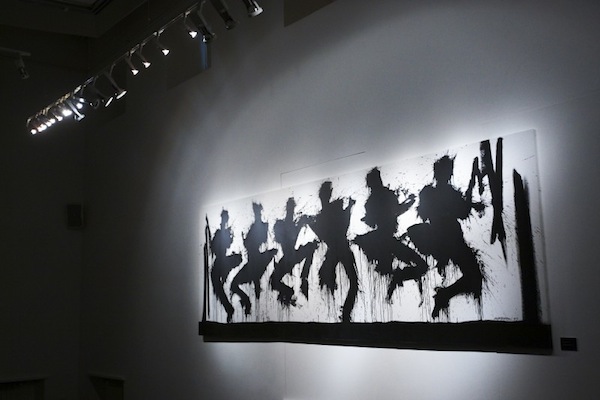
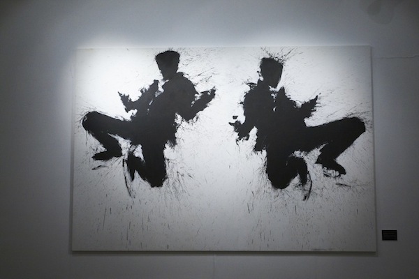
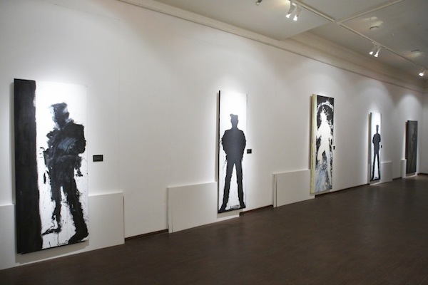
Hambleton started making street art in the late 1970’s when he made chalk outlines of people’s bodies in public places, as if a murder had occurred there. The physical artwork was really just the start of these pieces though. Often, these would get picked up by the local media, as residents in suburban and generally wealthy communities mildly panicked about the “crime scene.” Besides being fun, these early pieces of street art help to draw a very clear connection between the situationist movement and street art, something that I like to look for.

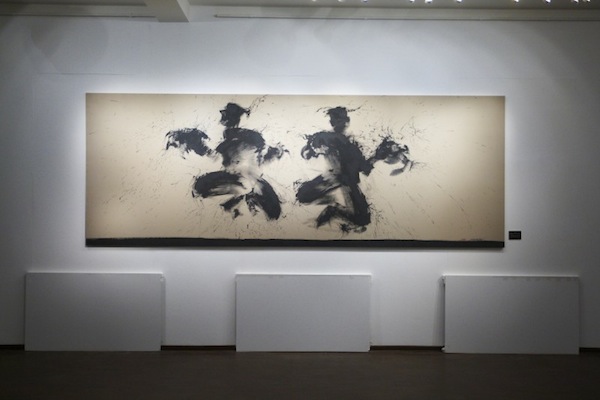
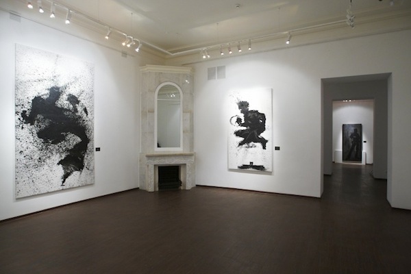
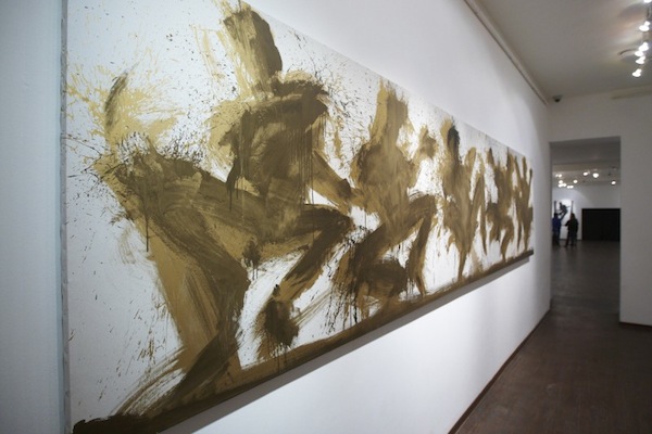
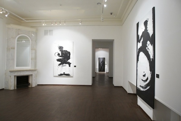
But it’s another series that Hambleton is probably best known for: The Shadowmen. These are what is on the cover of Street Art. Hambleton splashed black paint onto the streets in figurative shapes that looked like the shadows of people. It’s these paintings that you’ll primarily find at his current retrospective in Moscow. I briefly mentioned Arrested Motion’s preview of the show a few weeks ago, but now some photos of the work hanging in the museum have come out. Oh, did I mention that the retrospective is at a museum? Looks like USA hasn’t quite caught up with the Russians on this one, as Hambleton’s retrospective is taking place at The State Museum of Modern Art of the Russian Academy of Arts in Moscow.

There are some pretty nice pieces in this show, and for a fan of the years of street art like me, it’s fantastic to see Hambleton finally getting due recognition in a museum (as well as a recent Juxtapoz Magazine interview).

Unfortunately, Richard Hambleton – New York closes on September 29th, but hopefully show will help to relaunch Hambleton and we’ll be able to see these works in the UK or USA soon. Hambleton is among street art’s original innovators and it’s a shame that his contributions haven’t been more properly acknowledged until recently.

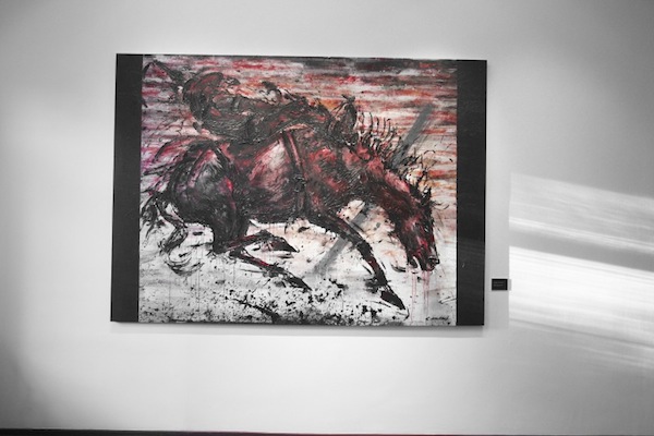
One of the interesting things about Hambleton is that even though he was one of the first street artists, his gallery work wouldn’t immediately be pegged as “street art” (unlike, for example, Blek le Rat, Crash and Futura). The above painting his part of his Marlboro Man series, and it just looks like a strong painting; Hambleton’s street art background doesn’t entirely define him.

Hambleton’s retrospective was put together by Valmorbida and Feedback.

Photos courtesy of Valmorbida

This is going to be awesome… Moniker International Art Fair

Way back at the beginning of August, I mentioned that the Moniker International Art Fair would be starting in London this year as a street art alternative to Frieze. Basically, some of the world’s top urban, street and low-brow art galleries have been brought together and will be exhibiting under one roof from October 14th-17th at Village Underground in Shoreditch. Galleries with booths include New Image Art, Campbarbossa, Black Rat Projects, Carmichael Gallery and more. Additionally, there will be project spaces from artists like Ben Eine and Polly Morgan.

They’ve just released this new animated video for the fair:

While our friends at VNA are officially sponsoring the fair, we here at Vandalog have a bit of involvement as well. Elisa Carmichael is obviously going to be there for Carmichael Gallery, Steph Keller is currently interning with Moniker and I’m organizing something small with them as well which will be announced soon, so you can be sure that we’ll be posting a lot about the fair in the coming weeks.

Vandalog Interviews – Retna

Photo by DoubleKf

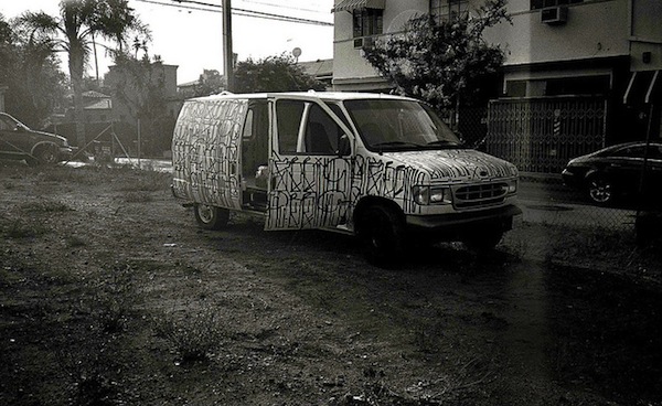
One of the best examples of the grey area that I love between street art and graffiti is Retna. The artist that I most wanted to watch paint last year at Primary Flight was Retna. I remember seeing one of Retna’s faux-marble sculptures at Primary Flight’s Blue Print For Space show and thinking “Damn, he needs to do that in real marble and I’d want one in every room of my house.” One of the first pieces of graffiti that I saw upon arriving in Philadelphia last month was an piece by Retna. For the last year or so, Retna has secretly been climbing toward the top of my list of favorite artists. His art works equally well indoors or outdoors, alone or in collaborations. He deals with subject matter ranging from politics and spirituality to fashion and street culture, but he doesn’t feel all over the place because it’s all part of a continuing push to bring things to a new level.

Recently, Retna took some time to talk to us here at Vandalog for this exclusive interview. And if you enjoy this interview (and even if you don’t for some reason), I highly suggest that you check out the September issue of Juxtapoz where Jeffrey Deitch shares his thought on Retna (excerpted here) and Retna is interviewed in-depth.

This is the first in Vandalog’s series of interviews in anticipation of the Moniker International Art Fair. Retna’s work will be shown at the fair in New Image Art Gallery‘s booth. Over the next couple of weeks, we’ll be posting more interviews with a number of artists involved in Moniker.

How did you become interested in graffiti art?

My first encounter with graffiti was when I was a kid—I remember going out in my backyard and seeing a group of older guys hanging out on the roof a couple houses away writing gang blocks. At the age of 8, I was fascinated and already trying to imitate what they were doing. I was immediately attracted to the art form of graffiti and wanted to know how it was done, so I started practicing writing letters and eventually developing my own style.

How did your affiliation with MSK and AWR come about?

It begins and ends with my oldest group of friends.

Something that has always intrigued me about your work is its unique use of the Latin alphabet. Where did the idea to incorporate this technique in to your work originate? Was this style something you were already familiar with or did you have to learn it from scratch and adapt it?

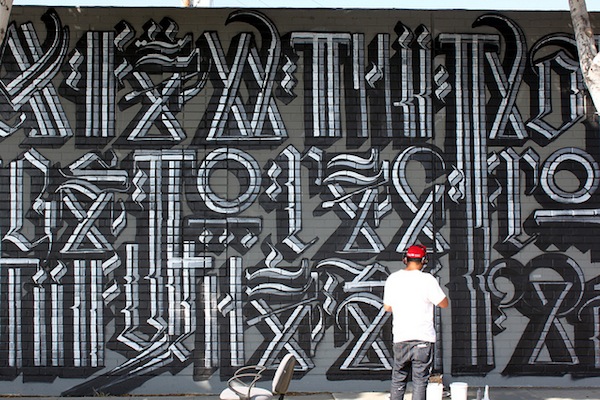
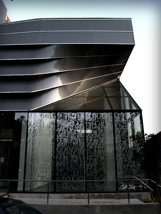
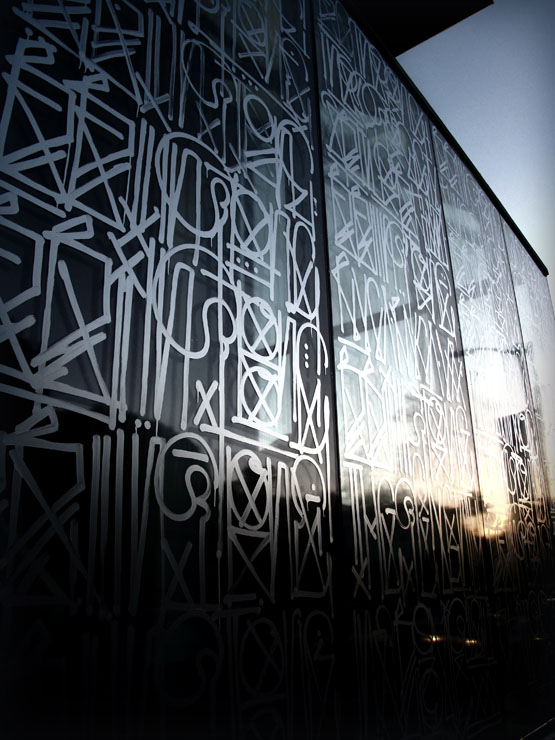
The incorporation of text in my work is a direct result of my graffiti background. It’s become my way of bridging the gap between graffiti art and fine art. My style of writing is something that I have created and refined over the years by taking inspiration from various sources including Egyptian hieroglyphics, Old English calligraphy and traditional graffiti writing.

Photo by Lord Jim

When you’re creating a piece that incorporates this type of lettering how often are you actually creating an encoded message, rather then just using the font purely for aesthetics?

Although some may see the text as aesthetically pleasing and merely as symbols, I never write random letters. All my pieces can be decoded into full messages and words that translate into English or Spanish.

Photo by Revok
Photo by Revok

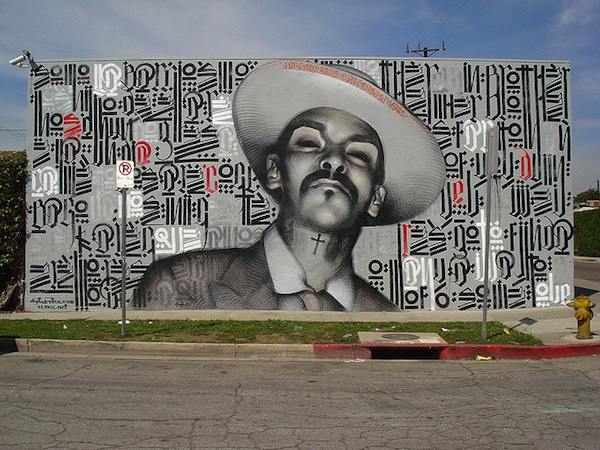
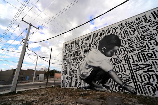
Creating murals by yourself or with others seems to play a very big part in what you do. One thing I’ve noticed is your consistency in collaborating with EL MAC. How did you guys meet and what is it that keeps bringing you back together for these awesome collabs?

Mac and I first met about ten years ago when we were painting side by side at an art event in Mexico and then we were reintroduced about five years ago—that’s when we completed our first collaborative mural. Our work garnered such a positive response that we realized that we had a strong synergy and we’ve been working together ever since.

Retna and El Mac. Photo by anarchosyn
Retna and El Mac. Photo by Hargo

How has L.A. Influenced your style since you were first introduced to the mural culture at an early age?

I was born and raised in Los Angeles so I grew up watching all the other great graffiti artists and muralists, and aspiring to be like them. I want to do the same for others—I want to create work that’s so awe-inspiring that it motivates others to get into art. I would love to be a footnote in someone else’s career and hear that they were inspired by something I created.

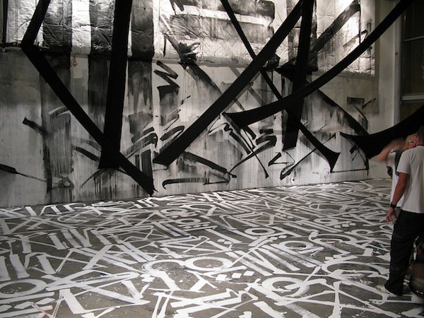
Lets talk a little about the latest installation you did over at the Rivera & Rivera Gallery, where you created a floor-to-ceiling installation piece. What was it like working on such a large scale?

I have worked on some large-scale murals before, so that was not a challenge for me. However what I did find challenging was, visualizing the piece on a three dimensional scale. The piece at Rivera & Rivera was the first time where I incorporated additional elements, like fabric, to my painting to create a truly interactive installation that fully engaged viewers.

Photo by Unurth

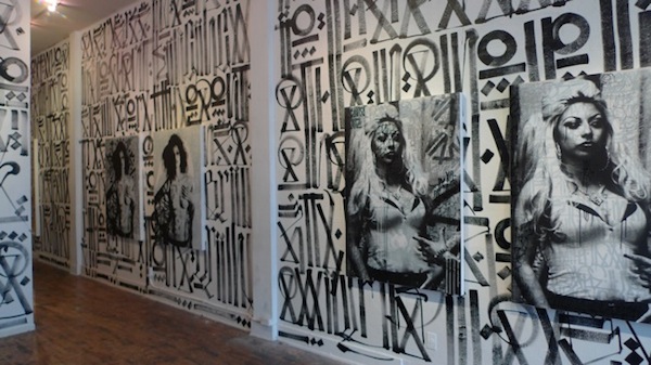
What was the inspiration behind the Desaturated exhibition? It seemed quite fashion orientated. Is this something you’ve become interested in as urban art and fashion seem to have merged together rather quickly.

I don’t think I’m into fashion all of a sudden because it has merged with urban art; I’ve always admired people who have dope style. That includes people from all over the world and their style, whether is unique to them or traditional according to their heritage—if it looks good, I’m going to like it. The same goes for the images of the Desaturated exhibition, I wasn’t as concerned with what they were wearing as much as I was about what the overall image looked like.

Photo courtesy of New Image Art Gallery

And finally, what does the future hold for RETNA? In regards to your work, new projects and any other personal aspirations you have in life. Is there anyone you’d like to give a shout out to?

I can’t say I know what the future holds. The only thing I am focused on right now is making new work and continuing to do what I do.

Be sure to check out more from Retna by visiting his official website here

Photos by Unurth, Hargo, anarchosyn, Revok, Lord Jim, DoubleKf and New Image Art Gallery