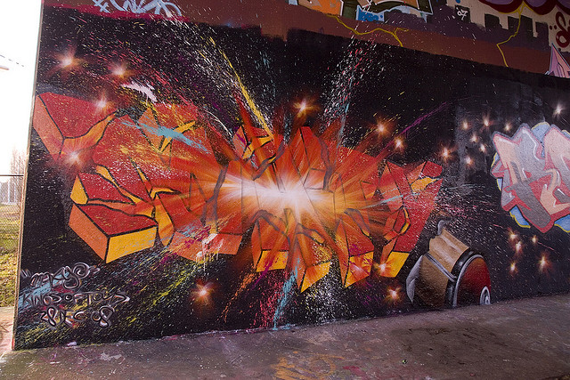
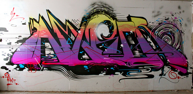
There are two things that I really like about this: one being the use of the wall it was painted on, and two being that the detail is concentrated behind Mime’s name, instead of the name itself.
Photo by DepteRIP
There are two things that I really like about this: one being the use of the wall it was painted on, and two being that the detail is concentrated behind Mime’s name, instead of the name itself.
Photo by DepteRIP

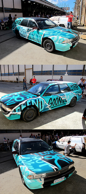
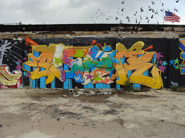
André aka Monsieur A covered some old car in his tag. The headline is basically all that needs to be said.

Photos by VitoStreet
Numskull, from Sydney, Australia, does indoor and outdoor work (his most recent solo show just finished up). The subject of his pieces typically center around mixed and matched text art, as well as cartooning which often pieces fragments of other iconic characters. In an interview done last year with This Life Numskull explained how his childhood background in graffiti and his history working in advertising ultimately led him to sign painting.
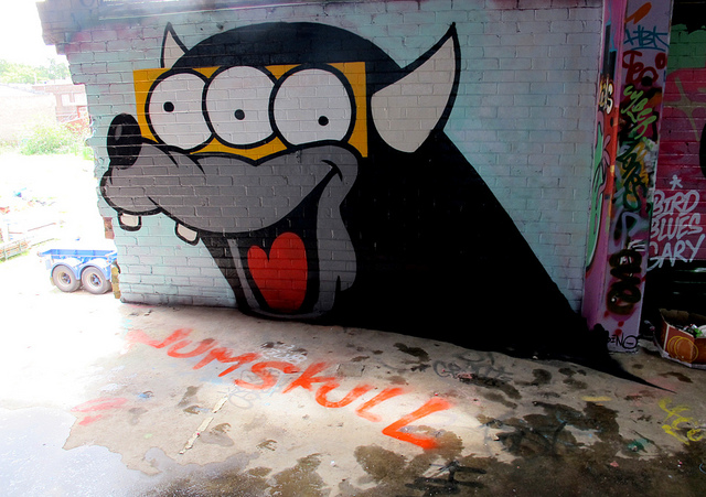
Photos by Numskull
Earlier this month, Hush and OneThirty3 Projects held an installation at Hush’s OneThirty3 space in Newcastle, UK. The show featured a new installation by Hush and the works of photographers and film makers documenting previous installations in the space by artists such as Titifreak, Paul Insect, Sickboy, Herakut and Gaia.
Photos courtesy of Hush and OneThirty3
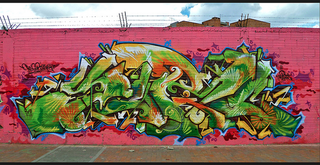
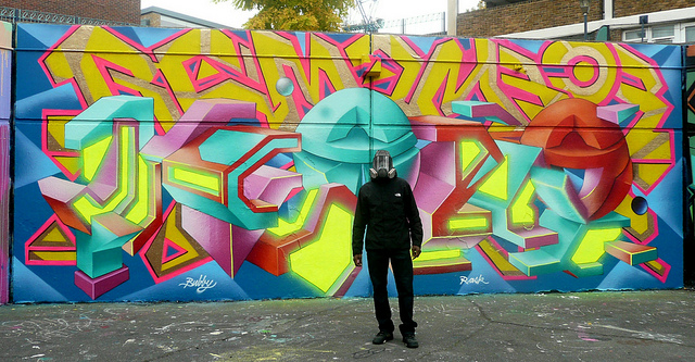
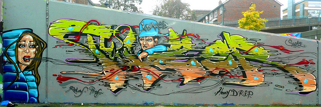
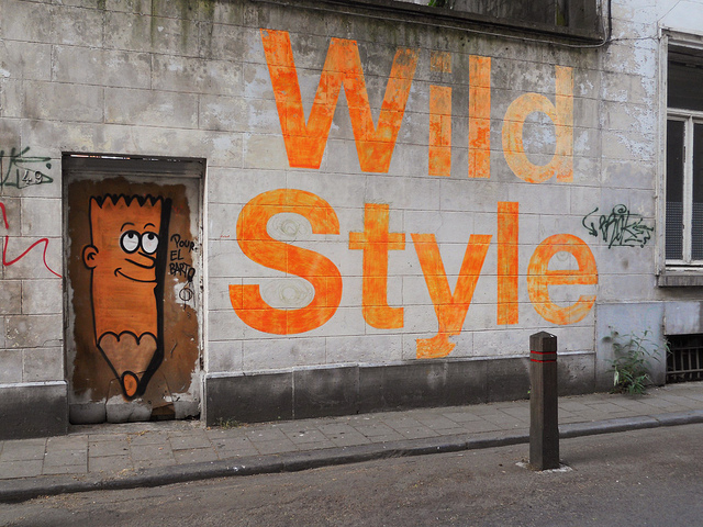
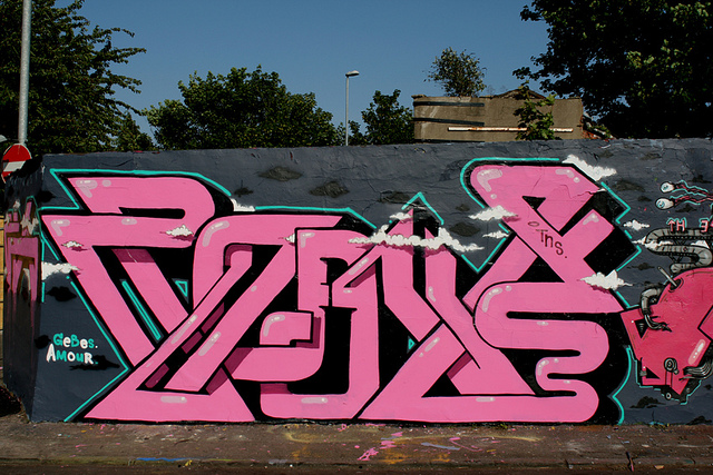
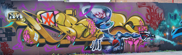
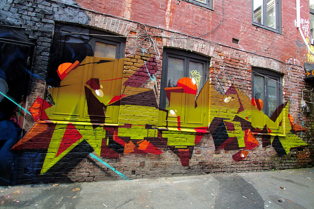
Round 2 of Wild Style Wednesday!
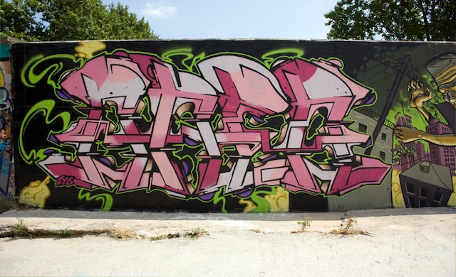
Photos by Yuric, AVK ONE, Luna Park, Herbalizer, Fat Cap, and Anarchosyn
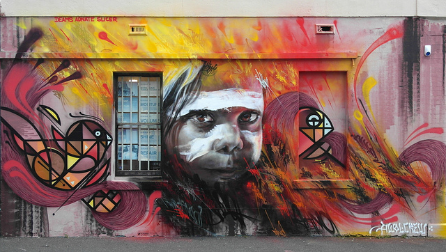
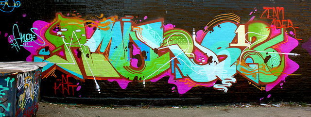
Awol Crew, from Melbourne, produce some beautiful collaborations. These two walls display how the members of the AWOL Crew have very different personal styles, yet can pull them all together. Slicer describes it all as “a collaboration of all our unique diverse styles. Adnate’s realism style portraits, Itch’s surrealist style characters, Deams’ bold graphic letter forms and Slicers chaotic tags and line work. a pure AWOL wall”.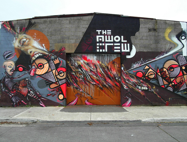
Photos by Slicer Awol
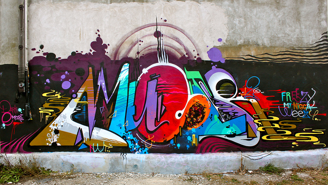
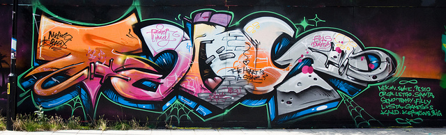
Amuse, reigning from Chicago, raised the bar for writers and dimmed the line separating graffiti and street art. Three prominent qualities that keeps Amuse’s work attractive are the details work, the movement, and the sporadic use of color. The following are some of Amuse’s illest work yet.
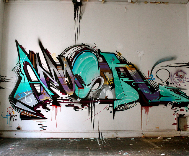
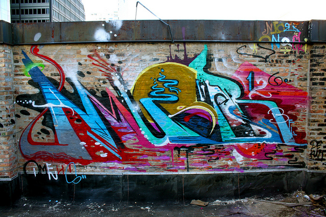

Photos by Eclectric Dyslexic
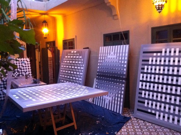
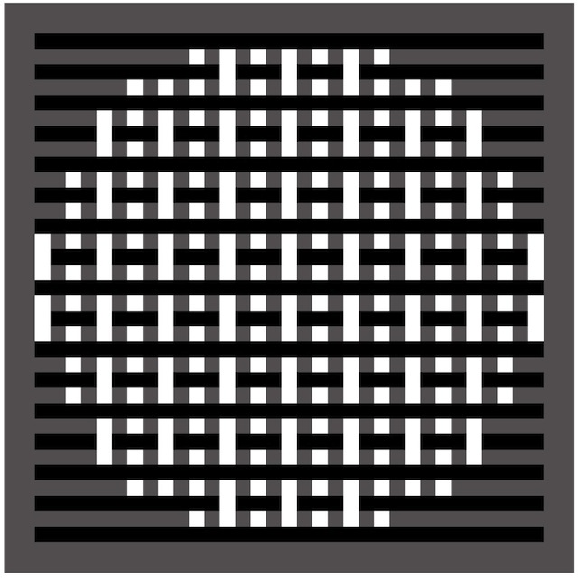
Last week Graffuturism posted a preview of L’Atlas‘s upcoming solo show at the David Bloch Gallery in France. The show’s name, Morphologie, is perhaps a hint that L’Atlas has strayed from his signature style to try something a bit different.
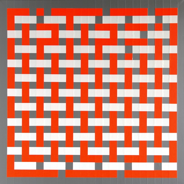
L’Atlas typically works with black and white in his abstract, geometric typography, which is commonly his own name. At first glance, it looks like he has abandoned these trademarks in his new work. However, his new use of color has worked to encrypt his signature in more complex patterns.
Personally, I think his style works best at its simplest, black and white. I’m a very big fan of L’Atlas, particularly his lettering, so I’m interested in others think of this new direction.
Photos courtesy of Graffuturism
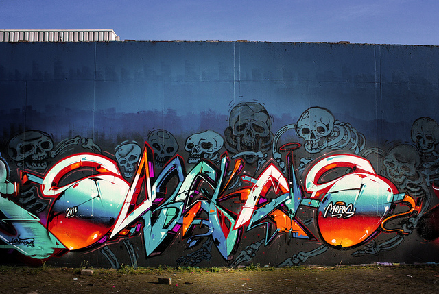
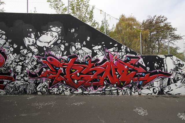
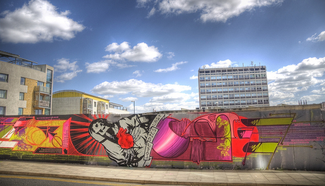
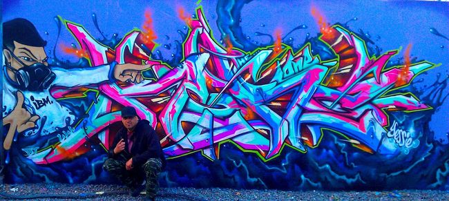
Trying something new: Wild Style Wednesday coming at you!

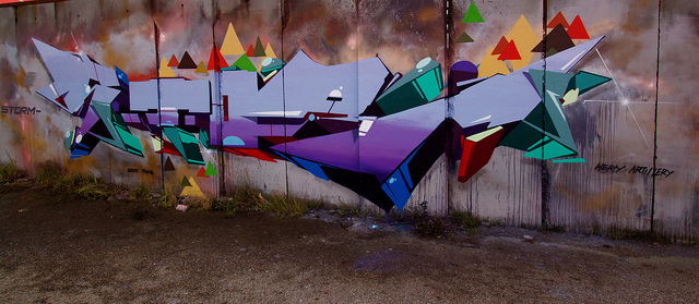
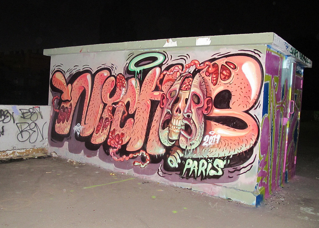
Photos by Philaretordre, BRIGHTON ROCKS! ©™, Heavy Artillery, and Nychos.