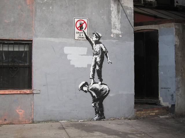
Banksy comes to New York City, first piece damaged within hours

Banksy in NYC. Photo by carnagenyc.

Update (October 2nd, 11am): AnimalNY is reporting that Smart Crew temporarily replaced the sign with one of their own making, but that sign is now gone too and the entire piece has been buffed.

We now have some idea of what Banksy‘s Better Out Than In project is, the project that was hinted at on his website last month. It seems Banksy is putting up work around New York City (not LA as rumors initially suggested) throughout October. The work above is the first piece of Better Out Than In and is located on Allen Street around Chinatown/the Lower East Side. Pretty much everything that’s known about the project is on a new site, Banksyny.com. There’s also an Instagram handle (@banksyny). Looks like we will be getting regular updates from those two sources as to when new pieces go up. The site currently says, “For the next month Banksy will be attempting to host an entire show on the streets of New York.” To make this like (scare quotes) “a real show,” there’s an audio guide of sorts. Note the little stenciled numbers to the right of the piece in the above image. That’s a phone number (1-800-656-4271) that you can call to hear the audio guide (the item number of this piece is, naturally #1). You can also listen to the audio description (at least of this first piece) on banksyny.com.

As Bucky Turco at AnimalNY says, “So to recap: Banksy, a street artist who puts up work in the street–as other street and graffiti artists are wont to do–will be putting up work in the street. Got it.” But that seems to be missing the point, at least the point of where I suspect Banksy may be going with this. Just like The Street Museum of Art is absurd, there is a level of absurdity in Better Out Than In, but I think it’s probably useful absurdity making a point.

It may be the case that Banksy is trying to comment on street artists’ desires to get into museums or paint legal murals rather than work on the street in a guerrilla fashion. Are Banksy’s stencils good? Yes. Are they usually mind-blowingly brilliant? Nah. As Melrose&Fairfax points out, the concept of first stencil of this “show” is similar to work that went up earlier this year in LA last year by Plastic Jesus. If Better Out Than In continues in this vein of the kinds of stencils and public interventions that we have come to expect from Banksy, then I think Better Out Than In may be using those “typical” works to make a larger commentary about Banksy’s work and street art in general. So it’s not really the individual works that will matter but the show as a cohesive whole. Could Better Out Than In be the street art equivalent of institutional critique, really only using the works of street art as props? If so, Banksy may once again outdo himself, a commendable feat when the question among his fans always seems to be “What can Banksy do next? How can he top that last thing?”. Like I say, it’s too early to say with any confidence if this is what Better Out Than In is really about. So far we’ve only seen one piece and gotten a hint at the larger project, so I’m just speculating out loud and tomorrow it could become apparent that I’m completely wrong and have just my head too far up my own ass to see that yet. Maybe Banksy just wanted to make some jokes that didn’t work as stencils or he’s upset that MoMA hasn’t given him a show yet. I guess we’ll find out soon, although with Banksy it seems that hardly anything is ever completely clear.

One of the questions that people seem to be asking about these works is how long they are going to last, given the recent spike in the number of Banksy street pieces that people have sold or are trying to sell. Well, if this first piece is any indication, the works won’t last very long. This first piece has already been damaged. The sign has been removed and some tags have been added. My partners in The L.I.S.A. Project stopped by the wall late Tuesday night and took this photo:
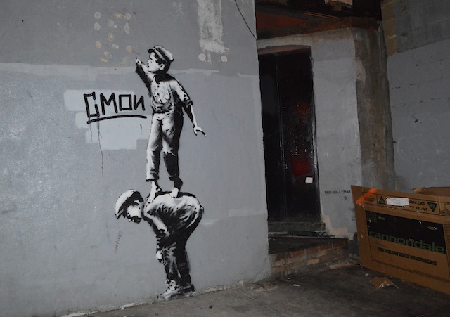
Photo courtesy of The L.I.S.A. Project

Or, for the gif-lovers out there, I’ve made this:
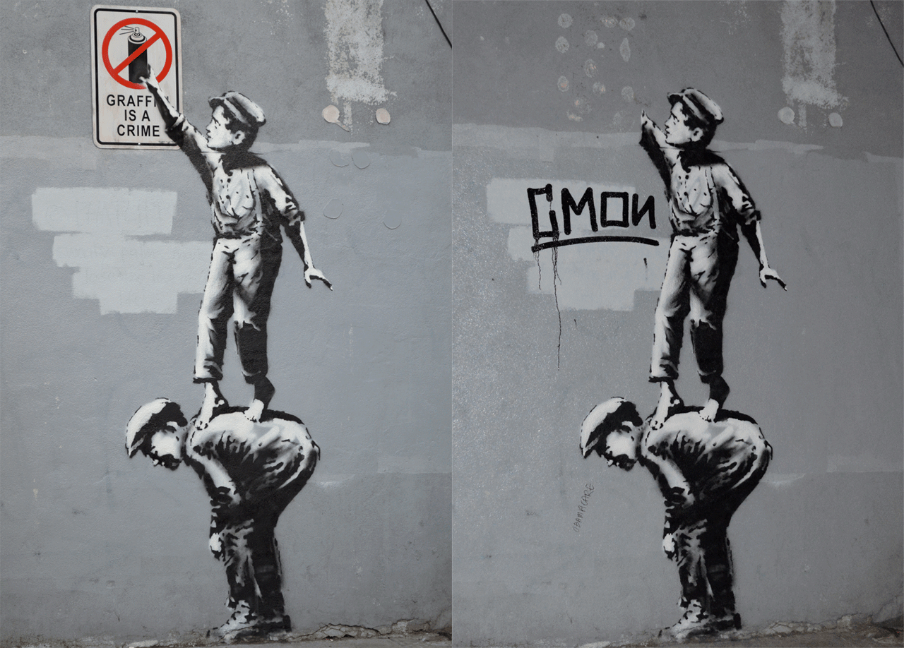
Photo courtesy of The L.I.S.A. Project
Photos courtesy of The L.I.S.A. Project

The point is, if you really want to see one of these pieces, it’s probably best to keep a close eye on the project website, the project’s Instagram and other social media channels where the location might be revealed (since it appears Banksy’s sites will only be giving an approximate location) so that you can get to the new work before thieves or people bent on destroying it do.

Speaking of other social media channels. I tweeted a bit this evening that perhaps Banksy had joined Twitter for this project as @banksyny, but pretty soon after that I realized that the account is almost definitely a hoax. Obviously there’s no way to no for sure, but the general rule-of-thumb for confirming anything Banksy-related is to see if it appears on his website. While the @banksyny Instagram account is linked to from banksyny.com (which his official site, banksy.co.uk, currently redirects to), the Twitter account is not. So, I think it’s safe to say that the Twitter account can be assumed to be a hoax. Ironically, right after tweeting about the @banksyny Twitter account and believing that it could be real, I tweeted this about how people shouldn’t report Banksy rumors as fact. So, I screwed up on that one…

My guess it that we won’t be posting updates about every new piece in Better Out Than In or news about the project to this blog. Instead, you’re probably better following Vandalog on Twitter or Facebook for those updates (or of course following Banksy’s own site).

Photos courtesy of The L.I.S.A. Project and by carnagenyc
Tim Hans shoots… Carlos Mare

Mare139_TimHans_03

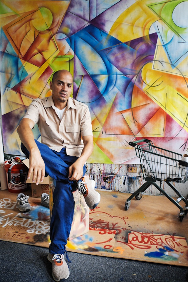
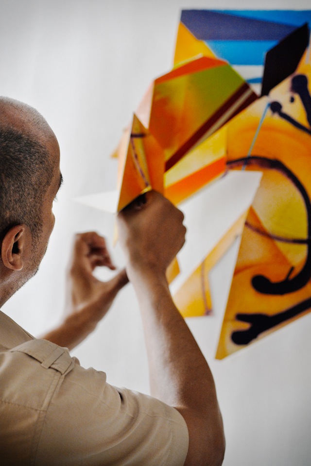
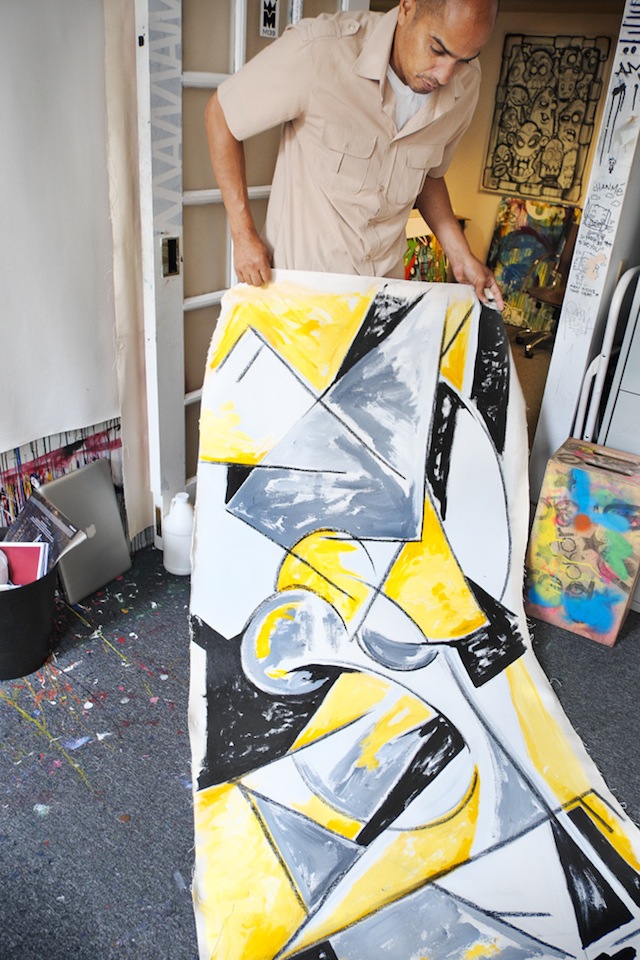
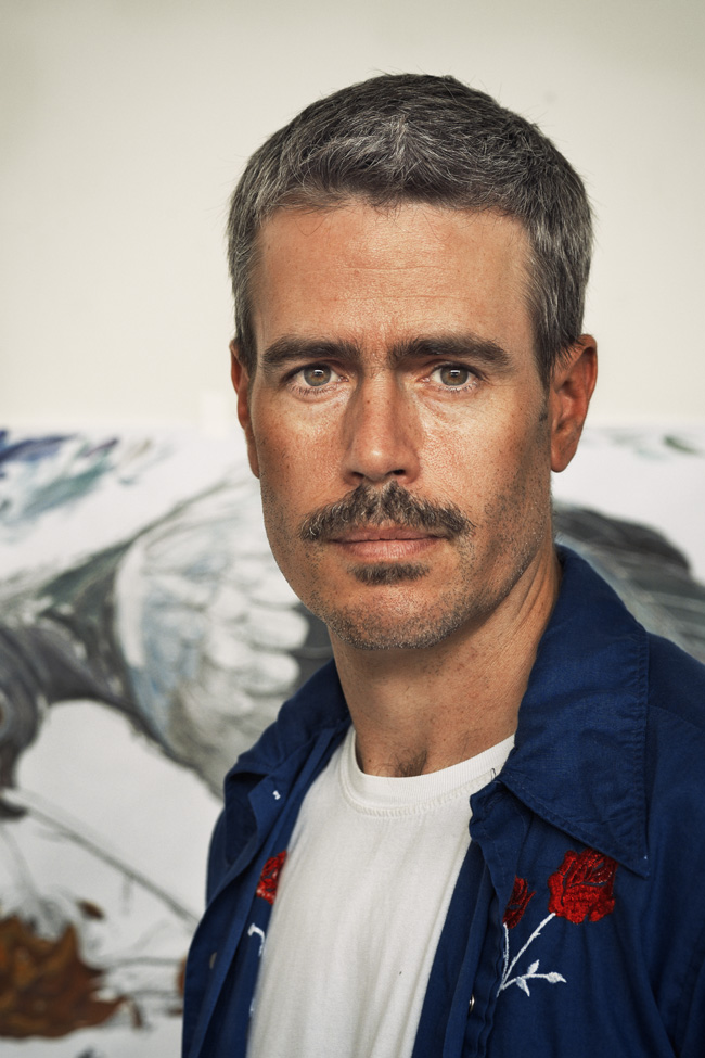
Carlos Mare aka Mare139 is one of hip hop’s living legends, and one of the pioneers when it comes to adapting what he learned in graffiti to settings other than walls and subway cars. Indoors, he is probably best-known for his sculptures, but of Mare’s recent work involves painting Bboys in action. This past spring, Tim Hans met Mare at his studio for the latest in our continuing series of photo-portraits of artists by Tim. I asked Mare a few questions over email.

RJ: Do you see yourself as bridging a divide between hip hop and other art movements with your artwork, or do you see art movements all as one thing?

Carlos Mare: I believe, though unintentional my works and words act as a bridge between histories and culture. Art movements are isolated events that are time and location specific, ultimately the ideas and aesthetics of that culture disseminate. Hip Hop was a great catalyst for global impact, it used to be very provincial in NYC during its hey day but once it breached local geography it was adopted and readapted by the world. This forced the hand of us pioneers to rethink it, I just happened to think of it in Modernist terms after I saw the 1980 Picasso retrospective at MoMa.

RJ: What have you done in your role as a cultural ambassador for the USA?

Carlos Mare: My role is not unlike any other traveling artist of the culture, we have been doing ambassadorships since day one. My role in part is supported by the State Dept., which does so for many American artists. I just happen to be an ‘Urban’ voice of the generation. Being able to have these opportunities allows me to speak in rooms with high level officials, artists and art advocates about the benefits and challenges of today’s urban artists. One of the most important things about traveling and speaking is that you get to educate others about the past and present contributions of the culture. This discourse is crucial and often overlooked in the relationship between governments and artists which is at best a side eyed acknowledgement.

Promoting American urban culture is much easier abroad then it is at home just so you know, in the US we have a tendency to marginalize the people of color who innovate culture until it is adapted by the mainstream. On the other hand the world youth took us on as their own and flipped the script by recognizing us as an artistic movement they too could embrace. Once it went pandemic it became hard to deny so it had to be in the best interests of Governments, Institutions and artists to bridge the gap in order to create more opportunities for personal and community change.

Mare139_TimHans_05

RJ: What do arrows mean to you?

Carlos Mare: Not much anymore actually. When I was more into Style Writing it had different meanings such as the direction in which the the construct of the letter would flow or to camouflage my name, perhaps use it as a weapon as my good friend Rammellzee used to imply. I learned that the greatest of Style Writers could do without it and can create sophisticated graffiti without it. At the end of the day it’s just another graphic element in the graphic design of graffiti.

RJ: Your Bboy pieces seem to capture so much energy and movement even while they are based on stick figures. Even moreso than many photographs. How do you go about capturing that movement in a static 2-dimensional image?

Carlos Mare: The Bboy works are not based on stick figures at all but rather geometry and movement. The line work implies the skeletal framework of the body and to a degree yes the stick figure is an easy analogy but it’s been so refined and so thought out that these shapes even in their simplest forms capture a reduced impression of the body, a familiarity that both Bboys and writers can identify with. It’s coded language, it’s rhythm, wild style and modernism all in one. One of the best interpretations came from my show in Berlin at Skalitzers Gallery when Robert Smith observed:

“Carlos Mare’s Bboy drawings and paintings, so refined and visually direct, become coded representations of the dancer’s repertoire of movements and poses. In much the same way that staffed symbols are used to represent the written form of musical notation, so too the simple, gestural icons come to express a visual codification, a defined scale of available movements.”

I had never considered an analogy like this even though it was already baked into the work, this observation was spot on and opened up a whole other dimension into my thought process. These works are in large part about physical intentions, what is implied by gesture and movement, so much of the genius of the dance is nuanced and can be found in the in between spaces of the action, a dancer begins at A and goes through his whole vocabulary to get to Z. What I am interested in is what happens in between and how to capture that. It’s a Futurist concept with a dope backbeat.

Mare139_TimHans_06

RJ: What’s next for you?

Carlos Mare: I am always stretching the boundaries in my works, I’m challenged by my own works and see my work changing radically in the coming year. I will continue painting the Bboy works which are more and more amazing and will turn these ideas into sculpture as well. That series will likely come to an end but not before I do a series with Ken Swift, this will be the pinnacle of this exploration I think, I could be wrong but I’ve been at it for many many years and feel I can bookend it with the legendary master as my subject.

As for sculpture, I haven’t begun to scratch the surface. I have lots of new works coming and older works that need closure before I move into the next phase of sculpting. It’s unfortunate that sculpture is not in the urban contemporary art conversation right now, painting is getting way too much light since it is easier to do and live with. I hope to change this with new public works that are larger, smarter and more ambitious.

Currently I am consulting with the Lemelson Center/Smithsonian Institute with an upcoming exhibition on Hip Hop culture which will highlight the Turntable as an American Innovation. Beyond that I can’t speak about what I have planned as it is probably the most ambitious and important work of my career.

“Don’t be an outsider looking in, be the Outsider they look into.” – Carlos Mare

Photos by Tim Hans

From mark-making to video art with Adam Void, ekg and Swampy

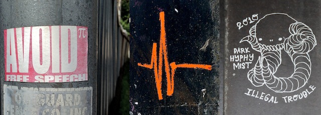
AVOID pi, ekg and Swampy
Outdoor work by AVOID pi, ekg and Swampy

This month, Swampy and ekg both released quite unexpected video pieces on YouTube, and I happened see a relatively new piece by Adam Void aka AVOID pi for the first time (even though it was uploaded in June). What I find so interesting about these three artists making these videos is that all three come from a sort of alternative mark-making tradition that doesn’t fall neatly into street art, hip hop graffiti or that grey area in between street art and graffiti where artists paint logos instead of letters. Although Swampy, ekg and AVOID pi’s outdoor may at first glance appear to fit in with grey area, I think there’s something different about what these three are doing (as well as artists like DROID 907 or stikman) and what artists like Pez or ChrisRWK or members of the now-defunct Burning Candy crew do. There’s nothing wrong with Burning Candy or Pez or ChrisRWK, but this is different. With Swampy, AVOID pi and ekg, there’s a sense that they are drawing from a larger tradition of public mark-making like Situationist graffiti, zine culture, art theory and freight train monikers. And of course, all three have made zines.

These three new videos seem to have been influenced by zines rather than the endless stream of timelapse and interview videos that most street artists and graffiti writers either make themselves or contribute to. The rough cuts remind me of the collages in zines and if the videos were cut into a series of stills, they would seem right at home in a zine (or in ekg’s case, a flipbook/zine).

Even ekg’s video, the most “normal” of the bunch, is not your straight-up animation or timelapse. ekg’s video is a promotional video for his show at Pandemic Gallery (opening in about 1 hour) and a timelapse of sorts, but it still has a video art feel rather than the feel of a slick and perfectly produced promo video developed by someone in charge of PR for the show. And it fits somewhere between animation and timelapse, since it’s a timelapse of a massive artwork coming together, but it’s an animation in that the piece is never really in-progress in the way that a normal timelapse video clearly shows work “half-done” at some point. With ekg, the work is just progressing and each frame of the animation/timelapse could be considered a piece. The video is more an exploration of the format and an artwork than a promotional video for his show. Interestingly, Adam Void’s video has a similar shot to what ekg has done at about the 30-second mark.

Adam Void and Swampy’s videos are surprisingly similar: Both consisting of intentionally low-fi video-diary-like series of clips shot with handheld cameras. Yes, the videos show some graffiti, but they show a lot more than that too. These videos give context to the graffiti that the artists make. They give us a little bit more of a sense of their lives. It’s easy to say “Those guys write graffiti and make zines” and put them in a box, but videos like these complicate their perceived identities.

What is it about these artists that they have all turned to experimenting with video art after becoming known for a particular style of drawn, painted and printed work? Is it just a coincidence, or is there something about ekg, Swampy, Adam Void and possibly other artists doing similar things that draws them to video art? Are YouTube videos like these a logical transition from zines, graffiti or street art? I’m curious what people think. Let me know in the comments.

Photos by RJ Rushmore

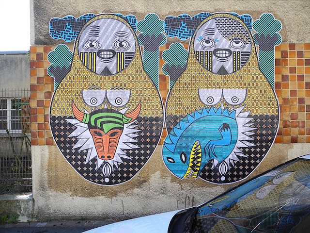
Sara Conti’s Russian nesting dolls

198+(2)

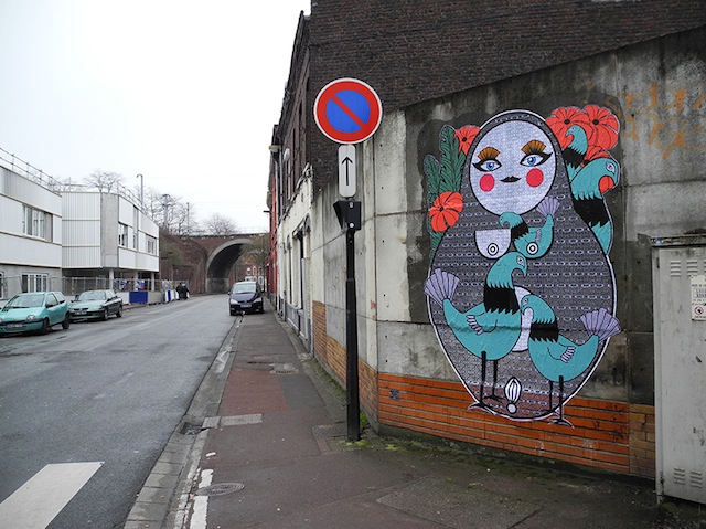
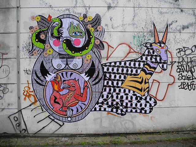
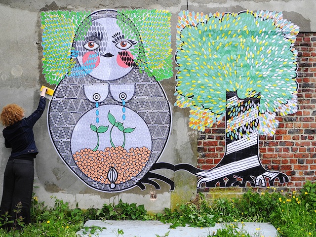
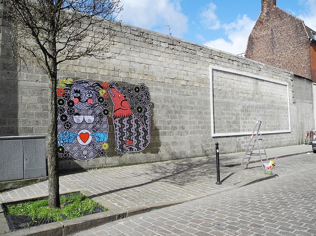
I was recently introduced to the work of Sara Conti and her Russian doll wheatpastes. I’m enjoying her combination of printed designs and cut paper. Plus, of course it’s always nice to see a bit more of a feminine vibe on the street in such a male-dominated scene (especially when the work appears to be done without permission). You can find Conti’s work on the streets of Belgium.

204+(1)

m.

15

2
Check out the details of the cut paper.

213+(1)

Photos by Sara Conti

Weekend link-o-rama

Unit 12, maybe. Photo by Dani Mozeson.
Unit 12 or Unit 112, maybe?

This link-o-rama is super helpful for me, because all week I’ve been working on my upcoming ebook instead of blogging. Hopefully the ebook will be out in November… Anyways, links:

  • I love that this show at LeQuiVive Gallery reframes a certain kind of work that often gets lumped in with street art or urban art as Neu Folk Revival, which describes the work much better than calling it street art or urban art or low-brow art. Some real talent in this show: Doodles, Troy Lovegates, Cannon Dill, ghostpatrol, Zio Ziegler, Daryll Peirce, Justin Lovato… It opens next month.
  • This piece by Part2ism needs to be seen. And look closely. That’s not just paint on the wall. Very interesting. I am glad to see Part2ism on the streets again, and I can’t wait to see what he does next. Once again, he has shown that he is ahead of the rest of us. This piece doesn’t look like graffiti. It doesn’t look like street art. It looks like art on the street, and that’s much too rare.Swampy has relaunched his website and posted a video diary sort of thing. I’m very curious what people think about it. Have a look and let me know.Check out this concept from Jadikan-LP: Art that only exists within Google Maps. Click the link. Explore the room. I normally hate lightpainting or “light graffiti,” but I absolutely love this piece. As far as I’m concerned, the internet is a public space and Jadikan-LP has invaded it with artwork, so this project is street art.
  • CDH wrote a really fascinating article in Art Monthly Australia about the commodification of street art. While I don’t agree with him entirely, I think it’s a must-read because at least it sparks some thoughts. It’s one of the best-written critiques I’ve read of the capitalistic nature of contemporary street art. Over on Invurt, they have posted CDH’s article as well as a response by E.L.K. (who CDH calls out in his critique). In his article, CDH called out E.L.K. for using stencils with so many layers that the work isn’t really street anymore, since stencils were initially used for being quick and a piece with 20 layers isn’t going to be quick. It’s just going to look technically interesting. Well, E.L.K. shot back in his response and made himself look like an idiot and seemingly declaring that all conceptual street art and graffiti is crap. There were arguments he could have made to defend complex stenciling or critique other points of CDH’s article, but instead E.L.K. mostly just attacked CDH as an artist. Anyway, definitely read both the original article and the response over at Invurt. The comments on the response are interesting as well.

Photo by Dani Mozeson

Meres and Spudbomb collaborate in Little Italy

P1020335

Last week Meres of 5Pointz and Spudbomb from Toronto collaborated on this piece in Little Italy, on one of The L.I.S.A. Project NYC‘s rotating walls. This was one of co-curator Wayne Rada’s ideas and I really wasn’t sure how this wall was gonna go, but I trust Meres and like that Spud took on Toronto’s mayor as a subject in his work, so I was curious. Seeing the finished product, I think the guys did a really great job. It’s a solid piece with each artist bringing their trademark characters to Little Italy and giving them a slight Italian twist. For me, what’s so fun about working on The L.I.S.A. Project is helping bring pieces like these to life. The work fits in with Little Italy, but it’s still not exactly the kind of mural you would expect to see there.

P1020340

P1020346

P1020344

Photos courtesy of The L.I.S.A. Project NYC

Harlequinade combines high and low tech

-2

Harlequinade recently put up these four new wheatpastes in Philadelphia. At first, they may appear to be pretty standard, although nice, wheastpastes. Which, for Philly is something a bit special since there aren’t a lot of artists doing wheatpastes, but wouldn’t really be anything of concern to the rest of the world. Harlequinade is talented, but I don’t usually find his pieces to be absolutely mindblowing. But these four wheatpastes include small QR codes. Small being the operative word. I bet you didn’t even notice the QR codes in these pieces until now that I’ve pointed out that it exists and you’ve gone up and looked specifically for them.

-4

QR codes are difficult to incorporate into street art and graffiti. Yes, these QR code stickers by KATSU were a bit clever, but typically, my thought is that just putting up a QR code is a waste of space. Most people don’t scan QR codes regularly, and they aren’t typically visually appealing. One previous exception to that was Josh Van Horne’s piece for Open Walls Baltimore. If you ignore the issue of the patchy white background (was that ever fixed?), the piece was great. The mural scanned like a QR code should and brought up a YouTube video relating to the mural, but even if you couldn’t scan it or didn’t want/know how to, the piece looked great. If it hadn’t been scanable, it would still be a solid mural. But generally what I’ve seen is more in line with what the Wall Hunters/Slumlord Watch “Slumlord Project” did. The QR codes there were somewhat useful (certainly more useful than just a link to the artist’s website or whatever else QR codes are generally used for when used in street art), but they sure didn’t improve the space visually.

And I ran into a piece yesterday in NYC that showed just how annoying QR codes can be. Apparently it’s by Pérola Bonfanti and Nicolina of The Free Art Society. I found that out because I went to their website which is listed on the piece THREE TIMES. It’s listed directly beneath the QR code. The QR code also goes to the site. And the little plastic-but-metallic-looking plaque that was next to the piece until my friend ripped it down for being stupid went to the site too. All of that isn’t great, but it also isn’t the end of the world. What is pretty lame is when sending viewers to artists’ website actually interferes with the artwork itself. These artists need a lesson from Harlequinade in how to cohesively integrate QR codes into their work. Anyway, please don’t use this as an excuse to get into these artists. I’m trying to point out how irritating, self-promotional and untalented they are. Back to the talented guy, Harlequinade…

-1

Harlequinade’s QR codes are not visually intrusive. They pretty much blend into the piece. If you see one of these wheatpastes but you don’t notice the code or you do and you don’t scan it, no problem (or if the piece gets partially buffed or tagged over and the code is unreadable). You still get half of the piece and it can still be a positive experience. But if you do choose to scan the QR code, you get an extra bonus to the piece.

-3

For the benefit of those who may come across these pieces in person, I’m not going to spoil the surprise and say exactly what these QR codes do. One of the things I really like about this piece is that you can’t experience it fully online, and the component that you can’t experience online is the high-tech component of the work.

Kudos to Harlequinade for using QR codes so well.

Photos by Harlequinade

Tim Hans shoots… Brian Adam Douglas

-1
Photo by Tim Hans

Brian Adam Douglas aka Elbowtoe is one of New York’s best-loved street artists, but he also has also developed a healthy and equally well-regarded studio practice. This week, Douglas’ largest and most significant solo show yet opens at Andrew Edlin Gallery in New York City. “How to Disappear Completely” will feature drawings as well as Douglas’ famous cut paper paintings/collages. I’ve been eagerly awaiting this show for at least a year, and now it’s almost upon us. The show opens on Thursday evening (6-8pm) and runs through October 26th.

Earlier this summer, Tim Hans met up to Douglas at his studio for the latest in our continuing series of photo-portraits of artists by Tim, and I asked him a few questions over email.

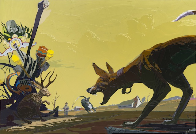
"The Last Jackalope And Other Fables Of The Reconstruction" by Brian Adam Douglas. Photo courtesy of Brian Adam Douglas.
“The Last Jackalope And Other Fables Of The Reconstruction” by Brian Adam Douglas. Photo courtesy of Brian Adam Douglas.

RJ: What can you tell us about your upcoming solo show?

Douglas: This show, at least for me, has been grappling with the end of things.

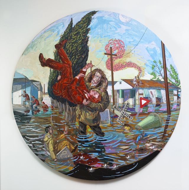
My close circle of family has been through quite a series of challenges over the past 2 1/2 years, and these struggles have had a profound effect on my psyche. My show is a series of events of great calamity, more often than not after the fact. The protagonist most often rises to the occasion and grapples with the changed environment, though there are occasions that they stand in awe of the devastation before them. The images are on first glance an illustration of destruction, but in actuality are metaphors of redemption.

Though the initial seeds for the images came quite quickly, I have been working out the compositions slowly over time, letting elements slide in and out of focus.

A majority of the work is made of paper, though there is a series of drawings that compliment the cut paper works. I took it as a challenge to make drawings that in their starkness could hold their own against the complexity of the cut paper.

ElbowToe_TimHans01
Photo by Tim Hans

RJ: What goes into making one of your paper paintings? Can you go through the process from beginning to end? How long did the pieces in this show take you to make?

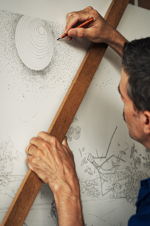
Douglas: For most of the works in my current show, I developed the ideas while taking long walks. My goal is to be a vessel for my imagination, so I am very open to whatever my mind throws at me. Once I get a set of ideas, I begin to research what the significance of the signs, gestures and relationships might offer. This often leads to troves of new information that in turn yields more imagery. My goal when coming up with the images, is to step as far back from the process as I can and literally take notes at what my imagination throws at me. When I have the inklings of an image, I run through a number of studies, and once I find the composition that works best for the image, I get to work on the final drawing.

These drawings can take days, and sometimes weeks to execute depending on the level of complexity. Many of the structures I have in the show are built using old fashioned perspective techniques. The more complex the structures, the longer the study takes. I have one piece with several shipwrecked frigates that I built each with their own vanishing points. They become like scale models. After the drawing is complete, I make a very detailed color study, to establish the proper relationships in terms of light effects and atmospheric effects as well as color and value.

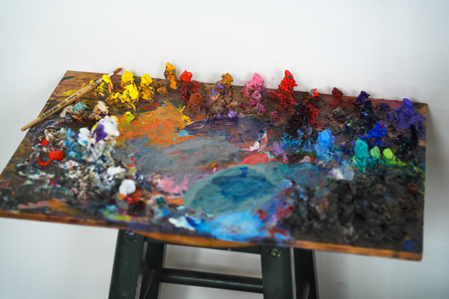
A huge influence on my process is an unfinished painting by Dürer at the Met. In it one is able to really see him working things out. I took his process of the very detailed under drawing from that work in progress. Once I transfer my drawing onto the panel, I comb through my vast collection of paper in search of paper that will build off the color study and other reference that I have gathered. If there are colors that I am unable to find I will make the colors. This is particularly the case in areas of large solid color.

I then attack the image like I would a painting. There is not a set method to the application of the paper. It is a very organic response to the studies as well as all the reference I have gathered. I will say that my “brush marks” are as closely aligned with drawing as they are with paint. I think that the two are inseparable.

When I varnish the pieces, I tend to rub the varnish in, like I am polishing a table. I find this part of the process to be the most stressful. I use a rag to apply the varnish, and I build it up in several thin layers. The difficulty arises from the texture of the built up paper. The surface creates ledges and crevices that the varnish can build up on/in.

The smaller pieces in the show take somewhere in the ballpark of 2 months to execute. The largest pieces took almost half a year in execution, but almost a year for all the elements to accumulate and ferment into the appropriate image.

"The Center Cannot Hold" by Brian Adam Douglas. Photo by Brian Adam Douglas.
“The Center Cannot Hold” by Brian Adam Douglas. Photo courtesy of Brian Adam Douglas.

RJ: You seem like you are always one of the busiest people I know and you spend a lot of time in your studio. What drives you to work so hard?

Douglas: There was a period of time in my life that art was the only stable place I could be. During that time I forged a deep love of the solace of the studio. Since then I have never really been able to shake it. My wife has always been very driven by her arts as well. I think her passion encourages me to work even harder myself. But probably the greatest driving force of my time in studio is that I am always trying to raise the bar on myself with everything I take on, and that just means more work.

RJ: How do you see street art fitting into your practice these days?

Douglas: Sadly I don’t have much wiggle room for street art these days. It has certainly not been for a lack of desire. I have a stack of prints in my studio that we printed this summer, that I have just been waiting to get out. Honestly with any spare time I have I want to spend as much as I can with my twin boys.

RJ: Has having kids changed your art?

Douglas: I don’t know if it has, at least in terms of subject matter. I know it has meant less time in the studio than I used to take. I used them in a street piece. And I made the decision that any time I do any work with them I will make it as off-kilter as possible, find the troubling or unsettled moments. I hate sentimental art, and any time one uses children in art, the artist runs the risk of sentimentality. Having children has certainly made me take a hard look at my practice. I don’t want to waste any time making art that is not worthy of the time I take away from spending with them.

ElbowToe_TimHans03
Photo by Tim Hans

Photos courtesy of Brian Adam Douglas and by Tim Hans

Interview with painter/sculptor/stickerer Rae

-4

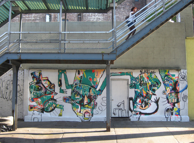
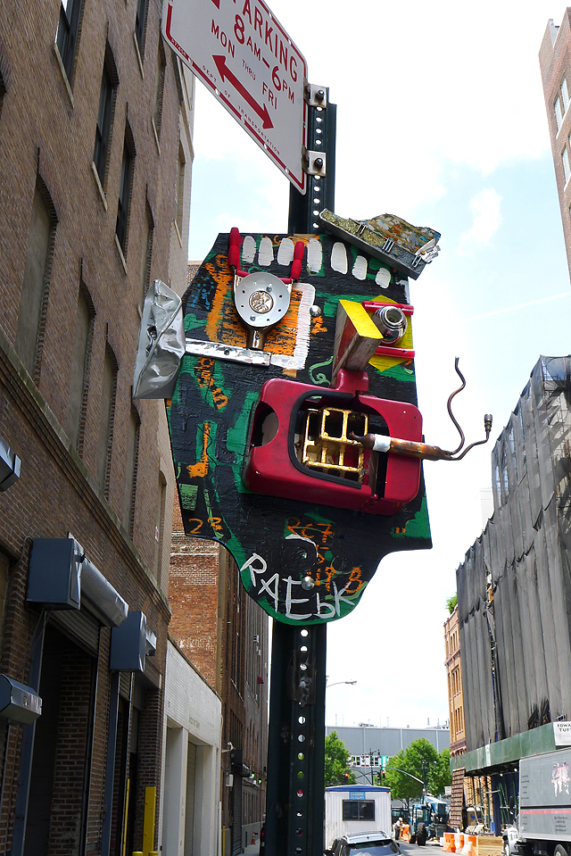
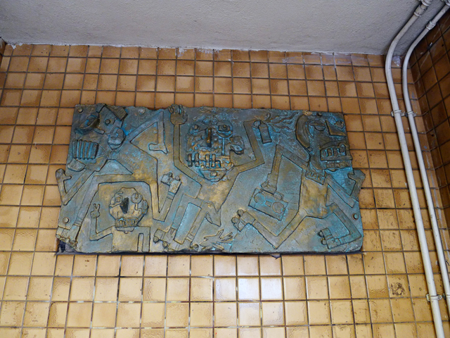
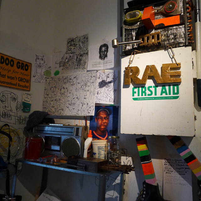
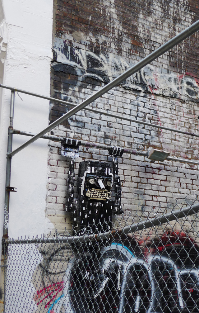
Rae is probably one of the ballsier street artists active in New York at the moment. He regularly installs sculptures on signposts around the city, stickers prolifically and once even installed a bas relief-like piece onto the wall of a subway station. I recently caught up with Rae over email.

RJ: Why do you think there are only a handful of sculptors doing street art?

Rae: Well they definitely take more time to make and usually require more planning to install. But I like to mix things up, so sculptural pieces are just one aspect of my work along with painting walls, paste-ups and stickers.

-9

RJ: What do you see as the difference between your street pieces and your gallery pieces?

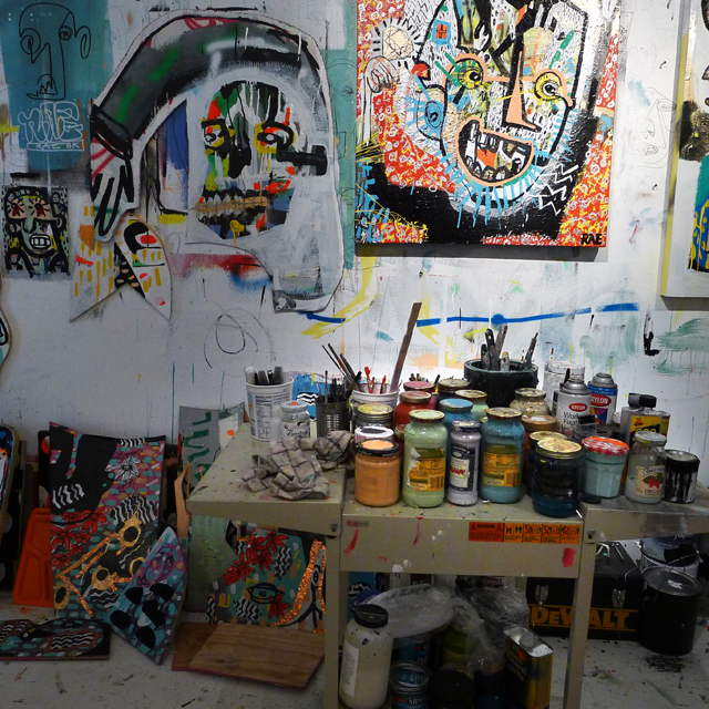
Rae: With my street pieces I try to focus on things being a bit more graphic. So if you see them from a distance you can make them out easier. They also need to able to hold up to the elements and A-holes messing with them. My indoor pieces tend to have more details to them, hundreds more nails banged into them and more metal parts. Too much metal on outdoor work makes them attractive for scrap metal guys.

-8

RJ: Why do you install your work outdoors?

Rae: Growing up in Brooklyn and doing graffiti was all about getting your name up as many times as possible. I was not prolific in that way but the times I did write outside it was as much about the art of getting away with it as it was to getting up. I’ve been making art my whole life but didn’t always share it with others. When street art first emerged I became a “lookout” and “facilitator” for other artists but didn’t have the bug to get into it myself for some reason. I just focused on making art indoors and experimenting with microwaving, melting and boiling things. Until one day I woke up took a look at all the stuff collecting dust in my studio and said “shit’s got to go”. I tried giving some art to family as gifts but some of the pieces wound up stored in the garage next to mechanical reindeers. So next best thing was to try bolting things outdoors and paint murals. After that I was hooked. Now it’s about seeing the work become apart of and play off of the street’s landscape that interests me.

-6

RJ: How important is an artist’s mythology to their artwork?

Rae: Considering we live in a society where people tend to want to label others and put them in a box, I think as an artist it is important to have some mythology behind your work. For example, I have been making art my whole life in one form or another but because I didn’t put work outside or tell everybody I met I was an “artist” some might think you’re new to the game. I also think your work should speak for itself. If you’re going to stand in front of your paintings with a Kool-Aid smile explaining the meaning behind your work– something’s wrong. The other issue is that fact that 90% of my outdoor work is ‘unsanctioned’.

-2

RJ: Whose art do you have hanging in your home, and whose would you like to have hanging if you have unlimited resources?

Rae: I’m into collecting things that some may not consider “art”. Misspelled signage from local shops, crudely made tools, poorly crafted furniture, for example a stool I picked up in Costa Rica with one leg shorter than the other two. Things like that. I see art in everyday objects and things people make for function. But, if I had unlimited resources I’d probably hang the Mona Lisa in my house. I think it’s interesting that out of all the masterpieces ever created in the world the one that intrigues people the most is a portrait of a half-smirking, thick woman.

-7

RJ: What have you got coming up?

Rae: Besides my dental appointment next week, more street work in a variety of mediums and a show/project somewhere TBA in the fall.

RJ: What’s up between you and Bast?

Rae: Rather than give you a lengthy explanation, I prepared a video statement that I hope you will consider including a link to in this interview: http://www.youtube.com/watch?v=syaGBHRguYY

Photos courtesy of Rae

Tristan Eaton paints Audrey Hepburn in Little Italy

f920bd_f179cf8b68577972a428dec2781e341c.jpg_srz_975_736_85_22_0.50_1.20_0

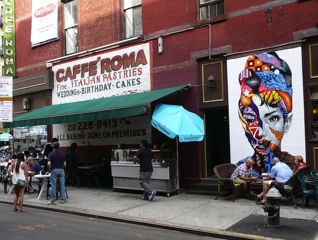
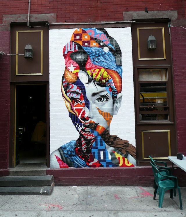
One of the things that I just have to bring up despite it happening in August while we were only posting illegal work is Tristan Eaton‘s portrait of Audrey Hepburn. It was painted last month in New York’s Little Italy as part of The L.I.S.A. Project NYC, a mural program that I help to organize along with Wayne Rada. Tristan painted this piece at Caffe Roma on the corner of Mulberry and Broome.

-2

Ripping away at Hepburn’s flawless Hollywood exterior, Tristan finds a combination of the natural world and hollow advertising. Beneath the makeup and the hairdo, Hepburn is only human, but today we as humans are so surrounded by advertising at every turn that it becomes a part of us. We like Coke better than Pepsi, not because it tastes better but because Coca Cola is a part of our identity. And Hepburn, just like the rest of us, is made up of brands just as much as she is made up of natural elements. For me, the best artists are those who can make something that addresses both the “at a glance” audience who just want to walk by a piece and smile, maybe stop and take a photo if they have a moment, and the audience who search for a deeper meaning and enjoy spending time with an artwork, looking at it as more than just decoration. It’s very difficult to please both of those audiences simultaneously, but Tristan does it with this mural.

Plus, just have a look at the #littleitaly hashtag next time you’re on Instagram. People love photographing this piece.

Photos by Wayne Rada