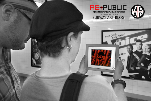
This app turns the NYC subway system into an art gallery

and_promo_1920-1
NO AD beta-testers and friends of Vandalog, Luna Park and laserburners

I should be working on something else right now. I should be doing writing that I really need to finish ASAP, writing that could bring me some considerable upside both in money and reputation. But then Jordan Seiler and the heavy projects (as Re+Public) and Subway Art Blog went and released their awesome and eagerly anticipated new app: NO AD. So I’ve become momentarily distracted, and you should be too. Go download NO AD right now (for Android or iPhone), especially if you live in New York City.

NO AD is an augmented reality application that gives you a glimpse of the New York City subway system without advertisements, a world where billboards are for art instead of ads. NO AD replaces the top 100 ads in the subway system at any given moment with art. How? By using the ads like QR codes. Simply download the app to your phone, open it while you’re on a New York City subway platform, and point your camera at an advertisement. On your phone’s screen, you’ll see the ad almost magically replaced by artwork. Download the app now, and give it a try with this image:
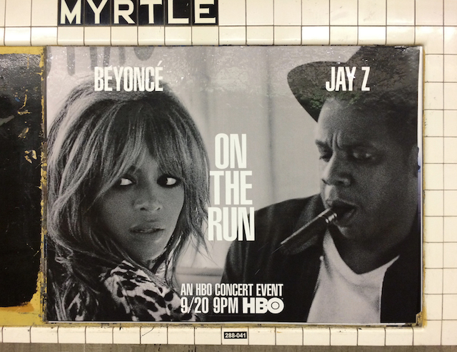
photo-1

See how amazing that is?

And here’s a short video about the app:

This idea isn’t entirely new. NO AD may remind some readers of Steve Lambert’s Add-Art or Julian Oliver’s The Artvertiser. But Add-Art hasn’t been functional for some time and The Artvertiser never really made it beyond a fun experiment and no longer appears to be in development, so it’s great to see other artists take up the mantle of digitally and legally replacing ads with art.

One question that I’m sure will come up: How does NO AD know what subway ads look like? The app developers essentially have to feed the app information about what ads are up in subway stations at any given time, which means that they have to go out and photograph every different subway ad they can find and rotate ads in and out of the app. As new ads rotate in, so will new artwork.

On some level, NO AD is an ad takeover tool. It takes space that is currently filled with ads and replaces those very specific ads with art. They could have just as easily used other objects around NYC as “triggers” for the art, but they decided to go with ads. Plus, for the initial launch, they’ve partnered with about 50 artists, many of whom have been outspoken critics of public advertising.

Today, NO AD is a kind of “what if,” a thought experiment to get people thinking about what it would be like to replace the ads with art, because of course you still need to take out your phone, open the app, and look at specific ads to see the artwork. So, essentially, it could be said that the app is a gimmick to get people thinking about replacing ads with art, rather than a tool to actually achieve that.

But NO AD may not be just a thought experiment in a few years. Fast forward to when everyone and their mother is wearing some version of Google Glass all day long. There will still be ads on the subway, but with NO AD running in the background on your Google Glass, you won’t see the ads. You’ll just see art exhibitions.

And that’s the other half of NO AD, the part that is more than just a thought experiment or a very long-term thinking anti-advertising strategy: It’s potential as an exhibition space. The first set of artists whose work is being exhibited through NO AD (including Vandalog’s Caroline Caldwell) are a motley crew of experimenters and friends of the organizers, which isn’t such a bad thing since these guys have some very talented friends, but imagine given a single artist a chance to take over all of the ads on the subway, or bringing in a professional curator to use NO AD and the subway system as an exhibition space in a more organized way. NO AD is an exhibition space that exists somewhere between the physical and the digital, always bringing with it an energy of political activism and chance.

NO AD is a glimpse into the future, a new exhibition space, and a platform for activism. I’m excited.
Skewville + Dscreet + two dead rats

Later this month, the new DUBL TRUBL collective is going to be having their first exhibition. It will be at Urban Spree in Berlin, and it opens on September 18th. A bunch of great artists are involved, brought together by Dscreet who is curating the show, and all of the work will be done collaboratively in pairs. You can learn more about the show here.

That all sounds great. Except that Skewville didn’t make any paintings or sculptures for the show. So instead, Skewville and Dscreet made a video. I’m not totally sure how people are going to react to this video, but I imagine there will be a lot of love, a lot of hate, and some viewers just left feeling a bit queasy. Anyway, enjoy…

Link-o-rama

art_museum
Unknown artist in Philadelphia

Loving my time so far at the City of Philadelphia Mural Arts Program, but it’s definitely more than a 9-5, so it’s time for me to play catch up yet again…

  • Speaking of the Mural Arts Program, I am really pleased to say that we now have a major Shepard Fairey mural in Philadelphia. Find me some day and ask me the whole story of this mural, but let’s just say it’s complicated and thank goodness for Roland at Domani Developers for getting us a wall at the last minute.
  • We also have a new much more politically-charged mural from Shepard Fairey through The L.I.S.A. Project NYC, and while I’m sure the process for that was also quite complicated, my friend Wayne took care of that and all I had to do was pitch Shepard on the idea of a big wall in NYC and the property owner on the idea of a Shepard Fairey mural on his building (neither of which were too difficult). I’m absolutely honored to have played even my small role in each of these murals. It was my first time working with Shepard, and it was a pleasure.
  • Two real kings of NYC graffiti, Blade and Freedom, have shows open now at the Seventh Letter flagship store in LA. Blade is an undisputed subway king who also pushed graffiti forward as an art-form, a rare combination. Freedom is a personal favorite of mine (his piece in my black book is a real prized possession) for combining pop art, an ability to paint very well, comics, and graffiti in an intelligent way without too much of an ego. I’m sad to be missing both of these shows, but I hope LA will give them the love they deserve.
  • Hi-Fructose posted some interesting GIFs by Zolloc, but the best part of the post is the first sentence: “While GIFs have yet to find an established place in the art world, they’re fascinating because they have the potential to go beyond the frozen image in two dimensions.” Of course, Hi-Fructose is part of the art world, so just having them post Zolloc’s GIFs counts for something. Hi-Fructose seems to be saying (albeit hesitantly) that GIFs being in their corner of the art world, which is great. That’s not a bad corner to be in, and it’s a hell of a lot better than nowhere. So, why be hesitant? If the work is fascinating, embrace it.
  • Oh Olek, always the best of intentions, but the results are not so great…
  • Some absolutely great ad takeovers.
  • These projections from Hygienic Dress League are a bit different. Very cool though. Anyone know of other artists who are projecting onto steam?
  • Smart Crew have teamed up with Beriah Wall on a series of cool collaborations. Does anyone else see this as further evidence of Smart Crew growing up, aka transitioning from a crew producing illegal graffiti into a brand or collective that does legal (and sometimes commercial) work referencing illegal graffiti? Nothing wrong with that. I’m just noting the transition.
  • Even when recycling old work, Tatyana Fazlalizadeh is always poignant and powerful. She’s also created a new poster of Michael Brown that you can download on her website.
  • I’ve been saying for a while that there’s great similarity between GIFs and street art, so I’m a big fan of this series of installations organized by Guus ter Beek and Tayfun Sarier.
  • Hyperallergic has been covering artist reactions to the killing of Michael Brown in Ferguson. Public performances in Philadelphia (by Keith Wallace) and New York City (by Whitney V. Hunter) exemplify to the unsurprising obliviousness to the situation or at least lack of caring that so many people openly display (for more, see Kara Walker at Domino). It’s amazing to see these two striking performances go widely ignored while it’s mostly pretty but empty murals that go viral. Is that the state of street art and muralism today? I hope not. And of course, maybe what makes those performances so jarring online is that they were ignored on the street.
  • I have tried to resit the allure of Pejac’s work for a while, but no more. Yes, some of the jokes are cheap and feel twice-told, exactly the sort of easy made-to-go-viral work that I am complaining about in the previous paragraph, but Pejac is painting them really well, and they consistently catch my attention. As much as I would like to write him off as a Banksy-ripoff who even came to that idea a few years too late, I can’t do so any longer. The work is actually quite good. Have a look for yourself.
  • Last week I was in Atlanta for the Living Walls Conference. A great time was had by all. I was there to speak with Living Walls co-founder Monica Campana and Juxtapoz editor Austin McManus about the evolution of street art and graffiti over the past five or so year, and Vandalog contributing writer Caroline Caldwell was there to paint a mural. Atlanta got some real gems this year, including new work by Moneyless, Troy Lovegates and Xuan Alyfe in collaboration with Trek Matthews. Juxtapoz has extensive coverage. Congratulations to Living Walls on a truly impressive 5th anniversary event.
  • This coming week I’ll be in Norway for Nuart and Nuart Plus. The artist lineup features some of my personal favorites, including John Fekner, SpY and Fra.Biancoshock. I love Nuart because it’s a festival that always strikes a balance between the best of the best artists painting epic murals on the “street art festival circuit,” and the oft-under-publicized but highly-political activist artists intervening in public space. Putting these artists in the same festival strengthens the work of everyone there, and reminds us that murals can serve many different purposes. I’ll be speaking at Nuart Plus on behalf of the Mural Arts Program in a few capacities. I’ll be moderating a panel about activism in art, presenting couple of short films during Brooklyn Street Art’s film night, sitting on a panel about contemporary muralism and giving a talk about how government-sanctioned art and muralism can be used to promote positive social change. There will be a lot of great speakers at Nuart Plus this year though. Brooklyn Street Art has the whole line up for the festival and the conference.

Photo by RJ Rushmore

Mega-update from The L.I.S.A. Project NYC

Anthony Lister
Anthony Lister

Wow. I have been falling behind on Vandalog lately. I’ve been just a little bit busy at the Mural Arts Program. The last month and half have been almost as busy up in NYC with The L.I.S.A. Project NYC. I’ve got to hand it to Wayne and Rey, the other two main team members there, for really carrying the project this summer as I’ve adjusted to my new job. There’s been some exciting work going up, including murals by a few people that we’d been wanting to work with for quite a while.

L'Amour Supreme
L’Amour Supreme

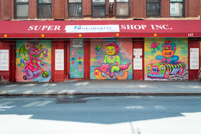
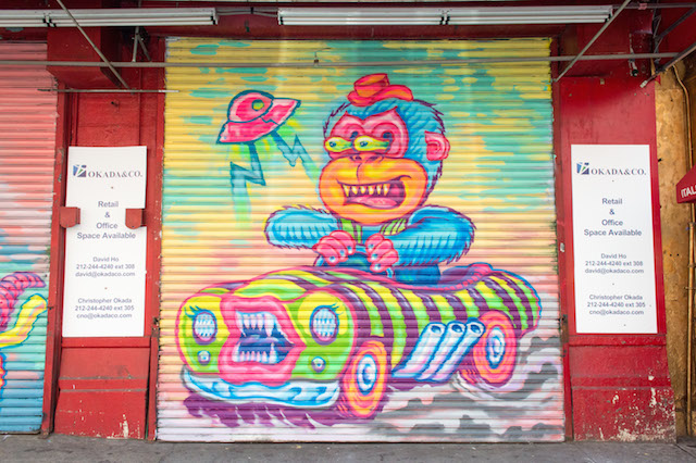
Let’s start with L’Amour Supreme. We first worked with L’Amour Supreme as part of a Secret Walls event in Little Italy last fall, and he came up with a really fun concept his mural on Mulberry Street: A series of twisted tin toys. I had the chance to hang out in front of this mural briefly while it was going up, and it felt like everyone walking by was stopping to give a thumbs up. Good stuff.

L'Amour Supreme
L’Amour Supreme

And then there’s Queen Andrea. She’s been on our list for a while. She knows how to paint, the work is uplifting, she’s a New Yorker. Her mural, on a security shutter in the East Village, went over a great Phlegm piece that I’ve long admired, but it had been hit with graffiti and it was time for a refresh. I’d say Queen Andrea did the wall justice.

Queen Andrea
Queen Andrea

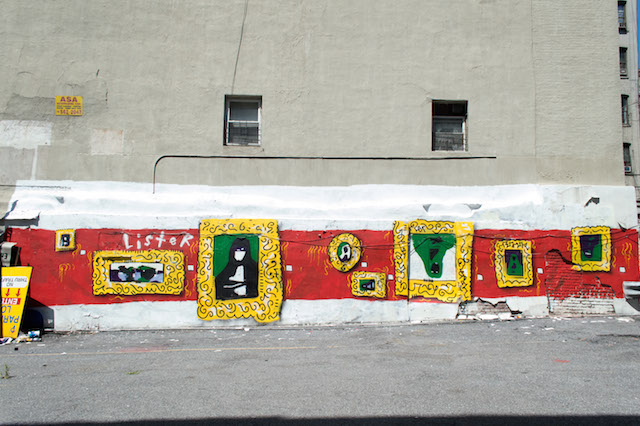
One of my dreams has been work with Anthony Lister. When we found out that he was due to have a show at Jonathan Levine Gallery, I began pushing that we absolutely had to find a wall for him. I soon discovered that I didn’t have to push too hard. After all, who doesn’t want a Lister mural? He wound up with a pretty large spot on Mulberry Street, in the same lot as Ron English’s Temper Tot and our wall with Secret Walls.

Anthony Lister
Anthony Lister

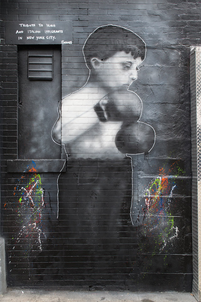
I thought might have lost the wall at Mulberry and Kenmare where this happened with Mint and Serf, but no. While much of that spot has been taken up with a new display advertising magazines, we were still able to squeeze in a piece by Solus. Solus’ mural is tribute to NYC’s Irish and Italian immigrants, and it makes for great photos.

Solus
Solus

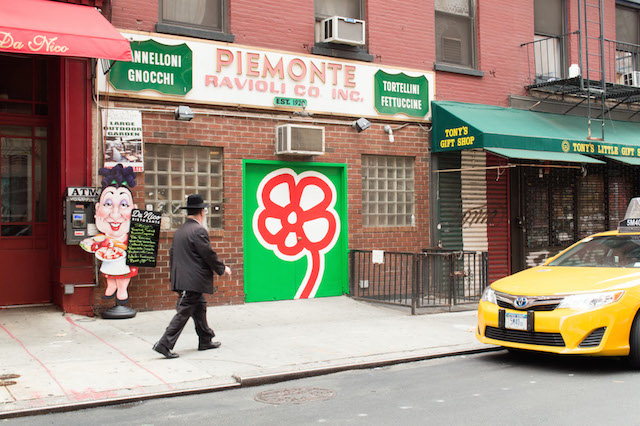
And finally, I’ve been a fan of Michael De Feo‘s work for a long time. His flowers just put a smile on my face, and last weekend, we got one in Little Italy. Another mural that’s long overdue.

Michael De Feo
Michael De Feo

Photos by Rey Rosa Jr. for The L.I.S.A. Project NYC

See you at Living Walls 2014

Troy Lovegates at work in Atlanta

This week the annual Living Walls Conference is taking place it Atlanta. This is the 5th year of the conference. Artists for the mural-making portion of the conference include Troy Lovegates, Moneyless, HENSE, Bayete Ross Smith, Borondo and Vandalog contributing writer Caroline Caldwell. This year’s supplementary events include an outdoor screening of Brad Downey‘s Public Discourse, the annual bicycle mural tour, a series of talks with people like Meres from 5Pointz, the opening party at The Goat Farm, and a panel discussion with me and my friends Monica Campana (Executive Director of Living Walls) and Austin McManus (Photography Director for Juxtapoz).

If you’re in Atlanta, I hope you’ll come out and support, not just because I would love to see a packed house for the panel that I’m on (although that would be nice), but because I love Living Walls and Living Walls has made me love Atlanta. This is going to be a great conference.

Photo courtesy of Living Walls

Invader turns his art into a game for his fans

3465868123_14c8c34b42_z
Photo by RJ Rushmore

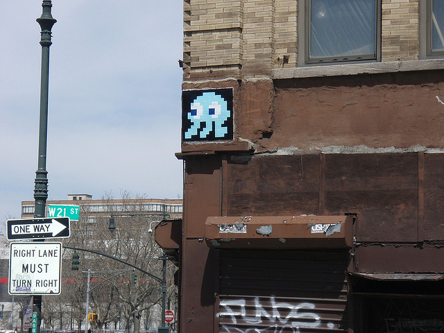
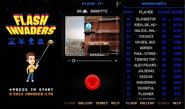
Invader recently released his own iPhone app, but it’s a lot more than a glorified eBook or an artist edition rebranding of standard drawing app. Invader’s app is a game that combines video games with real life. Flash Invaders is played by photographing (“flashing”) actual Invader pieces on the street, for which the players earn points. When players spot an Invader mosaic on the street and flash it, the app compares the player’s photo to a database of pieces to see if it is a match. If it is, the player is awarded a set number of points for that particular piece. Cleverly, the app has been designed to only allow players to flash pieces when their phone’s GPS shows that they are near the piece in question, so you can’t just take all your old Invader photos and flash those for points (trust me, I tried).

Invader’s work has always been a game in some sense, at least for the artist. He’s spoken about awarding himself points based on the complexity of the pieces he installs, and some of his works have even mentioned their point value. Now, it’s not just Invader playing, but his fans too.

I am very excited about this app because A. It’s not quite augmented reality, but it’s close and I could see Invader going in that direction in the future, and B. It’s a way to connect the virtual and the physical. I for one spend way too much time on my smartphone, often to the detriment of paying attention to what is around me, but Invader uses a game on a phone to get people paying attention to their physical surroundings. Players might not spend quite as much of their time in public spaces scrolling through other people’s photos of street art on Instagram. Instead, they’ll be keeping their eyes peeled.

While I have a lot of respect for him, I’m not one who usually gets overly excited about Invader these days, but the prospect of competing against a group of fans from around the world and hunting down his work has got me falling in love with Invader’s mosaics all over again. Kudos.

See you in the game and on the streets…

photo
Screenshots from Flash Invaders

Photos by RJ Rushmore and from FlashInvaders

Watch a work by mobstr grow daily for over a year…

Photo by RJ Rushmore

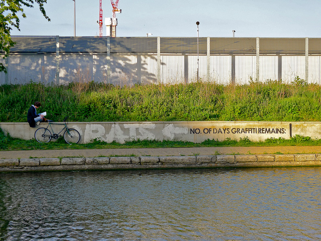
Last summer, I was visiting London and came across the above piece by mobstr in Hackney Wick. The piece was good for a laugh and I took a photo, but then I didn’t think much more of it. Until last week that is, when mobstr emailed me the update to the piece. Turns out, mobstr’s piece wasn’t a one and done. The count was accurate. Like much of mobstr’s previous work, this piece is a taunt and a game with the police and the buffman and took some real commitment. Here are the results…

NO 1
Photos by mobstr

Continue reading “Watch a work by mobstr grow daily for over a year…”

Parole restrictions cause HERT to go to extremes to produce art

-1

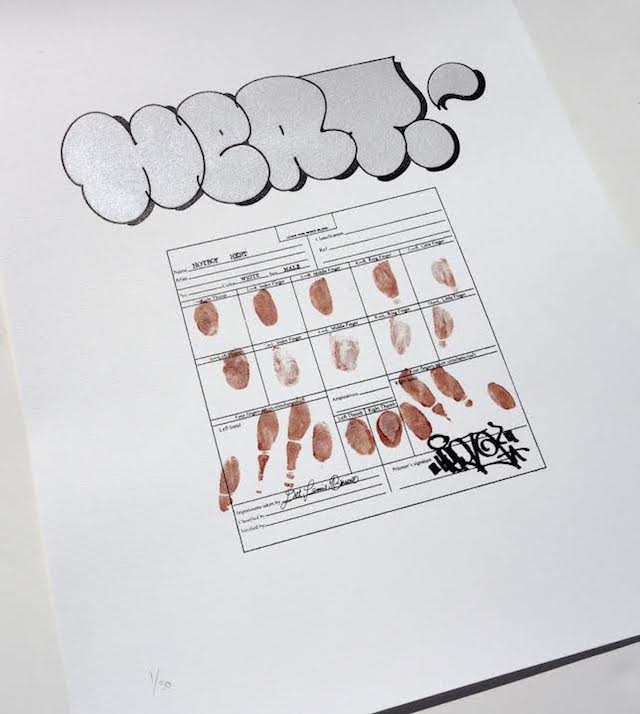
This Tuesday, Carnage NYC will be releasing a print with Ian de Beer, aka HERT, a writer that anyone keeping an eye out in NYC will certainly be familiar with. I try to avoid just copying and pasting press releases, but Carnage NYC has already told this story very well:

In September of 2010, Ian de Beer, aka HERT, was sentenced to 1-3 years in state penitentiary for graffiti. Regarded by many of his peers as one of the most talented young artists emerging on the East Coast, he now faced severe restrictions. After a year in prison he was moved first to a half-way house and is currently still confined to his hometown in Western New York State. His artistic interests have broadened considerably in recent years, but de Beer’s transition to a professional art career is facing serious hurdles: Under the condition of his parole, de Beer is not allowed to use a wide variety of art materials, including paint and any type of marker or pen, even to create works on paper or canvas.

In order to create this print without these essential tools, de Beer decided to incorporate these restrictions into the artistic process. He manipulated the imagery digitally and commissioned an external printer. Rather than signing the prints in a conventional manner, de Beer chose to tell the story of his arrest with his finger-prints and had a pint of his own blood extracted to use in place of ink. De Beer thus re-focuses the viewer’s attention from the banality of arrest procedures to the existential threat of suffocating restrictions that aim not to reform but solely to punish.

Some of the best art comes out of restrictions, sometimes self-imposed and other times imposed by society or the state or simply lack of resources. While I’m no fan of the criminal justice system that led to HERT’s incarceration for a non-violent crime or the restrictions on his parole, it’s great to see how he’s taken that situation and managed to create something unexpected as a result. Never underestimate the lengths a writer will go to get their name up. As HERT has shown with this print, the best writers are also great hackers.

HERT’s print will be available at Carnage NYC’s webstore starting Tuesday at noon, NYC time. It is an edition of 50, measures 18 x 24 inches and will sell for $50 each.

Photo courtesy of Carnage NYC

Artists bringing their reality into our own

"World Police State Champs" by Shepard Fairey. Photo courtesy of OBEY Clothing.
“World Police State Champs” by Shepard Fairey. Photo courtesy of OBEY Clothing.

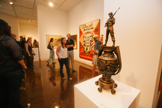
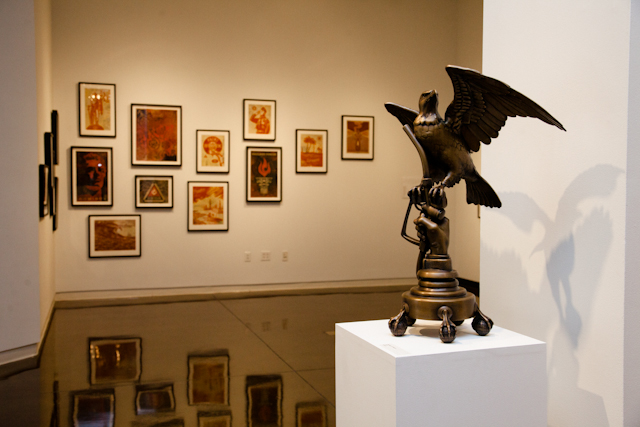
Some recent works by Shepard Fairey and Os Gêmeos have caught my eye, for essentially the same reason. These sculptures go beyond the typical artwork or even installation artwork in that they do not simply create a situation or depict something, but rather act as objects from another reality, transported into our own. This isn’t something completely new to art, but it’s certainly atypical.

Two works by Fairey in the show The Insistent Image stand out to me. Both are bronze sculptures, and each is based off of a separate print by Fairey from 2007. The prints are interesting enough, but these sculptures bring the ideas in each print to life. While I’ve heard other people describe these sculptures as a bit corny, I think they do their job. Both pieces look like the sort of ridiculous thing that an eccentric fascist dictator would really put on their mantlepiece or dining room table. By taking these ideas from 2D to 3D, Fairey has transformed them from essentially political cartoons into something almost real. Despite their absurdity, these works are much more powerful and disconcerting as bronze sculptures than 2D illustrations.

"Operation Oil Freedom" by Shepard Fairey. Photo courtesy of OBEY Giant.
“Operation Oil Freedom” by Shepard Fairey. Photo courtesy of OBEY Giant.

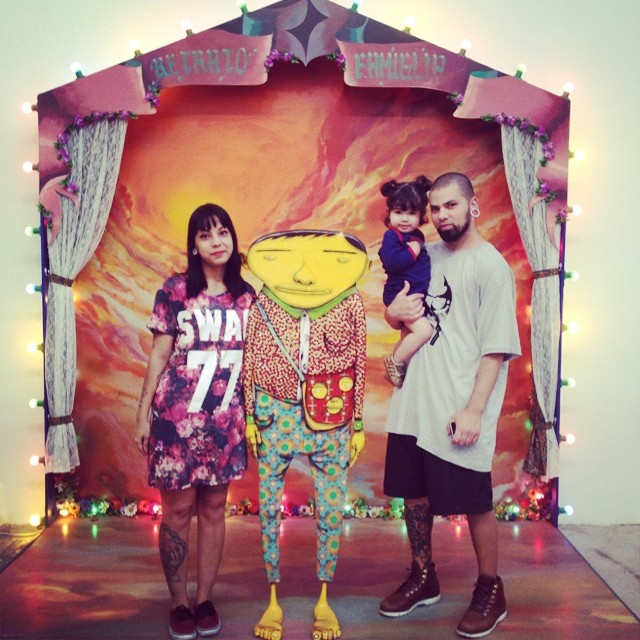
Also of note is a participatory piece by Os Gêmeos that is part of their show A ópera da lua at Galpão Fortes Vilaça in São Paulo. The text in the piece, though not easily visible in the photo below, reads “Retrato família” (“family portrait”). Essentially, the artwork is an invitation to take a photograph beside an Os Gêmeos character and with a backdrop straight out of Os Gêmeos’ world, but also easily recognizable as a sort of vernacular photography setup. In many ways, the piece reminds me of Alyse Emdur’s Prison Landscapes series and the photography it is inspired by. While Os Gêmeos’ work indoors and outdoors is often in some way about bridging the gaps between their dreamworld and our reality, this piece takes that idea to an extreme. By taking a photo in this artwork, viewers become a part of Os Gêmeos’ world in a way that simply observing or taking your picture with most of their other artworks, however impressive the installation, sculpture or painting may be, does not allow.

A work by Os Gêmeos at their show "A ópera da lua". Photo by @gikacrew.
A work by Os Gêmeos at their show “A ópera da lua”. Photo by @gikacrew.

These works do not attempt to depict something. They attempt to realize something, and something unfamiliar at that. Even Dalí’s surreal paintings and sculptures are mere references to another reality, not that reality realized in our own. These works by Fairey and Os Gêmeos at least attempt to realize the unfamiliar, the surreal. When these works succeed, it’s as if each work has been teleported into our world from an alternate universe, rather than made in an artist’s studio, or perhaps as if being around them (at least in the case of Os Gêmeos) temporarily transports us into that alternative universe. These works are artists’ surreal visions made real, or as close to that as we are likely to get. I think that’s great.

Photos by Susan Sermoneta, @gikacrew and courtesy of OBEY Giant and OBEY Clothing

Peter Drew in collaboration with Australian asylum seekers

Original drawing by Ali Rezai

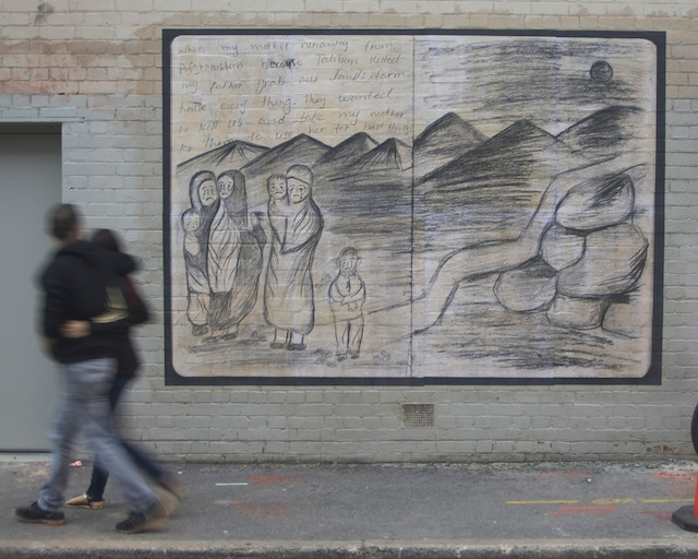
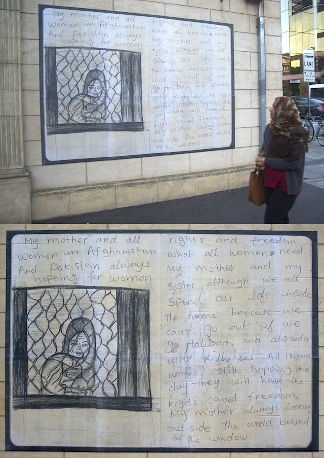
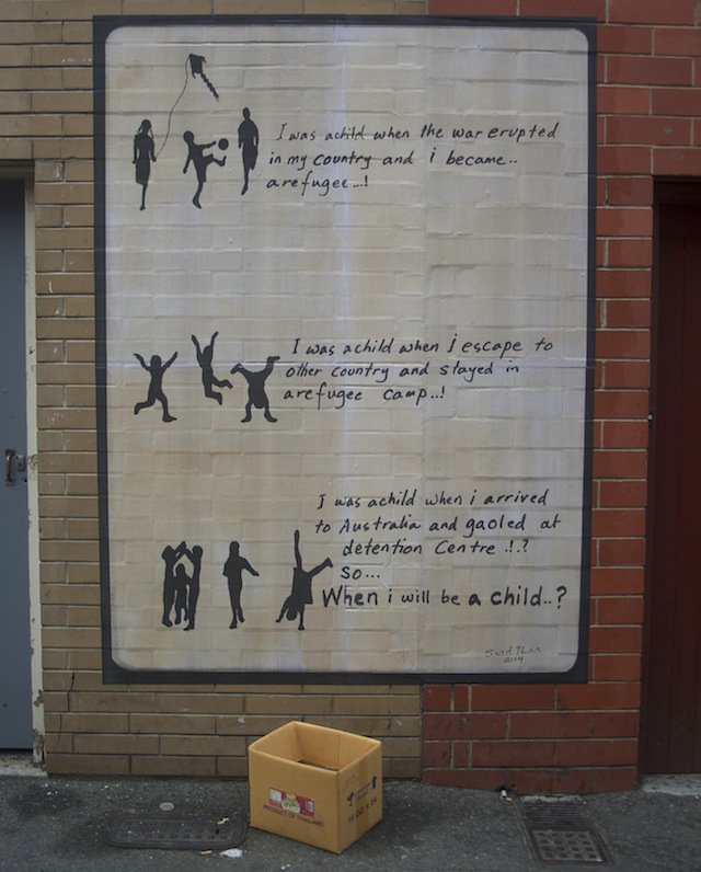
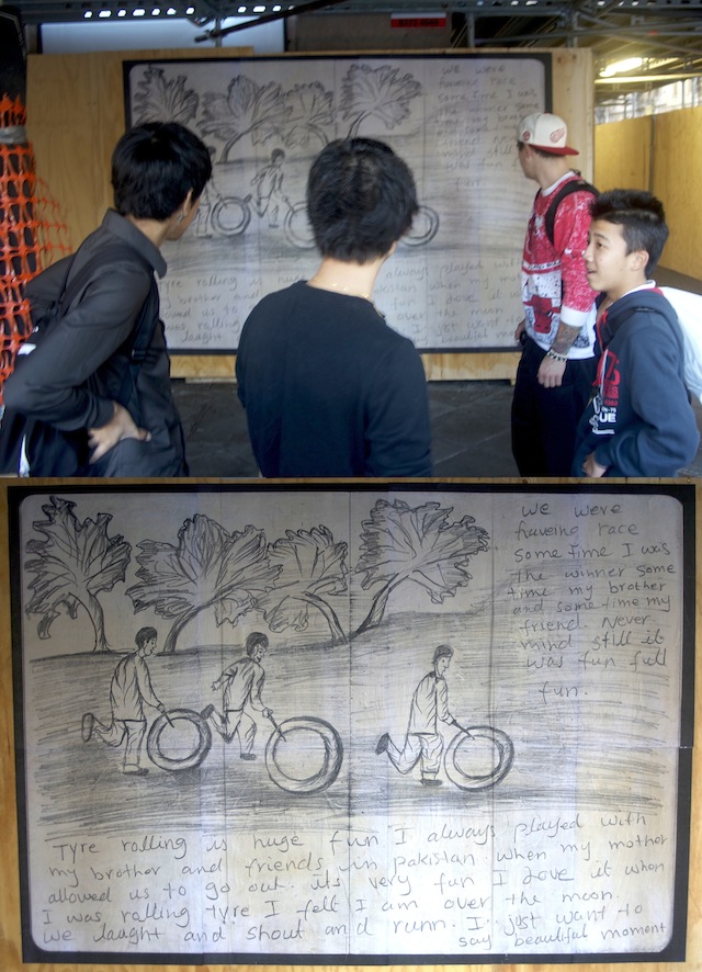
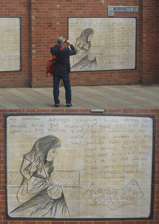
Australian street artist Peter Drew recently installed a series of wheatpasted drawings on the streets of downtown Adelaide, Australia. Of course, that sounds like what plenty of street artists do, except that these wheatpastes aren’t Drew’s design. Each wheatpaste is a blown-up version of a drawing by a person seeking asylum in Australia. The project is an effort to take on the very very controversial immigration detention centers in Australia that those seeking asylum in Australia often spend a great deal of time in, and to humanize the asylum-seeking process in general. This isn’t the first time that these facilities have caught the attention of the art world, but Drew’s project attempts to give the issue a personal touch, which is somewhat less common.

Original drawing by Ali Rezai

Made up of 36 drawings by seven asylum seekers, the Bound For South Australia series takes some of the most disenfranchised people in the world and attempts to give them a very loud voice. Many of the drawings had to be smuggled out from the Inverbrackie Detention Centre near Adelaide, where many asylum seekers are currently being held (although the facility will be shut down later this year). One particularly key contributor was Ali Rezai, an Afghani teenager who has made his way from Afghanistan to Pakistan and now to Australia and currently holds a temporary Australian visa. This video tells some of his story:

But Ali is the exception. Most of the other works are uncredited. I asked Drew about that decision. Here is his response:

It’s an ethical juggle. The worst thing that could possibly happen from this project would be one of the participants being deported for their participation. For that reason I’ve only revealed the authorship of those participants who have already been issued a bridging visa. Even that took deliberation. There’s a deliberate lack of information from Australia’s Border Protection Force. They seem desperate to send a message to the world’s asylum seekers that Australia is unsympathetic to their plight. That’s why I wanted to protect the names of participants who might still be vulnerable as they could be targeted to be made example of.
Original drawing by Saad Tlaa

In some ways, Bound For South Australia is similar to JR‘s Inside Out Project, which essentially allows anyone to become a mini-JR using JR’s facilities, and both projects suffer from a similar flaw: authorship. Both projects are ostensibly about giving a voice to those who do not have one, amplifying those disenfranchised people’s voices through a megaphone provided by a well-known artist. Except in both cases, the “artist” is a white male who at the end of the day takes credit for the project, and the often non-white participants are somewhat left anonymous or effectively anonymous, arguably used as props by the “lead artist.” In both cases, there’s arguably a reason for that anonymity. JR and Drew have provided a voice to people living in dangerous situations, who may not be in a position to name themselves safely. These situations are probably entirely necessary. Still, they are ironic, and muddy the waters as to how much these projects actually humanize their subjects/participants.

How well can Drew’s project humanize asylum seekers when journalists pick up on the project as a Peter Drew project and the names of the asylum seekers who drew the works that are on Adelaide’s walls, effectively relegated to the role of technicians, are kept secret? It is telling that even Drew seems to conceive of this as a Peter Drew artwork, not a series of 36 artworks facilitated or installed by Drew.

Original drawing by Ali Rezai

What if, in Drew’s case, he had not actually claimed responsibility for the wheatpastes? Would an anonymously distributed press release, or a press release distributed by a human rights organization without Drew’s name, or no press release or explanation at all, have gotten the same attention for the project? I’m not sure. On some level, Drew is taking advantage of the very people he is trying to help, but I get the sense that such exploitation may be necessary for the success of the project, a project with the admirable goal of awareness about the asylum seeking process in Australia.

Original drawing by Ali Rezai

Photos by Peter Drew