Connecting street and studio

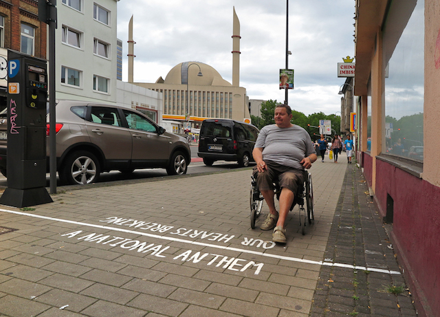
A National Anthem_Our Hearts Breaking_outdoor_lo res

One of the most common questions I get from people outside of the street art world is some variation on “How do street artists show in galleries?”

My 30-second answer is that just as painters can sculpt and illustrators can take photos, artists aren’t restricted to just one way of displaying their work. I tell them that street artists often have a studio practice too. I tell them that what the street/studio combination looks like can vary, but sometimes the two can feed off of one another in a brilliant synergy.
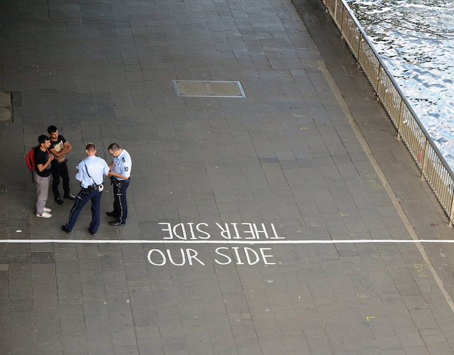
Our Side_Their Side_outdoor_lo res

That’s a best-case scenario though, overly optimistic, which is fine when I’m being an evangelist for street art, but not quite suitable for a conversation among the already converted. We all know that the reality isn’t so cut and dry. What works for street art, what works for murals, and what works in a gallery setting are rarely the same.
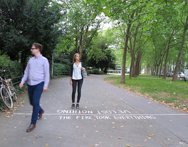
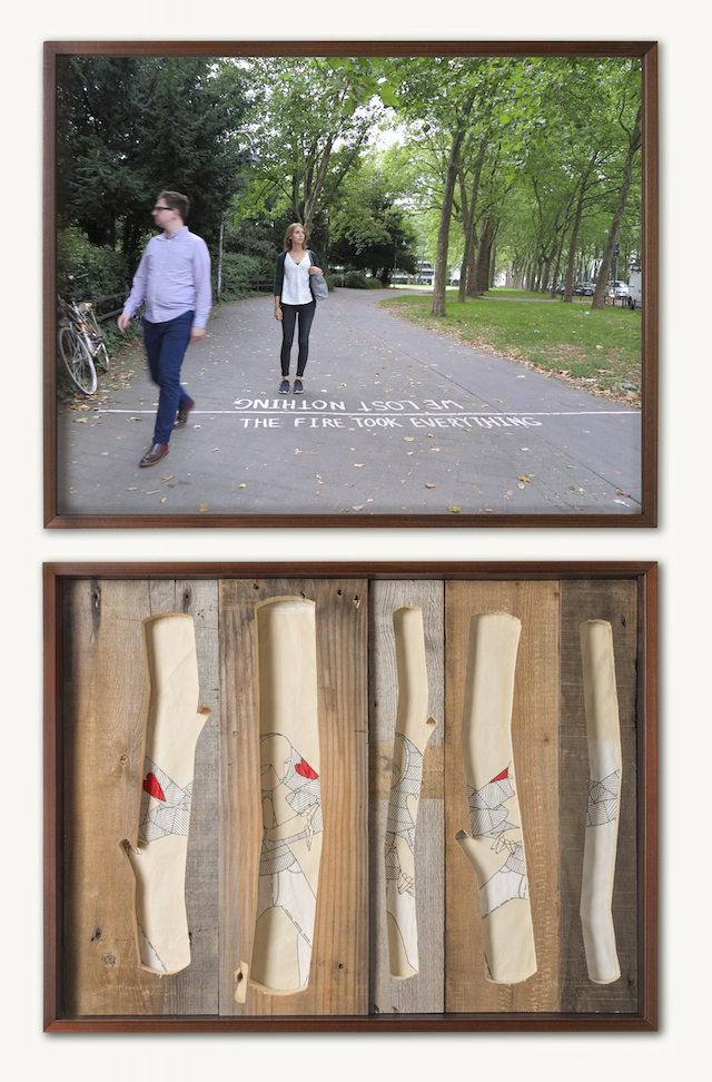
The Fire Took Everything_We Lost Nothing_outdoor_lo res

So how do you find that synergy between street and studio? I don’t have a great catchall answer, but I do have a recent example of someone getting it right.

Taking Sides, a new series from Know Hope, is one of a handful examples that I can think of where documentation of street art actually works as a piece in a gallery. It reaches a rare and coveted level of synergy between street and studio practice. For Taking Sides, Know Hope created a series of subtle street pieces in Cologne, Germany and photographed them at just the right moment. In the gallery, he paired each photo with one of the more “typical” studio works that he is best known for. As street pieces, they are solid. As photographs, they take on a new dimension. Paired with paintings, each piece in the pairing informs the other.
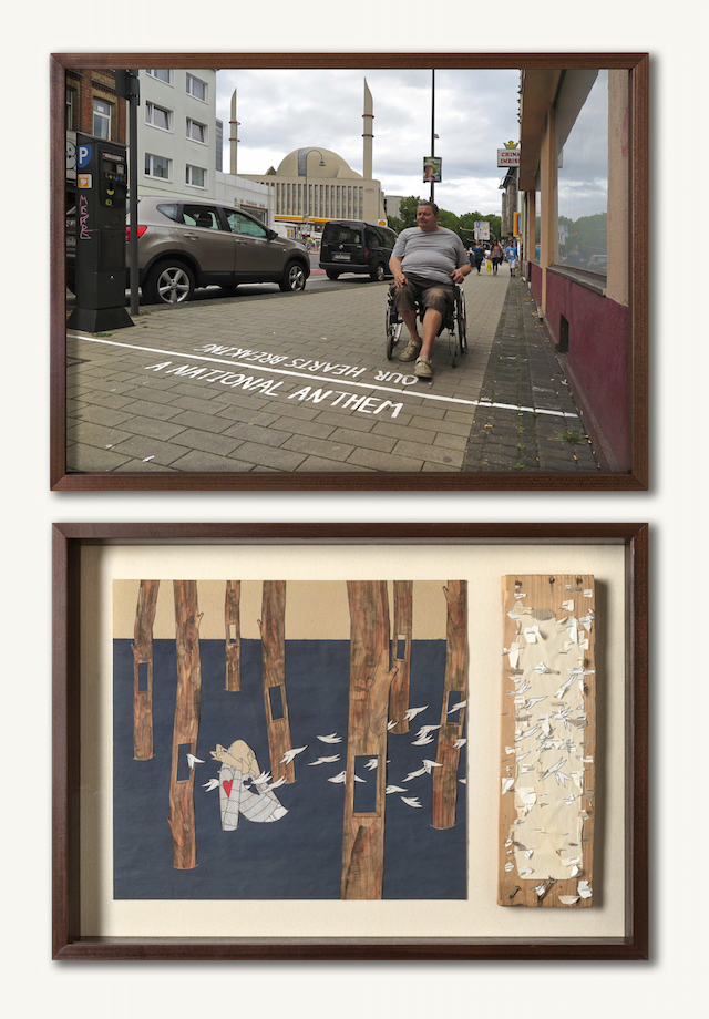
A National Anthem_Our Hearts Breaking_lo res

This approach won’t always work. That synergy isn’t as simple as putting some photos in a gallery. A photo of a mural next to a print based on that mural is going in the exact wrong direction, even though that seems to be how a lot of art is sold. It works for Know Hope (and also Barry McGee) because the photos capture something that their paintings and drawings can’t, and vice versa. That’s the key. And while I’m focusing on Know Hope today and it’s still not a catchall answer, it remains true even if the street and studio pieces aren’t literally exhibited side by side.
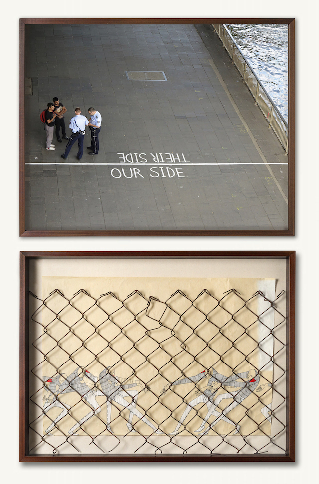
Our Side_Their Side_lo res

The Fire Took Everything_We Lost Nothing_lo res

Photos courtesy of Know Hope
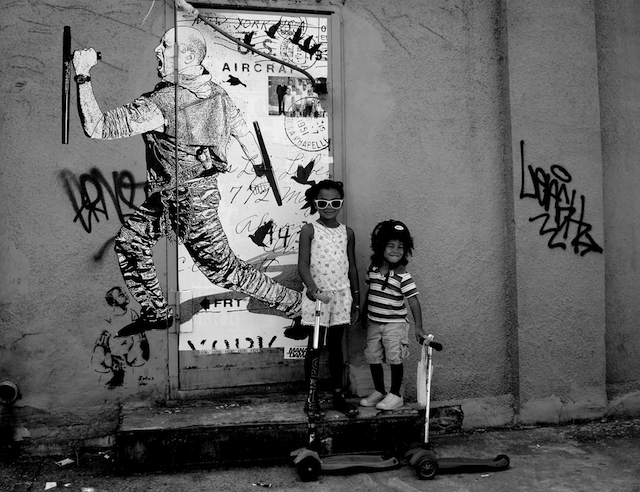
Dancing in the street with London Kaye

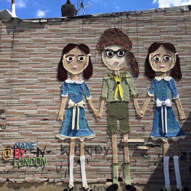
London kaye

London Kaye, whose work I would usually ignore because it is more boring and derivative than The Cleveland Show, has become an accidental symbol for street art’s role as a gentrifying force. Oddly enough, she seems to be okay with that, even embracing it her newfound position as the symbol of white hipsterdom steam-cleaning the longstanding culture out of Bushwick.

A yarnbomb that Kaye put up on the wall of a Bushwick home has gained national attention because A. She didn’t ask the Salvadorian property owner and resident of the building for permission, B. She did ask the anti-immigrant white guy who runs a flea market in the lot next door for permission, C. Kaye’s piece depicts two little white girls and a boy from a Wes Anderson film, and D. She’s been at best naive and at worst unapologetic and taunting in her response to feedback that her work is rubbing residents and the property owner the wrong way.

The Gothamist has the full story, including an interview with Will Giron, the nephew of the property owner. Giron put the situation most succinctly: “I don’t feel like London was doing anything malicious. I truly believe that from the bottom of my heart. At the same time though, that’s a lack of awareness of your own privilege. If any black or Latino person were to do what London did, we’d have to worry about being bashed by the cops.”

What’s happened to Kaye could happen to almost any well-meaning street artist these days, but I have no sympathy for her. Of course, gentrification is a process that takes place (and in which I am a participant in my own neighborhood), and it’s not Kaye’s fault that graffiti writers are sent to prison and people of color are beaten and killed by police, she is literally dancing in the street after using a nailgun on someone’s home without permission. Kaye seems almost gleeful in the way that she has embraced her role as a symbol for white privilege and an active participant in claiming Bushwick for a gentrifying community. It’s an embarrassment to the potential of street art. Caroline Caldwell hits the nail on the head: “London Kaye is so up her own ass with the idea that she’s beautifying the world through street art that she’s missing the larger context of her work.”

Of course, you might say that Kaye was just doing some illegal street art, and should be applauded in a culture of muralism. Illegal street art is one thing, but what Kaye did here was ask permission of the white guy in the room, ignore the property owners, and then defend her actions while taunting her critics.

Kaye completely deserves her inevitable future selling a “street art inspired” clothing line on QVC alongside Paula Deen.

Photo from London Kaye’s Facebook

Shepard Fairey on art, politics, and being a role model

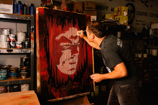
Photo courtesy Obey Giant Art via Shepard Fairey

As the leading American street artist and one of the country’s most recognizable graphic designers, Shepard Fairey himself needs no introduction. But these are strange times for Fairey, and a refresher might be in order. His latest exhibition, On Our Hands at New York City’s Jacob Lewis Gallery, is set to open on Thursday evening. The show tackles the influence of money on politics, the way that legalized bribery has corrupted our democratic system. His new book, Covert to Overt, is due out later this month. The book tackles the influence of money on Fairey’s art, the way he’s fed his ever-growing fame and commercial success back into the work he’s always been doing. He’s on top of the world, or at least the art world. Except that Fairey also standing trial in Detroit for some wheatpastes that the city calls “malicious destruction of a building,” and he could wind up going to prison. So the next few months could really go either way.

Fairey has left an indelible mark on American politics and culture. No matter what happens next, I suspect he’ll continue on that path in one way or another. As he prepares for the opening of On Our Hands, we had the opportunity to ask Fairey a few questions about his career, his place in the art world, and his politics.

RJ Rushmore: As your own fame has grown, as you’ve gone from covert to overt, how have you learned to strike a balance between using your fame for positive change and simply enjoying it?

Shepard Fairey: There are pros and cons to being known whether you call it famous or infamous, but I definitely try to leverage my higher profile to push socially conscious and sometimes provocative ideas. I have a large audience now, which I view as a tremendous resource but also a group to be considerate of and responsible toward. It may sound trite but I take my situation seriously as, for lack of a better word, a role model. I try to provide strong justification for my actions and my viewpoints and I think one of the reasons many of the doors have opened for me that have, is because I’m community and socially minded, not only with my work but with the organizations I support and the activism I engage in.

Continue reading “Shepard Fairey on art, politics, and being a role model”

Hyuro and Space

3
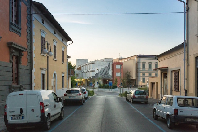
Photo by Marco Tani

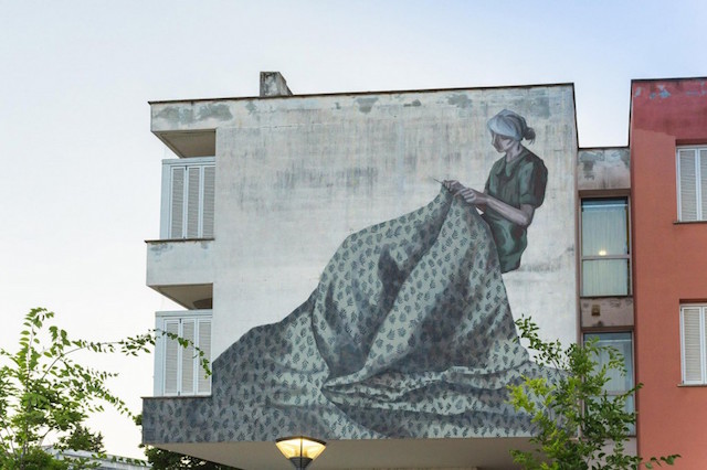
Today, I want to highlight two recent murals by Hyuro that I am completely in love with. In both murals, space is as important as content, and the two are intertwined. It’s been a long while since we’ve covered Hyuro on Vandalog, but she’s one of my favorite European muralists for her unique mix of anger, struggle, and beauty.

This first mural from is back in July. It was painted on what Hyuro describes as “a third age care center” in Poggibonsi, Italy for DOTS Festival. Kudos goes in part to the curators at DOTS for this one. The wall in a prime location, facing traffic on what looks to be a curved road. You can probably spot this mural for blocks. Potential wall-hunters, look out for locations like these. Of course, not every artist could do something worthy of such a wall, but Hyuro did.

Photo by Marco Tani
Photo by Marco Tani

Rather than pulling out a random page from her sketchbook and turning it into festival-friendly muralvomit, Hyuro painted something specifically for that wall and that building. On a spot that could just as easily have been turned into a massive billboard for a naked woman to sell Coca-Cola (brief aside: That joke doesn’t work if you’re stealing it to sell it), Hyuro’s highly-visible mural honors the building’s residents, a group who are all too often ignored. And yet, that message isn’t overbearing. The mural is, first and foremost, a quiet moment for meditation.

For this mural, Hyuro factored in the setting around her wall and on the other side of it, the whole environment. Hyuro responded intelligently and skillfully to the unique space and the opportunity presented to her. Isn’t that supposed to be a core tenet of quality street art? And yet, work like Hyuro’s is all too rare.

Photo courtesy of Hyuro

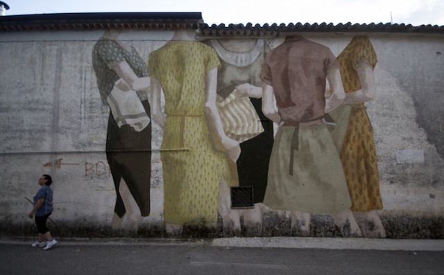
And then there’s Espacios de empoderamiento, which Hyuro painted just a few weeks ago for Fate Festival in San Potito Sannitico, Italy. As the subject for a mural, a group of women standing around and talking is already notable (a Bechdel-Wallace test for street art and muralism is long overdue). Hyuro takes things a step further by playing with scale. Even the side of a building cannot contain these women. This space for empowerment extends beyond the wall, up into the sky and out onto the pavement. Such a simple tweak took what would have been a good mural and made it great.

There are a lot of reasons to like what Hyuro does. Maybe you like her skills with a brush, which she has in spades. Or you appreciate her politics, which are underrepresented in street art and contemporary muralism. But, with these two murals at least, it’s her appreciation of space that any artist working outdoors can learn from.

Photos by Marco Tani and courtesy of Hyuro

It’s not the size, it’s how you use it

10295150_10204839281165455_6764465598386105533_o

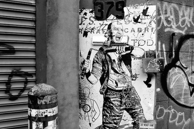
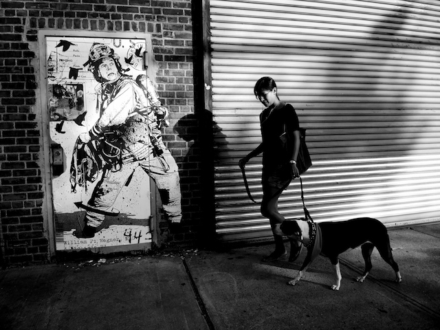
In this era of monumental murals, it can be easy to forget that bigger isn’t always better. In a series of new wheatpastes, WK Interact has taken to the doors of New York City. These life-size pieces are bursting with WK’s trademark energy, and they pack more of a punch than murals ten times their size.

c1

These wheatpastes remind me of an old story from Richard Hambleton, although I can’t remember quite where I read it. It goes something like this… Hambleton was once standing on a New York City street corner, preparing to paint one of his shadowmen. Only, there was a man across the street who just seemed to be standing there. Hambleton kept waiting for the man to leave so that he could begin painting. Eventually, Hambleton crossed the street and walked towards the figure, only to realize it wasn’t a man at all but one of his shadowmen painted on the wall!

k1

True, WK’s figure’s are black and white, but Hambleton’s were just silhouettes. Surely a few passersby are going to catch these pastes in the right light and out of the corner of their eye and mistake them for the real thing. That’s an experience that a megamural can rarely deliver. Not to mention these pieces are probably perfect selfies.

n3

WK Interact can work big, but this series is a great reminder that he doesn’t have too. These new wheatpastes are better because they are “small.” You can find them on the streets of New York City. Happy hunting.

11406138_10204839279925424_442545794606191344_o

DSCN2414

b2

Or, if you’re not in New York, check out more from this series on Street Art News.

Photos courtesy of WK Interact

An Italian in the Big Shiny Apple

"1 Gram" by Nemo's. Photo by Jaime Rojo.
1 Gram by Nemo’s. Photo by Jaime Rojo.

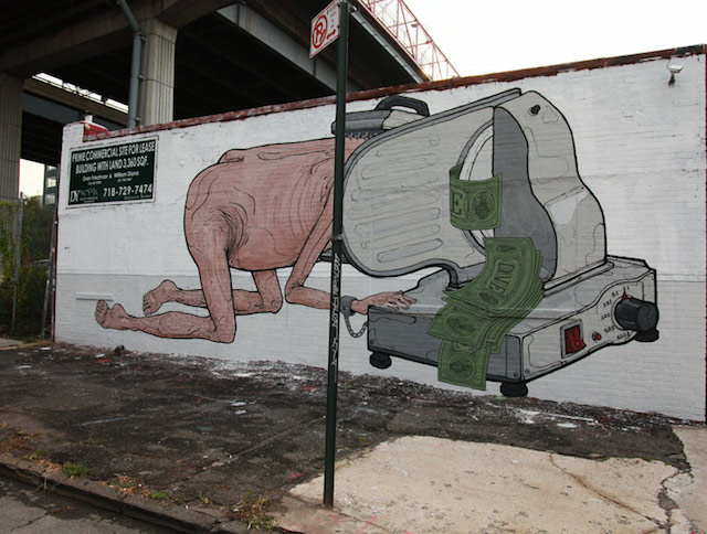
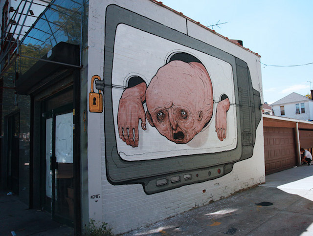
Two of the most provocative murals painted in New York this summer come from Nemo’s, an Italian street artist on his first visit to NYC. Both pieces can be found in Williamsburg, a neighborhood where murals function as billboards and billboards masquerade as murals.

First came 1 Gram (which happens to be the weight of a dollar bill). Brooklyn Street Art notes that the piece faced a bit of censorship, in that the wall owner didn’t like the penis on Nemo’s character and the artist agreed to remove it. But it seems a bit silly to quibble over castration when the penis was a relatively minor component of the mural and it’s overall message is already so bold and potentially controversial.

Stocks – Pillory by Nemo's. Photo by Jaime Rojo.
Stocks – Pillory by Nemo’s. Photo by Jaime Rojo.

Nemo’s followed that up with Stocks – Pillory. At first, the mural might seem a bit cliché: Another critique of the TV entertaining us with the public shaming our latest victim. Except that it’s not quite so simple and cliché. The victim isn’t trapped. The key is just around the corner, and the “prisoner” could probably reach it if he tried. Or, better yet, he could just back right out of his prison. The hole of the pillory are much larger than his head and his hands. But instead of slipping out to freedom, he maintains his clearly painful television existence. And we watch on. Entertained.

Actually, in both murals, the men are there by choice. In Stocks – Pillory, the man rests in the faux-pillory, and in 1 Gram, he feeds himself into the meat slicer. All it would take to stop the agony would be for them to take a step back to examine their lives. But we all know that isn’t going to happen anytime soon. And so the torture of contemporary society continues.

No matter how you read them, neither mural is decorative, the dominant trend in “street art muralism” lately. You’d be hard-pressed to find many street artists painting such provocative murals, especially in New York City. Unless of course, the mural is actually just an ad. When street artists are judged by their murals and those murals get them gallery shows and print releases and larger murals and corporate-commissioned murals, when “street art muralism” is a career path, decorative sells. Why mess with that?

So many street artists are like Nemo’s men: seeing no viable alternative, they sacrifice themselves to the entertainment, advertising, and real estate industries. But the biggest names in Italian street art buck the trend. Nemo’s follows in the tradition of Blu, Ericailcane, and Ozmo, as well as the notoriously rebellious attitude of FAME Festival.

What makes these Italians different? I don’t have a good answer. It could be nothing more than accepting nothing less than their true vision. The power to walk away. When Blu’s mural was buffed in LA, he left town rather than paint something else. When Blu’s murals were being used as as marketing tools in the gentrification of Berlin, he buffed them. When Ericailcane painted a mural critical of Mexico’s president, he painted his ideal mural and then faced a destructive act of censorship rather than self-censoring from the start.

But that’s just a negotiating tactic. It doesn’t explain why other street artists stick to decoration, or why mural festivals tend to work with those artists. So maybe they shouldn’t. The alternative isn’t an impossibility. Take a page of Nemo’s book. You can step back from the pillory and you can stop slicing off your face.

Photos by Jaime Rojo for Brooklyn Street Art

We’re going to Dismaland

The view from inside of Dismaland

In case you’ve been living under a rock… Banksy’s next major project has arrived: Dismaland. What is it? A sort of Burning Man-esque amusement park / art exhibition curated by Banksy with his own work and work by dozens of other artists. It’s located the British seaside town of Weston-super-Mare, among the ruins of what was once an outdoor swimming pool. Just when you think Banksy can’t outdo himself, he outdoes himself again. Of course, that part is just speculation. Dismaland isn’t open yet. A limited number of journalists, bloggers, and photographers were let inside today, and Dismaland opens to the public on Saturday.

For now, Arrested Motion has a great set of photos from inside the park, Juxtapoz has an exclusive interview with Banksy about the project, and the Dismaland website has the full artist line up (quite impressive and with some nice surprises), a calendar of weekly live music and comedy performances, a map of the park, and ticketing information. To enter the park, you’ll have to buy a ticket. The cost is just £3, and the online ticket system should be live soon.

Caroline and I are on our way to Dismaland now, so keep an eye out for more coverage once we arrive. We couldn’t be more excited.

Photo by Tanley Wong of Arrested Motion

Largely self-promotional link-o-rama

stikman in Philadelphia

Apologies that this particular link-o-rama is full of self-promotion and conflicts of interesting, but I do think these are all interesting projects and I hope you do too:

  • It takes a lot to get my excited about a mural festival, but this year’s Wall\Therapy in Rochester, NY looks great. It’s difficult to put on a mural festival. One short cut is to work with obvious artists. Your festival will look like 50 other festivals, but the walls will probably seem impressive. Wall\Therapy has not gone that route. This year in particular, they put together a surprising and diverse line up to create an arguably cohesive body of new work, and the quality of the murals is still strong pretty much across the board. Check out Brooklyn Street Art’s photos and review for the full story.
  • From the selections I’ve read, I’m still not sure how I feel about the book What Do One Million Ja Tags Signify? by Dumar Novy, but a philosophy book centered on the work of a prolific graffiti writer seems like something that should at least catch the interest of Vandalog readers.
  • Phlegm is in the middle of his latest art-making experiment, spending a month making art in the woods of rural England. I’m loving the results so far, and of course the concept of challenging himself in this way.
  • Shepard Fairey’s latest print about corporate greed and campaign finance reform is about to drop. It’s a nice print, and I’m always glad to see Shepard tackling this important but not particularly sexy topic. Plus, the profits from this print go to two great organizations fighting for campaign finance reform. I’ll just note that Shepard is working on a couple of projects right now for my employer, but campaign finance reform and political corruption really are topics that I care a lot about.
  • Speaking of my employer, I recently got to work on a really fun project with the City of Philadelphia Mural Arts Program and Ben Eine. Back in June, Eine came to Philly for a few days and painted almost 40 of his classic shutter letters. Philly now has a complete Eine alphabet, and then some. Eine’s work can be found throughout the city, but the shutters are definitely clustered in South Philly around Southeast by Southeast, a community center and art space for the neighborhood’s large Southeast Asian refugee community. Brooklyn Street Art has more on this project.
  • And one more Mural Arts project to mention: JR recently installed a huge mural right in the heart of Philadelphia as part of Open Source, our public art exhibition curated by Pedro Alonzo. The mural is a portrait of Ibrahim Shah, a local food truck chef who came to Philadelphia from Pakistan about a year ago. The Philadelphia Inquirer ran a great profile on Ibrahim. I love how this mural looms large on the side of one of the biggest buildings right in the center of Philly, but isn’t actually that visible from the ground except from a few choice locations. Sounds like that could be a problem, I know, but the mural actually pops out from behind buildings in the most surprising places, and catching a glimpse of it winds up being a thrill, a bit of hide and seek. Plus, that game plays into the meaning of the mural, which is about how immigrants are a big part of our cities, but aren’t always celebrated or allowed to be made visible.
  • Okay, actually, Mural Arts has something coming up with Steve Powers too, but hopefully it will last longer than these signs in NYC! No surprise, a great series of street signs by Powers, installed legally as part of a project with the NYC Department of Transportation, seem to be being ripped down and stolen by greedy collectors or maybe thieves hoping to make a buck. It’s no surprise, but it is still disappointing.
  • A few days ago, I appeared on Al Jazeera English as a guest on their show The Stream. Gaia and I joined their panel to talk about street art. You can watch the full episode, plus some bonus online content, here.
  • If you’re in New York City, do not miss Faile’s exhibition at the Brooklyn Museum. It’s on now, and visiting is a really exciting experience. Vandalog contributing writer Caroline Caldwell currently works as an assistant at Faile’s studio, but even hearing bits and pieces from her as things were coming together did not prepare me for the awesomeness that is Savage/Sacred Young Minds. Without a doubt, the highlight of the exhibition is the latest and (I think) largest iteration of Faile and Bast’s Deluxx Fluxx Arcade, with custom foosball, pinball, and of course video games. It’s just an unabashedly fun experience. Arrested Motion has photos of much of the exhibition.

Photo by RJ Rushmore

Sabe KST officially has the best blackbook, and here it is…

Sabe

For me, one of the most interesting writers in contemporary graffiti is Sabe KST. I have to give Faust credit for really turning me to on Sabe’s work, although I doubt that Faust realized he was introducing me to a writer whose work perfectly matched up with what I’d been interested in seeing from contemporary graffiti.

Credit goes to Evan Roth for introducing me to the idea that graffiti is a series of hacks. Graffiti is about re-purposing tools as much as re-purposing space. But modern graffiti writers have access to 1000 tools custom-made for them. Sabe not only continues the art of hacking together your own graffiti implements, but he brings that same energy and ingenuity into his legal work. For his paintings and drawings, Sabe creates custom motorized tools that give him an aesthetic that other artists can’t match, because they don’t have the tools to do so.

With his latest project, Anime Blackbook, Sabe has combined old-school animation with digital art and video art, something else I love to see from writers and street artists. Just watch:

Is that not one of the best possible digital displays of tags? Anime Blackbook works for the same reason that INSA’s GIF-ITI is so popular. It’s an eye-catching way to activate graffiti in digital space of endless scrolling. Actually, Sabe should probably convert each tag into a GIF.

Of course, Anime Blackbook is reminiscent of Graffiti Markup Language (GML)/#000000book/KATSU’s FatTag Deluxe and associated projects from F.A.T. Lab. In fact, I was surprised to find out that Sabe hadn’t simply used GML to capture everyone’s tags for this project.

Regardless of the underlying technology, which is what those F.A.T. Projects were really about, Sabe’s video is a new favorite of mine. By simply adding some music and cool backgrounds, he captures the unique vibes of each writer in the video, something that a tag on a blank background can’t do unless you’re acutely attuned to the intricacies of graffiti. The pairings are perfect. For the writers I know, they make sense, and for the writers I don’t, they immediately tell me something extra about them. Pixote’s tag makes sense on a rocky cliff. Sabio’s tag means something different against a forest. Of course Faust’s tag is set against skyscrapers, and KAWS’ name appears on some ethereal starscape. The idea behind Anime Blackbook is relatively simple, but so many good ideas are. With this piece, Sabe has captured something about writing and the people who write, and any fan of graffiti should be able to appreciate that.

For more about Anime Blackbook, check out Animal’s brief interview with Sabe.

PS, the full list of writers included in the video is… JOZ, EASY, VEEFER, CES, SKUF, RIME, VIZIE, NEKST, WANE, JEST, SACER, ARK, NOV, SYE5, PIXOTE, SABIO, KADISM, RASAD, END, AMUSE126, SEGE, HOUND, KORN, DCEVE, SNOEMAN, CINIK, FAUST, YEAR, REHAB, AKS, REMO, NEMZ, FORES, SHAUN, GUESS, REAS, ESPO, KAWS, LEWY, ADEK, MALVO, KATSU, DAYS, GUNS, OPTIMIST, RESQ, BEGR, PEAR, ZOMBRA, PHAT2, UDON, NUNO, FANTA, TOM246, WANTO, QP, VERY, and SABEKST. Also, the film was produced by Sabe KST with animation direction by Celia Bulwinkel and a soundtrack by Trouble Andrew/Gucci Ghost.

Screenshot from Anime Blackbook by Sabe KST