For me, one of the most interesting writers in contemporary graffiti is Sabe KST. I have to give Faust credit for really turning me to on Sabe’s work, although I doubt that Faust realized he was introducing me to a writer whose work perfectly matched up with what I’d been interested in seeing from contemporary graffiti.
Credit goes to Evan Roth for introducing me to the idea that graffiti is a series of hacks. Graffiti is about re-purposing tools as much as re-purposing space. But modern graffiti writers have access to 1000 tools custom-made for them. Sabe not only continues the art of hacking together your own graffiti implements, but he brings that same energy and ingenuity into his legal work. For his paintings and drawings, Sabe creates custom motorized tools that give him an aesthetic that other artists can’t match, because they don’t have the tools to do so.
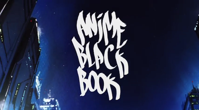
With his latest project, Anime Blackbook, Sabe has combined old-school animation with digital art and video art, something else I love to see from writers and street artists. Just watch:
Is that not one of the best possible digital displays of tags? Anime Blackbook works for the same reason that INSA’s GIF-ITI is so popular. It’s an eye-catching way to activate graffiti in digital space of endless scrolling. Actually, Sabe should probably convert each tag into a GIF.
Of course, Anime Blackbook is reminiscent of Graffiti Markup Language (GML)/#000000book/KATSU’s FatTag Deluxe and associated projects from F.A.T. Lab. In fact, I was surprised to find out that Sabe hadn’t simply used GML to capture everyone’s tags for this project.
Regardless of the underlying technology, which is what those F.A.T. Projects were really about, Sabe’s video is a new favorite of mine. By simply adding some music and cool backgrounds, he captures the unique vibes of each writer in the video, something that a tag on a blank background can’t do unless you’re acutely attuned to the intricacies of graffiti. The pairings are perfect. For the writers I know, they make sense, and for the writers I don’t, they immediately tell me something extra about them. Pixote’s tag makes sense on a rocky cliff. Sabio’s tag means something different against a forest. Of course Faust’s tag is set against skyscrapers, and KAWS’ name appears on some ethereal starscape. The idea behind Anime Blackbook is relatively simple, but so many good ideas are. With this piece, Sabe has captured something about writing and the people who write, and any fan of graffiti should be able to appreciate that.
For more about Anime Blackbook, check out Animal’s brief interview with Sabe.
PS, the full list of writers included in the video is… JOZ, EASY, VEEFER, CES, SKUF, RIME, VIZIE, NEKST, WANE, JEST, SACER, ARK, NOV, SYE5, PIXOTE, SABIO, KADISM, RASAD, END, AMUSE126, SEGE, HOUND, KORN, DCEVE, SNOEMAN, CINIK, FAUST, YEAR, REHAB, AKS, REMO, NEMZ, FORES, SHAUN, GUESS, REAS, ESPO, KAWS, LEWY, ADEK, MALVO, KATSU, DAYS, GUNS, OPTIMIST, RESQ, BEGR, PEAR, ZOMBRA, PHAT2, UDON, NUNO, FANTA, TOM246, WANTO, QP, VERY, and SABEKST. Also, the film was produced by Sabe KST with animation direction by Celia Bulwinkel and a soundtrack by Trouble Andrew/Gucci Ghost.
Screenshot from Anime Blackbook by Sabe KST


