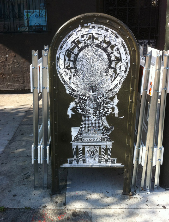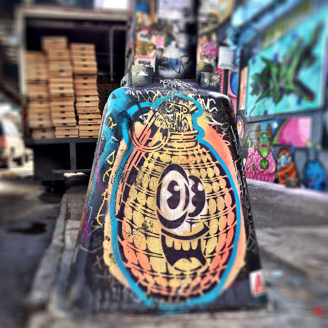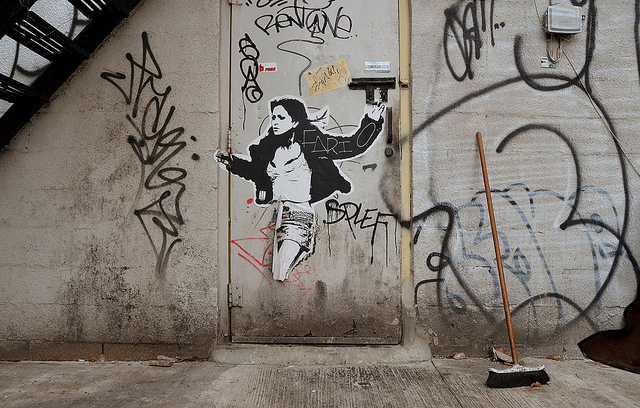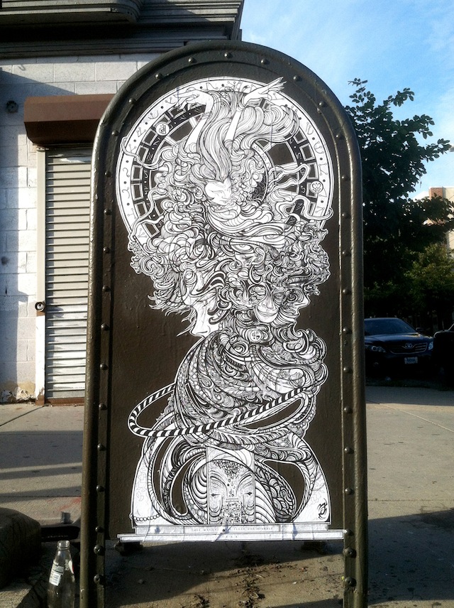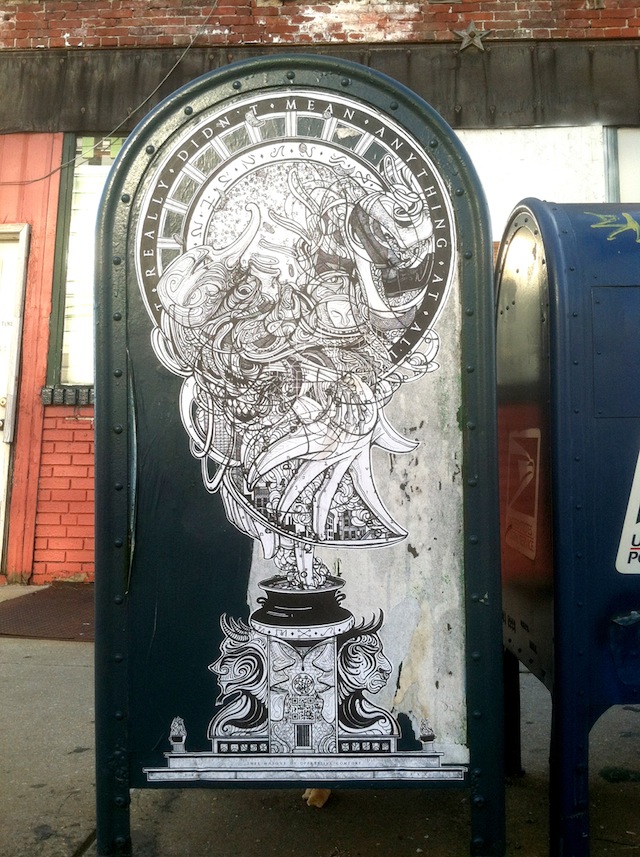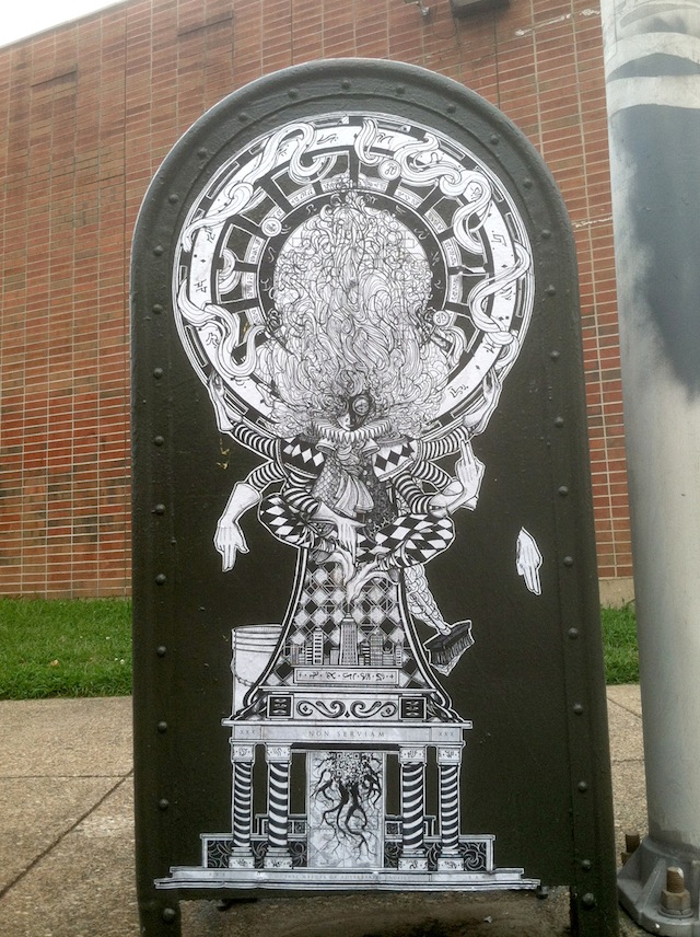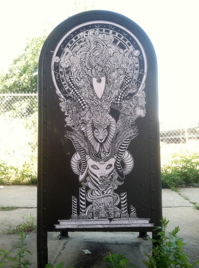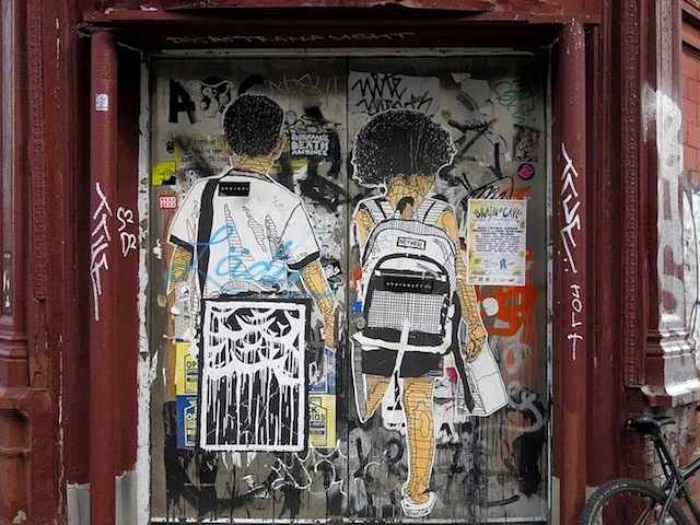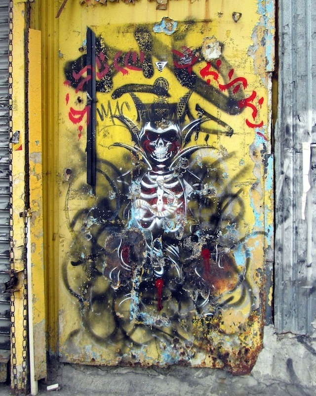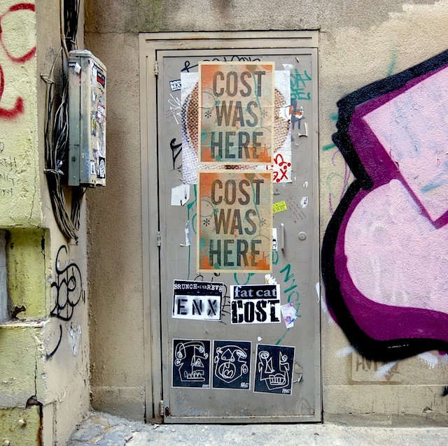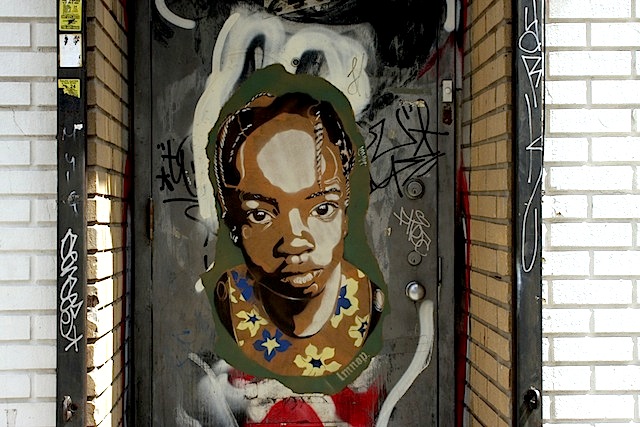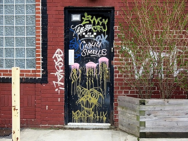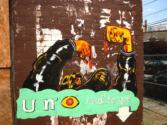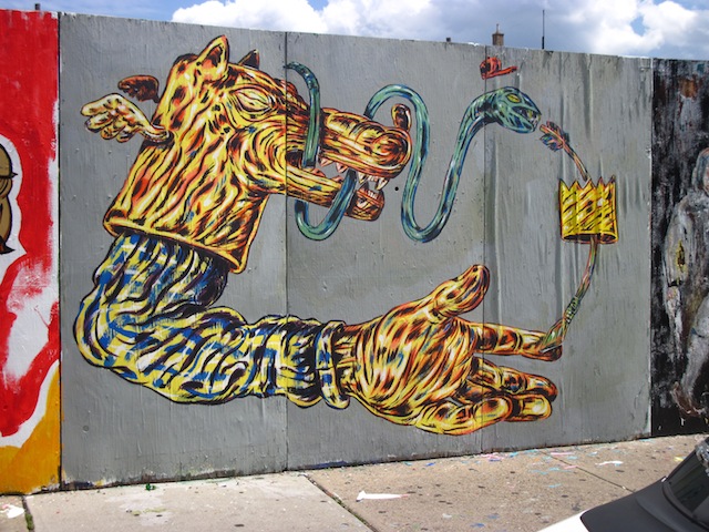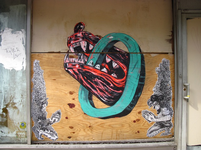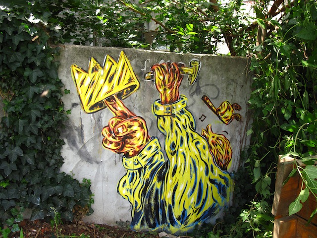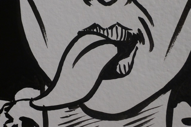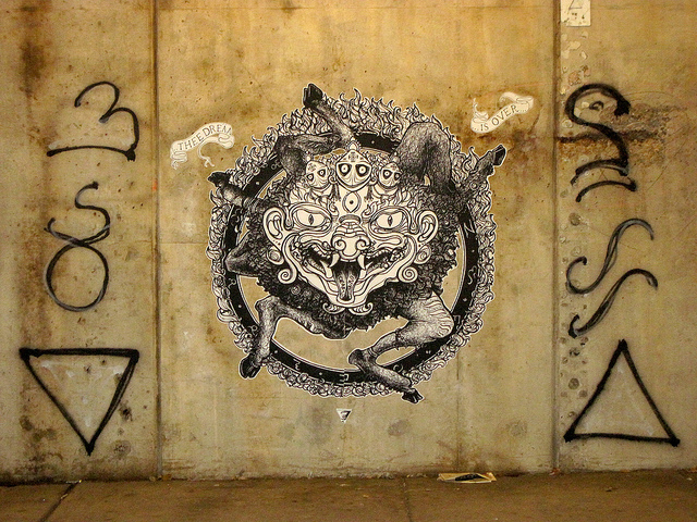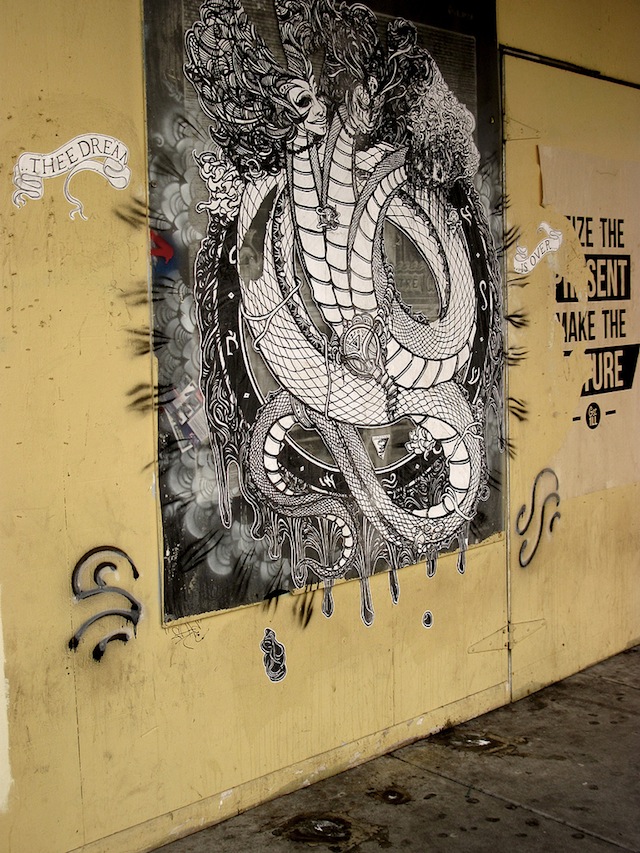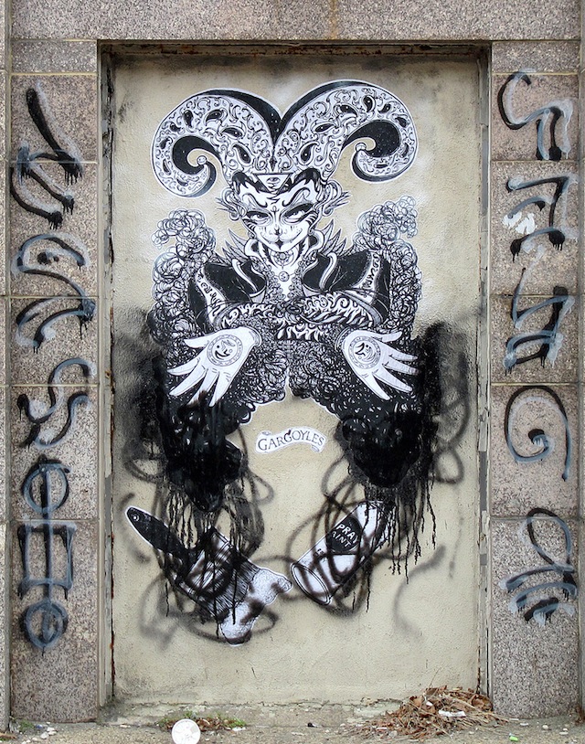
Harlequinade recently put up these four new wheatpastes in Philadelphia. At first, they may appear to be pretty standard, although nice, wheastpastes. Which, for Philly is something a bit special since there aren’t a lot of artists doing wheatpastes, but wouldn’t really be anything of concern to the rest of the world. Harlequinade is talented, but I don’t usually find his pieces to be absolutely mindblowing. But these four wheatpastes include small QR codes. Small being the operative word. I bet you didn’t even notice the QR codes in these pieces until now that I’ve pointed out that it exists and you’ve gone up and looked specifically for them.

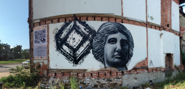
QR codes are difficult to incorporate into street art and graffiti. Yes, these QR code stickers by KATSU were a bit clever, but typically, my thought is that just putting up a QR code is a waste of space. Most people don’t scan QR codes regularly, and they aren’t typically visually appealing. One previous exception to that was Josh Van Horne’s piece for Open Walls Baltimore. If you ignore the issue of the patchy white background (was that ever fixed?), the piece was great. The mural scanned like a QR code should and brought up a YouTube video relating to the mural, but even if you couldn’t scan it or didn’t want/know how to, the piece looked great. If it hadn’t been scanable, it would still be a solid mural. But generally what I’ve seen is more in line with what the Wall Hunters/Slumlord Watch “Slumlord Project” did. The QR codes there were somewhat useful (certainly more useful than just a link to the artist’s website or whatever else QR codes are generally used for when used in street art), but they sure didn’t improve the space visually.
And I ran into a piece yesterday in NYC that showed just how annoying QR codes can be. Apparently it’s by Pérola Bonfanti and Nicolina of The Free Art Society. I found that out because I went to their website which is listed on the piece THREE TIMES. It’s listed directly beneath the QR code. The QR code also goes to the site. And the little plastic-but-metallic-looking plaque that was next to the piece until my friend ripped it down for being stupid went to the site too. All of that isn’t great, but it also isn’t the end of the world. What is pretty lame is when sending viewers to artists’ website actually interferes with the artwork itself. These artists need a lesson from Harlequinade in how to cohesively integrate QR codes into their work. Anyway, please don’t use this as an excuse to get into these artists. I’m trying to point out how irritating, self-promotional and untalented they are. Back to the talented guy, Harlequinade…

Harlequinade’s QR codes are not visually intrusive. They pretty much blend into the piece. If you see one of these wheatpastes but you don’t notice the code or you do and you don’t scan it, no problem (or if the piece gets partially buffed or tagged over and the code is unreadable). You still get half of the piece and it can still be a positive experience. But if you do choose to scan the QR code, you get an extra bonus to the piece.

For the benefit of those who may come across these pieces in person, I’m not going to spoil the surprise and say exactly what these QR codes do. One of the things I really like about this piece is that you can’t experience it fully online, and the component that you can’t experience online is the high-tech component of the work.
Kudos to Harlequinade for using QR codes so well.
Photos by Harlequinade
