Usually I have something to say here about my week, but it’s all kind of a blur and I’ve been struggling to find any words to describe what’s been going on or excuses for not blogging about everything interesting I’ve seen this week. So let’s skip the pointless pleasantries and here’s the stuff I missed:
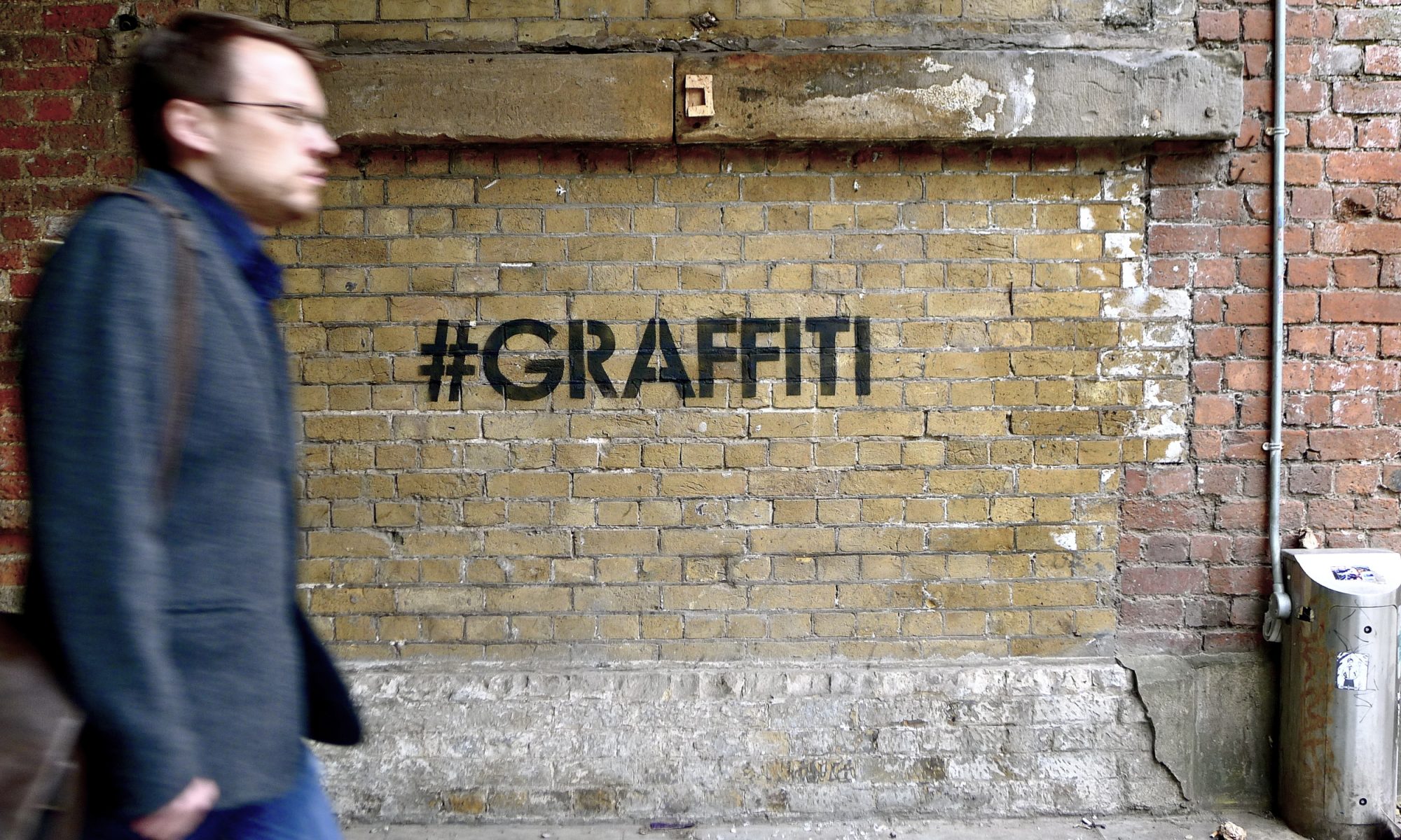
- Some thoughts from Alone One on graffiti and street art coexisting (and the inherent superiority of graffiti, according to the author). While I agree with the author that, in the case pictured, Aakash Nihilani and Posterboy did the smart and respectful thing by utilizing a piece of graffiti in their street art rather than covering it unnecessarily, the all-to-common argument that graffiti is always always always superior to street art really upsets me. Is there something beautiful/powerful about a tag that street art cannot capture? Sure. Are there street artists (and young graffiti writers) who stupidly go over important graffiti? Definitely, all the time. But warning that street artists can never go over graffiti under any circumstances is narrow-minded and naive, especially today when so much work blurs the line between street art and graffiti. It’s too bad when such a talented writer has such a narrow view of things.
- Here’s the latest work by Dal.
- Evol never fails to impress.
- MOMO is part of a show on at Space 1026 in Philadelphia and made this sculpture.
- Os Gêmeos have a show opening next week at the Museu Vale in Vila Velha, Brazil. Here’s a bit of a preview.
- Some stunning walls were painted at Meeting of Styles London this year, particularly by Shok1.
- S.Butterfly has a set of images from the Moniker fair. I’d like to hear in the comments what people who were there in the flesh thought, but it looks to me like a bit of brilliance (Dabs/Myla, Matt Small), a bit of goodness (Cash For Your Warhol, Aiko) and then a massive logo from D*Face and Scream Gallery’s booth which both just make me want to scream in a bad way (although I think D*Face’s piece actually looked a lot better once someone tried to mess it up and he had to change the piece to this). Update: It’s actually unclear if that simple D*face Ddog logo was intended to stay that simple or if the additions were part of the plan all along given this piece inside the fair.
Photo by Dimitris Taxis

