Memorial Day: Remembrances of things past, present, and future

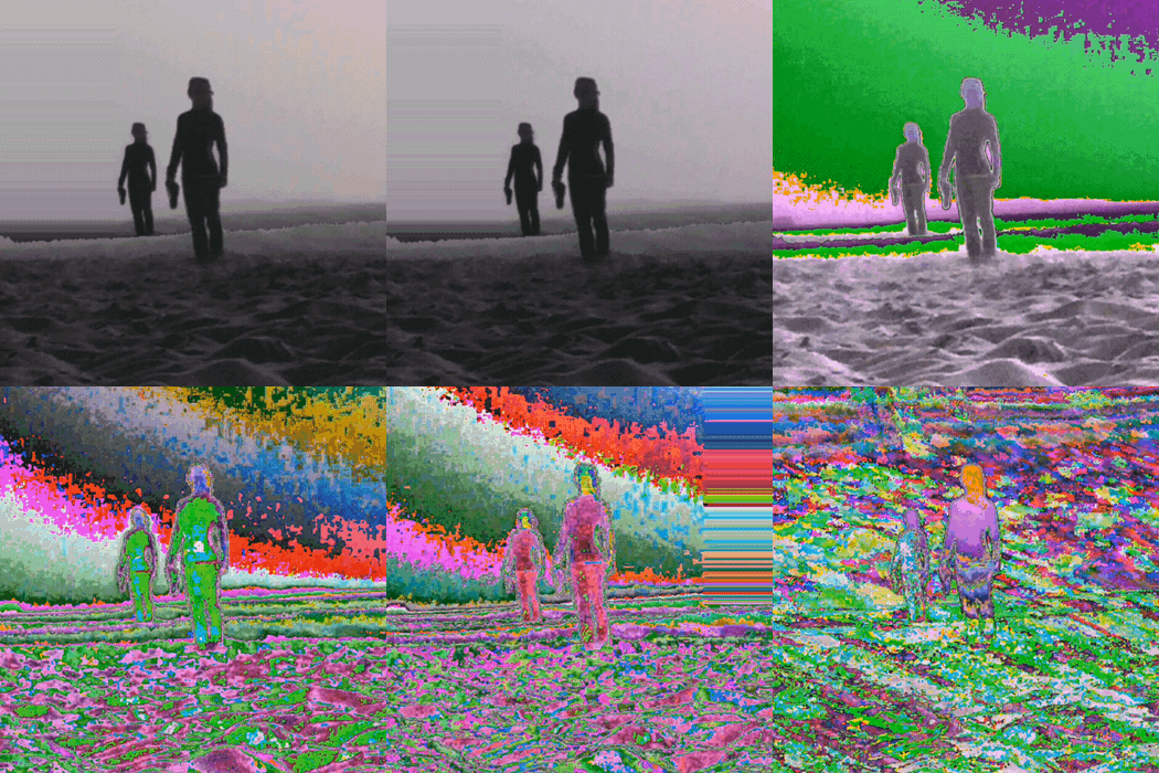
Monique Spier 2016, "Doubles" gif animation
Monique Spier 2016, “Doubles” gif animation

The Memorial Day weekend heralds the start of summer. A quiet moment on a windswept beach where ‘a clear view equals a clear mind’ has changed radically in recent years.

Life begins and ends where the ocean’s tide and sands meet. A stranger on the shore arrives from distant places. Beaches that previously glistened with laughter in the sun have become solemn and tragic: a sad journey’s end for thousands of forgotten migrant families on the run.

Idyllic locations where one might momentarily breathe deep and forget the real world are now faced with a relentless bombardment of social, political and environmental issues. Explores, invaders, refugees, the innocent boys killed at Gaza Beach by war missiles, intruders, and perhaps, even time travelers and aliens from other worlds. All are strangers in search of a new land. New people, like new art, have the power to provoke, agitate, engage and question the status quo.

Digital glitch art has about as much appeal as a loud, buzzing, broken and flickering, fluorescent light. New digital art draws from an old punk aesthetic: ‘three chord art that anyone can play’. Keep it brief; a few seconds at most, simple and fast, annoy and provoke with an uncanny and unique power to engage the viewer. Within a vibration zone of motion-triggered unexpected juxtapositions, digital images are hot-wired, quivering and spatially unsettling with a nonsense/sensibility that evoke the non-commercial, experimentation of No Wave artists associated with that brief scene in downtown New York in the late 70s’/early 80s’.

In my wildest scenarios, I could never imagine the words glitch and beach in the same sentence. While on their vacation this Memorial Day weekend, artists and partners Ryan Seslow and Monique Spier, spontaneously created some new glitch gifs that resonated with me on multiple levels. Their work exists as a refreshing reflection: hinting at the cautionary freedom that permeates the world today.

Ryan Seslow 2016, "Time travelers" gif animation
Ryan Seslow 2016, “Time travelers” gif animation

New media, a combination of visual and audio tools, echo the progressive experimentation of artists like László Moholy-Nagy almost a century ago. In Seslow and Spier’s gifs, there exists a lingering sense of reminiscence that evoke Yves Tanguy’s lonely landscapes of desolate gray sky beaches that transform, transport and confuse the viewer in the same moment. An expectation that maybe something better might happen just beyond the horizon.

In the 1968 movie Planet of the Apes, the last scene and dialog is shot at Point Dume on the Californian coast. The promontory is ‘matte painted out”, replaced with a rusted Statue of Liberty, informing the viewer that this is New York City in the distant (maybe near) future.

“Oh my God. I’m back. I’m home. All the time, it was… We finally really did it. You Maniacs! You blew it up! Ah, damn you! God damn you all to hell!”
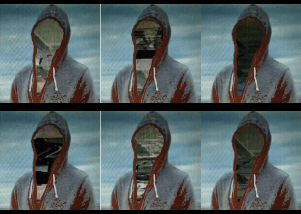
Ryan Seslow 2016, "Ghost at the Coast" gif animation
Ryan Seslow 2016, “Ghost at the Coast” gif animation

The ebb and flow of our oceans is less about growth and more about erosion due to radioactive tides, floating trash that pollute pristine coastlines with plastic carcinogens, accidental oil spill sludge, as well as flooding, hurricanes and other natural disasters due to global warming and climate change.

And never forget… the constant reckless beachfront overdevelopment by greedy real estate moguls.

We’ve reached a critical juncture where both our beaches and our politicians are extremely toxic and polluted. Let’s work to protect our beaches so they continue to be places of peace and remain a natural habitat for all living things instead of an arid and lifeless landscape for future generations.
Ryan Seslow
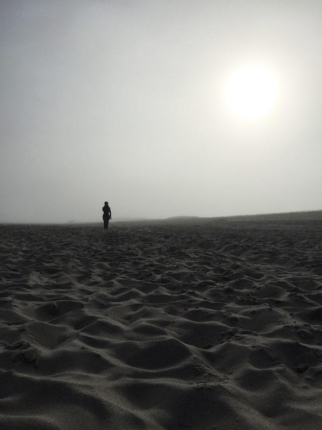
Ryan Seslow 2016, “Time-Travels” iPhone digital photograph.

Photos and gifs by Ryan Seslow and Monique Spier
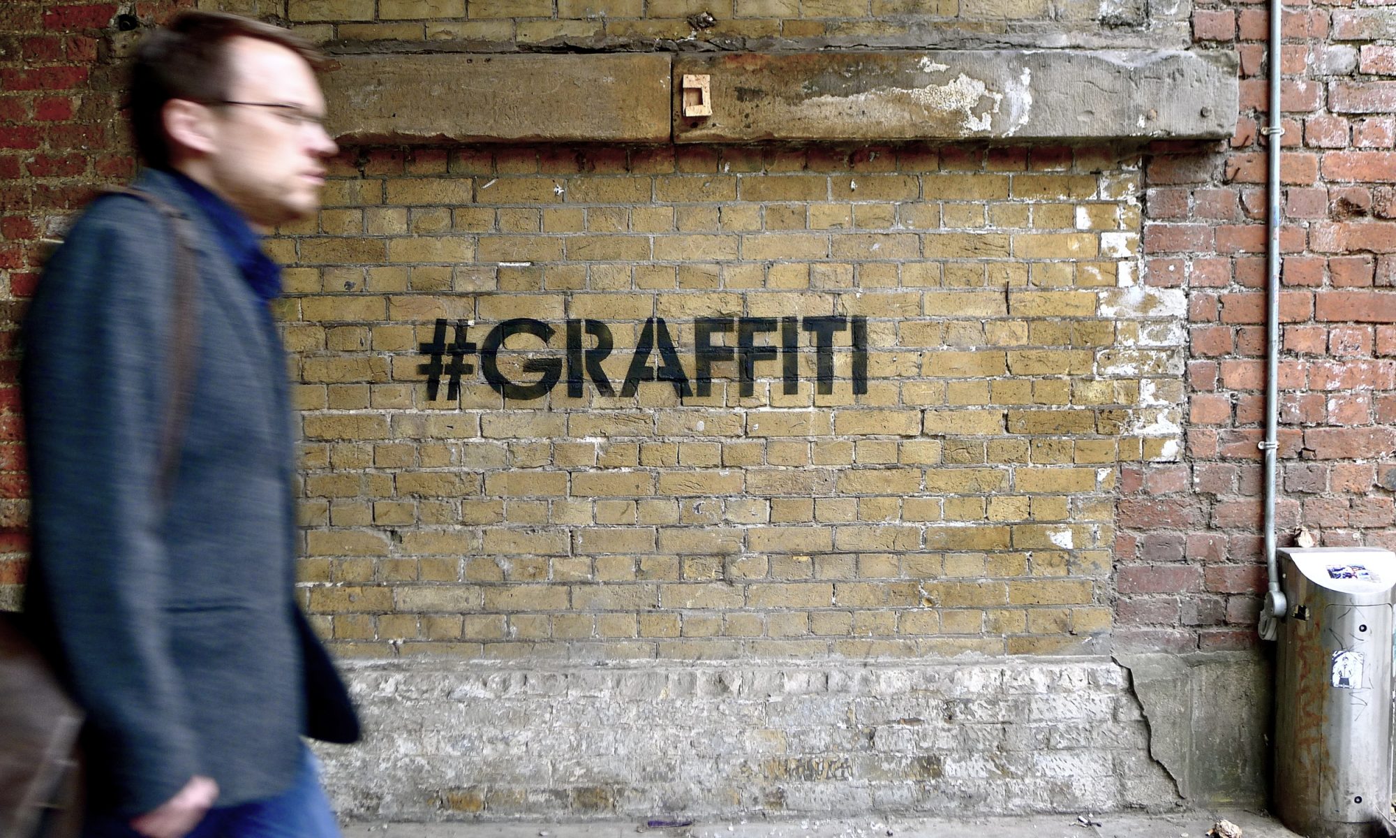
Hanging with mobstr

mobstr1

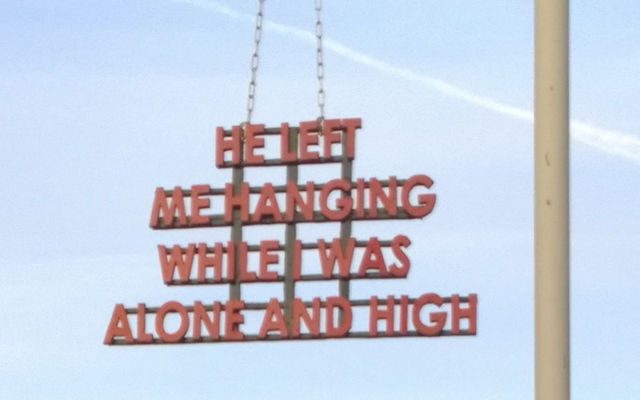
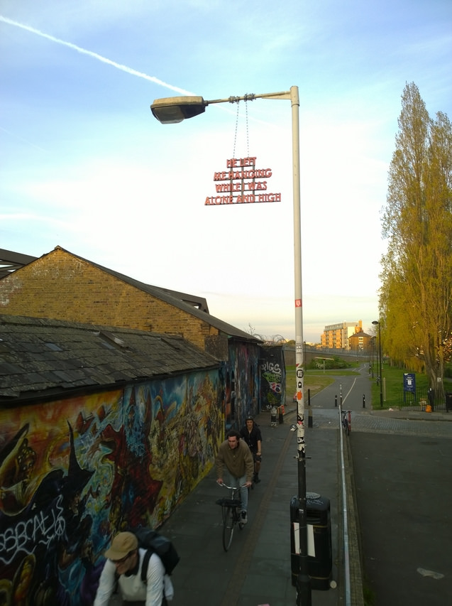
Another fantastic piece by mobstr. Context is king. First of all, how did he install this piece? But also, what a great spot for it! And of course, it doesn’t hurt that the little alleyway it’s on is just off of the heart of Brick Lane, one of the busiest roads in London for street art tourism. Mobstr knows his audience, for better or worse.

mobstr2

Photos by NoLionsInEngland

Student loans, probably something worth fretting over

Don't Fret on Student Loans

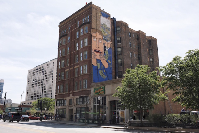
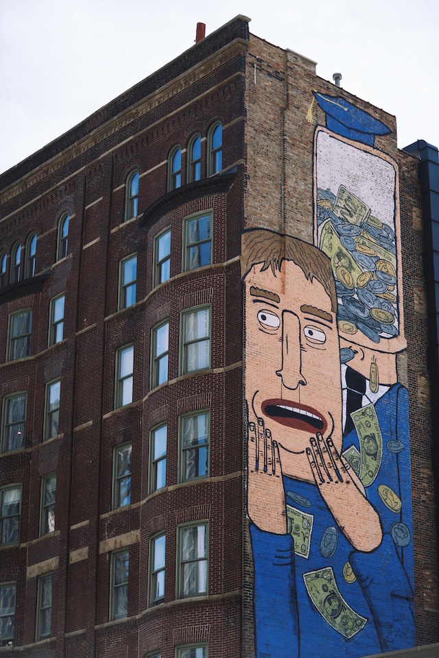
Don’t Fret has a graduation gift for the class of 2016: A reminder of the crushing debt that will likely follow many of them for decades. Don’t Fret’s latest mural echoes this recent headline from The Onion, envisioning college students as investment products, with the high cost of education driving them into debt, effectively garnishing their wages and making saving made next-to impossible.

Don’t Fret’s piece is part of a new series of murals organized by the Wabash Arts Corridor, an initiative of Chicago’s Columbia College. Most of the other murals in the project, while big and well-painted, are purely decorative. This is the only explicitly political piece, and perhaps the only piece where the artist took location into account. Don’t Fret’s mural is on the Roosevelt Hotel building, which is now student housing.

I’ve got to get credit to the Wabash Arts Corridor and Columbia College for commissioning this mural. It would have been easy to say, “We don’t want that conversation taking place on our buildings,” but you can be damn sure its taking place inside the building. Don’t Fret is an alumni of Columbia College and I’ve only ever heard him say positive things about the school, but the cost of higher education is a systemic issue across almost all American colleges and universities. This mural is a gentle, but important, reminder of that fact.

Don't Fret on Student Loans

Photos by Chris Geick

Something to reflect on in France

reflect

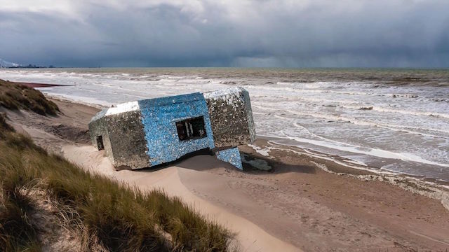
Wow. Ekosystem, probably my favorite European street art blog, drew my attention to this piece on the beaches of Northern France. Réflechir was made by placing pieces of mirror onto a “blockhaus,” a common remnant of World War II. Naturally, the piece is meant as a memorial. The piece was created anonymously, but the artist did create a website and issue a statement about the monument.

There’s also a video:

Beautiful.

Photo by the artist

GoddoG latest murals in Cambodia and France

CUA11_01
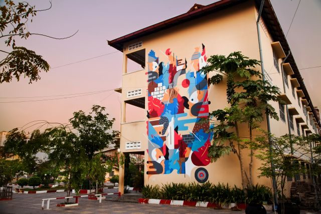
Phnom Penh, March 2016 for the “Cambodia Urban Art” Festival.

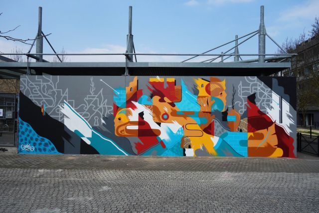
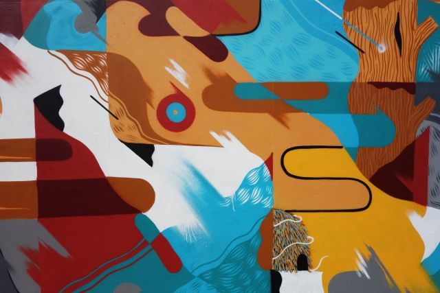
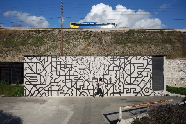
Goddog is a French artist from Avignon, well-know medieval city in southern France. He started practicing graffiti at a young age, then turned to figurative work that he’s put aside for a moment to achieve more abstract compositions. In time, he began to combine both trends to define a style he calls figurative abstraction. GoddoG takes inspiration from movements like Constructivism, Bauhaus, to create androgynous figures. The narration is never linear, and the dreamlike poetry that emerges encourages multiple interpretations. His hope to allow everyone to build their own story from what he paints on the wall.

The main quality of an artist is to be able to put him always in danger, to be able to renew itself, which GoddoG does successfully again and again. He does not claim a clear way of thinking, socially or politically speaking. He has always painted in order to escape, to dream, to create a comfort zone.

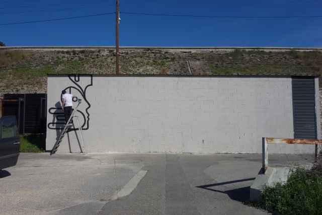
You can see in versatility and passion above the mural he did during the “Cambodia Urban art” Festival in Phnom Penh in March 2016, and following that his work for the French project “Le M.U.R de Bordeaux,” also in March, and a wall painted in Marseille, France, for “la cité des arts”, in February.

DSC05490_01
“Le M.U.R de Bordeaux”, Mach 2016.
DSC05520_01
“Le M.U.R de Bordeaux”, detail.
DSC05384_01
Cité des Arts – Marseille, February 2016.
citedesarts3_01
Cité des Arts – Marseille, February 2016.

Photos by Damien Mauro.

Meeting of Styles Melbourne 2016

Meeting of Styles Melbourne 2016.
Meeting of Styles Melbourne 2016

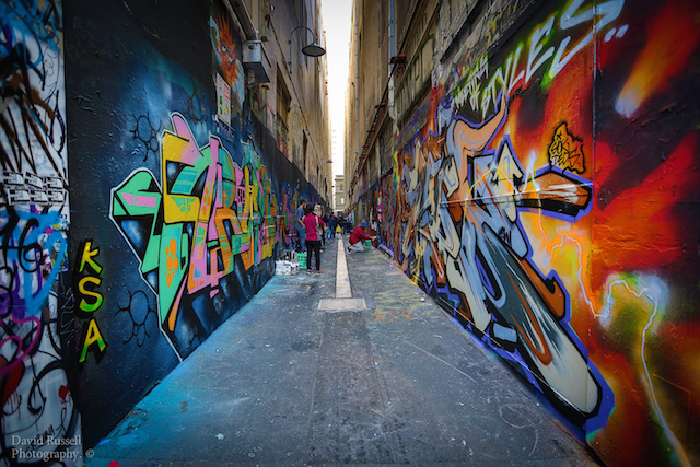
A few weeks ago now, Melbourne was host for the first time to the internationally renowned Meeting of Styles events. Meeting of Styles Melbourne 2016 saw around 300 artists paint all of Melbourne’s legal laneways over four days – as well as a couple of secret spots in and around the city. This was the first time this many lanes had been painted simultaneously.

This event was different to the usual arts events I have attended and posted about in the past, this one focused on graffiti and paid homage to Melbourne’s rich history and still strong graffiti scene.

Apart from the amazing pieces produced and having all of he city’s walls look their best, the vibe over the four days was incredible. Artists and their friends and fans filled the streets – it didn’t feel like we were right in the middle of the Central Busienss Districy of Melbourne at all, which is where many of the lanes are located. Thousands of spectators came to watch and tourists stopped and took hundreds of photos. Check some of the photos out here: #MOSMelbourne

It was refreshing to see some of Australia’s best writers come to town and remind us why Melbourne/Australia has a rich and vibrant graffiti culture, and how much we have to thank graffiti for it’s cousin, street art – also a massive and important part of our city’s fabric and culture.

Locations included, Hosier and Rutledge Lanes, Union Lane, Flinders Court, Croft Alley, Blender Lane, Electric Place, Drewery Lane, Lovelands (next to the Queen Victoria Market) and Whiteman Street and a number of “secret” spots in Footscray and South Yarra.

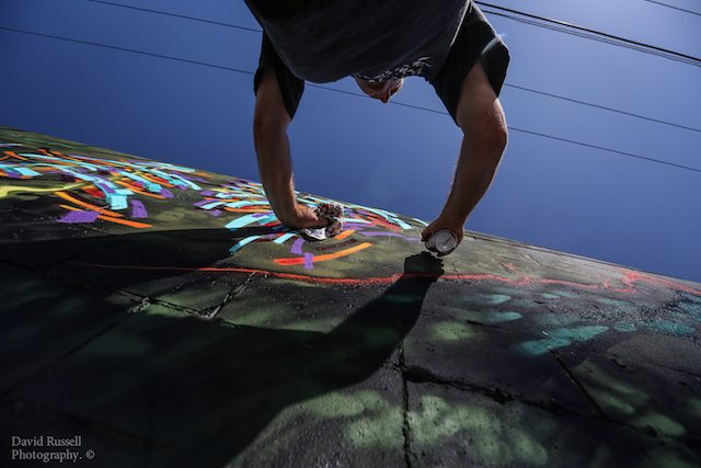
Check out these great photos by David Russell of the event – more here.

Meeting of Styles Melbourne 2016

Continue reading “Meeting of Styles Melbourne 2016”

Can you copyright graffiti? We’re about to find out

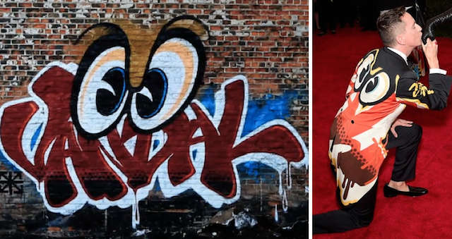
Rime's artwork (left) and a suit by Moschino (right)
Rime’s artwork (left) and a suit by Moschino (right)

Last year, the fashion designer Jeremy Scott quite obviously appropriated artwork by Rime for a capsule collection with the brand Moschino. The collection got a fair amount of attention when Katy Perry wore one of the dresses at the Met Gala, and Rime decided to sue Scott and Moschino for using his work (and his name, in the form of tags on other clothing in the collection).

This week, Moschino and Scott’s lawyers filed paperwork arguing that the lawsuit cannot possibly go forward. Why? Because graffiti cannot possibly be copyrighted. They say, “As a matter of public policy and basic logic, it would make no sense to grant legal protection to work that is created entirely illegally.”

First of all, it’s not entirely clear that the work was painted without permission, so that argument could be rendered moot pretty quickly. But part of me hopes that Rime’s Vandal Eyes was painted illegally, because that will be an interesting question for a court to take up.

In Australia, graffiti is protected by copyright, even if it was painted illegally. Enforcing that copyright can get tricky though, since the artist could still be arrested for vandalism. Why wouldn’t similar protections apply in the United States?

We’ll have the answer soon enough. Rime’s lawsuit is set to move forward in May.

HT to Brooklyn Street Art for spotting this story, and The Fashion Law for their more detailed article about it.

Photo from The Fashion Law

Placement makes perfect

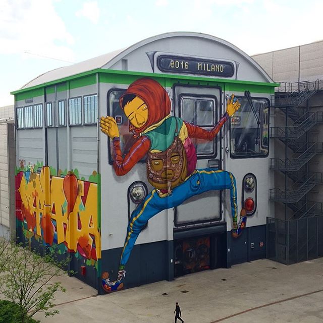
Os Gemeos in Milan. Photo by Os Gemeos.

It’s no secret that good placement can make or break a piece or street art or a mural. That can mean picking the perfect place to install an artwork, or responding to the space that’s available and making something that takes that space into consideration. Think of it this way: Site-specific should mean the work is in some way specific to a site, not simply located at a site. And when art is site-specific, it can make a big difference. Recently, some artists practicing good placement have really caught my eye. Here are a few examples:

1. Os Gemeos in Milan (above): Wow. Milan is a lucky city right now, with a spectacular new mural by Os Gemeos, facilitated by Pirelli HangarBicocca. Responding to the shape of the site, Os Gemeos took a drab building and transformed it into a massive subway car. Os Gemeos’ murals are always a treat, but they knocked it out of the park with this one.

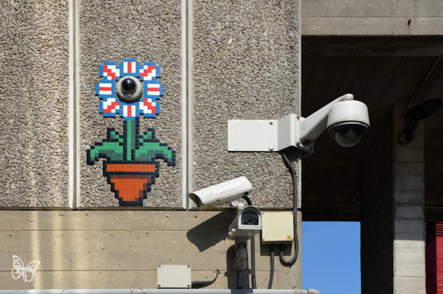
Invader in London. Photo by Butterfly.

2. Invader in London: Simple, but effective, placing his mosaics around a CCTV camera. In some ways, quintessentially London.

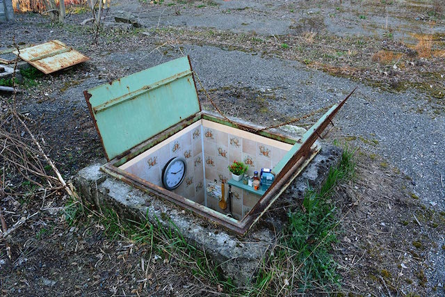
Biancoshock in Milan. Photo by Biancoshock.

3. Biancoshock in Milan: This series form Biancoshock seems to have really caught people’s attention on social media. I’ve been seeing these photos posted everywhere, so if you’re reading this, they probably aren’t new to you. But why are they so popular? Yes, I have a tiny apartment and can appreciate the joke too. But I think it’s more than that. Placement is an essential part of these pieces. If Biancoshock had made small rooms as sculpture for a gallery, or painted a tiny apartment on a wall, it wouldn’t have worked quite so well. It’s that he took a space and make work inspired by the location that simultaneously transformed the location.

Elian
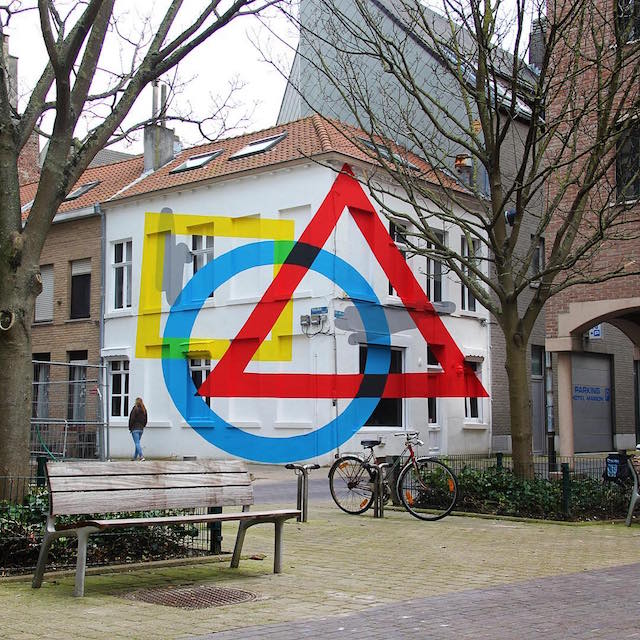
Exercise Of Anamorphosis #2 by Elian. Photo by Elian.

4. Elian in Ostend with Exercise Of Anamorphosis #2: What happens when you get to a mural festival and you’re told that you aren’t painting a flat wall, but rather two walls of a building without a lot of flat surfaces? For some artists, this could trip them up. Or they could still treat the surface like they are applying wallpaper, and it would probably work out okay. But Elian went a step further, creating an optical illusion that messes with your perspective. He took something that could have been a weakness (an odd wall), and he made it a strength.

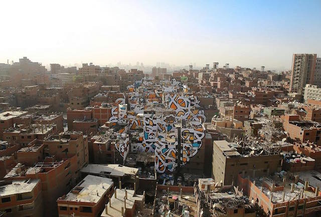
eL Seed in Cairo. Photo by eL Seed.

5. eL Seed in Cairo, for his Perception series: eL Seed painted this mural across dozens of buildings in Cairo, Egypt. It’s painted in a marginalized neighborhood in Cairo, where the residents are written off by the rest of the city as dirty because many of them are trash collectors. eL Seed’s text reads, “Anyone who wants to see the sunlight clearly needs to wipe his eye first.”

Photos by eL Seed, Butterfly, Biancoshock, Elian