Tim Hans shoots… Word To Mother

Word to Mother 1

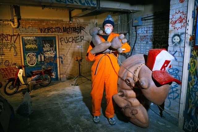
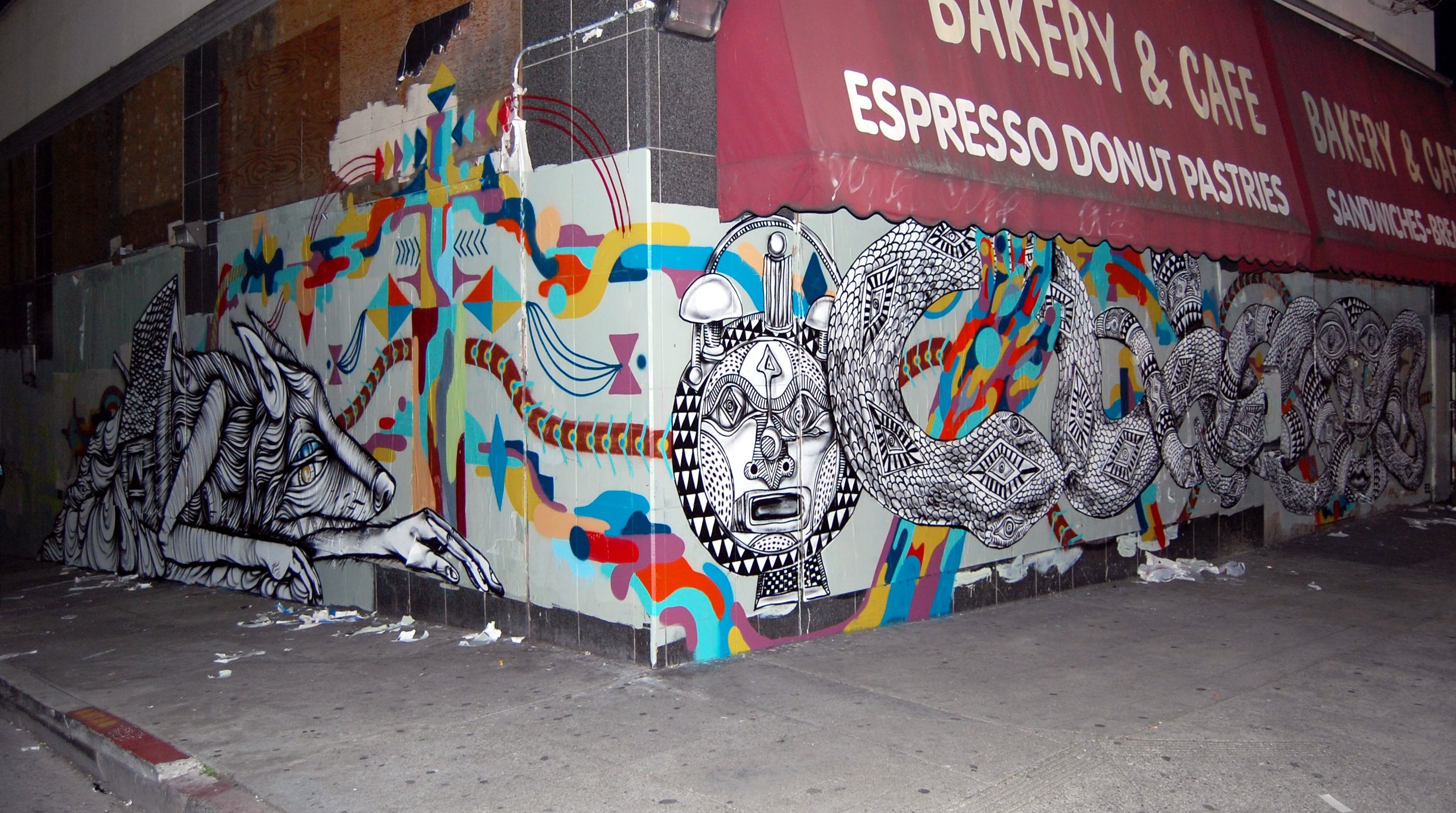
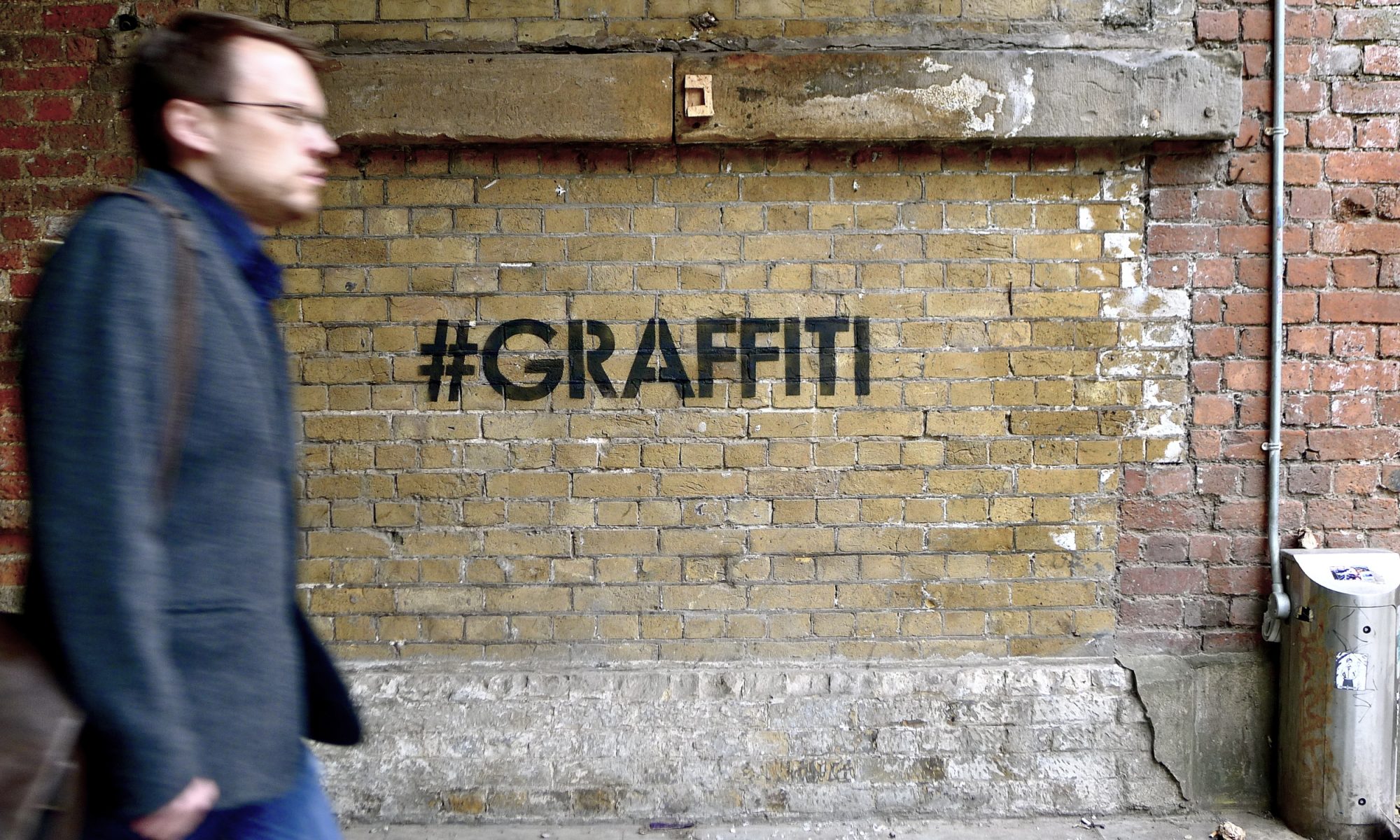
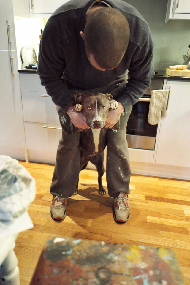
While on a recent visit to London, Tim Hans photographed with seven artists for our continuing series of photo-portraits by Tim. This week, we have Tim’s photographs of Word To Mother, along with an interview by Shower.

Also, Word To Mother has been as he puts it ‘analogue’ since we met him. In a small attempt to contribute to the digital world, he has got himself an instagram. Go follow him for regular updates on his work – @wordtomother.

Shower: I expect you have been asked this on numerous occasions but where did the name Word to Mother originate?

Word To Mother: It was never supposed to be a name. I started writing Word To Mother next to my pieces in about 2003…I like the expression, it’s affirmation of the Mother’s and classic Hip Hop phraseology, perfect! Illmatic is also one of my favourite albums so I guess that had a part to play in it all.

I started using Word To Mother as a name when I wanted to make a distinction between the fine art I was producing and everything else. I like the anonymity a pseudonym allows, it means the art is at the forefront and I am somewhere in the background.

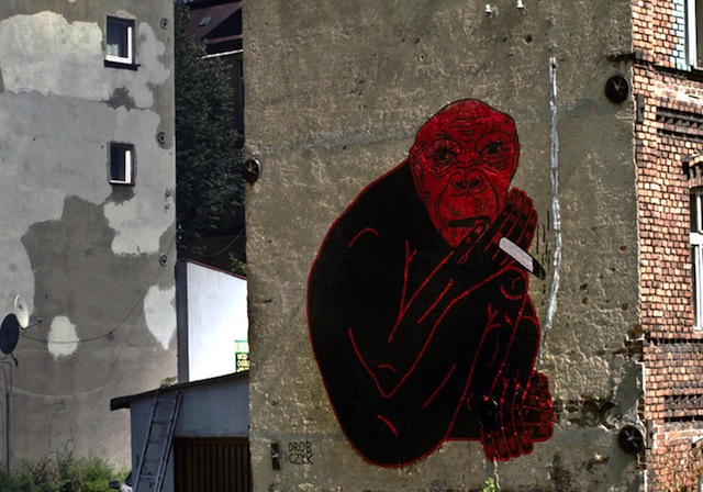
S: Your style is very distinctive, your characters tend to be warm and welcoming with a strange complexity, and are usually found juxtaposed against stylised typography. What influences you and this style?

WTM: I have never knowingly tried to construct a style, it’s an ongoing process that is continually changing…I just try and do me, not look at what others are doing for inspiration, but to outside sources; architecture, sign writing, vintage cartoons, nature…

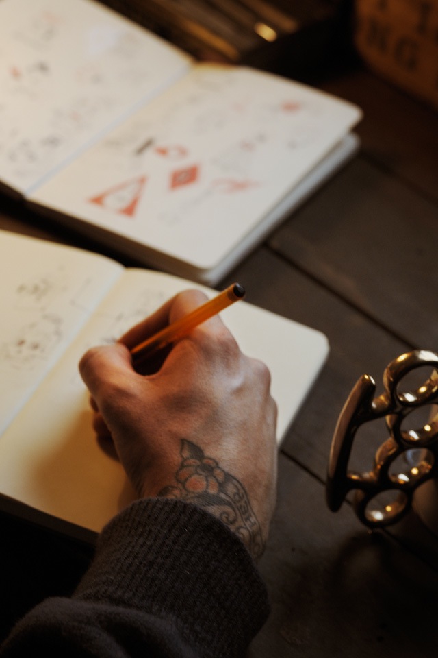
My strongest works are produced when I’m not thinking about what I’m doing, the images almost draw themselves. You can see by the weight of line in my sketches when a drawing is going to work. If the line is heavy then I’m not chilled and the drawing is forced. The best stuff is super fine and is like a subconscious wandering of thoughts.

S: On the subject of characters, Disney and other cartoon varieties feature regularly, which is your favourite and why?

WTM: I don’t have one favourite and the list is endless so let me just give you my starting five:

Early Mickey Mouse

Sponge Bob

Marvin The Martian

Big Bad Wolf (early Disney)

Ren and Stimpy

S: Do the influences differ between your gallery work and outdoors?

WTM: I have no interest in producing what I do indoors, outdoors. They are two separate things to me.

S: Which came first, indoors or out? Which do you prefer and what keeps you painting outside?

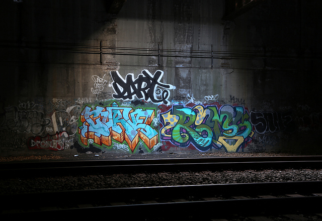
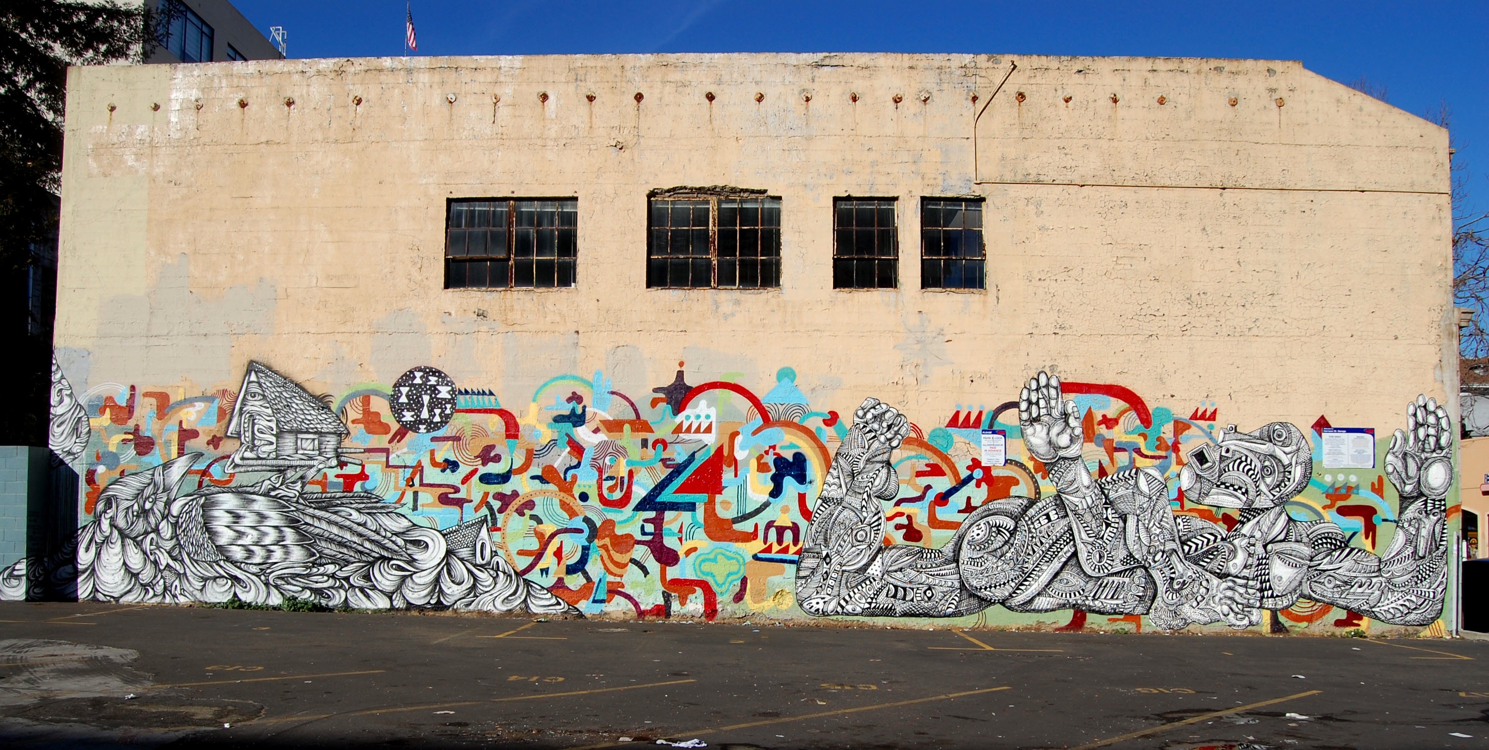
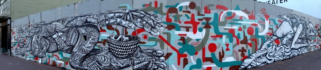
WTM: I’ve always drawn, so working inside came first. Working outside started with graffiti in the late 90’s. If I’m painting outside it has to be fun, and trying to replicate what I do in the gallery, outside, just stresses me out. If I’m painting outside it’s going to be letters but I don’t refer to myself as a writer or street artist, just an artist.

Word to Mother 2

S: If I was describing your art I would say that much of it is illustrative. Would you agree? And have you ever had any professional training to achieve this style or are you self taught?

WTM: I love to draw so I would agree that my work is rooted in illustration. I studied illustration and animation 3 years full time, before then I was like every other small town youth that thinks they can draw…I wasn’t as good as I thought I was. Those 3 years were imperative in deconstructing and rebuilding my drawing. I wouldn’t say that anyone taught me how to draw but that course guided me in the right direction.

S: The first thing that strikes me when I look at one of your pieces is the exceptional level of detail. How do you go about starting a painting to achieve this depth?

WTM: I’m always intimidated by a blank surface, so I begin with loose mark making and tags to create a base to work on. Then it is just a case of building layers and layers of tones, pattern, characters, text etc until the piece comes to life.

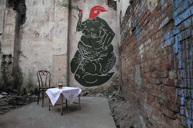
S: Your art tends to be found adorning weathered surfaces using a range of mediums – wood, brick, plaster, spray cans or paint brushes. Do you find each piece is dictated by the surface you paint onto or do you look for surfaces with the content in mind?

WTM: I love weathered objects, stuff that is decaying and has existed with another purpose for years, then adding your story to it. When I am painting on these types of surfaces, I try to retain as much of the existing qualities as possible. I’m always on the lookout for those little gems to hoard in my studio. Some stuff I get way too precious about, I have objects and panels that I have had for 6 years that are still yet to be worked on as they are so beautiful already…this is now becoming a problem as I am relocating to a much smaller studio and am going to have to let go of a lot of things. Also, the cost of shipping heavy objects overseas is crippling financially. As a result, my new works are going to be on canvas…you have to adapt with the times…this recession is bullshit.

S: In some of your pieces I have seen nods of appreciation to fellow artists; Sickboy, Ronzo and Roids come to mind, and you have also worked in collaboration with Sickboy on a few projects. Do you enjoy collaborative work and do you feel it brings anything additional to your solo pieces?

WTM: I know the painting you are talking about, it had a section of tags in it which shouted out a few of the homies…it was based on the gallery front on Redchurch street where they buff over all the tags in the same colour…

In terms of collaborating, I have to work with friends. I’m a perfectionist so it has to be a certain way….Sickboy and I moved to London at the same time and were introduced by our friend Stella Dore. We are complete opposites but somehow it works. I am a massive fan of what he does and we both love the same things visually. Whenever we work together it is a succession of sleepless nights and too many jazz woodbines but we always laugh ’til it hurts and end up with something we’re proud of.

S: I rather enjoyed your recent edition of ‘fuck you, pay me’ baseball bats? Is there a hidden story of personal experience?

WTM: A decade of self employment in the creative industry.

S: You seem to be a big fan of tattoos. Are any of yours self designed or influenced by other artists?

WTM: I love tattoos and am lucky enough to own work by Thomas Hooper, Saira Hunjan, Josh Sutterby and Frank Carter to name a few.

T: Do you tattoo others yourself? If not, then would you ever consider a change of career?

WTM: I have been known to tattoo friends but I am certainly not a tattooer. If I wasn’t painting I would consider it, I think it’s a great career for someone that loves to draw. If I were to do it I would stop making art and concentrate on it fully, it is an ancient craft that demands a huge amount of respect.

S: Finally, have you got any specific plans for the future?

As I mentioned I am in the process of moving from my enormous studio to a much smaller space. It’s a shame as I am having to part with a lot of things that I have accumulated over the years…Once that is done I am going to be concentrating all of my energies on making my largest paintings to date for my upcoming show in the incredible new White Walls Gallery space in San Francisco. I’m hoping to work with the incredible Angelino Milano again this year on a bespoke run of screen prints. I haven’t shown in London for a couple of years so 2014 will see another solo show with the StolenSpace family… Other than that I’ll be drawing as usual.

Photos by Tim Hans

Tim Hans shoots… Ronzo

Ronzo 1

Tim Hans visited London recently, where he met up with seven artists for our continuing “Tim Hans shoots…” series, where Tim photographs some of the world’s most interesting street artists and graffiti writers. First up from Tim’s London trip is Ronzo, for which Laura Calle conducted this accompanying interview:

Laura Calle: Can you tell us a brief story of what inspired you to create materials for public urban spaces?

Ronzo: Sometimes you just get new ideas from walking through the streets and talking to people. Most inspiration comes through that and through other artists, what’s happening in world right now, music, film, popular culture and many other things. You see spots in the city and you see opportunities. You think: This would be a great spot to do something… It’s a great gift to have but also a bit of a curse. Ones you start – you can’t stop!

LC: What’s it like to set up a large scale sculpture in such a densely populated city like London?

Ronzo: It’s good fun. You need a truck with a big crane. Also pray that the roof doesn’t collapse and a massive monster crushes everyone walking by. But once it’s up, the sun rises and people on their way to work stop, thinking “WTF – Where did this come from?” It’s beautiful.

LC: What are the main differences you experience when making sculptures for the streets versus murals in public? Do you think the public interacts with those mediums differently? How so?

Ronzo: Sculptures are just a bit more of a niche. They take 1000 times more work to do. That’s why nobody does them I guess. But that’s great – It that makes them more special when you spot one. Also cool – You can walk around them. You can’t really do that with a painting. (But paintings are cool too)

LC: Does your audience influence your art or the approach you take to your pieces?

Ronzo: Tricky one. The feedback you get from an audience always filters back into new work of course. Although I want to do keep doing what I think is dope. And not the other way round. Of course your audience finds it interesting too in the end.

LC: What’s next for Ronzo?

Ronzo: Big tingz. New paintings, new sculptures, new installations. Details are classified top secret at the moment but will be revealed through the year. Please stay tuned…

Photo by Tim Hans

Weekend link-o-rama

Dart, PC, Curve, Rams, and Sane

As I’ve been gearing up for midterms, I’ve missed posting some great outdoor work (and other things) this week.

Photo by Carnagenyc

Mata Ruda: Where nobody bothers to look

“I was leaving the South to fling myself into the unknown…I was taking a part of the South to transplant in alien soil, to see if it could grow differently, if it could drink of new and cool rains, bend in strange winds, respond to the warmth of other suns and, perhaps, to bloom.” –Richard Wright

IMG_1124

Conceptually and visually intricate, Mata Ruda‘s portraits convey a history that is unfamiliar to those who remain unaffected in their daily lives. The idea of el otro, or the other, is something that permeates not only methodologies behind Latin American art history, but the lives of those who chose to emigrate from those countries. While the translation is literal, the word otro encompasses more than that; it’s the feeling of being pushed to the side by the government and others because of one’s origins. Whether undocumented, displaced, or otherwise without a home, these individuals are often left without a voice.

IMG_1127

Director Alejandro González Iñárritu explains the feeling of otherness as, “we can’t understand what is happening to ‘something’ if we aren’t looking but nothing is going to happen to that ‘something’ if we don’t look deeply. That’s why so many things with incredible potential go unnoticed…..because nobody bothers to look.” In his most recent series, Mata Ruda draws attention to artisans who would otherwise go unnoticed, traditional Central American weavers who have since emigrated to Brooklyn. By immortalizing these individuals in a public space, the artist draws attention to several underlying issues, such as our lack of appreciation for craftwork, immigration, and labor standards.

IMG_1128

Often seen as less than art because of its functionality, this portrait draws attention to the technical layers that makes up the complex patterns associated with Central American textiles. In order to create the zig-zags and vertical stripes associated with these patterns, you must be proficient enough to operate several huddles as well as have mathematical precision in order to accurately reproduce a specific image. This same attention to detail can also be seen in the detailed lines that form the shadows and creases of the weaver’s hands. While the right hand is busy manually picking the weft to create a pattern while the left tests the warp’s strength. It is in this intricate representation of the forgotten that Mata Ruda can be compared to other Social Realist public artists such as Gaia and muralist José Clemente Orozco.

During his life, Orozco saw his neighbors used as expendable bodies in the  Mexican Revolution, which he envisioned in The Masses as a sea of faceless heads, yelling but not thinking. The harsh lines that define a field of overlapping reflect the hoards that barricaded towns into starvation during his childhood and eventually led to the loss of one of his hands. For Orozco, he called upon these experiences to give a voice that would otherwise be lost with the pulling of a trigger. A hundred years after the war’s inception, Mata Ruda follows in a similar path, but instead representing the inequalities that run through the 21st century.

IMG_1125

Equally as important for Mata Ruda is the representation of homeland and histories. Visually, the artist draws upon the mythology of lunar planning that was integral to his predecessors. Used as a planning tool for practical matters and spiritual ceremonies, Mata Ruda has created portraits that symbolize this importance; the lunar calendars orbit his figure’s head on a series of rocks or become literally placed on their conscience.

It was not enough for the artist to display this meaning in a public space, he also took on a name that would convey this symbology. When literally translated, Mata Ruda means a rough or hardy plant, one that can survive when transplanted like the emigrants he depicts. Beyond the translation, the latter part of his name can be seen as a corruption of the spiritually vital herb Rue. As with lunar charts, this herb is used for its supposed spiritual properties, such as warding off evil and to bring abundance. Through his use of subjects and histories that would otherwise be forgotten, Mata Ruda can be seen as an embodiment of his chosen name. Although paper and wheatpaste may not weather storms, the ideas behind them will last.

Photos by Rhiannon Platt

Lush back at Backwoods Gallery

-10
Mini graffiti by Lush

Lush is returning to Backwoods Gallery outside of Melbourne for a solo show (I believe his 3rd there) this week. The show, The Evolution of a Graffiti Shit ****, is open for one night only: This Friday. Lush’s shows are always a bit of a madhouse, so I would definitely recommending checking this one out, although obviously not if you’re easily offended (or, just really ever get offended about anything really). Seriously, should be great if you can handle it.

-9

lush

Photos courtesy of Lush

STOP WHAT YOU’RE DOING. Brad Downey has a website again.

1.retouched
“Bike and Sidewalk” 2012. Berlin.

Brad Downey has a website.

"This is How We Roll" 2011. Copenhagen.
“This is How We Roll” in collaboration with AKAY, 2011. Copenhagen.
"Wehrmann with Magnets" 2011. Vienna.
“Wehrmann with Magnets” 2011. Vienna.
"Portrait of My Father" 2012. Atlanta.
“Portrait of My Father” 2012. Atlanta (Part 1)
"Portrait of My Father" 2012. Atlanta.
“Portrait of My Father” 2012. Atlanta (Part 2).
"Portrait of My Father" 2012. Atlanta.
“Portrait of My Father” 2012. Atlanta (Part 3).
"Domesticated Waterfall" 2012. Grottaglie, Italy.
“Domesticated Waterfall” in collaboration with AKAY, 2012. Grottaglie, Italy (Part 1).
"Domesticated Waterfall" 2012. Grottaglie, Italy.
“Domesticated Waterfall” in collaboration with AKAY, 2012. Grottaglie, Italy (Part 2).

Photos by Brad Downey

Feral Child, Zio Ziegler and Cannon Dill collaborate

Click to view large
Cannon Dill on the left, Zio Ziegler on the right, with Feral Child’s background. Click to view large.

Feral Child, Cannon Dill, and Zio Ziegler have been working together recently on some walls in Oakland and San Fransisco, California. The three of them seem to make a great combo, and I don’t think I’d seen Cannon Dill’s work before, so I’m glad Feral Child has introduced me to the work of such a skillful painter. Definitely make sure to check out all of these walls in large by clicking on the image.

Click to view large
Cannon Dill on the left, Zio Ziegler on the right, with Feral Child’s background. Click to view large.
Click
Zio Ziegler on the left, Cannon Dill on the right, with Feral Child’s background. Click to view large.

HOTTEA in Hollywood

Hollywoodprocess

On a recent trip to California, yarn artist HOTTEA continued his experimentation with the public space. While stopping in LA, he chose a particularly risky fence near the Hollywood sign. Often thought of as being a relatively low risk form of illegal art, HOTTEA sends pictures that say otherwise. While, yes, you won’t go to jail for weaving some yarn through a fence, that doesn’t mean that the cops will leave you alone. In addition to this stellar location, HOTTEA shared some accompanying pictures of a stencil piece on Venice Beach and a fence near a wall by Dabs, Myla, How, and Nosm.

SunsetActionRaggedyANN

Continue reading “HOTTEA in Hollywood”