It’s no secret that good placement can make or break a piece or street art or a mural. That can mean picking the perfect place to install an artwork, or responding to the space that’s available and making something that takes that space into consideration. Think of it this way: Site-specific should mean the work is in some way specific to a site, not simply located at a site. And when art is site-specific, it can make a big difference. Recently, some artists practicing good placement have really caught my eye. Here are a few examples:
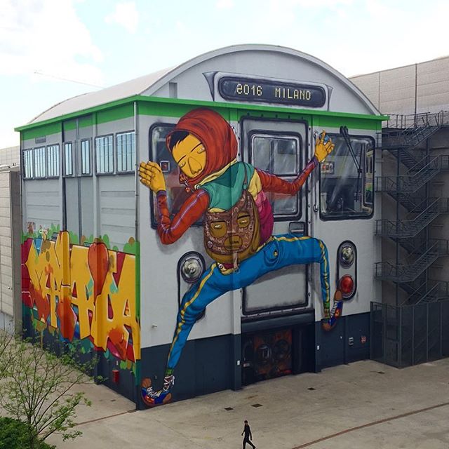
1. Os Gemeos in Milan (above): Wow. Milan is a lucky city right now, with a spectacular new mural by Os Gemeos, facilitated by Pirelli HangarBicocca. Responding to the shape of the site, Os Gemeos took a drab building and transformed it into a massive subway car. Os Gemeos’ murals are always a treat, but they knocked it out of the park with this one.
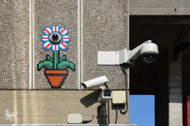
2. Invader in London: Simple, but effective, placing his mosaics around a CCTV camera. In some ways, quintessentially London.
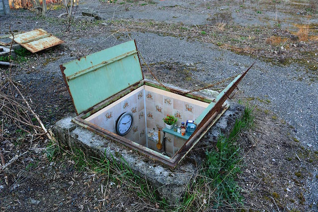
3. Biancoshock in Milan: This series form Biancoshock seems to have really caught people’s attention on social media. I’ve been seeing these photos posted everywhere, so if you’re reading this, they probably aren’t new to you. But why are they so popular? Yes, I have a tiny apartment and can appreciate the joke too. But I think it’s more than that. Placement is an essential part of these pieces. If Biancoshock had made small rooms as sculpture for a gallery, or painted a tiny apartment on a wall, it wouldn’t have worked quite so well. It’s that he took a space and make work inspired by the location that simultaneously transformed the location.
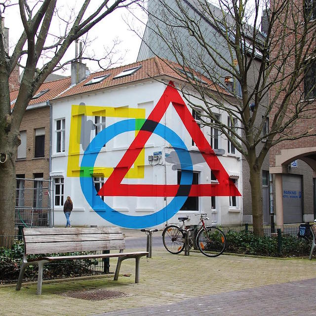
4. Elian in Ostend with Exercise Of Anamorphosis #2: What happens when you get to a mural festival and you’re told that you aren’t painting a flat wall, but rather two walls of a building without a lot of flat surfaces? For some artists, this could trip them up. Or they could still treat the surface like they are applying wallpaper, and it would probably work out okay. But Elian went a step further, creating an optical illusion that messes with your perspective. He took something that could have been a weakness (an odd wall), and he made it a strength.
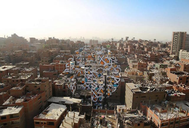
5. eL Seed in Cairo, for his Perception series: eL Seed painted this mural across dozens of buildings in Cairo, Egypt. It’s painted in a marginalized neighborhood in Cairo, where the residents are written off by the rest of the city as dirty because many of them are trash collectors. eL Seed’s text reads, “Anyone who wants to see the sunlight clearly needs to wipe his eye first.”
Photos by eL Seed, Butterfly, Biancoshock, Elian
