The Wende Museum has been doing some very interesting things lately, including the creation of an outdoor gallery wall (complete with framed work) on Main Street in Downtown Los Angeles, but its current project on Wilshire looks to be the most intriguing yet.
Now standing directly across the street from LACMA are several weathered sections of the concrete Berlin Wall. “The Wall Along Wilshire” is part of “The Wall Project,” the museum’s ongoing cultural history program.
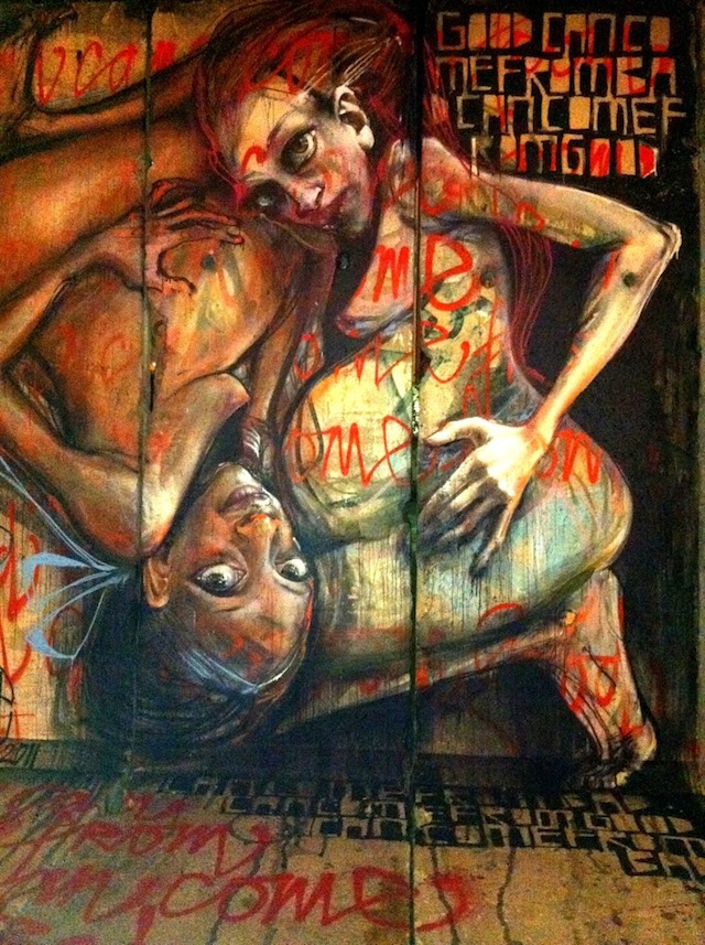
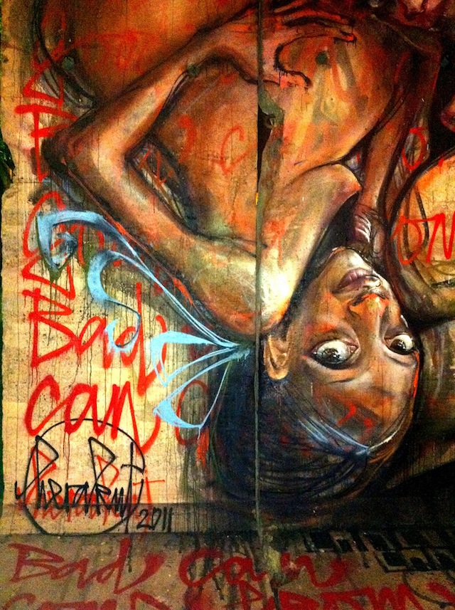
For the front of the wall, the artists paired with Thierry Noir (one of the first artists to paint the Wall in 1984) were Kent Twitchell, Farrah Karapetian, and Marie Astrid Gonzalez. Yet, the museum also saw fit to invite several street artists to paint the back of the sectionals, asking Herakut, RETNA, and D*face to do the honors. It is expected that the other street artists will start Thursday or Friday evening, but Herakut have already completed their work.
I arrived last night when they had just finishing painting. One half of Herakut, Jasmin Siddiqui (Hera) explained that the Wall holds a very special significance for Herakut, not just because they are from Germany, but because she grew up in the West, while her partner, Falk Lehmann (Akut), grew up in the East.
“It’s amazing how small it looks now,” Jasmin said as she surveyed their work, “and it’s hard to imagine it kept so many people apart.”
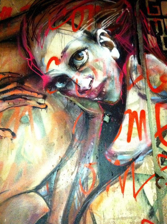
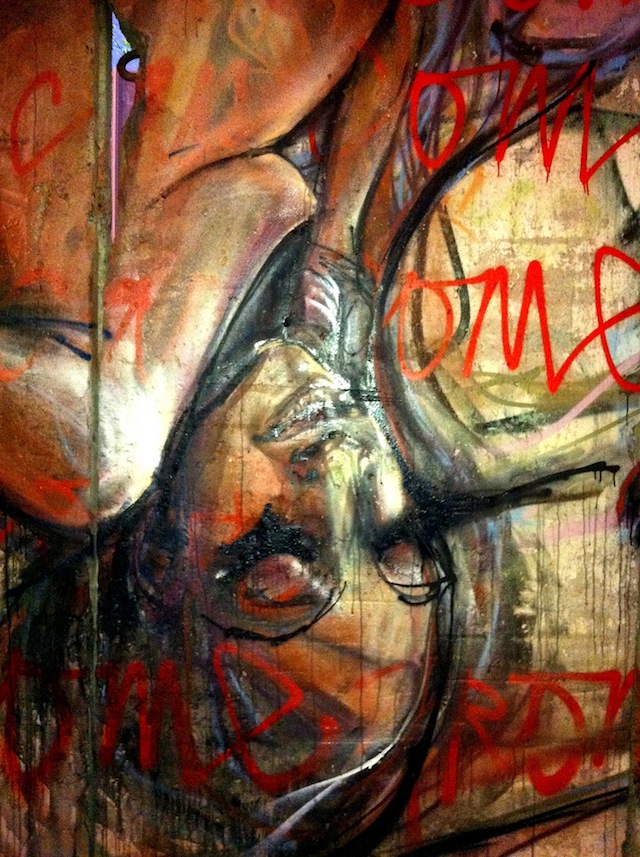
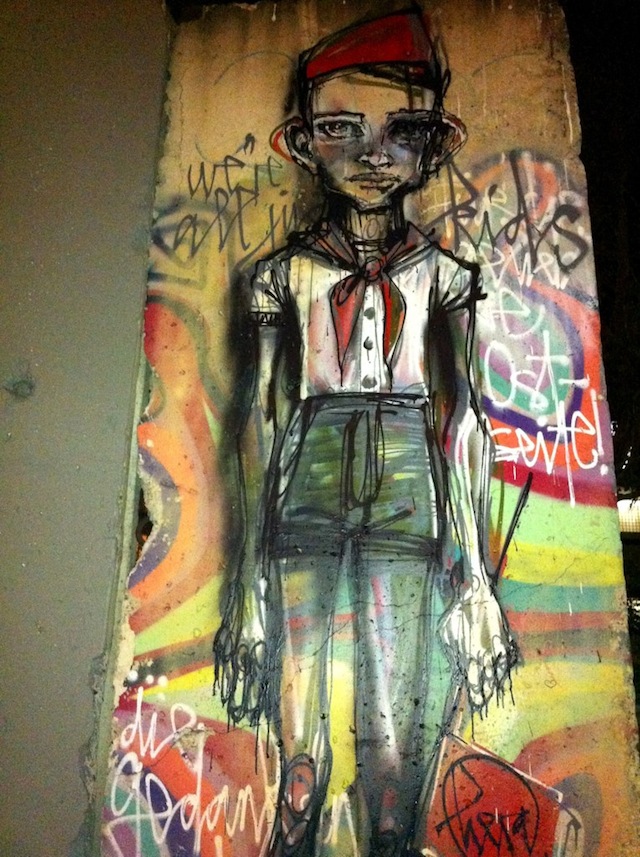
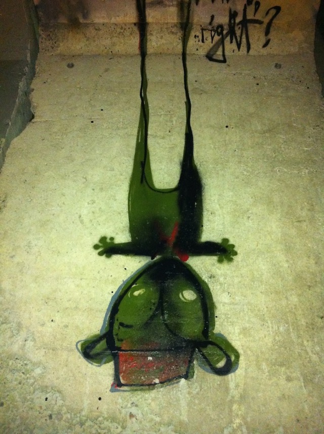
Their piece on the left-most sectional, “Good Can Come From Bad Comes From Good,” was informed by the transformative circularity of history, and features two pregnant women crouched together in a yin-yang position. Their piece on the right-most sectional, “We Are All Just Kids, Right?” depicts a thin schoolboy tapering into a teddy-bear-like black and green shadow. Both showcase the dark, illustrative quality of their work, and are all the more poignant given the history of the material they are painted on.
“The Wall Along Wilshire” will be in front of 5900 Wilshire until November 13, 2011, where a private reception will be held with the artists from 1 to 4 p.m. After that, the sectionals of the Wall will shift to The Wende Museum’s permanent collection at 5741 Buckingham Parkway, Suite E, Culver City, CA 90230.

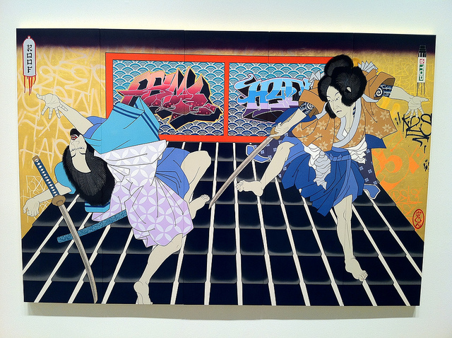
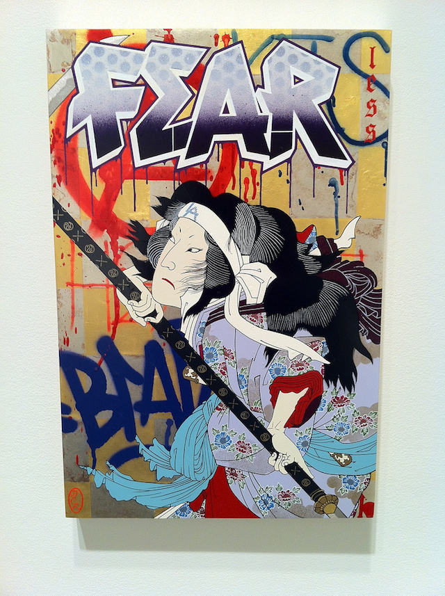
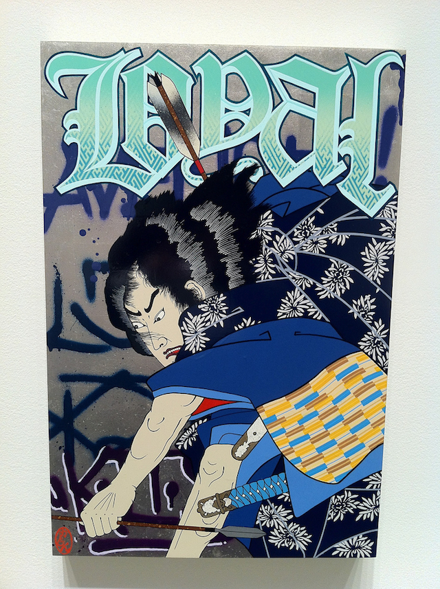
Photos by Ryan Gattis