Parallels: Shapolsky et aI., Manhattan Real Estate Holdings, a Real Time Social System, as of May 1, 1997

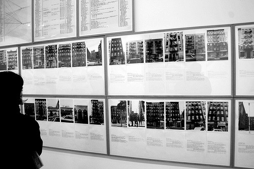
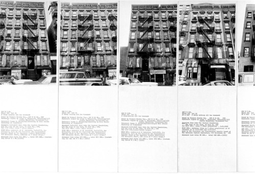
Considering a majority of Street Art exists in the shadow of neglect and finds its most receptive canvas on the facades owned by slum lords, I thought it would be pertinent to share this piece in particular. “Shapolsky et al., Manhattan Real Estate Holdings, a Real-Time Social System as of May 1,1971” was an exhibition of Hans Haacke’s work canceled six weeks prior to its opening by the Guggenheim Museum in New York because it exposed the questionable real estate speculations of a prominent board member Harry Shapolsky. Each property was detailed, photographed and mapped to expose the slum lord activities of this powerful broker. The Whitney literature on the show elaborates:

“Shapolsky et aI., Manhattan Real Estate Holdings, a Real Time Social System, as of May 1, 1971,” is the product of Haacke’s research into the real estate holdings of the Shapolsky family in Manhattan. Harry Shapolsky had attracted Haacke’s attention because he was the landlord who owned more slum properties than any other landowner in New York. Haacke’s research—all culled from public records—reveals how Shapolsky’s business worked, different properties being held under different company names. The series of 142 photographs of the facades of tenement buildings, accompanied by typewritten data sheets, added up to a biting indictment of the monopoly of one family of wealthy proprietors over the slums of a particular area. Due to be displayed in an exhibition at the Guggenheim Museum in New York entitled Hans Haacke: Systems, the work was deemed “inappropriate” by the museum’s management, and the Guggenheim decided to close down the exhibition. The curator, who defended the work, was fired. As a result of the ensuing furore, “Shapolsky et al.” became one of the most talked about works of the early 1970s.
Baltimore Open City

Now that the tumblr has developed, I would like to bring attention to the Baltimore Open City Exhibition and blog which I am writing for. As a sort of extension of the parallels series I have been continuing on Vandalog, the BOC site will be regularly updated with projects from the Exhibition along with pertinent essays and past shows that serve as precedence.

A brief explanation of BOC: An open city is a place where everyone feels welcome, regardless of such things as wealth, race, age, or religion. In every neighborhood of an open city, one feels like he or she belongs. In Baltimore, however, issues like housing discrimination, inadequate public transportation, and the privatization of public space have resulted in an exclusionary environment for many people. The restriction of access to the basic things anyone would want, such as a good education, a decent job, stable property values, and cheap, healthy food, are conditions of a closed city.

For the exhibition Baltimore: Open City, students of Maryland Institute College of Art’s Exhibition Development Seminar have invited scholars, activists, community-based organizations, local artists, and visiting artist Damon Rich to investigate the ways in which Baltimore is and is not an open city. Through a series of installations, workshops, and other public programs, we explore the impact of Baltimore’s history on the current politics of the city’s built environment. We welcome our neighbors to join us in exploring what a more open city might look and feel like.


Urban Succession in the Tenderloin


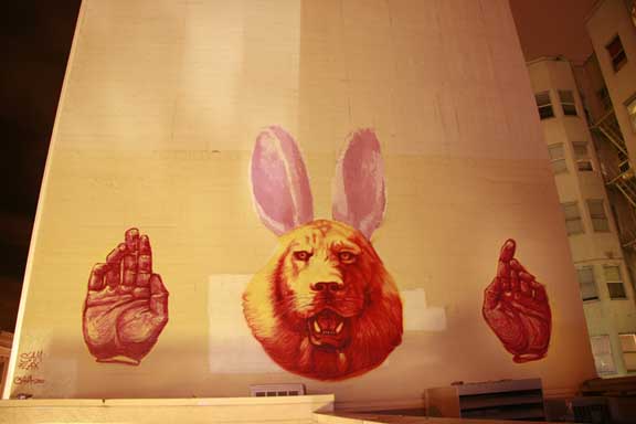
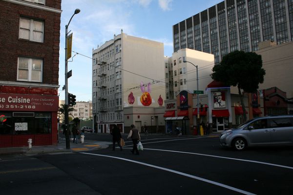
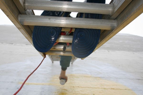
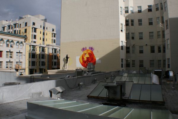
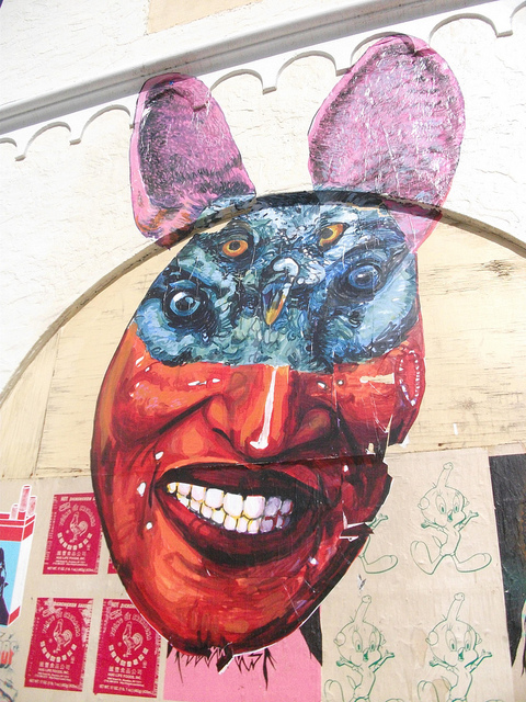
This last week I had the immense, delightful pleasure of finally getting to know the city of San Francisco much better than on my last trip which was a whirlwind weekend of installation at Gallery Heist and street work. This time around I got to settle down and paint a legal wall on Polk and Eddy with the great people over at WallSpace. The piece was completed with spray paint, and rollers to cap off the ears, throughout three days of cool sun showers. The Lion/Rabbit hybrid is a seemingly innocuous image but represents the subversion of the Urban Planner. Le Corbusier, one of the strongest identities in modernist architecture, took a paternalist approach to planning with the notion that the lion is the architect, the master, and the masses are the rabbits. Rarely does the contemporary urban landscape develop organically but is instead defined by the clamor of contending agendas and legislation. This image and its dissemination throughout neighborhoods all over the world is the embodiment of the resolutions and failures of planners to control the incredible mess and natural logic that is the city. (http://www.flickr.com/photos/wallspace/)

From the folks at WS: Wall Space was started to provide artists from all over the world a stage to express their ideas and abilities.  As we all know most street artists must use illegal means to get their idea across to the public. WS wants to allow these artists the time to perfect their art in a legal manner on the most advantageous public viewing areas.  By enabling the artists the time and freedom of expression WS hopes that the communities where these murals are made will be enriched with color and thought provoking imagery.


A HUGE thanks to Jerry Deal for providing the wall, Sam Flax for providing the paint, and Wall Space for orchestrating the project!!

Gaia Street Work in Miami

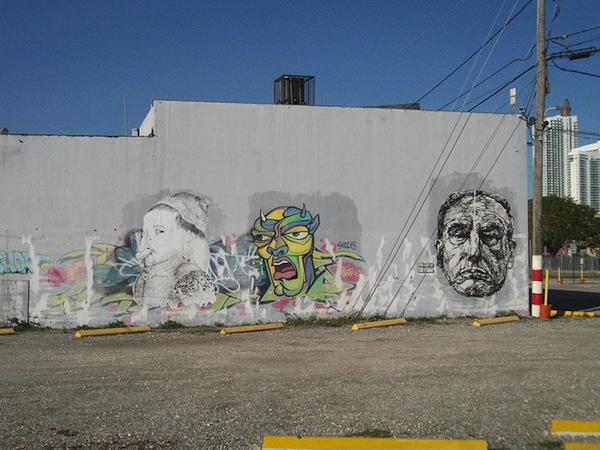
So now that everything has ended as quickly as it has begun, back in Baltimore after a crazy week in Miami. While we’re still going hard down in bmore, the sixth borough was debaucherous to say the least. In between constant libation, definitely crushed with old school writer Sae before Basel formerly jumped off to avoid the beast. Let’s say wasn’t one of those people standing idly while Miami police ran their records because they decided to bomb during the festivities. Props to Overtown, my boy muscles and everyone I saw down there. No love for the side busting that resulted in near immediate buff.

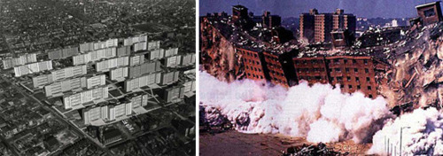
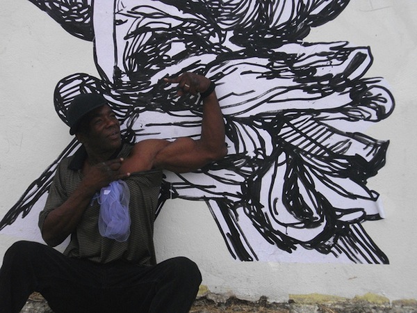
The Highlight was without a doubt being able to hit the abandoned projects with a Corbusier portrait that I knew would be pertinent placed somewhere. Serendipity is pretty wonderful. For more of course visit the flickr.

Continue reading “Gaia Street Work in Miami”

Abuse of Power

(yes that is lady pink modeling the t shirt in 1983) Colab, Group Material, the Real Estate Show, If You Lived Here, Martha Rosler, Dia Beacon Soho, ABC No Rio, Loft Living, Lee, Lady Pink, Jenny Holzer.
To get a sense of these correlations between sometimes seemingly disparate conceptual, graffiti and activist works, download this informative essay by Alan Moore with Jim Cornwell Local History: The Art of Battle for Bohemia in New York.
In an effort to explore street art in a frame of relational aesthetics, let’s start with these connections, exhibitions and artists


Waverly Development Legacy Project

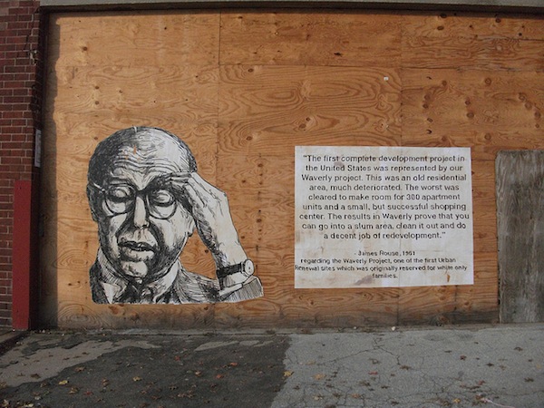
The third installment of the Legacy project, James Rouse is imposed with his own words back onto one of his first development projects in Waverly, Baltimore. Built in 1957, the Waverly development was one of the very first Urban Renewal sites in the United States. Housing stock designated as slum land was cleared for around 300 units and a small shopping center and was originally reserved for white families only.
For more photos of this piece check out this link http://www.flickr.com/photos/gaiastreetart/5187528288/

Parallels: Alfredo Jaar Part 2

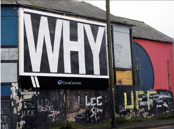
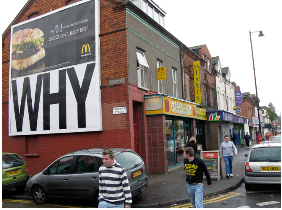
In light of the recent bill board takeover projects curated and organized by Jordan Seiler that we have covered in the past, I would like to a couple different billboard projects by Alfredo Jaar. With Why (2008) Jaar was granted access to various billboards run by clear channel, and rather than provide an alternative to the sale of products, he asks the simply question, “why?” By questioning this format of communication but providing no context or trail to follow, the authorship of the unique artist is nullified. Secondly we have the Rwanda, Rwanda (1994) project which is a series of pieces on street level ads bringing awareness to this war torn country. A simple reminder amongst all the contending issues that suffuse the urban environment.

Street/Studio 2.0 Opening Photos

Overall, Street/Studio 2.0 at the Irvine Contemporary was a tremendous success with a lively turnout to both the panel discussion at the Phillips Collection and the subsequent gallery opening. Opening night was split between two locations, the main gallery space featuring Shepard Fairey, Swoon, Jose Parla, Rostarr, and Judith Supine and the Montserrat House a few blocks away on 9th and U with Chris Mendoza, Dalek, David Ellis and Gaia. It was incredible to spend time with artists who I have always looked up to and quietly watched from a distance. Photo Credit: Kenneth Pennington

Continue reading “Street/Studio 2.0 Opening Photos”

Parallels: Alfredo Jaar’s Lights in the City Part 1

I recently had the immense pleasure to speak at the Phillips Collection in DC on a panel with three figures who I have always looked up to since beginning a street practice, Chris Mendoza, David Ellis and Romon Kimin Yang. The conversation was opened and framed by curator Klaus Ottmann with a passage by Wittgenstein that I feel succinctly embodies what I have personally been striving to achieve within my own work: “Ethics and aesthetics are one.” In such light, good art, is the balance between ethics and aesthetics, between the depth and appearance.

Yet this post is not about that weekend, it is the presentation of two works by renowned multidisciplinary artists Alfredo Jaar. I have personally attended a lecture of his works and I can attest that not only is he erudite, and an exceptional public speaker, but his work is truly a successful marriage of ethics and aesthetics. So, following up on the last post regarding the Times Square projects, without further ado, here are the pieces in two parts Lights in the City (1999) and Why (2008), which I will present a little later

“Lights in the city, 1999
Mois De La Photo a Montreal
Montreal
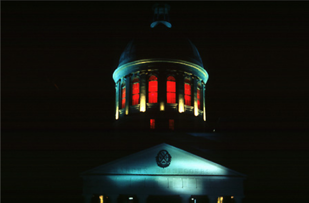
Approximately a hundred thousands watts of red lights have been installed in the Cupola of the Marché Bonsecours, a landmark monument in the old Montreal.
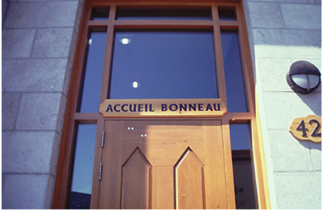
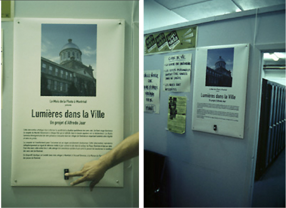
Detonating devices have been placed in the Accueil Bonneau, la Maison Eugénie Bernier and la Maison Paul Grégoire, homeless shelters located within 500 yards of the Cupola. Every time a homeless person enters any of these shelters, they are free to push the buttons and the red light will flash in the Cupola.
This project can be read in many ways:
First, a “photograph” is taken every time a human being asks for help (a light flashes as if a photograph is being taken). This “photograph” respects the privacy and dignity of the “homeless” person (there is no “material image”) while at the same time sends a sign (a red light) to society about his or her condition, a condition that is clearly unacceptable within the context of one of the richest cities in North America.
Second, the red light also can be read as a threat of fire, like all the successive fires that destroyed the Cupola of the Marché Bonsecours more than once during the course of its history. This sign of “fire”, which has meant tragedy for the Cupola, is now a sign of another tragedy, homelessness. And this time, tragedy (fire) is threatening not the Cupola, but society itself.

A last utopian thought:
Eventually all the shelters for homeless people in Montreal could be wired and connected to the Cupola. This way, a major landmark and historical monument in the city would be acting as a non-stop lighthouse, producing endless, painful distress signals to society.
With enough media coverage and public outrage and support triggered by these ongoing distress signals, homelessness could be completely eradicated from Montreal.”