As much I’ve enjoyed the anti-Trump stickers that have been making up a healthy portion of my Instagram posts lately, they’re pretty basic: Trump sucks. We get it. New York agrees (except for maybe that one asshole putting up Infowars stickers in my neighborhood). I enjoy those stickers, but what I’d love to see some work that goes a bit deeper into the issues that Trump represents.
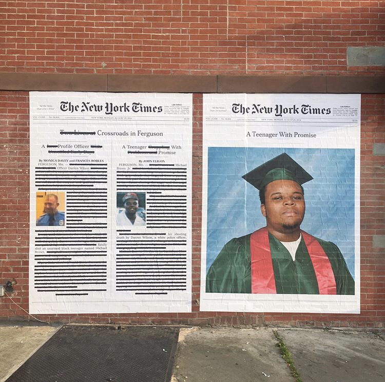
Luckily, there’s Alexandra Bell. Her new series of posters smacks you in the face, highlighting the everyday racism that was hiding in plain sight even before the age of “Trump’s America.” Bell has been putting her journalism degree to work critiquing articles from The New York Times to highlight the implicit bias in their stories, headlines, and page layout.
She starts with a real page layout from The New York Times, and redacts, critiques, or remakes the page to remove or highlight the paper’s implicit racial bias. Would Michael Brown have been referred to as “A Teenager Grappling with Problems and Promise” if he were white? Why was a major article about Brown given equal billing as an article about his killer? Why was Jamaican sprinter Usain Bolt’s photo used below and article about the four white American swimmers who got caught vandalizing a Rio gas station?
Bell’s posters have been appearing across NYC, in the subways and on the street, and they’ve provoked different reactions. At first look, they may be confusing, and that’s also why they’re so powerful. These alternative versions of the Times give a glimpse into a different reality, and in doing so highlight the racism still present in ours, even in supposedly liberal and culturally sensitive publications like The New York Times. It’s some of the best street art I’ve seen all year.
And Bell has more to come.
Photos from Alexandra Bell’s Instagram
