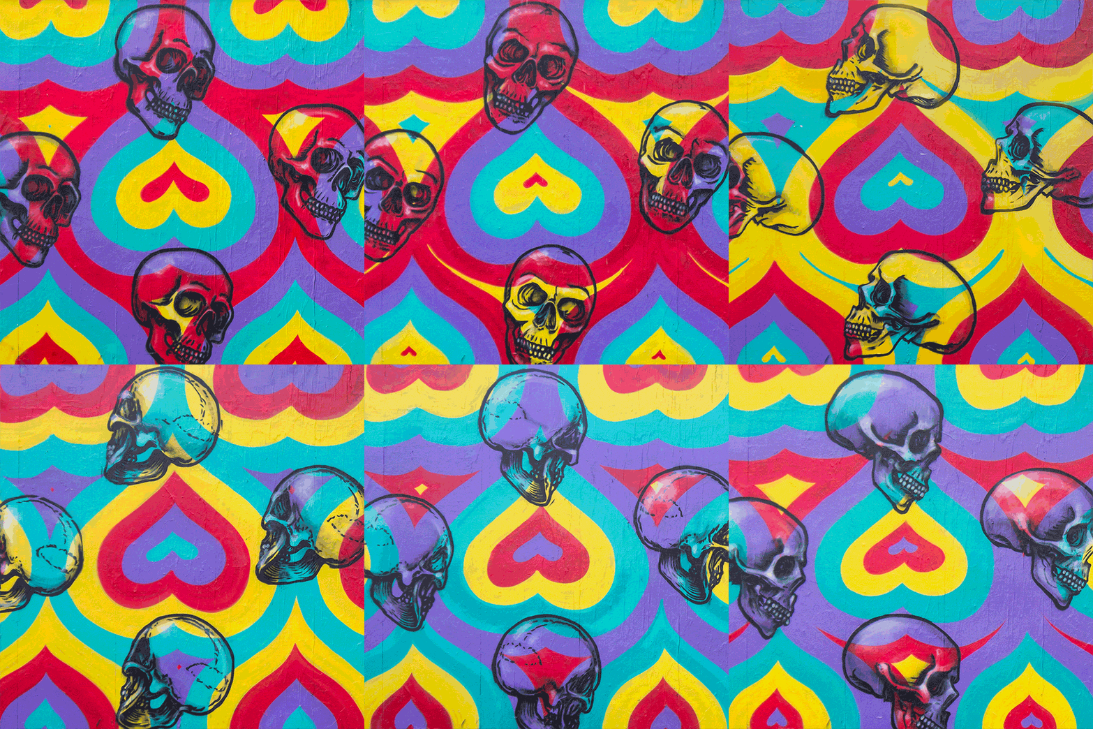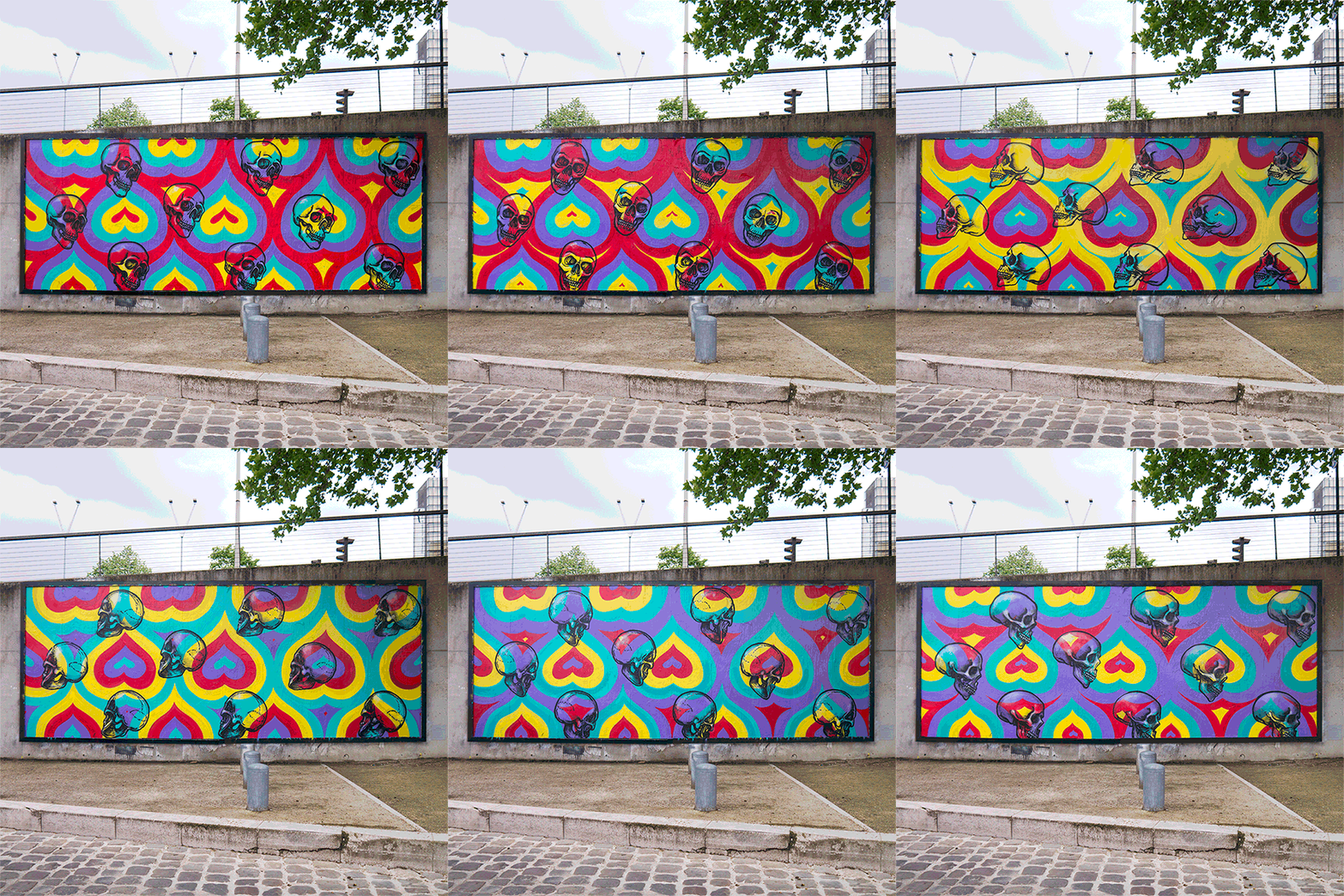
INSA just finished this new GIF-ITI piece at le M.U.R. XIII in Paris. I haven’t posted about INSA since the release of Viral Art, so I think it’s time to revisit his GIF-ITI work.
As I and many others have noted, INSA’s GIF-ITI is clearly designed for the internet. But what I like about it is that it’s not only for the internet. Blu’s animations look great as a finished product, but they’re not so beautiful if you visit those walls in person long after Blu has left. Some murals photograph well or make sense when you look at them, but they don’t pop or make sense when you see them in person. Others look great in person, but are difficult to photograph. INSA’s GIF-ITI pieces work amazingly well online (certainly better than most still photos) and still looks great on the street. That’s an uncommon combination.
For in-progress photos of this piece, see INSA’s blog.

Animations by INSA
