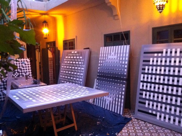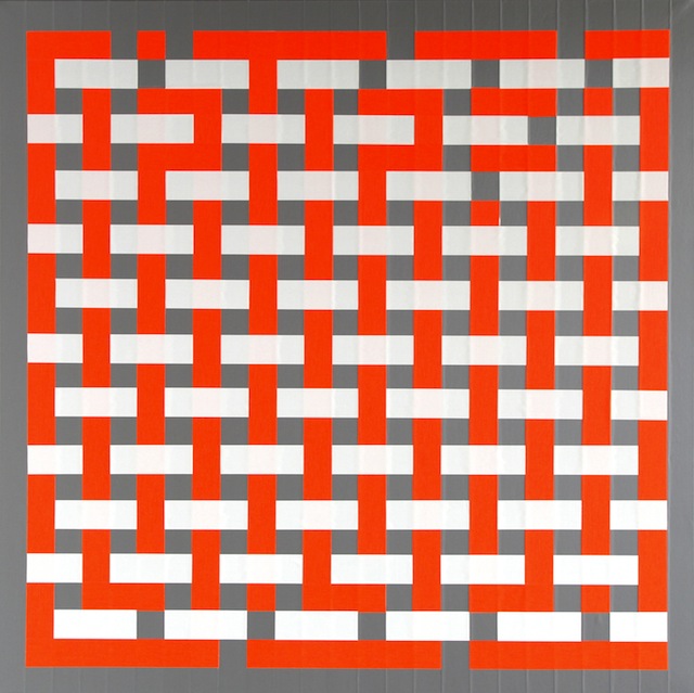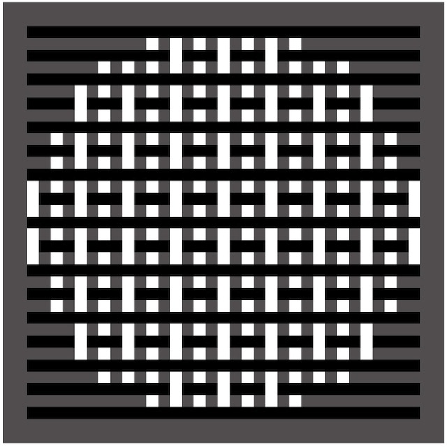
Last week Graffuturism posted a preview of L’Atlas‘s upcoming solo show at the David Bloch Gallery in France. The show’s name, Morphologie, is perhaps a hint that L’Atlas has strayed from his signature style to try something a bit different.

L’Atlas typically works with black and white in his abstract, geometric typography, which is commonly his own name. At first glance, it looks like he has abandoned these trademarks in his new work. However, his new use of color has worked to encrypt his signature in more complex patterns.
Personally, I think his style works best at its simplest, black and white. I’m a very big fan of L’Atlas, particularly his lettering, so I’m interested in others think of this new direction.

Photos courtesy of Graffuturism
