It took nearly two years for Gajin Fujita to create work for “Made in L.A.” at the L.A. Louver recently, but it was definitely worth the wait.
Hailing from Boyle Heights, Fujita mixes elements of his Japanese heritage with the cultural influences he absorbed growing up in East Los Angeles as a member of K2S. His new pieces consist mainly of three structural layers. The bottom-most layers usually feature extensive use of gold, white gold, and platinum leaf; often, he uses repeating squares in background design much like those seen in hinged-screen (byōbu) painting. The second layer consists of tagging or throw-ups, though occasionally these will make their way to the top layer as a title, and will share the piece with two-dimensional characters (reminiscent of ukiyo-e) from Japanese history and mythology. Of these, samurai feature most prominently.
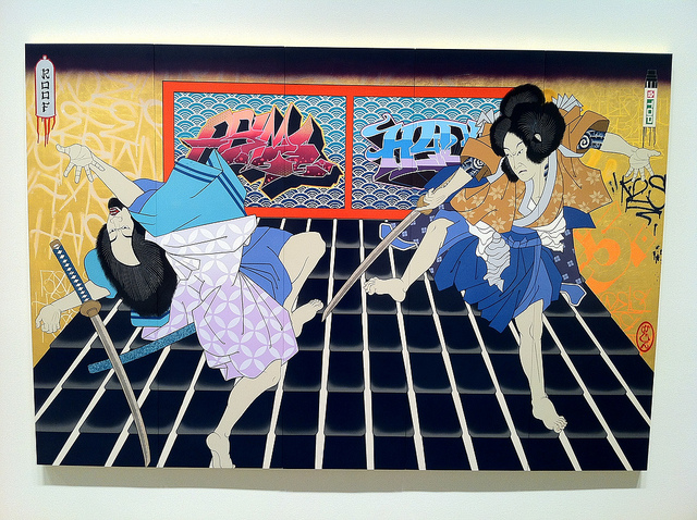
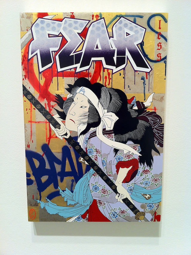
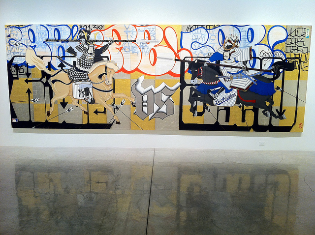
At times, Fujita uses this second-layer lettering to stand-in for the chaos of battle, as in “East vs. West,” yet he never allows the graffiti to overwhelm–or even become–the main focus of any piece. His third-layer characters are always foregrounded, and it has to be said that the use of textile details (particularly the flow of the kimono in “Fearless”) has been elevated from his previous work: where a print might have been repeated from head-to-toe in the past (as in “Fatal Match”, 2006), regardless of how the fabric might have been sitting on the character.
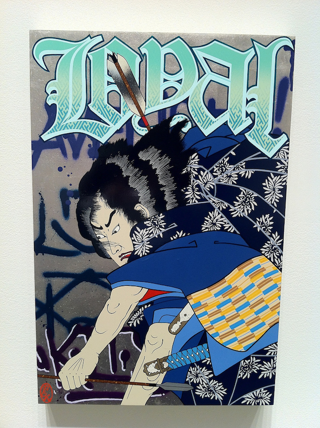
Fujita’s compositional style has grown as well. His one-panel pieces (“Fearless” and “Loyal”) use a similarly cropped frame to 2007’s “Loca”, but also utilize larger, more active characters, and a more dynamic color scheme–particularly with the strong primary colors of red and blue in each, as well as the patterned title lettering. The style used for “Fear” in “Fearless” appears to be an homage to local artist RISK.
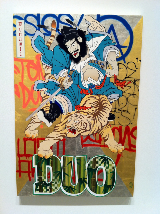
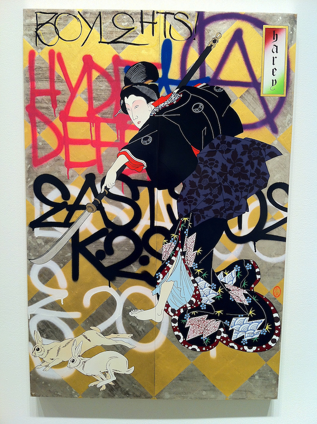
Interestingly, Fujita’s two-frame pieces (“Dynamic Duo” and “Getting Harey”) are guided by the diagonalization of the leafing in the background layers. In both cases, the rectangles have been turned on their ends to highlight the action. In “Dynamic Duo,” only four rectangles are preferred, drawing one’s eye to the center point, where the hero sits astride a tiger. This same technique is employed for different reasons in “Getting Harey,” where the smaller tiling guides one’s eye from the woman’s face, down the spear, and to the rabbits in the lower left corner.
Perhaps it’s easy to write Fujita’s work off as simple juxtaposition of graffiti and classical art. It’s true that these aren’t so much harmonious pieces as collisions of different styles and cultures, but it would seem that is precisely Fujita’s point, and precisely the type of environment that multi-ethnic neighborhoods in Los Angeles (as well as everywhere else) foster. Yet it’s also worth pointing out that these pieces don’t just feature Japanese imagery and predominantly Chicano-inspired lettering styles, but the pervasive use of the English language as well. As a result, these visual mash-ups don’t just comment on cultural influences, but also on how well the preservation of the ancient can fit with the present in an entirely new context–which is something all transplanted people, regardless of background, must learn to navigate in a new place.
“Made In L.A.” shows through November 12th at L.A. Louver, 45 North Venice Boulevard, Venice, California 90291. See it with your own eyes if you can. These pieces are far more impressive in person than they are in photographs.
Photos by Ryan Gattis
