Ryan Gattis (punchingonpaper.com) is a novelist, blogger, and creative writing professor at Chapman University. He is the author of ROO KICKKICK & THE BIG BAD BLIMP and KUNG FU HIGH SCHOOL, which was acquired by The Weinstein Company and chosen as a "Discover Selection" by Barnes & Noble. He runs Punching On Paper, an arts blog dedicated to examining representations of physical violence in literature, film, and visual art. Raised in Colorado, he now resides in Downtown Los Angeles.
If that is the case, they aren’t hiding very well these days.
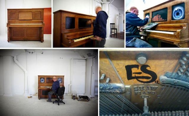
I suppose you could blame TNT’s popular TV cop drama Southland for some of that. The group’s “Painting the Painters” mural was prominently featured in a recent episode titled, oddly enough, “Risk.” In addition, UGLAR member Evan Skrederstu was commissioned by The Wende Museum (the same institution that commissioned RETNA, D*face, and Herakut to paint portions of its Berlin Wall) for the L.A. Chamber Orchestra’s “Play Me, I’m Yours” Project to paint a piano to stand across from LACMA, next to the wall segments.
The group has also completed two murals with ZES (including one in collaboration with PUSH for L.A. Freewalls), and features in the upcoming La La Gallery show.
The word is out, it seems. So who are they?
UGLAR stands for Unified Group of Los Angeles Residents and consists of five members: Evan Skredertsu, Christopher D. Brand, Steve Martinez, Espi, and Jose A. Lopez. They recently added ‘works’ to their name in honor of the great public works projects that were once commonplace in Los Angeles during the era of Rivera and Siqueiros. Originally, however, the group took their acronym from the Ulysses Guide to the L.A. River when they created a book celebrating the river and its inhabitants in 2008. This culminated in a show at the Pasadena Museum of California Art that featured Chaz Bojorquez and others. Perhaps what is most remarkable about that show is that the group fabricated and installed the entire exhibition by hand and brought the feel of the concrete L.A. riverbed indoors by obliterating the white gallery walls.
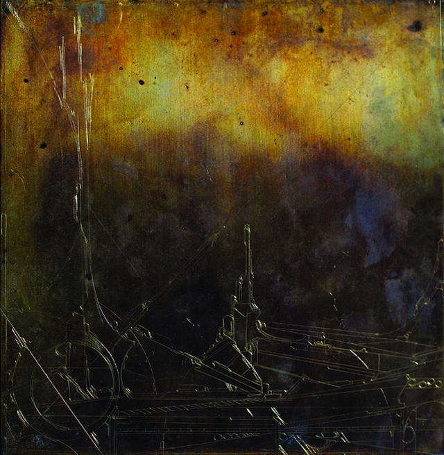
And yet, just a glimpse of their work shows it to be incredibly diverse. Martinez paints, photographs, and is the only member to use Photoshop in conceiving his pieces. Lopez graduated from graffiti lettering to abstraction years ago, even taking to etching some recent works on copper. Espi adds a spiritual element to the group it seems, but what else would one expect from the Art Director of the Los Angeles Friends of Tibet?
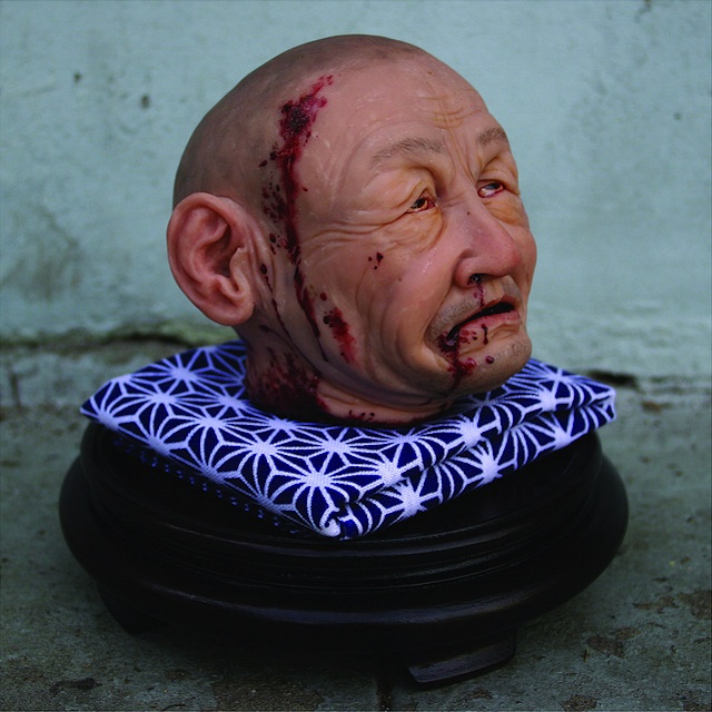
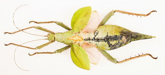
As a group, they do far more than walls. They are kings of scale, from the huge to the tiny, from murals to bugs. Yes, bugs. The story goes that Skrederstu and Brand were painting in the L.A. River a decade ago and accidentally sprayed a cricket blue. What grew out of that happenstance is amazing to see. Yet, what I find so fascinating is they do more than simply paint, and they don’t work exclusively with aerosol. Brand also sculpts, and is capable of some incredibly lifelike pieces similar to those of Ron Mueck. By way of example, check out the severed head below.
At a time when many are asking if street art can transition indoors (obviously the techniques can, but how well, and to what effect?), it is fascinating to watch contemporary street artists adapt to new spaces after having few limits. I can’t help but wonder which artists will transcend such labels by producing regardless of venue, and which will be limited in new environs. Considering the breadth of UGLAR’s skills and polish, it seems reasonable to conclude that they have all the potential necessary to effectively make that leap. Perhaps most importantly, they don’t seem satisfied to work exclusively on the street, but anywhere their creativity takes them.
A note from the editor: Yes, the Daniel Lahoda in this post is the same Daniel Lahoda who was investigated by the LAPD and complained about online on numerous occasions. While, to my knowledge, Lahoda has never been arrested and none of the past complaints have resulted in civil litigation, there were a lot of complaints about Lahoda being brought up consistently for a number of years. It’s impossible for me to say for sure what happened in Lahoda’s past. What I can say is that he does seem to be making an honest go of things with his current projects. I’ve had personal issues with Lahoda myself, but as far as I am concerned, this new gallery of his is a time for second chances. Since the last of the complaints against him surfaced, Lahoda has gone above and beyond with his noncommercial ventures like the LA Freewalls Project and involvement in changing LA’s mural regulations. If you asked me today, “Would you do business with Daniel Lahoda?”, my answer would be a cautious yes. If Lahoda did make mistakes in the past, I do not think he will make those mistakes again. Consider this aside as my way of publicly putting rumors and allegations from Lahoda’s past in the past and instead deciding to focus on the here and now. – RJ Rushmore
Daniel Lahoda’s L.A. Freewalls project has changed the face of the Arts District in Los Angeles. That much is inarguable. In fact, it’s getting harder and harder to imagine what the old warehouse district looked like without the rotating gallery at 7th & Mateo, ROA’s outdoor exhibition spanning Jesse and Imperial, HOW & NOSM, DABS & MYLA, Shepherd Fairey, and perhaps most indelibly, JR’s L.A. Wrinkles. Trust me, this is a good thing.
So what happens when these muralists that have transformed a neighborhood bring their work inside to the brand new LALA gallery? Can it maintain the same level of energy? The verdict will have to wait for the opening, but at first glance, you simply cannot argue with that lineup.
Up-and-coming artists like Anthony Lister, ASKEW, and ZES, all of whom have recently had some of the hottest shows anywhere, are in it. ZES’s mural partners in Little Tokyo and in L.A. Freewalls (alongside the incomparable PUSH, who is also in the show) UGLAR, are represented in the forms of Evan Skrederstu and Christopher D. Brand and possibly some special guests. On top of that, there’s HOW & NOSM. There’s Dan Witz. That alone is a killer group.
But throw in someone like, oh, I don’t know, Ron English–not to mention MOCA “Art in the Streets” vets like Shepherd Fairey, SABER, RISK, and SWOON? Well, let’s say that things just got serious. And they might get crazy too. In a good way. Here’s hoping, anyway.
Quite honestly, I haven’t seen this kind of excitement around in a while. Ever since Art Walk wrecked Gallery Row with its costly series of missteps, Downtown Los Angeles has been bleeding galleries. Upper Playground is gone. Mr. Cartoon’s shop is gone. Worst of all, Bert Green Fine Art, the originator himself, is gone too. The truth is, Downtown L.A. needs an innovative gallery–one willing to take risks, one unafraid to offend or prompt dialogue–more than people think.
Can LALA Gallery be one of those? Come April 21, we’ll find out. But on the evidence of the incredible show roster, it’s off to a very promising start.
As Lois mentioned, “My Turn” (curated by L.A.-based Bumblebee) opened at the Carmichael Gallery recently, showcasing global artists deserving of wider audiences. Although the show’s title and theme failed to carry through to the works on display, it’s worth noting that Bumblebee showed admirable range in selecting fellow artists from the UK, Colombia, Argentina, Italy, and the Ukraine.
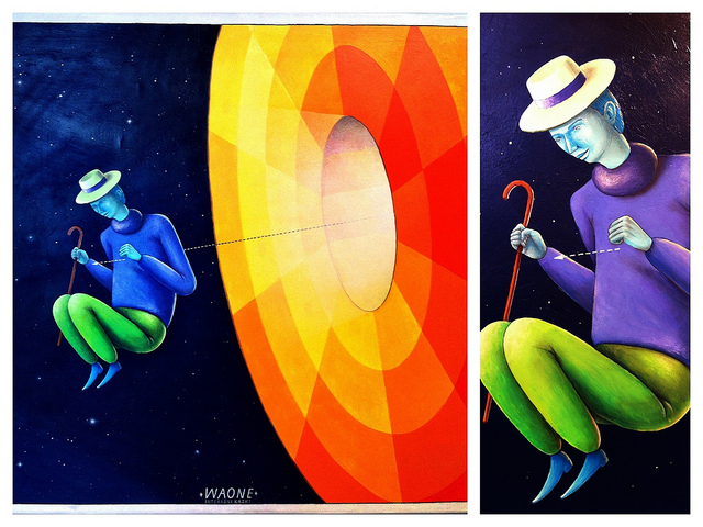
Interesni Kazki stood out as capably transitioning indoors without losing the magic that makes their large-scale work so spectacular. Building on their solo opening at Mid-City last year, the duo contributed separate pieces this time (each attributed to either WAONE or AEC), employing acrylics, rather than aerosol, in all but one piece.
Moneyless also showed strongly, with geographical works that utilized similar techniques to his yarn sculptures. (In fact, I’d be very interested to see what Moneyless could do if given free range in an entire gallery.) Though I love the idea behind Jaz’s animal transformations, they weren’t nearly as impressive on a smaller scale. However, what was impressive about the show was the diversity of work on offer–from Hyuro’s detailed pen work to Klone’s watercolors–bringing a solid perspective on where street art is going, and how it might continue to transition into gallery spaces.
“Play Me” runs through April 7 at the Carmichael Gallery, 5795 Washington Blvd, Culver City, CA 90232.
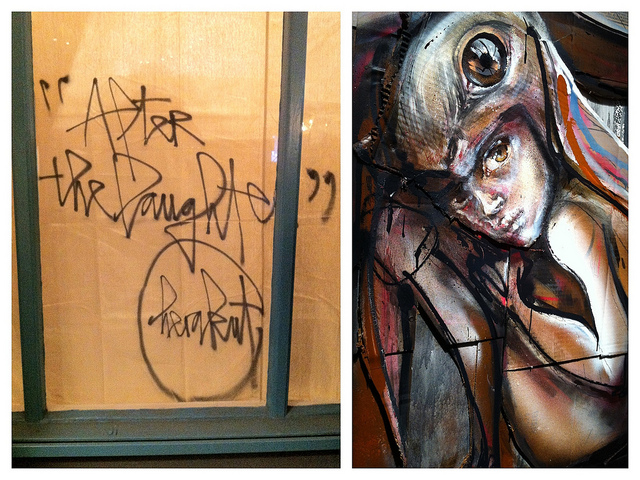
Herakut‘s recent solo installation at LeBasse Projects attracted quite a crowd to their Chinatown location. The exterior featured a carnival atmosphere–one with popcorn and cotton candy machines whirring and popping–but those belied the darker works on view inside.
It’s difficult not to compare Herakut and Os Gemeos after they had dueling openings on February 25th, but it’s worth noting that each was successful for different reasons, and in different ways. Although both featured triumphs of scale, and moved the bar up on what street artists can (and perhaps should) pull off in gallery spaces, Os Gemeos relied on playful lighting, bold color choices, and some instances of technological cleverness while Herakut combined their dark fairy-tale images with a flair for the dramatic.
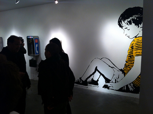
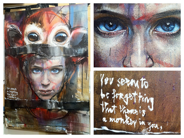
The largest pieces in the show came straight from the stage of Downtown L.A.’s Palace Theatre, where Herakut collaborated with Lucent Dossier on “When Lucent Found Herakut” earlier last month. In fact, members of the troupe worked the crowd over the course of the evening, dressed in masks designed by the German duo. A unicorn was present, a monkey too. I was put off by this at first; I felt it distracted from the art on the walls. It took me time to see that the artistry involved in the mask-making is a large part of what Herakut do, and these simply delivered life-sized recreations of their trademark women and children wearing animal head hats.
"You Seem To Be Forgetting That There Is A Monkey in You, Too."
One of the most intriguing aspects of the show were the statues (also adorned with hats) that were done either completely in casting stone, or with papier-mâché and tape, as was the case with two different deer pieces. However, the standout work was a canvas: a portrait of a child wearing a monkey’s head atop its own. The point where both merge is taped over–as is the chin–and it’s left to our imaginations how this fusion came about, or perhaps even how violent it was. The text reminds viewers that we “seem to be forgetting that there is a monkey” in us, as well.
It is this awareness of nature–not simply of the natural world, but also of our own human natures–that suffuses this show. It’s in everything from the small prints to the larger pieces. As with some Herakut, the work is not always the most comfortable viewing, but it is clear-eyed: a persistent reminder that part of what makes us human is the presence of the animal within.
“After the Laughter” runs through March 17 at LeBasse Projects Chinatown: 923 Chung King Rd. Los Angeles, CA 90012.
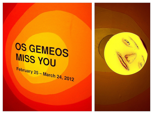
Few things in the L.A. art world generated interest and excitement like Os Gemeos‘ recent solo opening at Prism Gallery. I hadn’t heard or seen people this excited since MOCA’s “Art in Streets” last year, and that show undoubtedly served to bring more recognition to the Brazilian twins. It paid off on Saturday when, despite a piece of paper taped to the gallery door that the show would be starting at 7 p.m. (and not the previously advertised 6 p.m.), a line had already begun to form outside around 4. When the butcher paper came down off the glass gallery walls, a few gasps went up, and when the doors finally opened early, few could hardly wait to get in and experience it for themselves.
Now, I should say I often feel the term wonderland is overused–particularly in regard to art installations–but the remarkably immersive artworks on offer in “Miss You” makes this description nothing short of apt. In some cases, this immersiveness was literal, as viewers could enter a side room and play with a collection of touch-screens, or duck inside an enormous box painted with a face to find a blue-lit, completely mirrored space that felt acres bigger than it was. Yet, nowhere was that feeling more evident than on the faces of the visitors streaming in around me. Everywhere I looked, I saw gazes of wonder. Children squealed and wove their way through distended light bulbs anchored to the floor, which brings me to an important part on this show: it was both deeply fun, as well as family-friendly, and it showcased what truly game-changing artists (who just happen to have a significant amount of experience with scale on the street) can do when given total control in a gallery. Continue reading “Miss You: Os Gemeos at Prism”
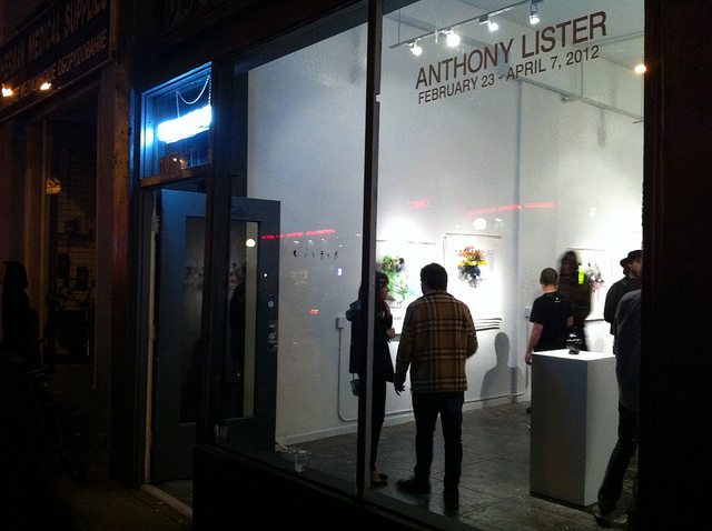
This wild week of L.A. gallery openings started on Thursday with Anthony Lister at New Image Art in West Hollywood. Although I’ve always admired the movement Lister conjures up in his pieces–in his superhero series or his street faces–I had come to expect still figures in Lister’s work, and, because of that, I had no idea what to expect from a show focusing primarily on the figurative movement of dancers. What I found was impressive indeed.
Lister’s decision not to back or frame his canvases enhanced the gallery atmosphere considerably. Instead, they hung flat on the wall and had a textured, organic feel. Perhaps because of this, visitors were encouraged to touch some of the pieces, and more than a few visitors shuffled through the canvases that had been stacked on top of one another and affixed to the wall, giving a sense of a flip-book without the sequential art component.
The effect came off as straightforward and intimate, as modern in the best possible way, and this was aided by Lister’s humorous strings of sentences, penciled onto the white walls above, around, and even underneath the works. In one, he suggested that an immovable load-bearing girder be moved to better accommodate his work, and in another he provided guidance on how his art needed to be lit. Beneath his portrait of van Gogh, he wrote: “Id like to think van gogh wouldnt agree with making his work into a laurel if he had a say in it”. Continue reading “Anthony Lister at New Image”
As RJ recently mentioned, L.A. is alive right now and ZES’s “Excavated Revelations” (a collaboration with RETNA which runs through February 25 at Known Gallery) is a big part of that.
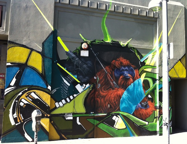
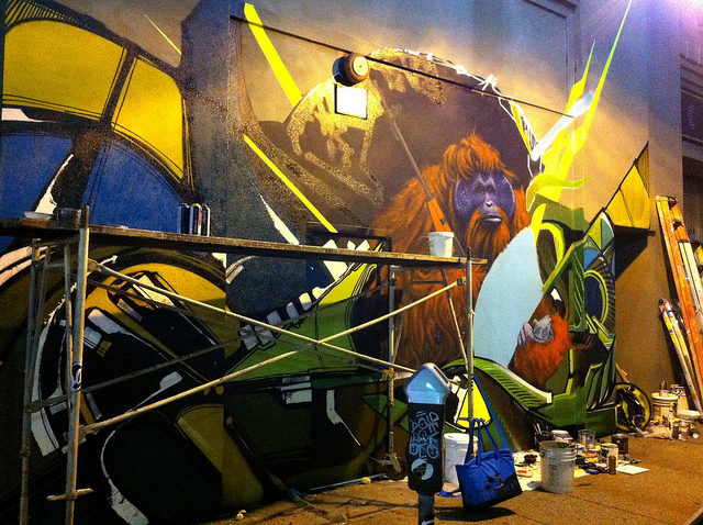
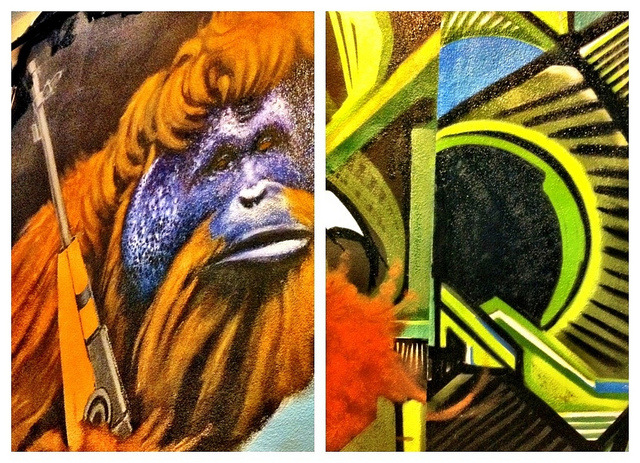
But shows aren’t the only thing contributing to that feeling. Commissioned by the Holdup Gallery, ZES is currently collaborating with UGLAR’s Evan Skrederstu and Jose A. Lopez on the facade of the old Brunswig Drug Company Factory Building in Little Tokyo.
Originally built in 1931, this art deco tower now hosts a seamless integration of ZES and Lopez’s abstract work, one flowing into the other–and echoing, with one of ZES’s trademark curvatures in its lower left corner, a nautilus shell’s curl. These bursts of color frame an unsettling juxtaposition: an orangutan holding an AK-47 and what will be a walkie-talkie when Skrederstu completes it.
Location: On 2nd, west of Central, next to the Second Street Jazz Bar.
Ryan Gattis: What’s most inspiring to you right now?
Scott Sueme: Abstract painting and progressive graffiti piecing for the most part. I’m also really excited about working with other artists that aren’t necessarily coming from a graffiti background too. For instance, I worked with Andrew Young recently. He and I did some painting in Miami for part of Primary Flight.
SS (laughing): Yes, he’s done my portrait. He works downstairs actually; we walked through his studio on the way up. He collages geometric shapes with wallpaper and other elements, then paints narrative driven realism in oils and blends the two together. Continue reading “Writer to Writer: The Scott Sueme Interview, Pt. 2”
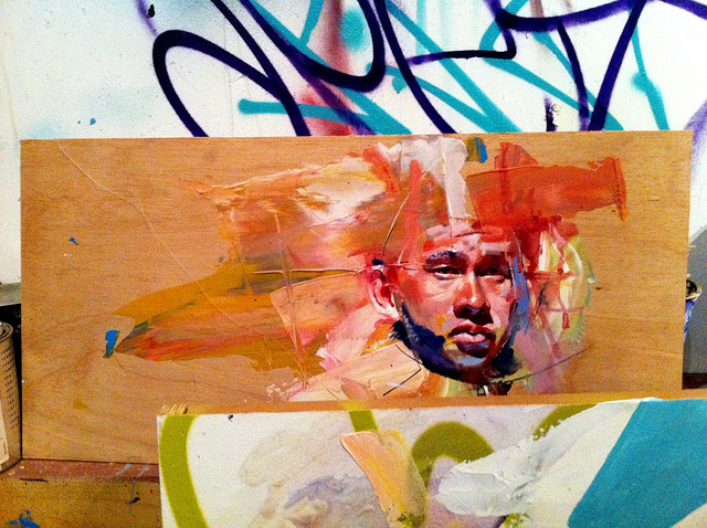
Scott Sueme & Andrew Young, Test Strip for Primary Flight
When I let RJ know I was heading up to Vancouver awhile back, he told me I had to get in touch with Scott Sueme, an artist at the forefront of aerosol abstraction who also happened to be one of the best letter-writers around. I dropped Scott a line that day, and after a few messages back and forth, we picked a day to sit down.
I first met Scott outside his studio building in Vancouver’s Downtown East Side on a night when the temperature was well below freezing. You couldn’t tell that from the look on Scott’s face though. He was wearing a Portland Trailblazers hat with the bill turned up slightly at its end, black-framed glasses, and a wide smile.
He introduced me around, quickly but warmly, as we passed through a series of first floor studios separated by half-walls and headed upstairs, only to find the end of the staircase blocked off by a construction wall. We jumped the banister and proceeded down a dark hallway before hair-pinning our way into a high-ceilinged studio.
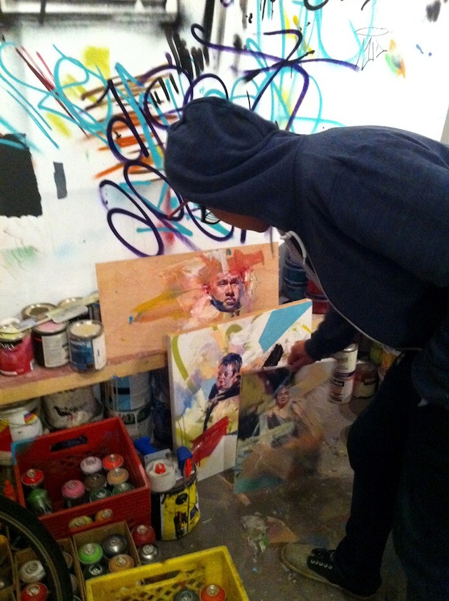
Anchored by a foosball table, the space was productively messy–a multi-colored laboratory of experimentation. Test strips for Primary Flight littered the near wall, each a collaboration with oil painter Andrew Young.
Scott indicated that the loft was a good place to talk, so he and I climbed a thin ladder up to a small living room area, where he sat down on a stretch of faux white fur laid over a rocking chair.
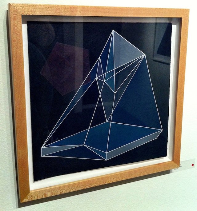
Beside him were a few of his paintings from the Unintended Calculations show, specifically “Collected,” which was partially obscured by the mostly sandy-colored triangles and occasional polyhedrons of “Pressed.”
From time to time as we talked, Scott would cut his hand at these shapes for emphasis, to demonstrate how he attacks geometry in his work.
"Pressed" (Left) and "Collected" (Right) by Scott Sueme
Ryan Gattis: You’ve said that you first became interested in graffiti when you hung around people that did it, so at what point did you realize that it might be the path for you?
Scott Sueme: I think I really started to take it on when I started painting alone more. When you paint alone, you get to express your true ideas, but when you’re going with someone–whether you’re each doing your own thing or you’re doing something collaboratively together–there’s a point where you just want to see your own idea through, and I picked up on that when I started going on missions to paint freights by myself. I found I got into my pocket a lot quicker and the workflow was just more fluid by myself.
RG: Last year, you took a road trip from Vancouver to L.A. to the Art in the Streets exhibit at the MOCA. What did you think?
SS: It floored me. I wasn’t expecting anything, but then I got there and the level of work blew me away. You can go to graffiti shows at galleries, but to see a museum exhibit? To be honest, it caught me off guard. One of the most memorable things was walking through TWIST’s installation, and seeing the magnitude of the work. It just consumed me, completely heightened my sensibilities as to what was possible in an indoor space.
RG: Do you feel the exhibition did everything it needed to do, in terms of showing the history of graffiti?
SS: I think it presented an objective view. I mean, there were a lot of people talking bad about it, the idea of commercializing graffiti and how it’s gotten to this point, but that’s never really been done before–an exhibit that presented the movement to the public like that. People need to see it, and I thought the information was very thorough and factual. Every artist and viewer has the right to make that decision on how they feel about it. For me, I think it was great to see that showcase; I think it spreads awareness, and I think it’s important for people to see that.
RG: We have to talk about your work in Unintended Calculations, a show you once described as “graffiti versus abstraction.” What does that phrase mean to you?
SS: First let me say that when you’ve painted graffiti for so many years, and you’re doing that aesthetic, you’re trying to emulate something. I’m trying to do a graffiti piece that looks like it’s done in graffiti style, something that pertains to certain values in the culture. So from there, the question is: once you’ve accomplished that, what’s next? You look at the simple structures of what you’re doing, and you start to break them down and you start to deconstruct the work–so it’s less graffiti “versus” abstraction. Instead, it has become a natural progression for me, to go from trying to do something really complicated and maintain the trueness to the form of graffiti, and then say, “okay, now, I want to deconstruct those elements and break them down into something more simplified.” That’s where my painting is at right now. I’m trying to use that same color knowledge and those same materials and strategies that I practice in graffiti, but I’m trying to use them in a new way.
RG: So do you find yourself more drawn to abstraction these days, or do you try to keep a balance?
SS: I think balance is important because it allows ideas to bounce back and forth. If I see something in graffiti, it might inspire a new painting, or vice versa. I keep both going and there’s always a dialogue between the two worlds, whether I’m doing something letter-based, or I’m doing something completely abstracted.
RG: Do you foresee a time for your work when they might fuse together?
SS: I feel like they’re already fusing. There are certain ways now that I block out my backgrounds behind pieces that are reminiscent of some of my abstract work, and more complex forms are making their way into my more uniform abstract work indoors.
RG: You’ve mentioned enjoying cutout letterforms, and that definitely reminded me of the triangle forms you’ve worked with in abstract pieces. Is it fair to say that’s an example?
SS: It’s totally an example, and a good one at that. My abstract paintings were initially inspired from my graffiti pieces and working with letterforms. I started to pay more attention to the negative spaces between the letters as shapes, and I saw how they made triangles. I didn’t intentionally paint them; they were just there. It’s a direct example of the idea of abstraction, as it pertains to my work. If you take away the letterforms, you would be left with the negative spaces. So, the next question is, can you create a painting of completely negative space? That’s the evolution. I went from something letter-based and switched it over, and now I’m putting all the color information that you would typically see in a letter-based graffiti piece, but now it’s in the void of what was there before. That’s the dialogue between the two works. When you’re looking at my paintings, in a way it’s a window through the negative spaces from the perspective of my work outdoors.
RG: So much of that new process must come from experience as well, because the more practice you have doing letter forms–
SS: I guess it’s when you start getting bored, or feeling restricted by the letterforms. It’s a very specific language and only graffiti writers can translate and understand what style you’re going for or how to properly read a graffiti piece. So I felt like there was more to what I was doing than just conveying that language, I wanted to reach more people with my artwork, and also get a better understanding of what it means to paint.
RG: I get that, but I also think there’s something stripped-down and zen-like about the way you’ve started seeing the negative space as the piece, as opposed to the other way around.
SS: I look at it like I have two polar opposites within me–the illustrative and the abstract. One day I can go out and do a graffiti piece and the letterforms still really excite me. But on another day I can turn that off and not try to appease that side of myself, because I find that one thing about graffiti and dealing with the subculture is that, in order to make something stylistically fitting, or make someone appreciate your work, you have to appease a crowd, or at least an aesthetic law or established form. And as an artist sometimes you don’t feel like doing that; sometimes you just feel like experimenting.
RG: Has there been a negative response in the subculture to your abstract work?
SS: Well, some people say it’s played out, or a lot of people are doing it, or they just say it’s trendy. I think they’d just rather look at graffiti than what I’m doing anyway, but there’s some controversy around it, I guess. It’s natural because that’s obviously something they recognize immediately, but what they don’t understand about my process is that I’m not actually thinking about painting triangles, or any shape for that matter.
RG: What are you thinking about?
SS: Edges. I build a painting from a single-sided edge. Each mark I make is in search of a hard, flush edge. Then I build and react around it. I react to the next one, and the next one, and so on. The painting, and the shapes eventually builds itself. I don’t actually go into a painting with the intention of creating a specific shape. In typography they say when you look at a letter, you’re not actually reading the shape of the letter but the negative space around it. This is a lot like how I create paintings, I trace the outside edges of each shape to create the flow of a painting.
RG: So your abstract work is all about finding an intuitive flow?
SS: I think that’s fair to say. When I build these edges, I’m actually looking at the edge around it and making sure it’s straight, so the shape ends up being what’s left behind after you trace the edge around it. So when you’re doing that, that’s the practice. That’s what my eye is actually doing.
RG: You’ve posted some shots of your collaboration with Andy Dixon on an installation piece for Tangled Wires at the Ayden Gallery, so it’s makes perfect sense to hear you mention building from an edge, because you can see your process as you’re going through it and how it grows organically as you’re working.
SS: Exactly. I construct the work by building off of, and around, edges–connecting them, really. I also find in most cases using tape is too restricting, I prefer just going into paint as my sole medium, it allows for more organic geometry. Which is, in a way, what graffiti is all about too, because for anyone to paint a clean piece in graffiti you have to sculpt an edge, and with my history as a designer, I work with planes and how geometric shapes fit together and work off each other. At this point, the mark-making is natural to me.
RG: I’d add one more thing to that: angles. The way you play with angles–specifically the way you might add an arrow at the end of a letter to help create movement in the letterforms–some of those bear a strong resemblance to the triangles you are using in your abstract work.
SS: Absolutely. And there are other shapes that show up in my work, squares or even diamonds, that come out of these transformations too.
Mockups for the "Unintended Calculations" project
Part two of The Scott Sueme Interview coming next week…
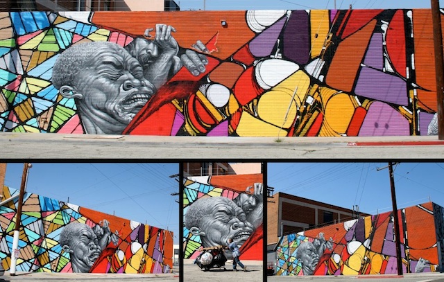
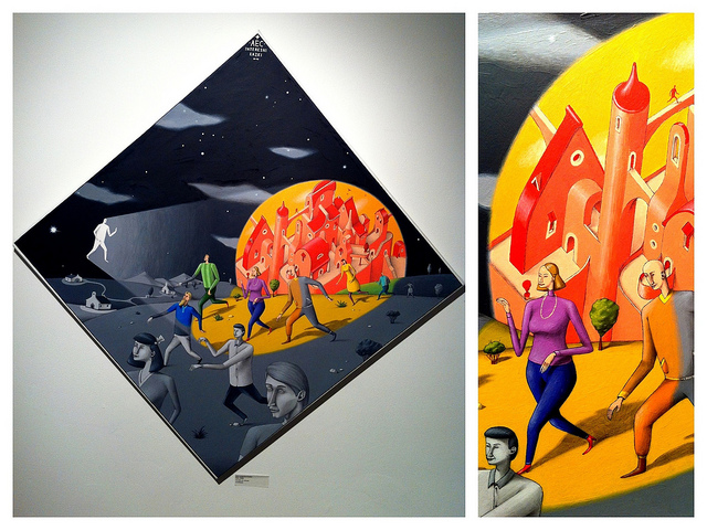
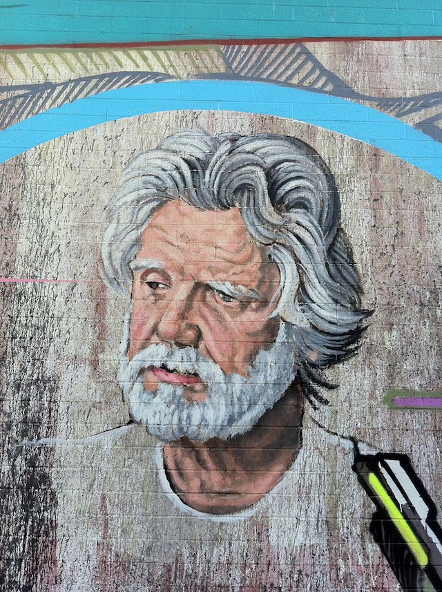
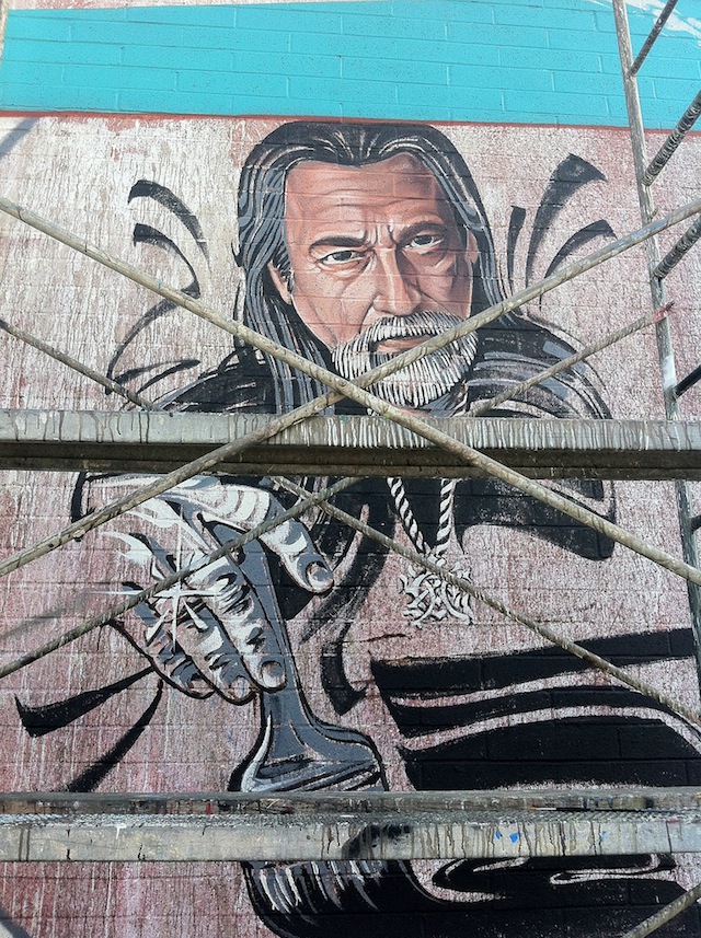
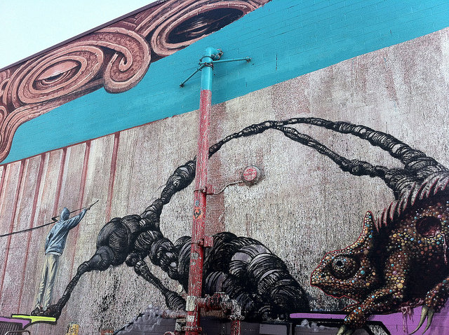
Balancing elements of local heritage with commentary on the process of large-scale, public works-style painting, UGLAR recently utilized techniques of fine art and street art to pay tribute to L.A.’s three greatest contemporary muralists, Willy Herron III, Kent Twitchell, and Chaz Bojorquez, with a massive mural just north of Chinatown called “Painting the Painters.”
Roughly 20 feet high and 100 feet long, the piece features several crewmembers depicted in the process of painting it (anchoring its left side is a larger-than-life Sergio Diaz, and spaced throughout are life-sized representations of Jose. A. Lopez and Evan Skrederstu), as well as a color-chart chameleon whose scales reflect every hue in the piece, and Tlaloc, the Aztec rain deity. It’s a piece that honors those that came before while commenting on the process of mural-painting, and could only have sprung up on the streets of L.A.
Location: 1726 N. Spring Street, Los Angeles, CA 90012.
Sergio Diaz (L), Willy Herron III (R), and Christopher Brand touching up a tentacle.Kent TwitchellChaz (In Progress)Tlaloc and the Chameleon